Top UI Design Trends for 2026: The Logic of Tomorrow

10minutes read
ui-design-trends

The digital design sector is expanding at a breakneck pace, with a projected 16% growth through 2030 and a 100 million professionals expected globally by 2050. But while the talent pool is surging, so is the digital noise. We at Gapsy Studio believe this influx is a direct response to a usability crisis: the world doesn't just need more pixels; it needs a way to make the ones we already have actually make sense.

In 2026, the UI design trends that truly move the needle shift the focus from static beauty to human logic. We are moving beyond the "dead" minimalism of the last decade toward interfaces that breathe and adapt. Whether it’s the physical depth of liquid glass or the predictive power of generative UI, the goal is to cut through the template-saturated web with designs that respect a user's intent rather than just their attention.

Why UI Strategy is Business Critical

In a market saturated with "templated" solutions, your interface is a direct communication of your company’s operational health. A haphazard UI signals to the user that your technology, security, and service standards might be equally outdated.

Moving into 2026, treating UI as a "final polish" is a high-stakes business risk. Here is why a UI strategy is the primary driver of ROI in the current landscape:

The Trust-to-Tech Correlation

Users equate visual maturity with technical reliability. If your interface feels like a relic of 2018, users subconsciously assume your backend security and data handling are also stuck in the past. Adopting modern UI design trends means  signaling that you are a market leader who is invested in the modern user experience.

Reducing the Hidden Cost of Friction

High Customer Acquisition Cost (CAC) is often a design problem in disguise. Every unnecessary click, confusing menu, or lag in visual feedback is a point where a potential customer drops off. A strategic UI design focuses on conversion logic, which streamlines the path from landing to lead so that every dollar spent on marketing converts into revenue.

Scaling Through the "100 Million" Noise

With the projection of 100 million professionals entering the field by 2050, the baseline for "good" design is rising. To stand out, businesses can no longer rely on generic UI kits. Strategy allows you to move beyond the average and build a proprietary visual language that competitors cannot easily replicate.

Is your current interface helping you scale or holding you back? Contact us to identify the hidden friction in your roadmap.

The Top 10 UI Design Trends for 2026

If 2024 was about AI disruption and 2025 was about adaptation, 2026 is the year of synthesis. The initial shock of new technologies has faded, replaced by a mature, intentional blending of the digital and the tangible. These trends are responses to a world where designers are fighting for the same sliver of user attention.

Trend #1: Liquid Glass 2.0 as The Evolution of Optical Trust

We’ve moved past the static "frosted" panels that dominated 2024. The new Liquid Glass is a living material that utilizes real-time refraction and light-scattering to respond to the user's movement. By mimicking how light behaves in the physical world, we create an interface that feels technically robust and premium. 

This optical realism does more than just look expensive; it builds subconscious trust. When a product behaves like a physical, grounded object, the user's brain perceives it as more reliable and secure. It turns a simple interaction into a high-fidelity experience that signals market leadership.

Trend #2: Intent-Based UI and The End of the Searching

The "one-size-fits-all" navigation menu is dying. Generative UI uses predictive logic to restructure the interface in real-time based on what the user is trying to achieve at that exact moment. Imagine a banking app that looks completely different on a Monday morning when you're checking payroll versus a Friday evening when you're reporting a lost card.

By surfacing only what is relevant, we eliminate the "cognitive sprawl" that leads to user fatigue. This proactive approach turns a complex product into a seamless assistant, drastically reducing the time users spend searching and increasing the time they spend acting.

Trend #3: Bento Box 3.0 with Modular Clarity for High-Density Data

As design tools become more powerful, they often get more cluttered. The Bento Grid trend, inspired by the organized compartments of a Japanese lunch box, is the definitive solution for the current data overload. It allows us to pack an immense amount of information into a single screen without it feeling chaotic. 

For our work on Scoop Solar, we used this modular architecture to translate complex industrial data into a clean, human-centric interface. It proves that "saving the planet" or managing a power grid can look sleek, accessible, and high-tech rather than overwhelming.

Trend #4: The Human Signal as The Luxury of Imperfection

A machine can generate a "perfect" image in seconds, but human imperfection is still a luxury commodity. We are seeing a massive rejection of sterile, stock-heavy visuals in favor of The Human Signal—raw textures, hand-touched scribbles, and digital collages. 

In our Galaxibites concept, we deliberately used hyper-tactile 3D surrealism to create a "chewy," sensory experience. These "flaws" act as a signal to the user: "A person made this for you." It builds an immediate emotional bridge that a polished algorithm simply cannot replicate.

Trend #5: Kinetic Storytelling for Liquid Conversion Paths

Motion in 2026 is moving away from "flair" and toward functional logic. We use "liquid" transitions where a button morphs smoothly into a success state or a content card glides to reveal deeper settings. This fluid movement acts as a mental map, confirming a user's action and masking system latency. 

When an interface feels liquid, it eliminates the jarring cuts and flashes that lead to frustration. It keeps the user in a "flow state," making the path to conversion feel like a natural progression rather than a series of hurdles.

Trend #6: Spatial Depth for Every Screen

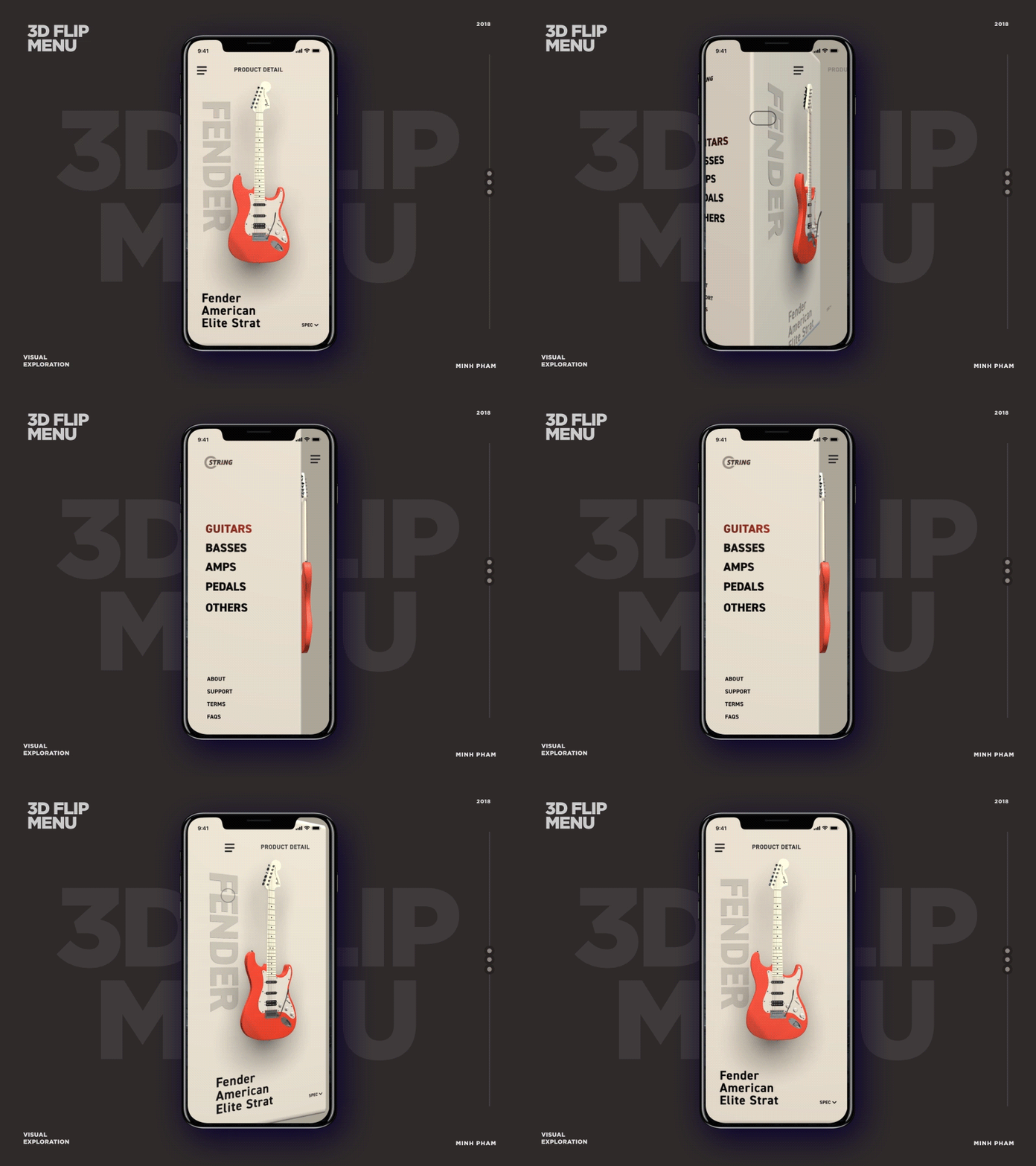
As spatial computing matures, 2D screens are adopting a Z-axis hierarchy. This isn't just a visual trick; it’s a way to guide the user’s eye naturally. By using soft shadows and light-play to layer elements, we create an environment where high-priority actions float "closer" to the user while background data sits deeper. 

Our VR BOXXX project highlights this shift, where buttons and data aren't just painted on a canvas—they exist in a hierarchy of depth. This makes navigation feel second-nature, reducing the mental energy required to decipher a flat layout.

Trend #7: Emotional Micro-Interactions

"Functional" is no longer enough to win a user’s heart; it’s just the entry fee. To build a product people love, you have to design for feeling. Emotional micro-interactions are the tiny, often overlooked moments that turn a cold digital exchange into a warm, human connection.

In 2026, we are moving beyond the generic "like" animation. We are designing "hyper-real" feedback loops that bridge the gap between the glass screen and the human nervous system.

  • Tactile reassurance. We’re moving beyond just "seeing" a notification to actually feeling it. By pairing a soft light pulse with a subtle micro-haptic vibration, like the satisfying "thunk" of a luxury car door, the interface gives you a physical sense of security that a flat screen never could.

  • The human rhythm. Surprisingly, instant isn't always better. In 2026, we’re introducing intentional "micro-delays" before a success checkmark appears. This brief, organic pause mimics the time a person takes to verify a task, replacing robotic speed with a steady, empathetic rhythm that feels more trustworthy.

  • Contextual empathy. Interfaces are finally learning to read the room. If you hesitate over a "Delete" button or seem lost in a menu, the UI responds with a softer, calmer transition rather than a sharp animation. It’s about sensing frustration and offering a gentle helping hand exactly when it’s needed.

These small moments are the retention engine of your product. They create a sense of delight and reassurance that lingers long after the user has closed the app. It’s the difference between a tool that "works" and a companion that "understands."

Trend #8: Dark Mode 3.0 that Respects the Eye and the Hardware

Dark mode has evolved from an aesthetic "choice" into a hardware-software synergy. We are prioritizing OLED-first themes that use deep blacks to save battery and high-contrast logic to protect user vision. 

This is the ultimate "humane" trend that recognizes we spend hours a day on these devices and designing a visual environment that is gentle on our biological limits. It reduces eye strain and extends device longevity, ensuring that your product is as usable at 2:00 AM as it is at 2:00 PM.

Trend #9: Hyper-Personalized Color Logic

In 2026, the color palette of your favorite app is no longer set in stone. We are moving away from rigid brand colors toward dynamic color logic. This is where the interface breathes and changes color based on who is using it and where they are. This shift turns a static design into a living environment that respects your personal comfort and surroundings.

Here are several examples of how this can work: 

  • Instead of a single "High Contrast" toggle, interfaces now shift their hues automatically to match your specific visual needs. Whether it's adjusting for color blindness or fine-tuning contrast for neurodiverse users, the UI prioritizes readability over "brand rules," ensuring the experience is effortless for everyone.

  • Your screen can look different in a sunlit park than it does in a dimly lit bedroom. Hyper-personalized logic detects your ambient light and shifts the color temperature to protect your eyes. It’s a "biological" approach to design that moves beyond a simple light/dark mode switch to a spectrum of colors that feel natural in any setting.

  • Color is being used as a subtle "mood setter" for the task at hand. If you’re managing a high-stress Fintech dashboard, the UI might shift toward calming, desaturated tones to help you focus. If you’re in a creative flow, it might introduce vibrant, energizing accents. It’s about using color to speak to your subconscious and set the right tone for the moment.

Trend #10: Accessible Minimalism

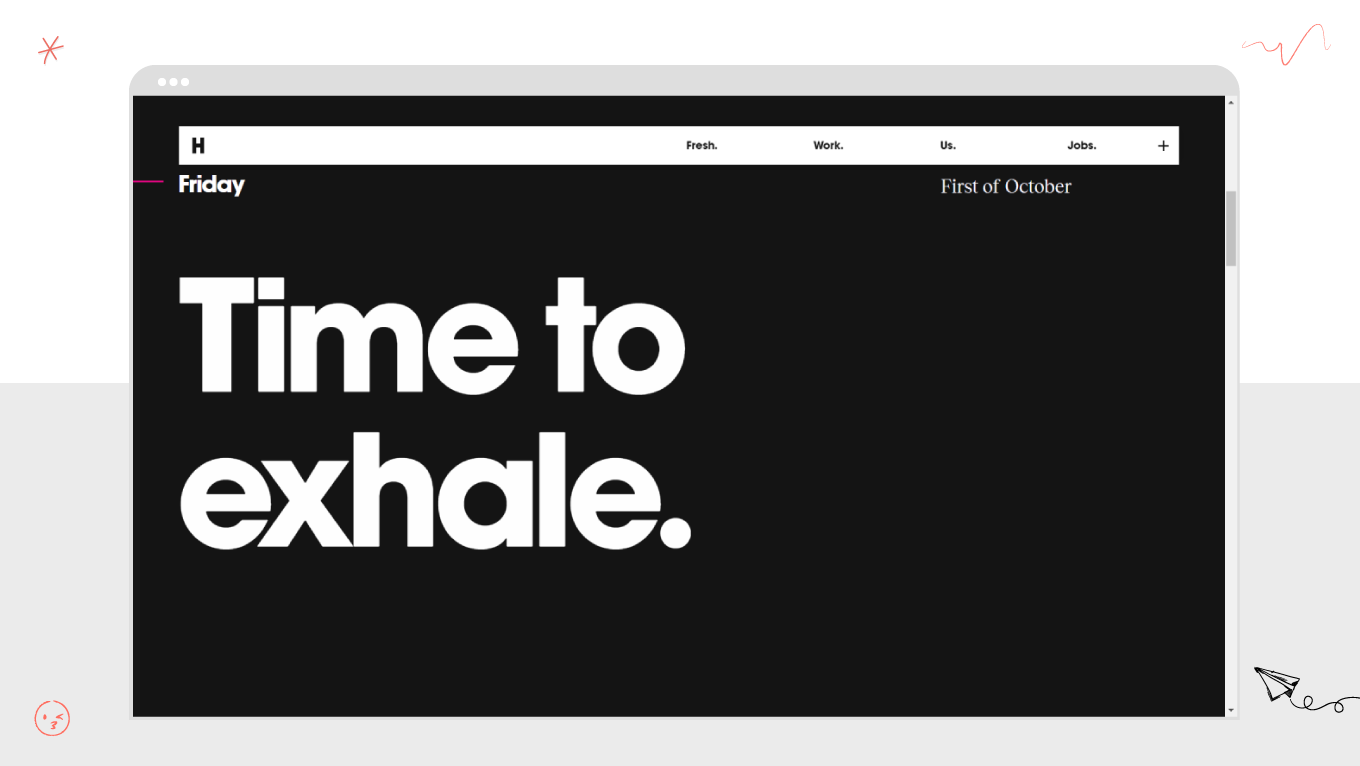
For years, minimalism was often misunderstood as just "having less stuff on the screen." In 2026, we are evolving toward accessible minimalism. This isn't about creating empty spaces; it’s about the intentional removal of anything that doesn't serve your immediate goal. It’s a shift from a "clean look" to a "clear mind," where the interface acts as a quiet partner that helps you focus rather than a loud billboard demanding your attention.

Every element on the screen now has to earn its keep. We are seeing a move toward bold, high-contrast typography and oversized headlines that act as visual anchors. By stripping away redundant icons and decorative borders, we allow the content to breathe. This clarity ensures that even the most complex tools, like enterprise dashboards or medical software, feel self-explanatory and welcoming from the first click.

What’s more, whitespace is no longer just "empty" space; it is a functional tool used to group related information and provide mental "rest stops." In a world of digital overload, an interface that breathes is an interface that respects your time. By giving elements room to exist, we reduce the "choice paralysis" that often happens when too many buttons compete for your focus. It’s about creating a sense of calm in a high-speed world.

The UI Design Mindset for 2026

Knowing these ten trends is only half the battle. In a market flooded with powerful AI tools, anyone can make an interface look "modern." The true differentiator in 2026 will be strategic empathy.

To build products that survive the rapid shifts of the next few years, you need to move beyond treating design as a decorative layer. This means adopting a new mindset that values clarity over clutter and human logic over machine capability.

Design for Intent Instead of Just Interaction

For years, we have measured success by "engagement"—how many taps, clicks, and minutes a user spends in an app. This approach is becoming obsolete.

The humane approach for 2026 is to respect the user's time by reducing the need for interaction. For example, by leveraging intent-based UI and accessible minimalism, you can help the user achieve their outcome as quickly and quietly as possible. 

So, stop asking, "How do I keep them here?" Start asking, "How do I help them finish?"

Empathy is Your New Technical Standard

We used to treat things like accessibility, dark mode, and haptic feedback as "nice-to-have" features. Today, they are baseline requirements for a humane product.

Designing with digital empathy means recognizing that your user is a biological being, one who gets tired eyes at night, becomes frustrated by lag, and feels anxious when technology is unclear. Trends like dark mode 3.0 and emotional micro-interactions are tools for reducing cognitive load and physical strain. When an interface cares about how the user feels, it builds a type of loyalty that features alone cannot buy.

So, the rule is: don't just build for the "average user." Build for the stressed, tired, and distracted reality of the human user.

The Discipline of Subtraction

With infinite technical possibilities, the hardest thing to do is say "no." The digital world is noisy. The greatest luxury we can offer a user in 2026 is silence and focus.

Applying the principle of accessible minimalism means rigorously questioning every element on the screen. Does this button need to be here? Does this animation add clarity or just noise? By practicing the discipline of subtraction, we create interfaces that breathe and move from demanding attention to earning trust.

True innovation in 2026 is about refining what’s left until only the essential logic remains.

Our design team believes that the most resilient products are the ones that never lose sight of the human on the other side of the glass. If you share our vision for a more humane digital future, let’s explore how we can bring these trends to your project.

Real-World Application of UI Design Trends

Abstract trends only become meaningful when they meet the messy, unpredictable reality of human life. We’ve spent the last year testing post-artificial principles in the wild, moving beyond the screen to see how logic actually changes the way people interact with complex systems.

Here is how the 2026 standards look when applied to real challenges.

Finding the Rhythm in the Chaos for Busify

Imagine a dispatcher at 7:00 AM. They are juggling thirty routes, fifty drivers, and a hundred moving variables. In the past, this meant fighting with a screen that looked like a digital junk drawer.

When designing Busify, we organized focus. Our team used the Bento Box 3.0 approach to give every piece of information its own "home," so the eyes don't have to hunt. By building in intent-based UI, the interface learns the dispatcher's morning rhythm. It doesn't distract them with yesterday's reports; it gently surfaces the immediate route changes they need right now.

It’s the difference between a cluttered desk and a clean workspace where the tool you need is already in your hand.

A Home for the Creative Soul: Creatorset

The digital world can be a lonely, sterile place for a creator. Most tools feel like they were made by machines, for machines.

With Creatorset, we wanted to bring back the human signal. Our team stripped away the "corporate" gloss and embraced accessible minimalism. We left room for the work to breathe, but we also tucked in hand-drawn, "imperfect" illustrations. They remind the user that this platform was built by people who value the messy, beautiful process of creation.

The Steady Hand in Finance for Ayata

Investing is an emotional rollercoaster. Most fintech apps feed that anxiety with flashing lights and urgent reds.

For Ayata, we chose a different path. We used Dark Mode 3.0 to create a deep, quiet environment, like a private library, where the user can think clearly. We applied spatial depth to make important decisions feel tangible, and hyper-personalized color logic to keep the mood steady. If the market gets loud, the interface stays calm, using soft tones to guide the user back to their long-term goals.

It’s the sense of security you get from a trusted advisor who speaks in a calm, steady voice while everyone else is shouting.

The People Behind the Logic: This is Gapsy Studio

We don’t believe in design for design’s sake. We are a collective of strategists, dreamers, and technical architects who believe that in an increasingly automated world, the human touch is the ultimate differentiator.

Our team  moved past the era of "pixel-perfection." The focus is on strategic empathy, the art of understanding not just where a user clicks, but how they feel when they get there. We bridge the gap between complex, high-performance logic and the quiet, intuitive needs of the human spirit.

Whether we are building a high-stakes industrial dashboard or a tactile fintech ecosystem, our goal is always the same: to create digital environments that breathe, respect your time, and feel unmistakably real.

Ready to move beyond the digital noise and create an interface that truly respects your users? We'd love to hear your story. Say hello to Gapsy Studio

Final Thoughts

As we look toward the next few years, the true indicator of a successful product will be how it makes a person feel during their day. UI designers are moving toward a world where technology acts as a silent partner rather than a noisy distraction. By embracing this post-artificial mindset, you can ensure that your digital products feel like supportive environments rather than cold laboratories.

So, our final verdict is: Trends are the language, but logic is the message.

A UI trend might tell you how to style a button, but logic tells you if that button should even exist. The most resilient products will be the ones that use the visual language of the day to deliver a timeless message of clarity, empathy, and respect.

Ready to see your product through a 2026 lens? Let’s strip away the noise and find the essential logic beneath.

Rate this article

20 ratings
Average: 4.9 out of 5

If you like what we write, we recommend subscribing to our mailing list to always be aware of new publications.

Do you have any questions? We tried to answer most of them!