Tablet App Design: Main Things to Consider

5minutes read
tablet app design

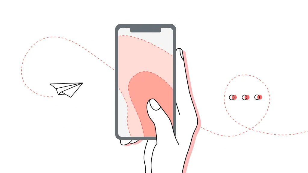
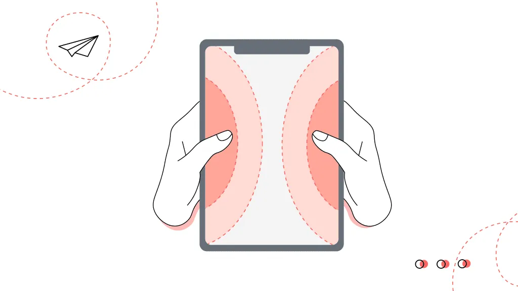
Tablets and mobile line up under the name “mobile devices.” But does this mean that their UI design shouldn’t have differences?

When creating a design, it’s worth considering what device your potential users will use. And of course, we have to consider the variations between a smartphone and a tablet design. But what is its essence?

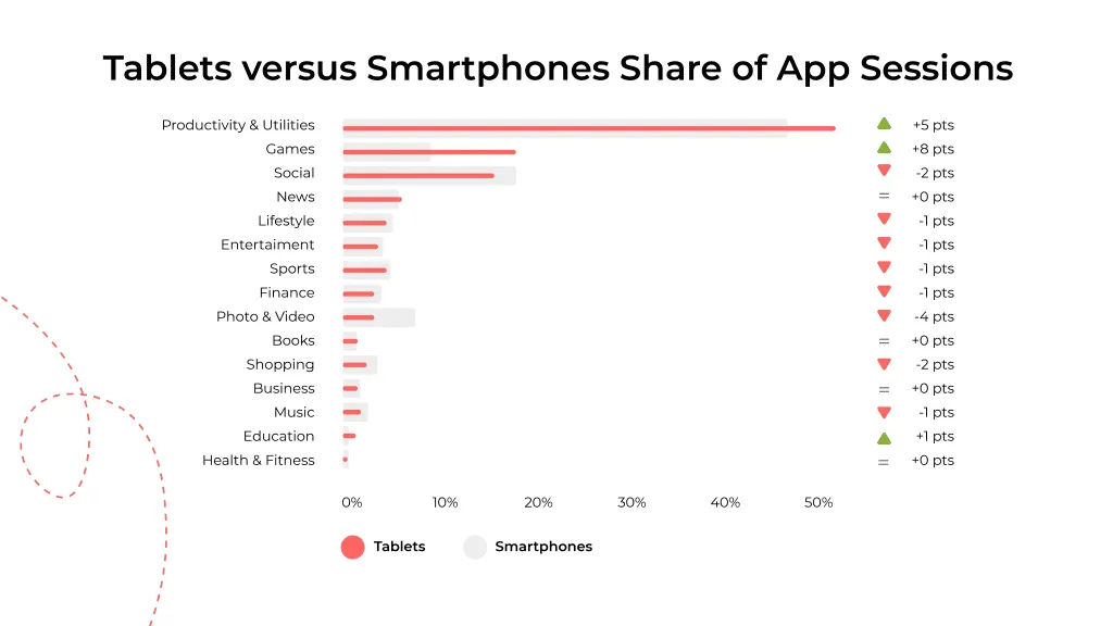
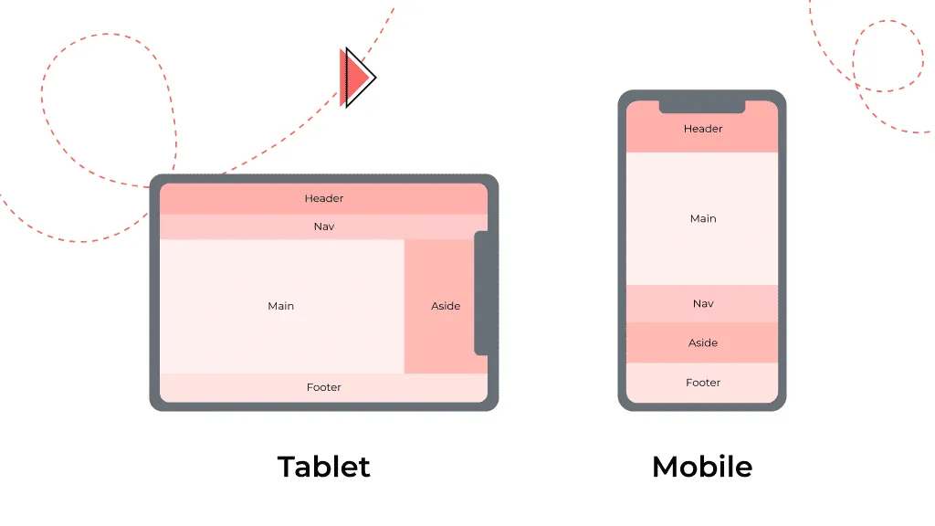
Let’s discuss how to create a well-designed tablet interface and the essential user interface differences you need to know when launching an app. And at the end, we highlight crucial tips on creating tablet UI design to apply it in practice.

The key difference between tablet apps design and mobile

The app can work on both devices, but will it retain superb interface usability? Many factors come into play, from how users hold their gadgets to the app’s functionality that depends on them.

Screen size

The most significant and simple difference between the tablet app’s design and mobile is the screen resolution. All pressable buttons should be within easy reach of the user’s finger to quickly press them holding the mobile in one hand.

That’s why when designing mobile apps, the central zone for active elements is the left or right corner and the middle of the screen.

mobile app design
mobile-oriented design

The tablet is more extensive in its size. Therefore, users involve both hands when using it. Because of this, the areas for placing elements so that they are easily accessible are the left and right sides of the screen.

tablet app design
tablet-oriented design

Depending on whether the resolution is tablet or mobile, the hierarchy of content and the placement of all elements will change. The small size of the mobile screen allows the designer to place only the most essential information and break up the rest into other screens. The tablet screen can accommodate more elements than the smartphone without hurting the app’s interface.

Contextual surrounding

The context of use is the user’s expectations of the mobile device. And its difference depends on whether a user picks up a tablet or a phone.

A trip or even an hour of our life can do without the phone; it’s a way of communicating and exchanging information. But, at the same time, people use tablets more for playing games and during their free time.

According to the research, tablets are more often used for games and education apps, less often for social networking. While smartphones, people usually use them for listening to music, communication, and online shopping.

Read more about Education app design and E-commerce app design in our blog.

use of gadget statistics
mobile vs tablet statistics

Before you start work on an app, think about the context of its use. The interface details depend on this.

Questions you can ask yourself before beginning designing:

  • Will this interface be comfortable if the user holds the gadget with one hand?
  • Would users prefer a landscape orientation or a tablet orientation?
  • How exactly will users use your app, sitting at their desk, lying on the couch, or on their way somewhere?

Content organization

The designer’s work aims at maintaining the content and functionality of the user interface. Therefore, all of its components must be organized according to a hierarchy and be receptive to the user.

A small smartphone screen provides less space for content layout. Therefore, all elements, cues, and drop-down menus should be used with care to avoid overloading the interface with unnecessary information and distracting the user from the main thing. On the other hand, the tablet has more free space. Accordingly, you can modify the interface and put some functional elements on the main screen. A phone should use a layout with one column and a tablet UI design with two columns.

Look also at the mobile app design services we provide.

mobile and tablet applications design
differences in designing for tablet and mobile

For example, we can see how the location of the call-to-action button has changed. On the smartphone, it’s in the middle, while on the tablet, it’s on the left side. You can also clearly see a one-column layout on the mobile and a two-column layout on the tablet.

mobile devices app design
example of tablet app ui design

TOP 10 tablet UI design tips

1) Buttons should be visible

The call-to-action button should be visible. Please don’t make it a hyperlink. It should be at the top of the hierarchy, stand out, and fit harmoniously into the overall interface. The users will perceive the call easier if it’s in the form of a button. So, they will intuitively understand what to do with it.

2) Pressable elements should have boundaries

It’s about intuitive tablet application design. All clickable elements in the interface should have a clear outline, preferably in the form of a button. This visual indicator helps the user not to confuse clickable text with shortcuts.

3) Choose the optimal size for targets

The minimum button size for touch is 42 pixels. But the tablet screen is larger than the mobile, and users hold it farther away when using it than the smartphone. So, the larger the button, the easier it will be to press. Therefore, it’s better to make it a size of 60 pixels.

target in tablet UI design
button size in tablet ui

4) Adjust the size of the touch target concerning the button

The user should be able to press the button quickly. This means that the touch target should be larger than the button. This is adjusted during the development process.

5) Don’t make a big text hierarchy

Any content should be easy to comprehend. Don’t make a long hierarchy line. The best option is to stop at the first and second level hierarchy. The information below the third level is hard to distinguish visually, so it doesn’t bear significance for the interface because it doesn’t perform its direct function.

Read more what is typography in web design in our blog.

6) Highlight the active elements

Active elements can be highlighted with color contrast. The accent color in the interface will draw the user’s attention to the item, thus, prompting them to take some action concerning this element, in particular, to click on it.

In the example below, the accent color is red. There’s also enough white space around and between the content to enhance perception.

7) Be careful with the active elements in the access areas

We keep in mind the areas that are most accessible to click. These are the left and right sides of the screen on a tablet. Try to calculate the possible trajectory of the user’s movement if you want to arrange elements on one of the sides. A large percentage of people are right-handed. It means that holding the tablet in their left hand, they can accidentally click on some element, thus opening a window they do not need.

8) Minimize scrolling

Long scrolling reduces the user’s concentration, and new information perceives more difficulty. Therefore, it’s better to divide the content into several blocks and systematize the information provided.

9) Spice up the interface with simple animations

Small, minimalistic animations will serve as hints for users. It can be added to confirm that the user has performed any action.

Read more about types of app animation in our blog.

well-designed tablet UI
animation in tablet ui design

10) Book and landscape orientation should have the one style

When switching between portrait and landscape orientation, keep the navigation. Don’t make drastic changes. Because the users won’t want to re-learn the interface, such changes will be confusing and annoying. Instead, choose a single style and stick to it.

how to design for tablet
example of single style tablet ui

Final call

Tablet and mobile app design have many similarities, but you need to consider things when working with the interface of a tablet application. For example, the screen size changes the layout of elements.

The main thing to remember, that a good design is a design that covers the users’ needs and is easy and intuitive to use. If you still have questions, contact us to solve your problems. Check out the finished projects on Behance and Dribbble. And also take a look at the services we provide.

Rate this article

21 ratings
Average: 4.9 out of 5

If you like what we write, we recommend subscribing to our mailing list to always be aware of new publications.

Do you have any questions? We tried to answer most of them!