Visual Weight in Design: Principles, Examples, and Best Practices

12minutes read
visual-weight

A surprising number of digital products stumble before they ever gain traction: around 70% of online businesses fail because their user experience doesn’t work. And one of the quiet reasons behind this is how poorly they handle visual hierarchy. When a layout doesn’t show users where to look first, what matters most, or how to navigate the content, confusion takes over long before the product's value is clear.

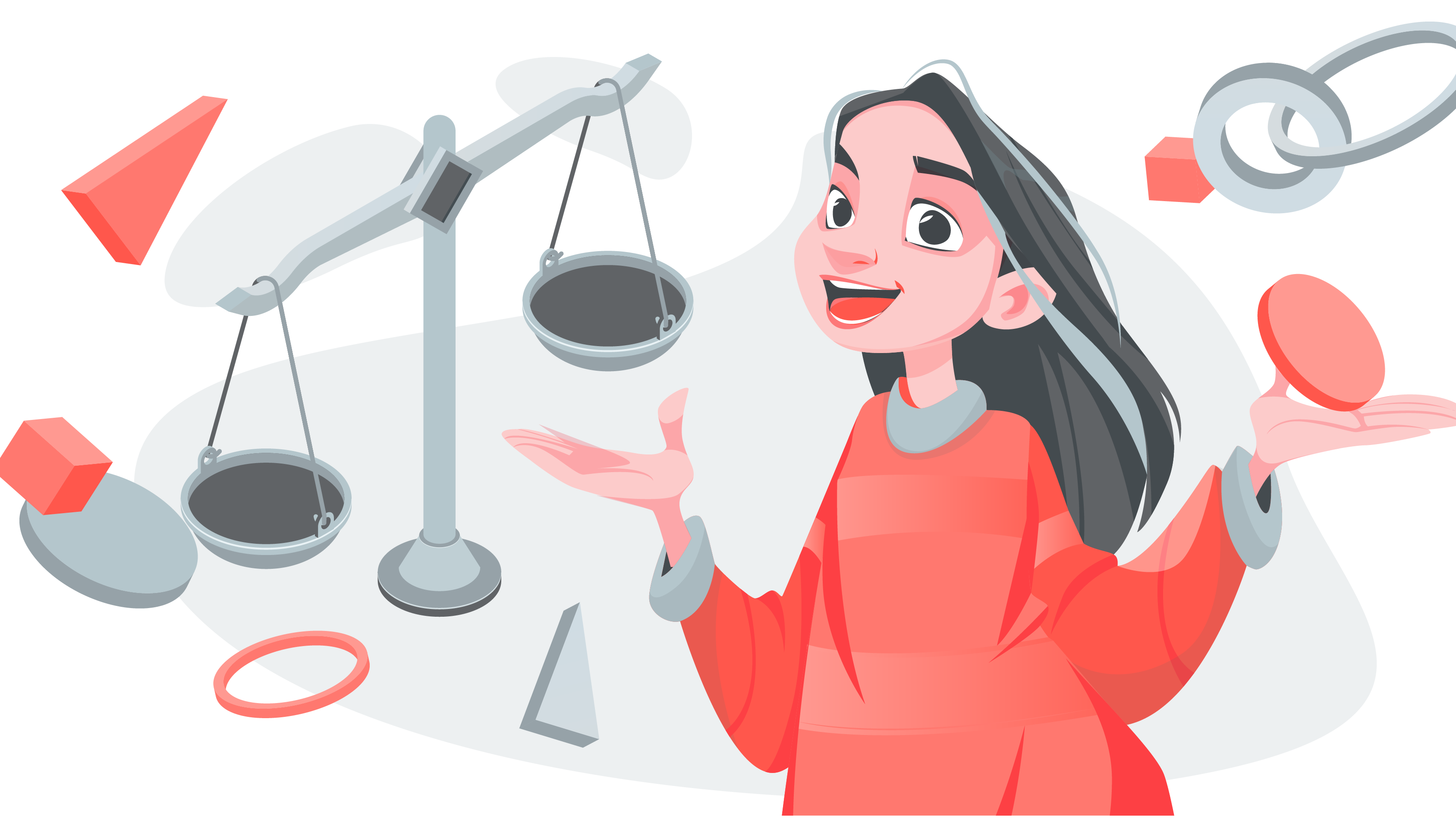
Visual weight in design is one of those principles that looks subtle at first glance but shapes almost everything about how a person experiences a page. The size of a button, the contrast in a headline, the spacing around a key message: all of these small choices either guide attention naturally or scatter it.

In this article, we’ll look at how visual weight works in practice and how using it intentionally can make an interface feel clearer, calmer, and easier to understand from the very first second.

What Is Visual Weight in Design?

Visual weight is the perceived importance or “pull” an element has within a layout. Some elements stand out instantly; they feel heavier, draw the eye first, and quietly signal what matters. This happens because our eyes react to size, color, contrast, spacing, and positioning long before we consciously read anything.

This instinctive reaction is significant when you consider user behavior online. People decide whether to stay or leave a website within just 8 to 10 seconds. If the layout doesn’t load fast, clearly communicate its purpose, or guide attention in the right direction, visitors bounce before they ever discover the value behind the product. Visual weight is one of the tools that helps prevent that early drop-off by making the first glance meaningful.

A simple example: imagine a page with a big product photo, a bold headline, a short description, and a “Buy Now” button. Even without thinking, your eyes follow a natural order: the image, the headline, the button. That flow feels natural because the designer intentionally played with size, contrast, and spacing to create a hierarchy. 

When visual weight is used correctly, the page feels easy to understand right away.

How Visual Weight Shapes User Attention and Experience

Visual weight shapes how people notice, understand, and navigate a layout. It’s one of the silent drivers of good UX: when it’s utilized well, users immediately see what matters and what to do next. When it’s used poorly, every element fights for attention, causing hesitation, confusion, and quick drop-offs. Here’s why visual weight in design is so essential:

Guides the User’s Attention

Visual weight directs the eye to the right places at the right moments. A stronger headline, a bolder button, or a high-contrast element naturally becomes the first stop in a user’s visual path. This helps people quickly make sense of the page and reduces the time they need to determine where to go next.

Example: On a landing page, a large dark “Get Started” button will always attract attention before a small light “Learn More” link right beside it. Users intuitively know which action matters most.

Creates Balance and Comfort

A balanced layout feels stable and easy to process. Designers use heavier and lighter elements to distribute attention across a page, preventing the design from feeling crowded on one side or empty on the other. The result is a composition that feels intentional, calm, and visually comfortable.

Example: When a hero image is placed on the left side of a homepage, designers often put a bold headline and short description on the right to balance the visual weight, so the page doesn’t feel lopsided.

Establishes Clear Focal Points

Not everything deserves equal attention. Heavier elements act as clear focal points: the hero message, the primary action, the main product shot. When hierarchy is obvious, users don’t waste cognitive effort figuring out what’s important.

Example: On an e-commerce product page, the product photo is usually the most significant and darkest element. That’s intentional: it becomes the focal point before the price or description.

Adds Interest and Depth

A mix of visual weights creates rhythm and keeps a layout from feeling flat. Contrast, proportion, and texture introduce variety, helping the design hold attention longer. This subtle complexity makes the overall experience feel more thoughtful and engaging.

Example: A dashboard that combines a bold main chart with smaller supporting cards feels dynamic, while a screen with charts all the same size appears monotone and harder to scan.

Improves Usability and Interaction

In UI/UX design, visual weight communicates what’s interactive and what’s secondary. Heavier elements often signal primary actions, while lighter ones take a supporting role. This is what creates good usability, where the visual language helps users make decisions faster.

Example: In a checkout flow, the “Confirm Purchase” button is typically large, dark, and high-contrast, while the “Back” or “Cancel” options are lighter and smaller. Users instantly understand which action is primary.

Gapsy Studio can help you improve the visual hierarchy of your user experience — contact us to collaborate.

Core Visual Weight Elements

Before you can control how users move through a layout, you need to understand what makes an element feel heavier or lighter on the page. Visual weight in graphic design is shaped by a set of core qualities that influence how quickly something catches the eye and how long it holds attention. These elements work together to create hierarchy, balance, and flow.

Size: The First Signal of Importance

Size is one of the most immediate and intuitive drivers of visual weight. Larger elements naturally draw the eye before smaller ones because they occupy more space and create a more substantial visual presence. Designers use size to signal importance, build hierarchy, and shape the order in which users process information.

When utilized intentionally, size helps users understand what matters at a glance. A big headline sets the tone of a page, a large image anchors the layout, and an oversized button communicates the primary action. When everything is the same size, the interface feels flat, so users have to work harder to figure out what’s worth paying attention to.

Example:

Consider a pricing page with three subscription tiers. The recommended plan is often displayed in a noticeably larger card, with a bold title and more padding around it. Even before reading the details, users can tell which option the company wants them to explore first. That size difference creates a natural entry point and gently guides the decision-making process.

Takeaway:

Use size to guide attention and establish priority. Bigger elements should represent key actions or essential information, while smaller elements support and enrich the experience without competing for focus.

Color: Guiding Attention

Color — the hue, saturation, and brightness of an element — strongly influences visual weight. Bright, warm, or highly saturated colors naturally feel heavier and draw attention, while cooler, lighter, or muted tones feel softer and less dominant. Contrasting colors can create focus and vibrancy, while harmonious ones unify a layout and guide the eye more smoothly.

Designers use color strategically to attract attention, evoke emotion, and establish hierarchy. Bold, saturated elements act as visual anchors, while subtler tones provide breathing space and balance within the design.

Example:

On an e-commerce page, a bright red “Add to Cart” button immediately stands out against a neutral background. Its saturated hue makes it visually heavy, guiding users to the primary action. If the button were a muted gray, it would blend in, and users might overlook it.

Takeaway:

Use bold, saturated colors to highlight key actions or important content, and softer tones to support hierarchy and balance. Color is a powerful way to guide attention and shape the user’s experience.

Density: Detail that Demand Attention

Visual density acts as a magnet for user attention. Detailed textures, busy patterns, and intricate shapes naturally carry more "weight" than smooth, minimal elements. Because these dense areas take a beat longer to process, they naturally hold the viewer’s eye, creating an intentional pause in the user's flow. When used strategically, this is an excellent way to signal quality, spark interest, or anchor the eye to the most critical actions in your layout. 

Example:

Imagine two icons side by side. One is a simple outline; the other is filled with tiny details, shading, and layered patterns. The detailed icon instantly feels heavier because your brain needs more time to interpret it. That added processing time gives it more visual pull.

Takeaway:

Use complexity when you want something to stand out or feel rich and substantial. But it’s essential to keep surrounding elements simpler so the design doesn’t become overwhelming.

Value: Shaping Visual Gravity

Value — the lightness or darkness of an element — shapes how heavy your design feels. Darker elements appear denser and more grounded, while lighter tones feel softer and less dominant. Strong value contrast can instantly guide attention, create depth, and help establish visual hierarchy across a layout.

How can value affect visual weight? Designers use it to control mood, emphasize key actions, and structure depth. A dark anchor element feels like a stable foundation; lighter areas act as breathing room, helping the design feel open rather than overwhelming.

Example:

A light website page with a dark, high-contrast “Sign Up” button immediately becomes the most noticeable element because the value difference makes it visually heavy. If the button were light and low-contrast, it would blend in, and users might ignore it.

Takeaway:

Use darker values to anchor attention, and lighter ones to create space. Contrast is a powerful tool, so use it to highlight what matters most.

Position: Placement that Changes Perception

An element’s position in a layout dictates its perceived gravity. Objects placed lower or toward the center feel grounded and heavy, mirroring our instinctive sense of physical weight, while elements at the top or the edges feel lighter and more fleeting. Negative space acts as the primary lever for this weight; generous margins grant an element prominence and room to breathe, while tighter spacing introduces a sense of tension and urgency

Thoughtful positioning lets designers guide the visual flow and create natural entry points. Space can be as impactful as the element itself, as it elevates, isolates, or softens depending on how it’s used.

Example:

Think of two identical cards. One sits low and centered, surrounded by plenty of white space; the other is tucked tightly near the top. The lower card instantly feels more essential and grounded, while the top one seems lighter and easier to overlook. Space transforms weight without changing the design itself.

Takeaway:

Use position and spacing to control emphasis. Central or lower placements feel heavier, while generous space around an element increases its importance without adding clutter.

Anomaly: Breaking the Pattern

Anomalies — elements that are clearly different from their surroundings — carry strong visual weight because they interrupt the expected pattern. A sudden shift in color, size, shape, or texture instantly draws the eye. Such a contrast is one of the fastest ways to create a focal point, spark interest, or guide a user’s attention across a layout.

Designers use anomaly to make statements, highlight actions, or introduce intentional tension. Subtle animation can add visual weight to key elements, drawing the user’s attention without overwhelming the layout. It’s a powerful tool, but one that works best when used with restraint — too much contrast and everything competes again.

Example:

Picture a layout built with soft neutrals. Now place a single vivid object (for example, a bright red badge) on the left side. It immediately feels heavier because the contrast is so strong. To balance the design, you’d need to adjust other elements on the right, whether through color, size, or complexity.

Takeaway:

Use anomaly and contrast to define clear focal points and break monotony. A single standout element can guide the viewer’s attention faster than any other design technique.

Element

Impact

Tip

Size

Bigger elements grab attention first.

Use size to prioritize key actions.

Color

Bright or saturated colors feel heavier.

Highlight important elements with bold color.

Density

Detailed elements hold focus longer.

Use complexity to emphasize key areas.

Value

Darker elements feel grounded; lighter feel soft.

Use contrast to guide focus.

Position

Center/lower placement feels heavier; negative space emphasizes elements.

Position strategically to control emphasis.

Anomaly

Unique elements stand out immediately.

Use contrast sparingly to create focal points.


Common Mistakes Designers Make With Visual Weight

It’s crucial to manage visual weight intentionally, as it helps keep layouts “together”. These issues don’t appear all at once. They creep in slowly — an extra icon here, a brighter color there — until the page suddenly feels heavy, confusing, or just “off.”

1. Everything Looks Equally Important

When every element has the same size, color, and intensity, nothing stands out. The eye has no clear starting point, so users end up doing more work just to figure out what the page wants from them.

Example: A landing page where headlines, subheadlines, icons, and all CTA buttons share the same styling. Instead of leading the user, the design feels flat and directionless.

Fix: Build a clear hierarchy. Give the page one main focal point, let the supporting pieces stay subtle, and reserve fine details for the lightest visual touch. Achieving an equal distribution of visual weight in a design ensures that no single element overpowers the layout.

2. Overusing Contrast

Contrast is great, but when everything is bold, bright, or high-impact, the design turns into visual noise. If everything is loud, nothing is heard.

Example: A dashboard where every chart, button, alert, and label uses saturated color. Rather than highlighting essential data, the entire screen feels chaotic.

Fix: Use strong contrast intentionally for primary actions or urgent information. Keep the rest softer so the crucial things stand out.

3. Too Many Competing Focal Points

A layout with multiple “heaviest” elements forces users to jump between them rather than follow a natural visual path. Bold typography paired with an outburst of colors can easily overwhelm users if used unintentionally.

Example: A hero section with a massive image, a visually strong headline, a bright illustration, and a glowing CTA — all fighting for attention at the same time.

Fix: Choose one main focal point and make everything else support it.

4. Lack of Whitespace Creating Unintended Heaviness

When elements sit too close together, their combined weight increases. Even simple sections can feel dense or overwhelming because the eye never gets a moment to pause.

Example: A form where every field, label, and description is packed tightly together. The inputs aren’t complicated, but the layout makes them feel exhausting.

Fix: Add space to breathe. Whitespace lightens the page, reduces tension, and makes each element easier to understand.

5. Misaligned or Unbalanced CTAs

A primary CTA that doesn’t visually outweigh secondary actions can confuse users and lower conversion. Proper alignment of elements creates visual order, making layouts easier to scan and more aesthetically pleasing.

Example: A “Continue” button that’s the same size and color as a “Cancel” text link—or worse, a secondary action that accidentally looks heavier.

Fix: Give primary actions more weight through size, color, or placement so users instantly know what to do next.

Afraid that your product may look overwhelming? Reach out, and we’ll help you find a solution.

Visual Weight Examples in Action

Seeing how well-known brands apply visual weight makes the concept easier to understand. Effective interface design relies on creating visual weight and counterweight to guide the user’s eye and maintain a balanced layout. These companies use size, color, symmetry, and spacing intentionally to guide users’ attention and shape the entire experience. 

Here are a few recognizable visual weight examples that illustrate this in different ways.

Dropbox: Bold Color Accents That Lead the Eye

Dropbox’s redesigned site uses bright, high-impact colors paired with simplified shapes and generous whitespace. These vibrant accents instantly add visual weight to a design — headlines, CTAs, or key illustrations — pulling the viewer’s attention exactly where it’s needed. The clean structure around them creates balance, making the overall experience energetic but never overwhelming.

Google Workspace: Clean Weight Distribution Through Minimalism

Google Workspace products (Gmail, Docs, Drive) rely on minimalism to distribute visual weight evenly. Light backgrounds, thin lines, and simple icons make the interface feel airy. Important elements, such as Compose buttons, active tabs, and selected items, gain weight through subtle color and shape shifts rather than through dramatic styling. The intentional visual weight keeps the experience focused and distraction-free, especially in long work sessions.

Slack: Color-Driven Hierarchy in a Dense Environment

Slack handles a lot of information, yet it keeps things clear by using color strategically. Channels, notifications, mentions, and active conversations all rely on weight created through subtle color differences. A bright badge or a highlighted channel name instantly becomes the heaviest element in the sidebar. Even small details like this can radically improve navigation in a busy workspace.

Pinterest: Mosaic Weight Through Structured Uniformity

Pinterest’s home page looks busy at first glance, but it’s actually a carefully controlled grid of evenly weighted images. By giving each tile a similar size and spacing, Pinterest creates a sense of “organized exploration.” A balanced website layout leverages size, color, and spacing to create a clear visual hierarchy. Users feel free to browse because no single pin overwhelms the others — the uniform visual weight encourages curiosity and scrolling.

Checklist: How to Evaluate Visual Weight in Your Design

A quick self-review can reveal clarity issues long before user testing. Use this checklist to evaluate whether your visual weight is intentional, balanced, and guiding the user in the right direction.

  • Is the primary action the heaviest element on the screen? If not, users may miss the main interaction you want them to take.

  • Is anything unintentionally competing with the focal point? Overly bold icons, illustrations, or colors can steal attention from key messages.

  • Does the layout feel balanced from left to right and top to bottom? Uneven placement can make one area feel disproportionately heavy.

  • Is contrast being used deliberately, not everywhere at once? High contrast should highlight priority elements, not overwhelm the whole layout.

  • Does the eye naturally follow the intended reading flow? Try the “squint test”—blurring your view slightly should reveal the main path.

  • Are supporting elements visually lighter than primary ones? Secondary links, captions, and helper text should not compete with core content.

  • Is whitespace helping distribute visual weight? Tight spacing often amplifies heaviness; generous spacing lightens the experience.

  • Does the design still work in grayscale? Removing color helps verify that value (light/dark contrast) supports your hierarchy.

  • Do interactive elements look interactive? Buttons, toggles, and form fields should carry more weight than static text.

Is there only one main focal point per screen or section? Multiple focal points create confusion and force users to guess what matters.

How Gapsy Studio Can Help You Build Clear and Eye-Catching Designs

At Gapsy Studio, we treat visual weight as a practical tool for guiding users. Over the past 9 years, we’ve designed 230+ digital products, and one thing stands out: projects with a clear hierarchy help users understand a screen faster and interact with confidence.

We focus on the small but powerful details that shape the experience: the size of a CTA compared to surrounding text, the right level of contrast to draw attention without overwhelming, and spacing that keeps the layout balanced. In user tests, these subtle adjustments often lead to smoother navigation and faster, more confident decision-making.

We also audit screens for unintended heaviness or elements that compete for attention, and we fine-tune layouts where hierarchy breaks down, especially on smaller devices. In the end, you get designs that feel consistent, intuitive, and visually appealing, whether someone is browsing on a laptop, tablet, or phone.

Stand Out with Gapsy's Design!

We're here to help you enhance your online presence — drop a line.

Summary

Intentional use of visual weight makes interfaces clearer and easier to navigate. By guiding the viewer’s attention and establishing a natural hierarchy, designers can create layouts that feel balanced, intuitive, and engaging. Thoughtful adjustments, whether in size, contrast, or spacing, help users process information more efficiently and interact with confidence.

If you want to ensure your digital products are easy to use, visually harmonious, and effectively guide your users, contact us to discuss how we can apply these principles to your designs.

Rate this article

23 ratings
Average: 4.9 out of 5

If you like what we write, we recommend subscribing to our mailing list to always be aware of new publications.

Do you have any questions? We tried to answer most of them!