What is Product Design? The Ultimate Guide to Process and Strategy

8minutes read
what is product design

The product design definition is often misunderstood as simply "making things look good," but in the digital environment, it is a business engine. The data backs this up: a mere 10% increase in UX budgets can drive a 83% boost in conversion rates. This reality has elevated product design from a background role to a critical profession. It’s especially true for early-stage startups, where choosing the right UI/UX partner can significantly influence product viability.

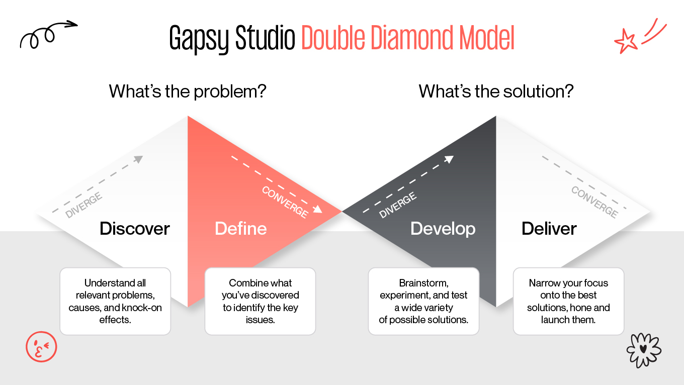
We at Gapsy Studio believe that great products are engineered. Our approach goes beyond surface-level aesthetics to tackle the core functionality that users demand and businesses rely on. In this article, we’ll explore what it really means to be a product designer, how the role differs from traditional UX, and the proven processes our team uses to turn ambitious ideas into market-ready reality.

Product Design in Action: How We Designed Scoop Solar

Theory is sound, but real value appears when design meets real-world constraints. A strong example of high-stakes product design is our work with Scoop Solar, a platform for managing renewable energy field operations across large, distributed teams.

This wasn’t a cosmetic UI/UX redesign. It was a systems-level intervention in which UX decisions directly affected operational speed, data integrity, and cost efficiency.

Identifying the Operational Bottleneck

Before redesigning anything, we mapped the actual working conditions of field technicians. The core issues were logistical, physical, and behavioral:

  • Fragmented tools. Technicians had to switch between up to five different applications just to complete and report a single job. Context switching slowed work and increased error rates.
  • Physical constraints in the field. Data entry happened on small mobile screens, often in direct sunlight, while wearing protective gloves. These are conditions that demand a very specific approach to mobile app design.
  • Data leakage and reporting delays. When interfaces are complicated to use, users take shortcuts. In this case, that meant incomplete reports, delayed uploads, and growing administrative overhead back at HQ.

From a product perspective, this was an operational risk.

Engineering a Centralized Solution

Instead of “cleaning up screens,” we treated the redesign as an operational overhaul. Our process combined UX research, task-flow optimization, and environmental interface design.

1. The WorkApp™ Ecosystem

We designed a centralized WorkApp™, a single operational hub that replaced fragmented tools with one linear, task-driven workflow. Each step mirrored how technicians move through a job on site, reducing cognitive load and decision fatigue.

2. Automation-First Architecture

Manual reporting was a major source of error and delay. The new system:

  • Automated report generation
  • Synced data in real time across teams
  • Reduced duplicate inputs and reconciliation work

This aligned the UI with backend efficiency, making design and operations work as one system.

3. Environmental UI Design

Because this was a true outdoor product, we optimized the interface for extreme conditions:

  • High-contrast color systems for sunlight readability
  • Large, glove-friendly touch targets
  • Clear hierarchy and minimal on-screen choices

Every UI decision was validated against physical usability. 

The Business Impact

Shifting the design focus from “visual polish” to problem-solving delivered measurable results:

  • 516% ROI for customers using the platform
  • $1.4M in annual savings for major clients (including RWE) through reduced admin costs
  • Zero-friction adoption among field teams who had previously resisted digital tools

This is the real product design meaning in practice: supporting real workflows instead of fighting them.

Strong product design doesn’t start in Figma; it starts in the field, with real constraints, real users, and real business pressure. When design decisions are grounded in operational reality, they transform entire systems.

If you’re exploring how thoughtful product design could support your own complex workflows, you’re welcome to start a quiet conversation with our team. No pitches, just clarity.

What is Product Design? (And How It Differs from UX)

Product design is a comprehensive discipline that goes far beyond interface creation. While built on strong UI/UX design foundations, it extends into strategy, validation, and long-term product thinking. Product designers focus on defining the right problems, shaping effective solutions, and continuously refining products so they deliver real value to users while remaining sustainable for the business.

Where a UX designer typically evaluates how an experience works (asking, “Is this intuitive and usable?”), a product designer steps back and challenges the fundamentals: “Are we solving the correct problem, and does this solution make sense strategically, operationally, and commercially?”

Because of this broader responsibility, product designers are often described as multidisciplinary specialists—covering research, strategy, systems thinking, and execution across the full product lifecycle, as reflected in the way we structure our work and services

Their role extends well past visual execution. Throughout the product lifecycle, they move fluidly between research, strategy, systems thinking, and delivery, connecting user needs, technical constraints, and business goals into one cohesive product vision.

  • UX Designer (Ensuring usability)
  • Researcher (Validating market fit)
  • Business Strategist (Aligning with company goals)
  • Prototyper (Testing mechanics)
  • Data Analyst (Measuring success)

Product Design vs UX Design: The Core Differences 

This is the most common confusion in the industry. While the roles overlap significantly, the difference lies in their primary focus.

The UX Designer (The User's Advocate) is laser-focused on the customer journey. Their goal is to reduce friction and ensure the product is intuitive, accessible, and enjoyable. These are three core principles of effective customer experience design across digital products.

  • Key Question: "How user-friendly and intuitive is this interface?"

2. The Product Designer (The Product's Guardian) encompasses all the responsibilities of UX but adds a layer of business logic. They must ensure the product isn't just usable, but also cost-effective, scalable, and aligned with the company’s roadmap, including long-term brand expression shaped through visual identity design. They protect the intersection between user needs and business viability.

  • Key Questions: "Will this feature drive revenue? Is it technically feasible? Does it match our brand strategy?"

Common Ground

Despite these differences, both roles are rooted in design thinking. Both rely on market research to validate assumptions, and both utilize the same industry-standard tools to bring ideas to life, such as:

  • Wireframing: Balsamiq, Sketch, Figma.
  • User Flow Mapping: Lucid Chart, Overflow.

In simple words, a UX designer ensures the user is happy. A product designer ensures the user is happy and the business is profitable.

Feature

UX Design (The User Advocate)

Product Design (The Business Architect)

Primary Focus

The User: Focuses deeply on usability, accessibility, and the emotional journey of the customer.

The Big Picture: Focuses on the intersection of user needs, business goals, and technical feasibility.

Core Objective

Satisfaction: To make the product intuitive, easy to use, and delightful.

Viability: To make the product profitable, scalable, and successful in the market.

Key Question

"Is this interface easy for the user to understand?"

"Does this feature solve a business problem and justify the cost?"

Scope of Work

Interaction: Wireframing, user flows, information architecture, and usability testing.

Lifecycle: Market research, product strategy, design execution, and post-launch iteration.

Success Metrics

User-Centric: Task success rate, System Usability Scale (SUS), Time-on-task.

Business-Centric: Conversion rate, ROI, Churn rate, Customer Acquisition Cost (CAC).

Relationship to Dev

Hands off designs for implementation; advocates for the user's needs during the build.

Works alongside developers to determine what can be built within the budget and timeline.

Timeline View

Project-Based: Often focuses on specific features or flows until they are "done."

Evolving: Views the product as a living entity that never truly ends; constantly iterating based on data.

Want to create a product design?

You are in the right place! Press the button and we will contact you.

The 5 Pillars of Successful Digital​​ Product Design

Great product design isn’t a happy accident. That’s why our specialists don’t just trust our gut or "wing it." We follow a system. Every decision is backed by core principles that ensure your product is eye-catching, resilient, scalable, and useful.

The 5 Pillars of Successful Digital​​ Product Design

1. Utility First, Decoration Second

A product should work before it can impress. Visual appeal means nothing if the core functionality fails or slows users down. We start with task completion, efficiency, and clarity, then enhance the experience visually once the fundamentals are solid.

This principle directly reduces cognitive load and improves task success rates, especially in complex or high-frequency workflows.

The rule: If a design element doesn’t help the user achieve their goal, it’s clutter. Remove it.

2. Data-Driven Empathy

Empathy without evidence is just opinion. Instead of guessing user needs, we validate them through data by combining:

  • qualitative insights (user interviews, usability testing)
  • quantitative signals (analytics, funnels, heatmaps, error rates)

We ensure every design decision reflects real behavior. This approach helps teams avoid costly redesigns and aligns UX improvements with measurable business outcomes.

The rule: Every major design decision must have a clear “why” supported by user data.

3. Consistency Builds Trust

A consistent design system, where typography, components, spacing, and interactions follow clear rules, creates cognitive stability. This kind of alignment across visual elements is fundamental to building trust and reducing friction. It shortens the learning curve and makes the product feel reliable and professional.

From a product perspective, consistency also speeds up development and simplifies scaling across platforms.

The rule: Don’t redesign the same pattern repeatedly. Rely on a shared design system.

4. Accessibility Is Not Optional

Inclusive design is a baseline. High contrast, readable typography, logical focus states, and screen-reader support make products usable for people with different abilities, environments, and devices.

Importantly, accessibility improvements almost always enhance usability for all users, not just those with specific needs.

The rule: Design for the margins, and the center benefits automatically.

5. Iteration Over Perfection

Digital products are never truly finished. Markets evolve, user expectations shift, and competitors adapt. The most successful teams treat design as a continuous cycle: Build → Measure → Learn, frequently iterating on onboarding flows

Launching MVPs allows teams to test assumptions early, gather feedback fast, and improve incrementally, rather than betting everything on a “perfect” release that may miss the mark.

The rule: Ship early, learn quickly, and iterate continuously.

Solid design isn't about chasing trends or making things "bold." It’s about discipline and smart decisions that respect your users and your bottom line.

If you’re stuck in the "what’s next?" phase, a fresh pair of eyes usually helps. We’re always up for a chat to look at your roadmap, poke holes in your assumptions.

The 7-Step Product Design Process

Designing a product is a disciplined cycle of learning, testing, and building. That’s why Gapsy follows a clear roadmap, but not blindly. We layer in strategy to make sure we solve the right problems for the long haul.

Here’s our typical framework: 

7 step design process

Step 1: Vision and Strategy

Before a single pixel is placed, we define the “Why”, often through structured UI/UX consulting that helps teams align vision, constraints, and priorities early. A product without a clear vision quickly turns into a scattered feature set. At this stage, we align stakeholders around the core problem, success criteria, and long-term business objectives.

One of our key expert practices here is a Pre-Mortem workshop. We ask: “Imagine it’s six months after launch and the product failed. What went wrong?”

This reverse framing surfaces hidden risks early—budget constraints, unrealistic timelines, unclear ownership, or technical dependencies—when they are still cheap to address.

Step 2: Market Intelligence

We investigate. Competitive analysis helps us understand not only market standards, but also where competitors consistently disappoint users.

A particularly valuable tactic is analyzing 1-star reviews. They reveal unfiltered frustration: missing features, broken flows, poor performance. These gaps often represent the clearest opportunities to differentiate and win dissatisfied users.

Step 3: Deep User Analysis

On this stage, we move beyond demographics into psychographics (motivations, anxieties, habits, and mental models), using structured UX research methods to uncover what truly drives user behavior.

We actively search for workarounds. When users rely on spreadsheets, notes, or improvised tools to solve a recurring problem, it’s a strong signal that existing products aren’t doing their job. These moments often define the product’s strongest value proposition.

Step 4: Ideation and Architecture

This is where creativity meets structure. We generate ideas through brainstorming and sketching, then progressively narrow them down through feasibility and impact filters.

Early on, we apply a strict “quantity over quality” rule. In the first ideation sprint, volume matters more than polish. Dozens of rough concepts help uncover patterns—and usually, one unexpectedly strong direction that wouldn’t appear through cautious thinking.

Step 5: Design and Prototyping

Here, structure becomes form. Wireframes evolve into high-fidelity UI aligned with the brand’s visual identity, where branding plays a critical role in ensuring the product feels coherent, recognizable, and trustworthy.

Crucially, we design systems instead of pages. A reusable component library (buttons, inputs, cards, states) ensures consistency, accelerates future iterations, and significantly improves scalability.

Step 6: Testing and Validation

We test with real users before development begins, when changes are fast and inexpensive. This stage often mirrors the principles of a UX audit, helping teams uncover friction, usability gaps, and hidden risks early.

One expert principle guides us here: users may say “It looks great,” but behavior tells the truth. We prioritize observable metrics like task completion rate, error frequency, and hesitation points. Knowing how to use UX metrics effectively is what turns testing insights into confident product decisions.

Step 7: Post-Launch Evolution

Launch is the starting point. Once the product is live, we monitor real-world usage through analytics and feedback loops, which is an essential part of managing the product adoption process over time.

We pay close attention to “desire paths”—unexpected but repeated user behaviors. Instead of forcing customers into a predefined flow, our team often adapts the product to support natural patterns, making the experience more intuitive over time.

The best way to see how this works is to apply it to your own idea. If you’re ready to stop theorizing and start building, let’s talk.

The Framework Behind the Process: The Double Diamond Model

You might be wondering: How do we ensure these seven steps actually lead to innovation?

We use the Double Diamond model. Developed by the British Design Council, this framework maps our 7-step process into four distinct phases of thinking. It forces us to diverge (explore many options) and then converge (decide on the best one).

Gapsy Double Diamond Model

Here is how our process fits into the Diamond:

1. Discover — Diverging

Objective: Build a broad understanding of the problem space.
Mapped steps: Vision & Strategy, Market Intelligence

This phase is intentionally expansive. Rather than jumping to solutions, we investigate:

  • business goals and constraints

  • market dynamics and competitor weaknesses

  • early signals of unmet user needs

The key discipline here is resisting certainty. Assumptions are treated as hypotheses to be tested, not truths to be defended.

2. Define — Converging

Objective: Identify the right problem to solve.
Mapped step: Deep User Analysis

After gathering a large volume of insights, the focus shifts to synthesis. We filter noise, cluster patterns, and isolate the single most critical user problem, the one that, if solved, creates the highest product and business impact.

This stage is where clarity emerges. Without a strong Define phase, products tend to become unfocused or overloaded with features.

3. Develop — Diverging

Objective: Explore multiple possible solutions.
Mapped steps: Ideation, Design & Prototyping

With a clearly defined problem, creativity can expand safely. We deliberately generate many solution paths, including unconventional or initially impractical ideas. Innovation often lives at the edges, not in the obvious middle.

This divergence is controlled because it’s anchored to a validated problem statement.

4. Deliver — Converging

Objective: Refine, validate, and launch the best solution.
Mapped steps: Testing, Launch

In the final phase, options are reduced through evidence. Usability testing, behavioral metrics, and real user interaction determine which concept earns the right to be built.

Poor-performing ideas are discarded early. The strongest solution is refined, systematized, and prepared for release, already validated by user behavior, not internal opinion.

3 Common Mistakes That Kill Great Products

Even a billion-dollar idea can fail if the execution is flawed. In our years of rescuing stalled projects, we’ve seen the same three patterns destroy potential market leaders. Here is what to avoid and how we prevent it.

1. The "Swiss Army Knife" Syndrome 

It’s about trying to be everything to everyone. Startups often fear their product isn't "enough," so they keep adding buttons, settings, and secondary features. The result? A confusing, bloated interface where the user can’t find the one thing they actually need to do.

Remember Google Wave? Launched with massive hype, it promised to be the ultimate communication tool, combining email, instant messaging, wikis, and social networking on a single screen. It was an engineering marvel, but a user nightmare. When people logged in, they were paralyzed by the sheer number of options. Because it tried to do everything, it did nothing well enough to keep users. Google shut it down just one year later.

We fight for the MVP (Minimum Viable Product). We ruthlessly cut features that don't serve the primary user goal. Remember: Perfection is achieved not when there is nothing more to add, but when there is nothing left to take away.

2. The "Dribbble" Trap 

Designing for likes, not users. There are thousands of beautiful designs online that are technically impossible to build or a nightmare to use. A design might look stunning in a static image, but if it ignores accessibility standards, load times, or development constraints, it is useless business art.

When Microsoft launched Windows 8, they prioritized a sleek, futuristic aesthetic called "Metro UI." It replaced the boring old desktop with beautiful, live animated tiles. It looked stunning in screenshots. But in reality? It removed the "Start" button and hid the taskbar: the two things office workers relied on for decades. Users weren't delighted; they were lost. Microsoft was forced to publicly backtrack and restore the old functionality in Windows 10.

We involve developers early in the design process. We ensure every animation and layout is technically feasible within your budget and timeline before we finalize the pixels.

3. The "HiPPO" Effect

Relying on the Highest Paid Person's Opinion. Too many products are designed based on what the CEO thinks is cool rather than on what users actually do. Subjective opinions lead to expensive features that nobody uses.

The streaming service Quibi is the costliest example of this in history. Founders Jeffrey Katzenberg and Meg Whitman bet $1.75 billion on their own intuition: that people wanted "Hollywood quality" shows on their phones. They ignored the data showing that mobile users actually wanted shareable, social content (like TikTok). They built a fortress of high-production content that nobody wanted to live in. The service collapsed in just six months.

We replace opinions with data. By using user testing and analytics, we validate decisions based on real-world behavior. We don't say, "I think this looks better"; we say, "The data shows this converts 20% higher."

Turn Complexity into Competitive Advantage with Our Expertise

Understanding the theory of the Double Diamond or the product design process is valuable, but deploying it effectively within a live business environment requires a different caliber of expertise.

Our design studio operates as an extension of your product team, not just an outsourced design shop. We bridge the gap between "ambitious vision" and "technical reality." Our role is to de-risk your investment by applying rigorous research and testing before development costs spiral.

Where we add value: 

  • Product Discovery and Strategy: We don't just take orders; we challenge assumptions. We use data to validate your roadmap before you build.
  • Complex System Architecture: From SaaS platforms to Enterprise tools, we specialize in untangling messy workflows into intuitive experiences.
  • Scalable Design Systems: We build libraries, not just pages. We equip your internal team with the assets they need to scale the product for years without needing a total redesign.

Whether you are a Series A startup needing a high-fidelity MVP to secure funding, or an enterprise seeking to optimize a legacy platform for higher conversion, we provide the strategic architecture to get you there.

If you face a complex product challenge, we’re happy to act as a sounding board. Drop us a line with the specific problem you're trying to solve. We’ll offer an honest perspective on the strategy and systems needed to move forward.

Conclusion

Product design should be treated as a business survival strategy. After all, solutions rarely fail because teams lack ideas. What kills them are decisions without clarity, validation, and structure. Design, when done correctly, is how companies reduce uncertainty before committing engineering time, budget, and reputation. Especially when viewed through the lens of long-term product design cost versus short-term execution savings.

The difference between successful products and expensive experiments is process, discipline, and the experience of product teams who have repeatedly navigated complex product challenges. A clear approach to discovery, validation, and iteration ensures that teams build the right thing before scaling it. 

Our team doesn't position ourselves as execution-only designers. We work as growth partners, helping businesses de-risk decisions, align teams, and translate complexity into scalable systems.

Design is a big investment. It helps to have a clear roadmap before you start. Reach out and tell us what you’re working on. We’ll help you look at the risks, the ROI, and the most efficient path to getting your product right the first time.

Rate this article

20 ratings
Average: 4.9 out of 5

If you like what we write, we recommend subscribing to our mailing list to always be aware of new publications.

Do you have any questions? We tried to answer most of them!