A Guide to Affinity Mapping UX: How to Stop Guessing and Build What Users Want

11minutes read
affinity maps ux

If you feel like you are drowning in user feedback, you aren't alone. The volume of qualitative data hitting product teams has reached an all-time high.

Surveys remain the dominant research weapon, employed by 79% of organizations, with usability testing (71%) and user interviews (66%) following close behind. But here lies the trap: Companies have become experts at collecting data, yet many startups still struggle to use it. After all, a spreadsheet full of 500 survey responses isn't a roadmap.

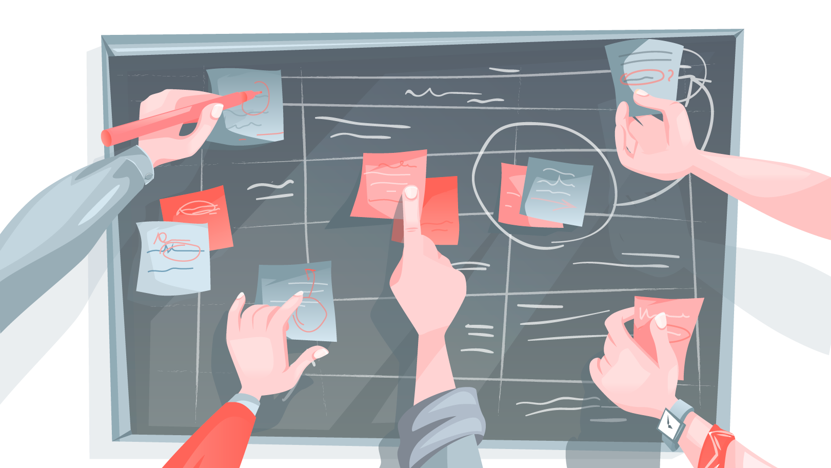
The difference between a startup that pivots successfully and one that stalls often comes down to organizing user feedback into actionable truth. This is where affinity mapping UX transforms from a simple design exercise into your most critical strategic tool. It is the bridge that turns a mountain of conflicting user quotes into a clear, data-backed path to product-market fit.

Key Takeaways

  • The most effective sorting happens in silence. This neutralizes the "HiPPO effect" (Highest Paid Person's Opinion) and ensures data is grouped by logic, not hierarchy.
  • Don't group notes by "Login Screen" or "Dashboard." Divide them into clusters with user sentiment like "Anxiety" or "Confusion" to solve root causes rather than just patching symptoms.
  • To keep the process fluid, every sticky note should contain exactly one insight. If it takes more than 10 seconds to read, it’s too long.
  • If you only look for data that supports your current roadmap, you are wasting your time. Mark the contradicting evidence with a star. That is where the real value lies.
  • A beautiful affinity map is useless if it doesn't result in action. Every cluster should be translated immediately into a Jira ticket, a user story, or a design sprint goal.

What is Affinity Mapping in Simple Words?

At its core, affinity mapping (or affinity diagramming) is the process of finding the "signal in the noise. 

Imagine you have hundreds of sticky notes representing user quotes, complaints, and feature requests. Right now, it looks like qualitative chaos. Affinity mapping is the act of clustering the scattered pieces of feedback based on their relationships until a clear picture emerges.

Startup founders especially need affinity diagramming, as it removes "I think" from the boardroom and replaces it with "The data shows." Instead of arguing over opinions, you are looking at evidence. It turns a pile of scattered feedback into a prioritized, defensive roadmap.

Affinity Mapping Example: How This Works in Practice

Imagine a founder building a challenger bank app who has just completed usability testing with 20 early adopters. On the surface, the feedback looks scattered and technical: 

  • User A complains they spent ten seconds hunting for the logout button

  • User B admits they hesitate before hitting "Send" to check the account number three times

  • User C asks if their data is encrypted because the interface looks "too simple."

The Surface-Level Grouping Trap 

To the untrained eye (or an AI scanning for keywords) such information looks like isolated usability bugs. A junior designer or inexperienced product manager will typically sort these notes based on the feature they mention. 

They see the "logout button" and group it under "Navigation Issues." They see "encryption" and group it under "FAQ/Help."

The resulting roadmap is predictable and ineffective: The team decides to redesign the hamburger menu to make the logout button bigger and adds a "Security" page to the help center. This consumes two weeks of development time, yet retention metrics don't improve. That’s because the team fixed the surface symptom but ignored the disease.

How to Find the Behavioral Core

When applying strategic affinity diagramming, you should ignore the specific keywords and look for the emotional thread connecting diverse data points. 

When digging deeper, you can realize that the user who can't find the logout button isn't confused about navigation; they are frantically trying to secure their session because they don't trust the app yet. The user hesitating to hit "Send" is experiencing financial anxiety.

By grouping all these notes under a single, behavioral insight cluster labeled "Trust and Safety Anxiety," the solution changes entirely. The insight reveals that users need reassurance instead of a better menu. 

The Strategic Pivot 

Instead of a UI redesign, the team implements a biometric confirmation step. Now, before any money leaves the account, the app asks for a fingerprint or FaceID scan. The complaints about the "logout button" vanish, as the users finally feel secure enough to close the app without panicking. 

This is how affinity mapping UX protects your runway: it ensures you solve the psychological root of a problem, rather than just patching the interface.

It is hard to spot these patterns when you are in the trenches building the product every day. Sometimes, you just need a fresh pair of eyes to look at the data without bias. If you have a pile of user feedback and want to make sure you are fixing the right problems, let’s take a look at it together.

5 Steps for Organizing User Feedback with Affinity Diagramming

For complex products, an affinity map is a rigorous data synthesis engine. We use this specific five-step protocol to help organizations move from gut feeling to validated strategy efficiently.

Step 1: Externalize 

You should begin from stripping every piece of feedback, observation, and metric from your team’s collective memory and place it onto a shared canvas.

This represents the raw inventory of your user experience. Whether using digital tools like Miro or physical boards, the rule is absolute: One insight per note

We do not filter for feasibility or quality at this stage. By visualizing the sheer volume of qualitative data without judgment, it’s possible to prevent selection bias, the tendency to remember only the feedback that supports the current roadmap.

Step 2: Democratize Insight 

Sorting is conducted in silence is the most critical rule in our playbook. 

In typical strategy meetings, the highest-ranking person or the loudest voice may create a "gravity field" that pulls data toward their pre-existing opinions. By enforcing silence, we neutralize hierarchy. Team members move notes based solely on the logical relationship between data points, not the authority of the person who wrote them. This forces the team to read the data rather than listen to the summary, ensuring purely evidence-based clustering.

Step 3: Recognize Patterns

As clusters form, we shift from searching for keywords to looking for intent. This is where the strategic value of affinity mapping UX emerges.

We don't just group notes because they share the word "slow." Instead, our team analyzes why the user cares.

  • Surface level: Grouping all "slow" comments under "Performance."

  • Strategic level: Realizing that "slow loading" during a checkout process is a trust issue, while "slow loading" on a dashboard is a productivity issue.

By clustering based on user behavior and psychology rather than just feature sets, we uncover the root causes of friction that technical audits miss.

Step 4: Label The Narrative 

A cluster without a definitive name is useless. Amateur teams frequently label groups with passive nouns like "Search Bar" or "Onboarding." This tells you where the feedback lives, but not what the problem is.

We require clusters to be labeled with active, descriptive sentences.

  • Weak label: "Search Functionality."

  • Strong label: "Users are abandoning search because filters are too complex to navigate."

The first label is a category; the second is a clear problem statement that developers and designers can immediately act upon.

Step 5: Prioritize 

You cannot solve every friction point simultaneously. Once the wall is covered in clear, sentence-based insight clusters, we use "dot-voting" to democratically identify the critical path.

We ask stakeholders to vote on the clusters that represent the highest risk to the business or the greatest opportunity for user value. The clusters with the highest heat density become the non-negotiable objectives of the next design sprint. This turns a mountain of ambiguity into a prioritized execution plan.

Dos and Don’ts in Affinity Mapping

Success in affinity mapping is also about the mindset. We’ve facilitated hundreds of these sessions at Gapsy Studio, and the difference between a strategic breakthrough and a waste of time comes down to a few tactical nuances.

To get the most out of your session, follow these rules of engagement: 

DO

DON'T

Trust the silence. Keep the sorting phase quiet. This prevents "groupthink" and ensures introverts contribute just as much as the loudest person in the room.

Critique ideas early. Never say "that’s not important" during the data dump. If a user says it, it goes on the board. Filtering comes later; right now, you need raw data.

Write one thought per note. Keep sticky notes concise (6-7 words max) so they are easy to scan, move, and cluster.

Write essays. If a note takes 10 seconds to read, it breaks the flow of the sorting process. Keep it punchy.

Focus on user intent. Group notes based on the underlying problem (e.g., "Anxiety"), not just the feature mentioned (e.g., "Buttons").

Sort by feature categories. Avoid lazy grouping like "UI," "Bugs," or "Login." These tell you where the issue is, not what the problem is.

Let clusters evolve. It is okay to break a big group into smaller ones or merge two groups halfway through. The board is a living document.

Be territorial. There is no ownership here. If you think a note belongs in a different group, move it. Don't ask for permission.

Write active labels. Use full sentences for headers (e.g., "Users are confused by the pricing model").

Use one-word headers. Labels like "Pricing" are useless because they don't describe the friction or point toward a solution.

Prioritize ruthlessly. Use dot-voting to identify the top 3 clusters that impact your business goals immediately.

Try to fix everything. An affinity map with 50 "high priority" items is just a wishlist, not a roadmap.


Affinity Mapping Templates and Platforms

The success of your session often depends on the canvas you choose. While the methodology remains the same, the medium—digital or analog—can change the energy of the room.

Digital vs. Analog

  • The analog approach with physical boards: There is undeniable power in moving physical sticky notes on a wall. It creates high energy, reduces screen fatigue, and encourages people to stand up and engage. However, the downside is significant: someone has to manually digitize the results later, or the "roadmap" risks falling off the wall overnight.

  • The digital approach: For distributed teams, digital whiteboards are non-negotiable. Platforms like Miro or FigJam offer a robust, ready-to-use affinity mapping template that saves setup time. The major advantage here is persistence; your board doesn't just disappear after the meeting. It evolves into a living document that stakeholders can reference weeks later.

How a Perfect Board Looks Like 

Whether you are taping off sections on a whiteboard or setting up a digital frame, effective affinity mapping requires a structured environment. Don't just work on a blank canvas. We recommend dividing your space into three distinct zones:

  1. Zone 1 for raw data. This is your intake valve. It is a large, unstructured area where every participant dumps their "raw data" sticky notes. At the start of the session, this area should be full, and the rest of the board empty.
  2. Zone 2 for sorting. This is the largest section of your canvas. It is the "messy middle" where the silent sorting happens. Leave plenty of white space here; you need room to drag, drop, group, and rearrange clusters without feeling cramped.
  3. Zone 3 for insights. This is the destination. Once a cluster is finalized, labeled with a strong problem statement, and voted on, it moves here. By the end of the session, this zone should look like a prioritized list of strategic pillars, ready to be exported into your project management tool.

5 Mistakes in Affinity Mapping That Kill Your Insights

Affinity mapping is a truth serum. However, many founders subconsciously try to dilute it. Here are mistakes we often encounter: 

The "Validation" Filter 

The most dangerous mistake is using the map to prove you were right. Founders often subconsciously discard sticky notes that contradict their pitch deck, labeling them as "user error" or "outliers."

How to fix: If a piece of data hurts your feelings or threatens your roadmap, put a star on it. That is usually where the pivot lies.

The Highest Paid Person’s Opinion Effect 

When the CEO stands at the board and says, "I think this note belongs here," the team stops thinking and starts complying. This destroys the objective value of the exercise.

This is why we insist on the silent sort. By eliminating the vocal track, you remove the hierarchy, ensuring the data is organized by logic, not by pay grade.

"Feature Bucketing"

It is easy to group notes by screen names: "Login," "Dashboard," "Profile." This is useless. It tells you where the feedback happened, not what the problem is.

How to fix: Ban feature names from your cluster labels. Force yourself to group by user emotion or behavior (e.g., "Fear of Commitment" or "Navigation Fatigue").

Jumping to Solutions Too Soon 

Engineers and founders are problem-solvers by nature. As soon as a cluster forms, the temptation is to start brainstorming features to fix it immediately.

How to fix: Stay in the problem space. If you start solutioning now, you will build a patch for the symptom rather than a cure for the root cause. Finish the map first; build the backlog second.

The "Art Gallery" Problem 

Many teams create a beautiful affinity map, take a photo of it, high-five, and then never look at it again. A week later, they go back to building whatever they planned to build originally.

How to fix: An affinity map should be treated as a to-do list. Every insight cluster should be immediately translated into a Jira ticket, a user story, or a research goal. If it doesn't land in your project management tool, it didn't happen.

It is nearly impossible to facilitate your own affinity map without bias creeping in. You can’t read the label when you are inside the bottle. Reach out to us, and let’s turn raw feedback into a roadmap that survives the market.

How Gapsy Studio Uses Affinity Mapping to De-Risk Your Build

We don't treat affinity mapping UX as just a workshop to make us look busy. For us, it is a risk-assessment tool. 

When partnering with a startup, our team uses this process to bridge the gap between "what the founder wants" and "what the user does."

We never leave you with just a pretty diagram. Instead, our team can translate every insight cluster into a design sprint goal.

Conclusion

Your users are already telling you exactly what to build. The problem usually is a lack of clarity. It is tempting to skip the synthesis phase. 

This feels productive to jump straight from "user interview" to "designing screens." But as we have seen, that is the fastest way to build a well-engineered product that solves the wrong problem.

Affinity mapping is the discipline of slowing down just enough to see the truth. It turns the "qualitative chaos" of hundreds of voices into a single, defensive narrative. It empowers you to look at your investors, your team, and your stakeholders and say, "We are building this feature because the data demands it."

Don't let your research gather dust in a spreadsheet. If you are ready to turn that raw noise into a clear, prioritized roadmap, we are here to help you hold the pen. Ready to find the signal in the noise? Let’s talk.

Rate this article

20 ratings
Average: 4.9 out of 5

If you like what we write, we recommend subscribing to our mailing list to always be aware of new publications.

Do you have any questions? We tried to answer most of them!