Successful Banking App Design: All You Should Know in 2026

13minutes read
bank application design

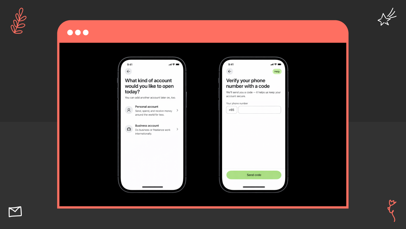
Your banking app design is one of the highest-leverage investments you can make in trust and retention. FCA reports that 75% of day-to-day account holders use mobile solutions, which makes them the main place customers experience your reliability. In practice, this means your UI and UX have to explain complex financial states with the same clarity every time, especially around payments, balances, cards, and verification.

A well-designed banking app goes beyond just improving the user interface. It serves as both a risk management tool and a driver of growth. When transaction states are clear, flows are predictable, and system behavior is easy to understand, customers can complete actions without needing support. They are comfortable moving larger amounts and return to the app more often, making it their primary financial channel.

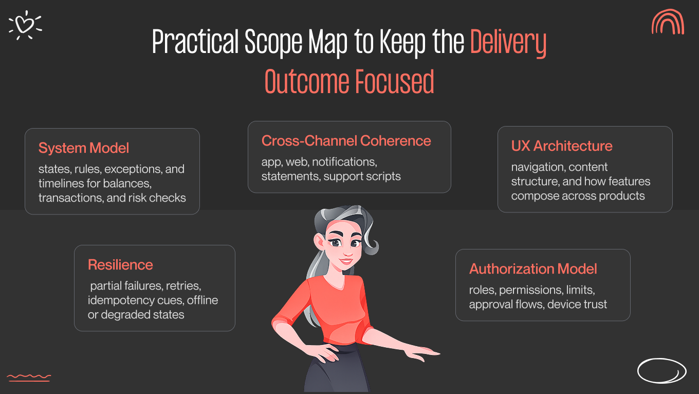
With over 12 years of experience in mobile product design, Gapsy Studio created this guide for product owners and banking teams. We break down banking app design as an operating system. Also, our team covers UI, UX, service logic, and channel consistency. This way, you can make choices that reduce support needs, accelerate delivery, and improve customer retention.

Key Takeaways

  • Treat banking app design as a full product system to cut operational risk and support costs.

  • Define clear transaction states and predictable feedback to reduce disputes and “where is my money” contacts.

  • Build scalable UX architecture so you can add products and compliance changes without breaking existing flows.

  • Enforce visual clarity and consistent UI standards to reduce user errors and increase self-serve completion rates.

  • Tie every design decision to measurable outcomes such as retention, fraud reduction, and faster release cycles.

Our Case Study: How We Applied System-First Design Thinking to a Complex Digital Platform

To see these 2026 banking principles in action, let’s examine Gapsy Studio’s recent work on The Lab Wallet. While designed as a next-gen crypto ecosystem, the project acts as a masterclass for traditional banking. We noticed that about 80% of its UI patterns, from liquidity management to portfolio visualization, transfer directly to the neobanking sector.

The "Calm" Architecture: Hiding the Backend Mess

Financial systems are complicated. They involve holds, partial fills, reversals, KYC/fraud checks, retries, and timeouts. When users encounter this complexity, they hesitate or reach out for support.

In The Lab Wallet, we followed a simplicity-first rule. We aimed to hide backend processes and show only the results. Complex actions such as staking, governance voting, and multi-step swaps were presented in calm, easy-to-follow flows. We focused on what would happen instead of how the system worked.

The Hierarchy of the Dashboard

The dashboard is the main control center of a banking app. If users cannot quickly grasp their financial status, they will make mistakes or leave.

In our case study, users would know their total position and the next action within three seconds.

We organized the dashboard like this:

  • Total balance. Large, eye-catching text for total funds, minimizing errors that lead to overdrafts, failed payments, and disputes.

  • Quick actions. “Send,” “Receive,” and “Exchange” were always visible, reflectingthe three main tasks of a bank teller.

  • Portfolio visualization. We separated liquid funds from long-term holdings, preventing users from treating illiquid assets as available cash (a common cause of failed transactions).

Aesthetic Authority: Dark Mode and Premium Accents

Fintech visuals serve a purpose to control behavior. For The Lab Wallet, we used a deep black background with subtle neon accents. This choice was a way to signal information.

This works because dark mode reduces eye strain for users who check balances, including traders and business users. Neon green was used only for positive outcomes (confirmed, gained, or approved).

Over time, users learned that green meant success and money gained. This reduces hesitation and builds trust in confirmations.

Rewarding the "Save" Action

Traditional banking apps treat saving as a secondary feature hidden in menus. This leads to low adoption and average balances. In the Staking/Earn section of The Lab Wallet, we emphasized “saving” as a primary, rewarding action.

Key mechanics:

  • Transparency. Clear APY comparison cards and one-tap confirmation modals make the process feel as easy as checking a notification.

  • Engagement. By making the "Earn" features visually exciting, we saw higher user engagement and longer session times.

Proving the Flow: Information Architecture

A refined UI does not fix broken processes. In The Lab Wallet, our focus was on the journey map. The goal was to avoid dead ends, confusion, and hidden states.

The key insight here is that banking UX begins with system diagrams. If users cannot move funds easily between modules, they may assume the product is faulty.

Result: From Crypto to Core Banking

When replacing crypto features with banking equivalents, you create an interface suitable for a neobank. The fundamental principle remains the same: complex financial systems should feel simple, predictable, and safe.

We view mobile banking app design as a product operating system rather than just a UI layer. Our focus is on reducing disputes, minimizing failed transactions, speeding up user decision-making, and improving retention. When complex financial actions are as intuitive as scrolling through a social feed, users stop seeing the app as a last resort and start using it regularly.

Want to identify where users get stuck? Gapsy will help you take a closer look at your banking flows — contact us.

Banking App Design as a Product System

When banking app design is treated as a collection of screens, you end up optimizing for what's easy to approve but hard to operate. While visual polish wins stakeholder sign-off, the real costs show up later. 

When creating banking app designs, we see three common failure patterns:

  1. Transaction states that differ between the user interface and the backend (pending, posted, reversed).
  2. Edge cases with unclear ownership are causing failures to slip between product, engineering, and operations.
  3. Fragile handoffs between design and engineering that fall apart when users encounter edge cases.

The consequences are predictable: drop-offs appear in the journeys that matter most, support queues grow after every release, and delivery slows as more teams coordinate around problems that were never properly solved. This presents hidden operational risks.

What to Do Instead

You should view your banking mobile app design as a complete product system. This means asking different questions: How does this behave when something goes wrong? How do we communicate holds, reversals, and limits in a way users understand? How do we keep logic consistent across mobile, web, support tools, and internal dashboards?

Designing at the system level is how you get higher completion rates, fewer transaction errors, and a lighter support burden.

Below is a breakdown of the main system layers and the business outcomes each one protects.

Design area

What you should review

Business outcome

UI design

Readability of financial data, component consistency, accessibility

Fewer user errors, higher confidence in core actions

UX design

Flow completion, decision clarity, and recoverability from mistakes

Higher self-serve completion, lower assisted service load

System design

State model, rules, exceptions, failure handling

Fewer production issues, fewer “mystery” states that trigger distrust

Service logic

Fees, limits, holds, disputes, KYC, fraud checks

Lower complaints and escalations, clearer compliance alignment

Cross-channel consistency

Web, mobile, notifications, statements, support

Fewer contradictions, stronger trust, fewer support contacts


Principles of Banking App UX Design That Hold Up in Production

One bad experience is all it takes. PwC found that 32% of customers would stop doing business with a brand they loved after a single mistake, while 17% would walk away after one negative interaction.

In banking, this moment arises from uncertainty, where the transfer seems stuck, a card is frozen with no confirmation, a KYC step feels suspicious, and an error message leaves the user with no idea what to do next.

These challenges stem from legacy systems, fraud prevention, compliance requirements, and incident response. Good banking design works within those constraints rather than ignoring them.

Principles You Can Rely On

The principles below apply to teams that operate at scale, handle exceptions, and must get it right under pressure.

Make transactional states predictable and explicit

Money movement should always be clear. Each state needs a straightforward, user-friendly meaning: pending, processing, completed, failed, reversed, or held. The best teams match UI labels with the actual backend states, not simplified marketing terms. This approach builds trust and reduces unnecessary issues.

The outcome: fewer “Where is my money?” inquiries, fewer disputes, and greater confidence in large transfers.

Design feedback that matches real system behavior

Your UX should show how the system works. If your backend is consistent, the UI needs to communicate that. To do this, show progress, explain what the system is doing, and inform the user about what comes next. If the system requires time, make that clear. Otherwise, users may mistakenly think there is a problem.

The outcome: fewer retries and duplicate transactions; lower perceived incident rates.

Use progressive disclosure for complex financial information

Start with the information users need to make a decision. Allow them to dig deeper into details when they want assurance. Here are some examples:

  • Fee breakdowns—lead with the total cost. Let users expand to see how it's calculated, including service fees, exchange margins, or third-party charges.

  • Execution timelines—Show the estimated arrival time upfront. Make the routing path and processing steps available for users who need to trace a delay.

  • Exchange rates and routing—Display the converted amount first. Let users drill into the rate, the spread, and the route determination.

  • Statement-level metadata—Surface the transaction summary by default. Keep account identifiers, batch references, and processing details one level deeper for reconciliation or disputes.

The outcome: higher completion rates; fewer abandoned processes and requests for clarification.

Prevent errors with constraints

Constraints are better at guiding behavior than warnings. Limit actions that might fail, block invalid inputs, and lead users along the correct path by default. This reduces:

  • Failed payments

  • Chargebacks

  • Fraud-triggered reversals

  • “Please fix this” support requests

The outcome: fewer operational exceptions and lower fraud risk.

Design recovery

Errors are inevitable. What matters is how the product responds when they happen.

Every error message should answer three questions:

  1. What happened? Be specific. "Something went wrong" tells the user nothing. "Your transfer couldn't be processed because your daily limit has been reached," tells them everything they need to know.
  2. What can you do now? Give users a clear next step. Retry, use an alternate method, or contact support. Don't leave them at a dead end.
  3. What are we doing in the background? If the system is working on a resolution, say so. Uncertainty is what turns a minor issue into a lost user.

When immediate resolution isn't possible, the experience shouldn't feel like a wall. A reliable next step, with prefilled context so users don't have to repeat themselves, is enough to maintain trust.

The outcome: fewer frustrated clicks, lower repeated attempts, and faster resolution times.

Assume stress, interruption, and partial attention

Users often check banking apps while multitasking. Sessions may time out. Biometrics might fail. Connectivity can drop. Your UX should maintain orientation and prevent duplicate actions when users return to a task in progress.

The outcome: fewer accidental double payments, abandoned processes, and high-risk retries.

How Principles Map to Outcomes

Principle

What you implement in the app

Outcome you should expect

Predictable states

State model with consistent labels and rules across all payment types

Fewer “where is my money” contacts, fewer disputes

Honest feedback

Clear progress, timestamps, and “next action” guidance

Higher completion rates, fewer retries, and double actions

Progressive disclosure

Summary first, details on demand, audit-level receipts

Faster task completion without sacrificing trust

Error prevention

Input constraints, pre-validation, safe defaults, contextual limits

Fewer failed transactions, lower fraud and mistake rates

Recovery design

Retry paths, alternatives, saved drafts, and support handoff with context

Lower drop-off, lower support handling time

Interruption resilience

Drafts, idempotency cues, session-safe confirmations

Fewer duplicates, fewer frustrated escalations

A quick checklist we use in reviews:

  • Can a user tell the difference between “pending,” “processing,” and “completed” without guessing?

  • Does the confirmation screen match what actually happens in the system, including holds and delays?

  • If an action fails, do you give a reliable next step or just an apology message?

  • Can a user leave the app mid-flow and return without losing context or creating duplicate actions?

  • Do your “details” screens answer real trust questions, fees, timing, payee identity, and reference IDs?

Reach out to our team to see how scalable design principles can make your banking app more reliable under real-world conditions.

Banking App System Design and UX Architecture

The American Bankers Association reports that 55% of US bank customers say mobile applications are their primary way to manage their accounts. When the app becomes the main channel, weak UX architecture becomes an operating cost.

When your UX architecture is unclear, every feature launch creates friction. Users misread states, support requests climb, disputes rise, and teams slow down because changes require workarounds. 

Where System Design Usually Breaks for Banking Businesses

System design is where outcomes are decided. When the backend and UX models conflict, the interface becomes a patchwork of disclaimers, tooltips, and extra steps; all trying to paper over a deeper inconsistency. When they align, behavior becomes more predictable, releases move faster, and users can resolve issues on their own without reaching for their phones.

User mental models do not match account and transaction models

Customers think in simple terms: my money, my card, my upcoming bills. Banking systems think in ledgers, holds, batches, settlement stages, and reversals.

When internal structures appear in the interface, your customers misunderstand balances and retry actions. They escalate issues that are technically correct but poorly explained. 

To avoid this, create a translation layer that presents real system states in user-friendly language, so customers can understand what is happening without needing to learn how banking works.

Navigation collapses under multi-product complexity

When you add cards for savings, loans, investments, insurance, and rewards, navigation can feel like a product catalog rather than a task system.

We organize information by customer tasks and how often they are performed. This way, users can find what they need quickly, even as the product range grows, improving feature discovery and completion rates without adding to cognitive load.

Permissions, roles, and hierarchies are bolted on

Retail users, joint/business accounts, delegated access, spending limits, approval chains, and device trust all shape who can do what and when. That's a complex picture even before a single line of code is written.

When permissions are treated as an afterthought, the cracks show quickly. Controls become inconsistent. Restrictions feel arbitrary to users who don't understand why they're blocked. Support ends up handling exceptions manually because the system was never designed to surface them clearly.

Permissions work better when they're designed as a central system, with states and constraints visible in the interface so users understand what they can do and why certain actions aren't available to them.

Future features break existing flows

Instant payments, new integrations, changing dispute rules, consent revocation, and regulatory updates are a constant in banking. The product will always need to absorb something new.

Nonetheless, when the foundation is fragile, every new capability forces a redesign, as well as retraining users who had already figured out how things worked. Flexible state models and scalable interaction patterns change this. New features slot into existing flows without disrupting learned behavior, which means faster rollouts, less UX rework, and fewer regressions after every update.

Why Clean State Models and Scalable Architecture Matter

When the system design is clear, the benefits compound. Users understand what's happening without needing to call support. Disputes drop because states are consistent and easy to read. Teams ship faster because patterns scale instead of breaking. UX debt shrinks with each release rather than growing, and the app becomes easier to extend over time. 

That's how good UX architecture earns its place. Not as a visual layer, but as a foundation that protects cost, speed, and trust.

Visual Clarity Under Constraint of Banking App UI Design

Thinking of app design as just "look and feel" is a costly mistake. According to Accenture's 2025 Global Banking Consumer Study, mobile apps are now the main way people bank. The average user logs in about 150 times a year. At that scale, even a tiny moment of confusion multiplies rapidly.

When banks focus on making their apps crystal clear through using simple language for transaction statuses, creating obvious visual paths, and keeping things consistent, they see results. Customers successfully finish what they set out to do, without needing to call support. 

In banking app design, clarity is what keeps error rates down, prevents disputes, and unburdens your customer service team.

What to Get Right in a Regulated Environment

Of course, designing for banking is notoriously hard because you do this around constraints:

  • Strict regulations demand absolute precision and transparency.

  • Security measures naturally add friction and extra steps to the user journey.

  • Legacy systems create awkward, behind-the-scenes delays between when a transaction is authorized, posted, and finally settled.

Despite all these backend challenges, your interface still needs to feel calm, readable, and predictable to the person tapping the screen. The goal is to prevent mistakes, reduce stressful support calls, and build deep trust in the everyday financial tasks that keep people's lives moving.

Structuring information for quick reading

We design screens so the most crucial details catch the user's eye first: the amount, who the money went to, the date, any fees, and the current status. If a fee or a pending status is buried, people tend to worry, retry the transaction, or call support. By making the layout logical and obvious at a glance, we answer the "where is my money?" question. Ultimately, this reduces accidental duplicate transfers and frantic customer service inquiries.

Using color with purpose and accessibility

Color should never be just for decoration; it needs to mean something consistent. We treat shades as a helpful secondary clue, backed up by clear text and icons.

This ensures that the message gets across clearly, whether a user is in dark mode, looking at their phone in bright sunlight, or is color-blind. When warnings, errors, and success screens are easy to understand, people make fewer mistakes and file fewer disputes.

Making actions and risks obvious

Users should never have to guess if a piece of text is just a label, a button they can tap, or a high-stakes action. We use smart spacing, visual cues, and deliberate placement to tell them apart instantly. This can reserve the boldest, most distinctive designs for risky actions, such as freezing a card or closing an account. Thus, people avoid making stressful, accidental mistakes that require a support agent to undo.

Keeping the mobile banking app UI design experience consistent

If your iOS and Android apps use different words, statuses, or confirmation styles for the same action, your support team pays the price. We standardize the language and the meaning of every design element across all platforms. While a swipe or a tap might be adjusted to feel natural for a specific device, the core logic and message never change. This consistency makes life easier for your support agents, reduces training time, and keeps the experience seamless for users switching devices.

UI rule set we use to protect outcomes

Good design in banking shouldn't be left to chance; it needs to be governed by purposeful rules. We developed this UI framework to protect users from stress and businesses from unnecessary costs. Every standard we set serves as a guardrail against confusion, costly disputes, and avoidable support tickets.

Here is how we tie our core design decisions directly to measurable outcomes:

UI decision area

What you standardize

Outcome you protect

Data hierarchy

Amount, status, payee, fee, date, reference

Fewer user mistakes, fewer “what happened” contacts

Status language

One vocabulary for all transaction states

Lower dispute volume, higher trust in payments

Color semantics

Color means the same thing everywhere, with text backup

Accessibility compliance, fewer misreads under stress

Risk separation

Destructive and irreversible actions look and behave differently

Fewer accidental actions, fewer escalations

Cross-platform consistency

Same components and meanings across iOS and Android

Lower support load, faster releases


Best Banking App UI Design Examples

In our experience, the best banking app UIs are predictable under pressure. They make transaction states clear, separate safe actions from risky ones, and help users grasp what is happening without needing to read long explanations.

Here are four banking interfaces we often reference because they address frequent transactions, anxious users, and multi-state financial flows. 

How to use these examples? Try not to copy interfaces; instead, adopt design choices that improve clarity and reduce operational load as your product expands.

Monzo: Clarity Through Real-Time Status and Transaction Storytelling

Design decision: Make transaction timelines and states clear and continuous.

Monzo keeps users informed with real-time notifications, consistent status labels, and a straightforward transaction narrative. Users see when money is authorized, posted, reversed, or refunded without having to guess.

This reduces the “did it go through?” anxiety that leads to retries and support tickets. It also makes balances and spending clear without pushing users into analytical dashboards, making daily checking easy, and promoting habit formation.

Business impact: fewer duplicate transactions, fewer contacts about “missing money,” and stronger trust in real-time payments.

Revolut: Dense Capability Without Feeling Dense

Design decision: Separate everyday banking from advanced features through hierarchy and gradual disclosure.

Revolut provides multi-currency accounts, cards, investing, and travel features without cluttering navigation. Core tasks remain prominent, while advanced features only expand as needed.

This structure prevents feature overload from obstructing basic actions and supports user adoption as the product catalog grows. Users can discover new products while maintaining their daily banking activities.

Business impact: higher feature adoption, fewer navigation drop-offs, and lower support load as the product suite expands.

Nubank: Trust-building Simplicity For High-Frequency Banking

Design decision: Reduce cognitive load in key money journeys and keep sensitive actions visually calm.

Nubank makes primary actions clear and secondary details available on request. Credit limits, repayments, and card controls are presented without aggressive visuals or clutter, reducing perceived risk and hesitation.

This approach works well when growth relies on self-service, because it prevents users from stalling or abandoning processes due to uncertainty or overload.

Business impact: higher completion rates in credit and card flows, fewer abandoned actions, and lower onboarding friction.

Wise: Transparent Money Movement and Fee Clarity

Design decision: Make fees, rates, and timing visible before users confirm money movement.

Wise displays exchange rates, fees, and delivery timing upfront and stores transaction receipts to answer questions users might have later. This reduces the perception of hidden costs and minimizes post-transaction disputes.

Clear pre-commitment disclosure also boosts confidence in cross-border transfers and foreign exchange transactions, which are typically high-anxiety processes.

Business impact: fewer fee disputes, fewer post-transfer support contacts, and higher completion rates in international payment flows.

Common Design Mistakes in Mobile App Banking Design

The most expensive flaws in banking app design rarely surface during standard usability testing. Instead, they sneak up on you later as operational headaches. You can spot them when support tickets spike, customers abandon tasks halfway through, or product releases slow to a crawl because development teams are bogged down fixing avoidable UX debt.

We see these exact same patterns playing out across both traditional banks and modern fintechs. Catching and addressing the blind spots protects user trust during sensitive financial moments and lowers your day-to-day operating costs.

Overloading the Home Screen

The mistake is turning the home screen into a product catalog. Campaigns, shortcuts, cross-sell banners, and various product entry points compete for attention. Users become confused, mistakenly tap on important actions, and seek support because they cannot find basic tasks.

How we avoid it: We focus the home screen on the few tasks customers do most frequently — checking balances, sending money, paying bills, and card actions. Secondary features move to stable, clearly labeled sections with predictable placement.

The result: The approach keeps frequent actions quick, reduces accidental taps on sensitive controls, and improves adoption of essential tasks because the app feels calm and manageable.

Treating Compliance Text as an Afterthought

This is about adding legal disclosures at the end of the design. Late-stage compliance can clutter screens, reduce comprehension, and trigger redesign cycles when legal requirements tighten near launch.

How we avoid it: We integrate compliance into the decision points. Users see clear, plain-language summaries that explain how rules influence behavior, along with easy access to full legal details when they need certainty.

The result: Reduced disputes and complaints in regulated areas, maintains steady completion rates on sensitive tasks like credit and investments, and reduces rework across legal, product, and design teams.

Inconsistent Behavior Across Similar Flows

When you use different wording, confirmations, and recovery patterns for transfers, card controls, and account actions, users interpret this inconsistency as unreliability. Even when systems are functioning properly.

How we avoid it: We standardize the underlying state model, terminology, confirmations, receipts, and recovery paths. These patterns are enforced through a design system and engineering acceptance criteria.

The result: Decreases "where is my money" inquiries, simplifies support scripts, and speeds up delivery by preventing teams from recreating interaction logic for each feature.

Designing for Launch Instead of Long-Term Operation

You shouldn’t focus only on happy paths. Reversals, holds, disputes, retries, and partial failures are addressed later through makeshift fixes after incidents and complaints.

How we avoid it: We consider operational states from day one: pending and held logic, retries, reversals, timeouts, and support handoffs with prefilled context. The system stays consistent under real conditions, not just during demos.

The result: Lowered the risk of incidents, minimized emergency patches, and established a product foundation that can accommodate new features without losing user trust.

Gapsy is Your Banking App Design Partner

Gapsy is a dependable banking app design agency with over 12 years of experience in creating scalable designs for digital products. We assist banks and Fintech teams with services that cover:

  • Mobile banking app UI design

  • Banking app UX design

  • Product discovery

  • UX architecture

  • Scalable design systems built for regulated environments

We are with you for the entire journey, from those early strategy and flow-mapping sessions right down to the final, developer-ready documentation. Our team ensures every detail adheres to your complex backend logic and strict compliance rules.

What’s more, we care about how your app performs under real-world pressure, how easily it scales, and how it prevents operational headaches down the road.

Why product teams trust us

  • We’ve successfully delivered over 300 design projects and have deep fintech experience.

  • Our work is recognized globally, earning more than 13 international design awards.

  • We know how to design around tough constraints, ensure smooth handoffs to your engineering team, and adapt quickly when project requirements inevitably change.

Want to Design a Banking App?

Our team is ready to collaborate — we're just a click away.

Conclusion

Strong banking app design compounds value over time. When you invest in clarity, predictable system behavior, and a scalable UX architecture, every new feature builds on a stable foundation rather than increasing complexity and risk. You reduce support costs, accelerate delivery, and strengthen trust in the moments that matter most: payments, balances, security, and identity.

Trends and visual novelty fade quickly in financial services. What endures is a product that behaves consistently under pressure, explains itself clearly, and evolves without breaking user mental models. If you approach mobile banking app design as a system-level discipline, you create an asset that protects revenue, reduces operational friction, and earns customer confidence year after year. 

Gapsy Studio is here to do this exact thing — we can help you bring a fresh perspective to your banking app.

Rate this article

20 ratings
Average: 4.9 out of 5

If you like what we write, we recommend subscribing to our mailing list to always be aware of new publications.

Do you have any questions? We tried to answer most of them!