Navigating Graphic Design Trends: A Deep Dive into Creativity

10minutes read
trends in graphic design

The latest trends in graphic design are shifting away from pure aesthetics toward a battle for authenticity. We are standing at a unique tipping point. On one hand, generative tools are reshaping workflows at lightning speed, with 49% of business leaders believing AI will surpass human capabilities in creating visual images within just five years.

But technology is only half the story.

While AI pushes the boundaries of speed, customers are doubling down on values. New data reveals that 63% of consumers value diverse representation in ads, making them 47% more likely to purchase from inclusive brands. This proves that while algorithms can generate pixels, they cannot yet replicate the nuance of human connection.

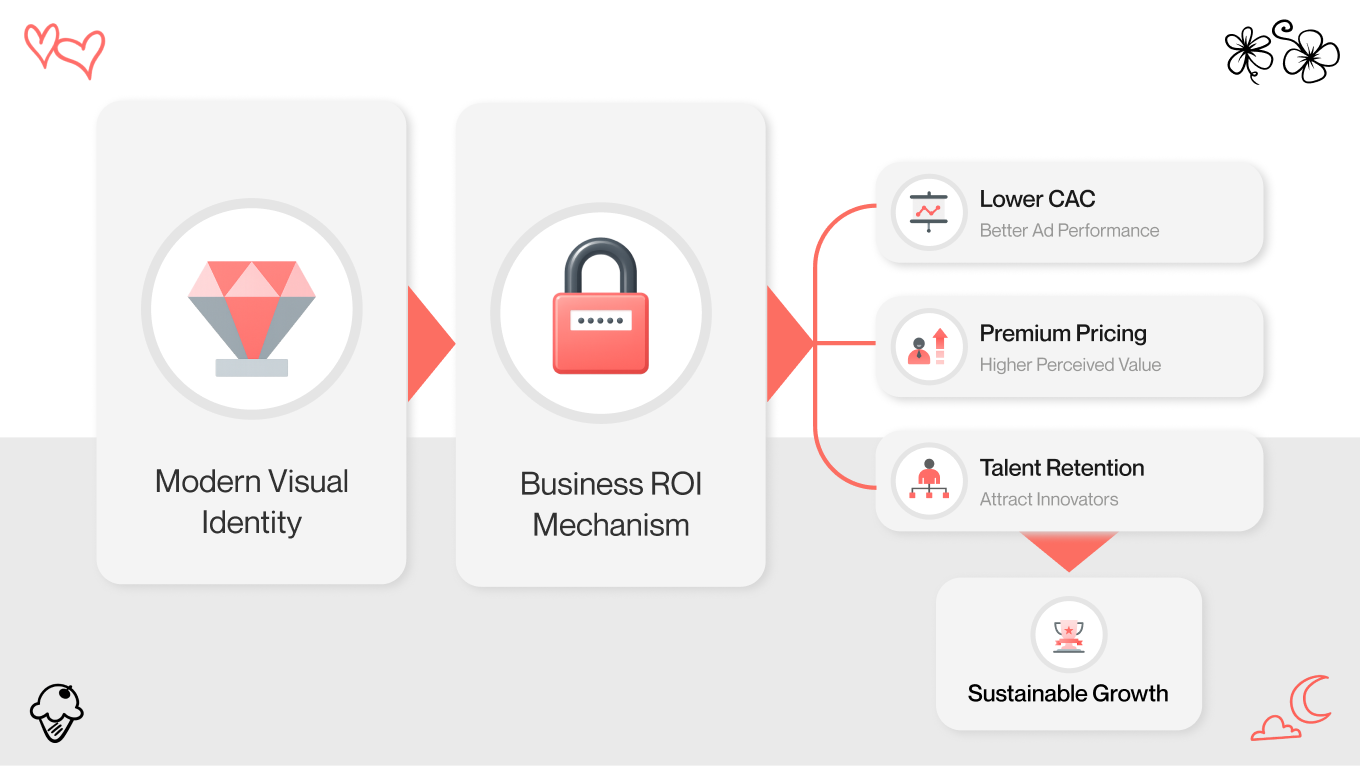
The most successful brands in 2026 won’t choose between high-tech and high-touch — they will master both. From the resurgence of raw, anti-AI textures to the precision of spatial UI, here are the trends in graphic design defining the visual landscape this year.

Why You Should Care About Current Graphic Design Trends

Why should a CEO or Marketing Director care about 3D shapes or kinetic typography? The answer is simple: Trust.

In the digital space, your visual identity is the first indicator of your company's health. If your website looks like it was built in 2018, users subconsciously assume your technology, security, and service standards are also stuck in 2018.

Navigating current graphic design trends is a strategic move to maximize ROI in three ways:

  1. Reduced Customer Acquisition Cost (CAC): Ads and landing pages that feel “current” consistently perform better. When your visuals align with modern expectations (e.g., real textures instead of stock imagery), you naturally earn higher click-through rates and pay less per conversion.
  2. Increased Perceived Value: A polished, trend-aware visual identity enables you to position your product as premium. It signals leadership, confidence, and market maturity, rather than competing on price alone.
  3. Talent Retention: Top talent wants to work for forward-thinking brands. Modern visuals signal innovation inside the company, not just in its marketing.

You don’t need to adopt every new style that pops up. But ignoring major shifts in the visual landscape is a decision that lets your competitors appear more innovative than you.

Not sure about the relevance of your design in 2026? We’re here to help you reimagine your platform with a fresh expert view.

The Definitive List of Graphic Design Trends for 2026

If 2024 was the year of AI disruption and 2025 was the year of adaptation, graphic design trends 2026 are poised to be the year of synthesis. The initial shock of new technologies has faded, replaced by a mature, intentional blending of the digital and the tangible.

The shock has worn off. In its place, we’re seeing a more intentional blend of the digital and the tangible. Designers are moving away from the sterile perfection of algorithm-generated visuals and toward something more expressive — work that values human texture, emotional depth, and controlled imperfection alongside technical precision.

Three themes define this shift:

  • A move beyond the clear-cut “AI vs. human” debate toward collaborative, hybrid workflows.

  • Sustainability expressed visually through organic textures, thoughtful color systems, and data-driven storytelling.

  • A transition from Y2K nostalgia to the sleek, optimistic futurism of the late 2000s and early 2010s (often referred to as Frutiger Aero).

Prepare to explore the aesthetics shaping brands, interfaces, and art in the coming year. Enter graphic design trends list.

Trend #1: Liquid Chrome (Acid Graphics)

Best for: Music, Tech, Disruptive Tech.

If 2024 was defined by a soft gradient graphic design trend and restrained transitions, 2026 moves in the opposite direction. Liquid Chrome is loud, reflective, and deliberately confrontational. It doesn’t try to blend in; it’s designed to dominate attention.

The look: Distorted metallic surfaces in silver, gold, or iridescent hues that appear to melt, stretch, or flow across the screen. These visuals feel fluid and kinetic, even bordering on alien or industrial. Light is simulated instead of illustrated.

Why it works: Liquid chrome feels heavy. It conveys mass, value, and presence in a way flat design simply can’t. Because of mimicking real-world light behavior, it instantly feels more premium and “real” than traditional digital graphics. For brands that want to signal disruption, speed, and confidence, this style creates impact in seconds and leaves no room for neutrality.

Trend #2: Bio-Digital

Best for: HealthTech, Clean Energy, Sustainability.

For years, “eco-friendly” design relied on safe, predictable cues, like paper textures, muted greens, and leaf icons. In 2026, sustainability gets a visual upgrade. Bio-Digital reframes environmental responsibility as advanced, intelligent, and data-driven.

The look: Neon greens layered onto dark-mode interfaces, microscopic textures inspired by biology, and abstract visualizations of natural systems and data flows. The aesthetic feels scientific yet organic, futuristic but grounded.

Business application: If you work in CleanTech, move beyond stock imagery of solar panels and wind turbines. Instead, visualize how your technology works: energy movement, efficiency gains, system intelligence. Abstract data visuals make invisible processes tangible, and credibility follows.

Our project, Scoop Solar, demonstrates how complex industrial sustainability data can be translated into a clean, human-centric digital experience. The interface avoids rustic cliches and positions renewable energy as precise, modern, and accessible. It’s proof that “saving the planet” doesn’t have to look earthy. Instead, it can look sharp, confident, and undeniably high-tech.

Trend #3: The Human Signal

Best for: Lifestyle Brands, Food & Bev, Direct-to-Consumer.

When machines can generate flawless visuals in seconds, perfection loses its value. In 2026, imperfection becomes the signal of authenticity.

The look: Hand-drawn elements, scribbles, scanned textures, uneven typography, and collage-style compositions. These visuals feel touched, layered, and personal. The message is subtle but immediate: a real person made it.

Why it works: Rough edges feel honest. As audiences grow more skeptical of overly polished, AI-perfect imagery, human flaws create instant emotional trust. They slow the scroll and invite connection.

Business application: This isn’t about turning your brand into a sketchbook. Small, intentional gestures (e.g., hand-drawn arrows, annotations over clean photography, imperfect highlights, etc) can soften an interface and make it feel collaborative, almost conversational.

With Galaxibites, we intentionally rejected flat vectors in favor of hyper-tactile, surreal 3D. Soft, toy-like materials and gravity-defying compositions give the visuals a “chewy,” physical quality. The result reflects a major 2026 shift toward sensory design: digital experiences so textured they feel almost touchable.

Trend #4: Spatial 3D and Glassmorphism 2.0

Best for: SaaS, Tech Startups, Fintech.

As spatial computing becomes more mainstream, flat interfaces begin to feel restrictive. In response, designers are embracing depth — not as decoration, but as structure.

The look: Translucent layers, frosted glass surfaces, soft realistic shadows, and a clear 3D hierarchy. UI/UX elements feel stacked, floating, and spatially aware, more like objects than graphics.

Why it works: Depth naturally increases engagement. Humans are wired to explore layered environments, and spatial UI transforms abstract digital tools into environments users can intuitively navigate. The result is higher dwell time and a stronger sense of product value.

VR BOXXX explores what it means to design beyond the flat screen. Buttons, cards, and data don’t sit passively on a canvas. They exist within a structured spatial hierarchy. It’s a preview of how interfaces will evolve alongside the spatial web.

Trend #5: Bento Grids (Modular Geometry)

Best for: Dashboards, Analytics, Complex B2B Sites.

Maximalism brought energy, but also chaos. In 2026, that energy gets organized.

The look: Content is arranged into modular, rectangular sections, each dedicated to a single function: a chart, a stat, a feed, a notification. Everything has its place.

Why it works: Bento Grids are scalable, responsive, and inherently user-friendly. They allow teams to present large volumes of information without overwhelming users. Instead of information overload, users experience curated clarity.

Trend #6: Frutiger Aero

Best for: Gen Z Apps, Crypto, Gaming.

Nostalgia follows a 20-year cycle. After years of Y2K revival, attention has shifted to the optimistic futurism of the early 2000s, often referred to as Frutiger Aero.

The look: Glossy bubbles, vibrant cyans and greens, soft gradients, skeuomorphic details, and wide-angle perspectives. It recalls a time when technology felt hopeful, friendly, and full of possibility.

Why it works: Against today’s sea of flat corporate blue, Frutiger Aero feels emotional and alive. It stands out instantly and resonates strongly with younger audiences who crave optimism over minimal restraint.

RKDE Wallet blends retro gaming nostalgia with contemporary UI execution. The result feels fast, neon-charged, and energetic, capturing the spirit of early digital optimism while delivering a distinctly 2026 experience.

Trend #7: Kinetic Typography

Best for: Hero Sections, Event Landing Pages.

Users don’t read, they quickly scan the page. Luckily, kinetic typography turns text into the primary visual hook.

The look: Variable fonts that change weight or width on scroll, animated letterforms, and typography that acts as a container for imagery or video.

Why it works: It captures attention immediately without relying on heavy imagery, improving load times while increasing engagement. In the first three seconds, when bounce rates are decided, the kinetic typography earns focus.

Trend #8: Abstract Data Visualization

Best for: AI Companies, Big Data, Logistics.

Every company is now a "data company." But spreadsheets are boring. The trend for 2026 is turning boring data into beautiful, abstract art.

The look: Particle systems, generative graphics, flowing streams, and heat maps that respond to real-time inputs. Adopting this trend will make users feel more in control of their digital decisions. A touch of creativity will give your visuals a soul.

Why it works: Seeing data move builds trust. It transforms invisible backend processes into something users can understand, feel, and believe in, turning complexity into credibility.

Trend #9: Modern Serif 

Best for: Legal Tech, Consultancy, Premium B2B.

After a decade dominated by geometric sans serifs, brands are rediscovering the authority of serif typography, translating “maturity” and “prestige”.

The look: High-contrast, modern serif fonts used boldly in headlines, paired with restrained, minimal layouts. It gives your platform a more sophisticated look, making users want to explore its aesthetics by browsing your website.

Why it works: Serifs signal maturity and confidence. They distance brands from the generic “tech startup” look and position them as established, thoughtful, and timeless.

Trend #10: 8-Bit Luxury

Best for: Web3, Fintech, Creative Agencies.

We aren't talking about Mario Bros. This isn’t pixel art nostalgia — it’s pixelation as a design strategy.

The look: High-resolution visuals that fragment into pixels, glitch transitions, and low-fi digital artifacts paired with refined typography and clean layouts.

Why it works: 8-Bit Luxury acknowledges the internet’s roots while elevating them. The result is a hacker-chic aesthetic that feels intentional, experimental, and especially appealing to developer-centric and Web3 audiences.

Gapsy Studio will help you define the visual moving force for your product. Reach out, and we can discuss all the details.

Real-World Graphic Design Trend Examples

The theory of "future design" is exciting, but how does it survive the boardroom? The biggest challenge for designers is applying these trends to industries that traditionally demand safety, rigidity, and "corporate" minimalism.

In 2026, one of the most interesting shifts is happening inside B2B SaaS, where maximalism and data density are colliding with traditionally “safe” design norms.

The Challenge: Maximalism in a Buttoned-Up World

For years, “professional” meant white empty space. Dashboards were minimal, sparse, and afraid of clutter. But as software becomes more powerful, users actually need more information at a glance, not less, making room for welcoming more details.

The Solution: The Bento Grid

So, how does a B2B SaaS company use the maximalism graphic design trend without looking unprofessional? By using Bento Grids.

Bento Grids act as a Trojan horse for maximalism. They allow designers to pack in rich visuals, real-time data, and multiple content types without sacrificing clarity.

Why this works in 2026:

  • It offers the density of maximalism (rich textures, high information load) but contains it within rigid, comforting boundaries.

  • Unlike a traditional list view, a Bento Grid lets you make the most crucial feature the largest "box," guiding the user's eye naturally through the density.

  • It mimics the responsive nature of mobile widgets, making the desktop experience feel as fluid and touchable as a phone interface.

This is how traditionally “boring” industries adopt bold trends. Not by going neon, but by adopting more innovative structures.

Beyond the Hype: Our Approach

Let’s be honest: looking at a list of "2026 Trends" can feel overwhelming. It’s easy to get lost in the noise of what’s cool versus what’s useful.

At Gapsy Studio, we act as your filter. Our team appreciates the artistry of emerging aesthetics, but we care even more about conversion rates, retention, and long-term scalability. Our job isn’t to make things look futuristic for its own sake. It’s to identify the one trend that solves your business problem.

Maybe your SaaS needs Bento Grids to reduce churn. Maybe your consumer brand needs tactile 3D to rebuild trust in a crowded market. We design with empathy for users and respect for your bottom line.

Want to Create High-Quality Graphic Design?

Gapsy is here to help you — press the button and let's discuss your project.

Final Thoughts

As we move toward 2026, the era of AI shock is over. The new directive is clear: be digital, but unmistakably human.

The trends shaping the future, from tactile depth to modular clarity, all serve one purpose: connection. In a saturated market, the most significant risk is being invisible.

At Gapsy Studio, we bridge the gap between future-ready and business-critical. Instead of chasing trends, our agency translates them into resilient, high-performing digital products that drive real growth.

Interested in adapting your product to modern standards to increase retention? Contact us — we’re your reliable partner with a sense of purpose.

Rate this article

20 ratings
Average: 4.9 out of 5

If you like what we write, we recommend subscribing to our mailing list to always be aware of new publications.

Do you have any questions? We tried to answer most of them!