The Ultimate Guide on How to Design a Great Logo For a Business

11minutes read
how to design a business logo

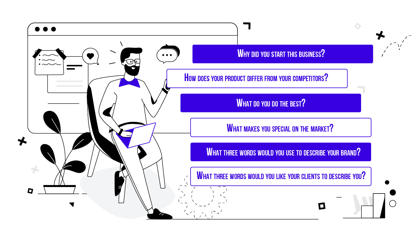
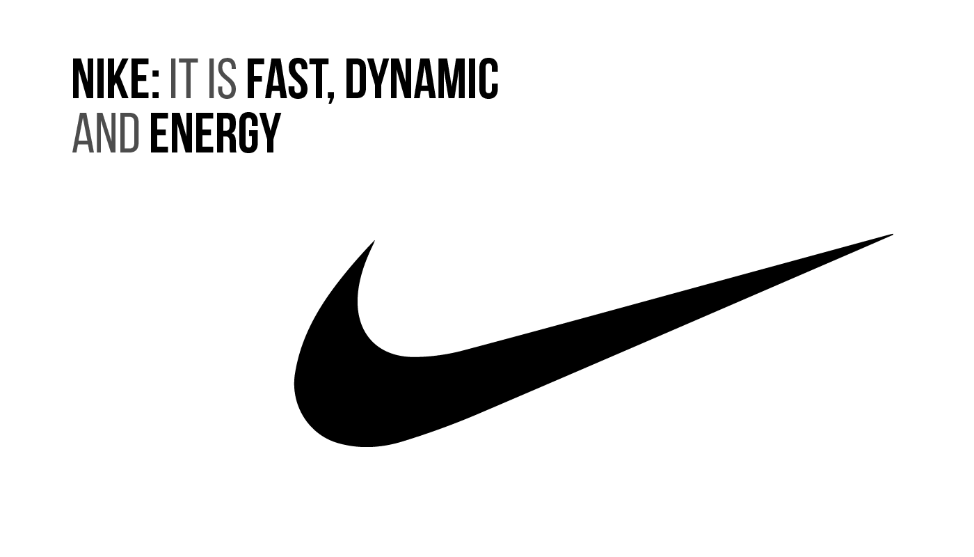
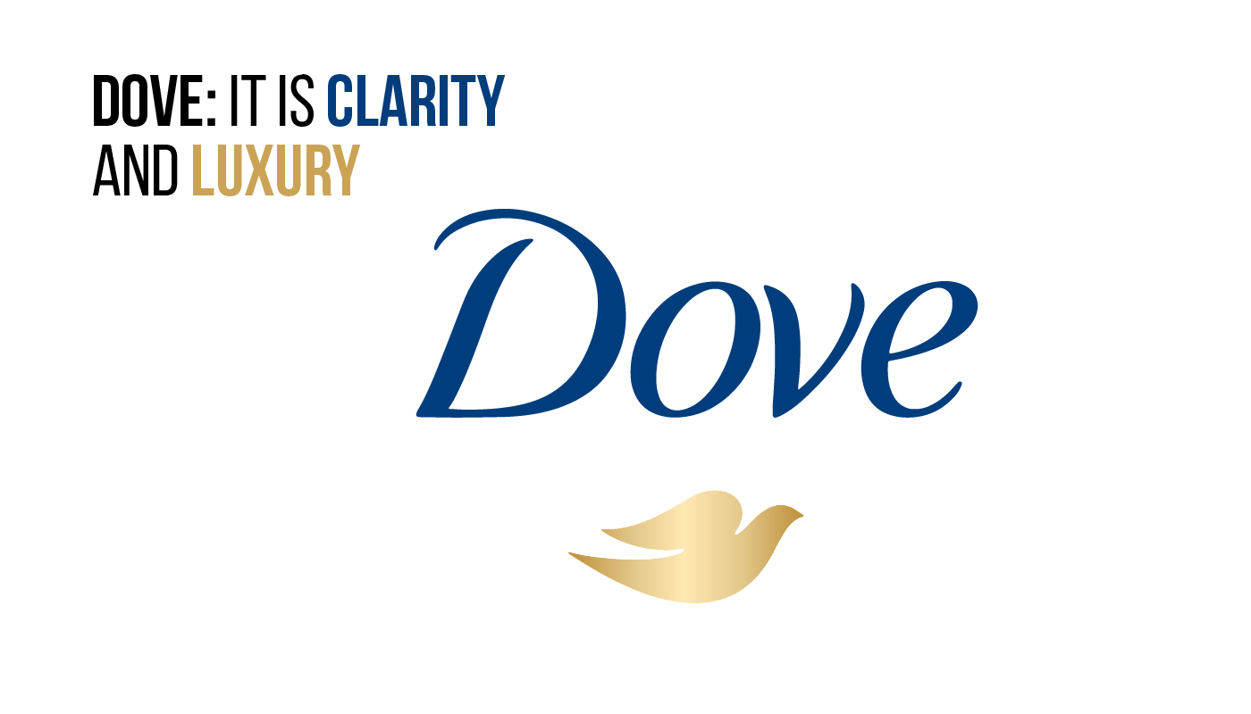
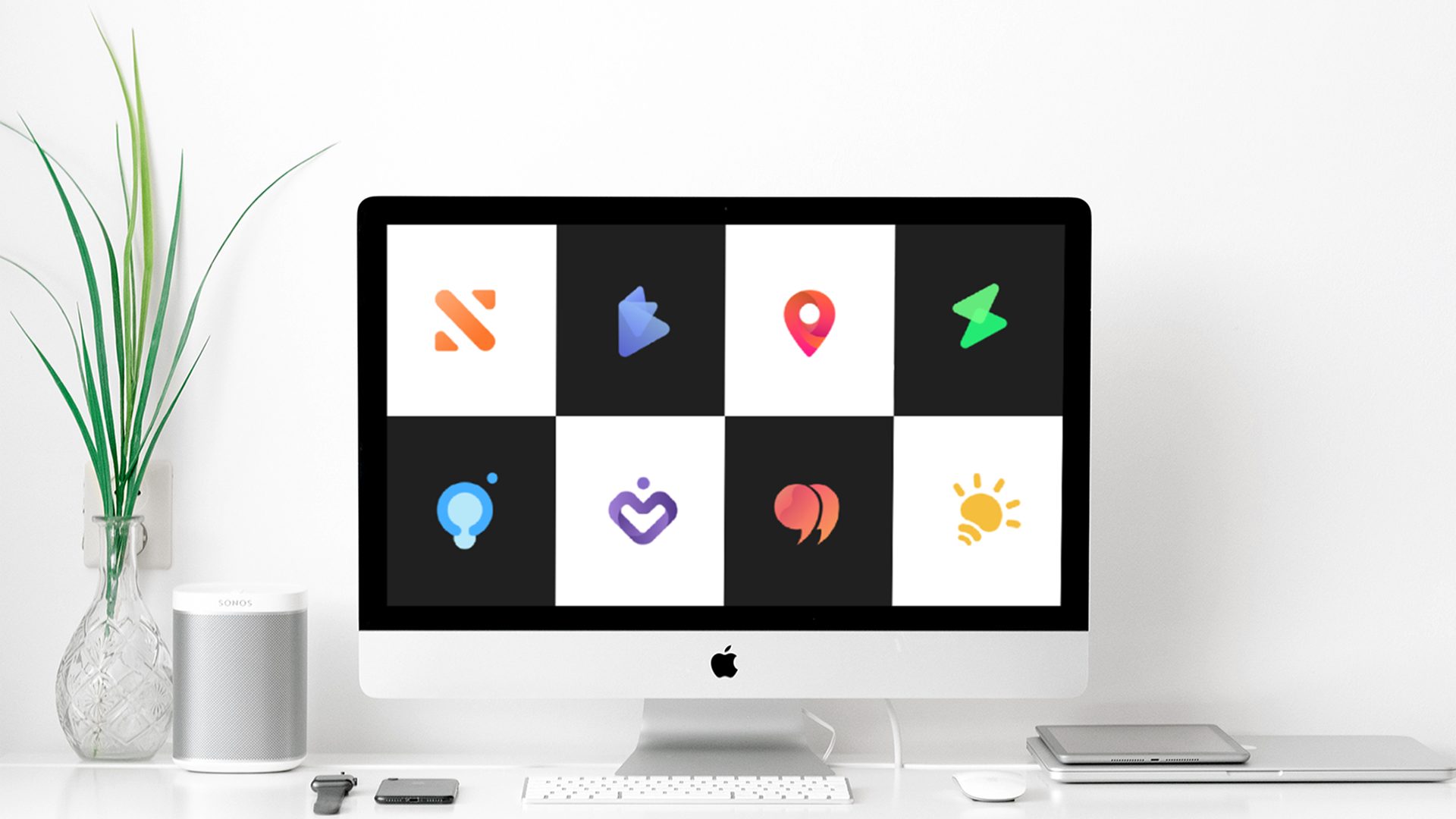
A logo is much more than just words, icons, or colors. A good logo tells your company’s story – who you are, what you do, and what your mission is. The logo has a significant impact on how your audience perceives your brand. It’s difficult to imagine a modern company without a logo; this symbol is the most important way of identifying any business.

Creating a logo isn’t an easy task: there are many nuances to consider when designing it. With this step-by-step guide on designing a business logo, we’ll try to tell you a little more about your brand identity, how to choose the right design, and how to navigate the logo design process.

So let’s get started!

What is logo design and branding?

For example, the average US citizen sees from 4000 to 10000 advertisements, logos, and labels per day. If you look around, you will probably also notice a few dozen logos around you.

Why do many companies spend thousands, hundreds, or even millions of dollars to create this small element? To understand this, let’s define the word “logo” first.

A logo is a compact graphic sign that represents a specific company, organization, brand, product, app, or website. The main tasks of modern logos are considered to be their recognition and memorability among the target audience; the right image of this type should be, at the same time, original and easy to remember. Today, there are many logos in the world, so not everyone will be able to create a unique and compelling image.

Why is Logo Design Important?

A good logo:

  • Makes the company, its products or services more recognizable, creates a positive business image, increases the level of audience loyalty;
  • Identifies the brand from competitors, helps to distance itself from them, to emphasize its features and advantages – is actively used for advertising purposes;
  • Protects products from counterfeiting, confirms the firm’s ownership of its developments, guarantees its high quality;
  • The logo is the basis and main visual component of the brand’s entire corporate identity, so its development should be given special attention.

The Main Steps on How to Design a Business Logo

Learn why any business needs a logo

Your logo is something that will get people interested and try to learn more about your brand. A logo is the first impression of your product. You hardly want a negative first impression, do you? This is why it pays to work hard to create a cool and attractive logo. A logo will provide your customers with information about your brand and let them know whether they want to do business with you or not.

Why logo design is important for your business

Since a logo is a significant part of any brand, you need to make sure that your brand is well-designed. Your logo will be everywhere: on all advertisements, on websites, apps, packaging, business cards, and more. A tremendous professional logo design can not only convey what you stand for. It will also make an excellent first impression and help you stand out from the competition.

Create your brand identity

Each logo should reflect the personality of the brand. Understanding your brand’s personality and uniqueness will give you a considerable boost in choosing a design that complements your logo. But how do you highlight your brand’s personality?

Design logo for business creating a brand identity

To find out, answer the following questions:

  • Why did you start this business?
  • How does your product differ from your competitors?
  • What do you do the best?
  • What makes you unique on the market?
  • What three words would you use to describe your brand?
  • What three words would you like your clients to describe you?

These are the questions that will help you better understand your brand’s personality.

Research the market and competitors

The logo is not created because it is necessary or fashionable. The logo should carry a specific function, the benefit of the company. Therefore, at the initial stage of creating a logo, you should clearly understand who your customers are, what they like, what qualities of your company they value. It’s necessary to create a logo that will evoke the feelings and emotions you need and create a positive brand for your company.

Design logo for business researching the market and competitors

Who else will best tell and advise you on how to create a good logo correctly like your competitors? Considering all their strengths and weaknesses, you can gain useful experience and create a unique product, with a great advantage. Find out what logos are already there, why users like them, and why they choose competitors’ products. Using an analogy, think about what will set you apart from them and how you will highlight those differences in your logo design.

Your main task is to stand out from your competitors. Otherwise, the target audience will not have any reason to go to you or new customers will choose you.

Having compared all the logos of competitors, highlight what they have in common and what is different. For example, if all of their logos are monochrome, you can create a bright and eye-catching one that will grab attention.

Choose the right design style and type of your logo

To make a logo effective, you need to follow specific rules. We have selected the essential principles with a brief description.

  • Keep the logo simple: A simple logo design makes it easy to recognize and allows the logo to be versatile and memorable.
  • Keep the logo memorable: An effective logo design must be memorable, and this is achieved through an original logo that stands out from others.
  • Make your logo durable: The logo must stand the test of time – not lose its effectiveness under the influence of fashion or any other short-term phenomena, be “future proof” and effective in a few years. For example, well-known companies do not create a new logo, but only slightly improve it, making it more modern.
  • The logo should be versatile: A quality logo always looks great in any device and any form.
  • Choose your logo design. No one style will please everyone; you should choose the best for your brand.

We distinguish six categories of logos. Each type has unique advantages, so it’s worth considering which logo is right for you before you even start designing a logo for your business.

1) Emblems

An emblem is a type of logo that includes text within a symbol. It’s a classic look that gives your logo a traditional quality. This is why you often see them used by schools and government agencies – they make everything right and official.

Design a logo like an emblem

Emblems are often more detailed than other types of logos and include thin lines and small detailed symbols. Although these are optional rules. The Harley Davidson logo is a straightforward emblem with sans serif text.

2) Font logo

A font brand name is a logo built entirely on the words or letters that make up a company name. The main focus here is on typography. This logo style strongly links the visual identity of the brand to the company name.

Design a font logo
Design a font logo

For example, the Google logo is effective because the font is simple and elegant(like their products), but many colors. The different colors represent the variety of results you get when you search on Google and the variety of their product line. The vibrant colors are fun and easy to understand, as Google wants its products to be used everywhere and not scare off new users.

3) Monograms

If that sounds like a description of your company name, a monogram will probably suit you better than a logo. This logo style shortens the name to catchy (and easy to pronounce) parts.

Design a font logo
Design a font logo

You probably read HBO by letters and not Home Box Office. If that’s what you want to achieve, a monogram is a perfect choice for your brand.

Many fashion brands use monograms (for example, Louis Vuitton, Chanel, Gucci), which immediately makes their brand symbol recognizable.

4) Trademark

The images you choose for your company logo must be too recognizable to the average consumer to be recognized and identified. Often these logos evolve from one of the above types over time. Think about how the Starbucks logo became an emblem, but now it’s just a drawing of a mermaid.

Design a trademark logo

5) Abstract logos

This type of logo is used when you want to use an image but don’t want to be limited by text caption. You can create an abstract logo that evokes feelings more than any other visualization. This can be difficult as not everyone will interpret the image the same way you do.

Design a logo like an abstract logo

For example, Nike is fast, dynamic, and conveys a sense of movement and energy. And even if you’re unfamiliar with the brand, you get a pretty good idea of ​​what is behind it. This is where abstract logos come in – immediate and clear.

6) Combined logos

You can combine any or all of the above ideas. You can combine the mascot with a text logo or insert your monogram into an abstract logo.

Design a combined logo

Think of Dove – the brand uses both the brand picture(dove) and the phrase (Dove) together. Combo logos are a way to kill two birds with one stone.

Get inspired

It is often challenging to take the first step when we are dealing with something unfamiliar. You can spend a day, or even a week, thinking and making drawings of the logo, which is very exhausting.

Fortunately, there is an excellent way to get rid of the stupor as soon as possible and make the first step less painful. For example, get inspiration from other logos and design work. To do this, we have selected several sites where you can spy on ideas for your logo.

Design logo for business getting inspired
  • Logo Pond

Logopond has an extensive gallery of logos to inspire you. You can view designers’ work and even upload your logos to share with the world and get feedback.

  • LogoFi

Logofi was created to inspire designers and other creative people. You can see robots of professional designers and ordinary visitors who have uploaded their logo on this site.

  • LogoLounge

LogoLounge offers a huge number for review, namely 277,237 different logo designs (at the time of compilation). The site was created for designers as an alternative to an efficient reference library. You will be able to share ideas and concepts with colleagues and clients. Also, on the site, you can participate in discussions on related topics and even find a job.

  • Logo Gala

LogoGala is one of the most outstanding resources for finding inspiration. On the site, you can select a logo filter by color.

  • Logo Faves

Logo Faves is one of the most popular sites. The site contains the logos of many famous designers. There is a tag search to find the logo you want.

Work on colors and typography

Color can help you heighten the feelings you want and create a strong emotional connection. Use the infographic to choose the color you want for your logo.

For example, statistics on color usage by global brands:

Blue seems to be the winning color, as it shows up in 33% of the top 100 brands. Red comes second by showing up in 29% of the brands, and black or greyscale makes the third most popular choice with 28%. Finally, 13% use yellow or gold.

Design logo for business using appropriate colors

What’s interesting is that 95% of the top 100 brands only use one or two colors. This can be explained as an attempt to maintain consistency by staying simple in their branding.

Moreover, the text is not essential to many of these brands, as only 41% involved it in their logos.

This serves as proof that a strong logo can connect with the audience, even with no use of text to supplement it. 9% of the brands didn’t even feature their company’s name on their logo, going one step further with their logos’ simplicity.

How to choose the right logo color?

To get an answer to this question, you should ask yourself three questions:

  • What color highlights the personality of your brand?
  • What colors characterize your products/services?
  • What color is your competitor using?

Colors are not tied to any particular industry, but specific colors are better for some services/products than others.

You should strive to choose a color that will highlight the personality of your company. The color should make the right impression on customers who see your logo for the first time.

What to do when you’ve figured out the colors of your competitors?

One option is to use the opposite color to your main competitor’s logo. It will help you stand out. But take into account the colors of your industry so that the opposite color matches the industry. For example, pink for the logo of a bank or a legal company looks out of place and ridiculous.

Consider color patterns in different cultures. For example, in the Western world, white is considered the color of purity and peace, and in some Asian countries, it is the color of death.

What to choose one color or several?

One-color is usually used when creating a logo design to maximize the desired feelings and emotions. However, there are many successful logos with multiple colors – Google, eBay.

Therefore, you can safely use either one color or several. The main thing is that the colors are combined! But, of course, do not overdo it and use a large number of colors.

We recommend choosing two primary colors. This makes it easier for your brand to communicate with customers. Many companies, from sports teams to corporations, have only used two colors for years.

How to choose multiple colors for your logo?

The easiest way to find the right colors for your logo is to use color schemes.

There are many online services for finding grand color schemes.

Designers often use the 60-30-10 rule. It consists in the fact that you choose three different colors and use them in the ratio of 60%, 30%, and 10%. This rule provides an easy way to create a professional color scheme for your branding design.

You can also pick up a lot of information about colors from our article about UI design colors

Evaluate your logo

You are unlikely to evaluate your logo objectively, so here you may need the help of friends, colleagues, potential customers, and your future target audience.

Design logo for business using signs

Here are ten signs of a good logo:

  • Scalability

This means that the logo should be clearly and legibly visible and readable on a large banner and a small thin pen, a wagon, and a T-shirt.

Here are two options:

  1. Make one version of the logo for all media; make two versions: full and simplified.
  2. The second will just be placed on a small press.

Which option is better?

This will become clear in the process. One option will be lower in price, and two options are suitable for application to different surfaces.

  • Intelligibility

The brand name should be visible on the sign from the passing car and the business card.

  • Multifunctionality

For example, your logo will not always be used in a color version. Imprints, seals, embossing – all this assumes only one color of your corporate logo.

That is, you shouldn’t get hung up on colors and focus on them.

Multifunctionality also includes a simplified and full version of the logo, which is described in paragraph 1.

  • Memorability

The memorability of a logo is not its unique design, the multicolor and excess of its details, but primarily an advertisement for what you are making a corporate identity for, and the use of a brand name.

That is, advertise your product/service/company and put the logo wherever possible: packaging, website design, patterns, menus. That is, for everything that is connected with you.

Because the purpose of a logo is to make people recognize you, and who are the consumers of everything possible and not? That’s right – people.

  • Simplicity

This does not mean that the dot in the middle is a full-fledged element of the corporate identity, but it means that you should not overload the sign.

The beauty is in simplicity and mystery, not in the re-logo.

  • High quality

Yes. Well-known companies spend several million to create/redesign logos for a reason.

They want quality. They know that by investing 1 (one!) Times in a good result, they will recoup the costs many times over.

Therefore, I recommend working with professionals with us – the graphic design studio, “Gapsy Studio”

We have already discussed what will happen if you order a corporate badge from an amateur, so we will not dwell on this here.

  • Uniqueness

That is, created from scratch, without other people’s developments/examples / taking graphic elements from someone so that no one but you has the same sign.

We have talked about this more than once.

By the way, if someone makes a very cheap brand name for you, check it for uniqueness.

You will then spend a lot more money on reworking the logo since it must be original for a trademark’s official registration.

  • Interest

This is a subjective concept, and there are general criteria:

  1. Seeing your logo, a person should want to take a closer look, stop and think,
  2. A person should believe that “I have never seen this. Something new”, reactions “wow,” “cool” also belong here,
  3. Comments about the corporate badge in the style of “so unusual, original, uncommon” again fall into this paragraph.
  • Ease

It is always better to add salt to food than to oversalt. The same can be applied to the logo.

Better to leave room to add new elements to the sign than to overload it.

  • Seasonality

We talked about the New Year’s logo here. This means the commitment of the corporate identity to the seasonal holidays.

100% have you noticed the Christmas decoration of the logo of famous companies. Why do they do it?

To show that they care about their clients, that they care about their appearance. And where there is a suitable wrapper, there is a quality product. But not always, here it is, how lucky.

Creating beautiful visibility is already part of the success because you can always refine your services/products and what you do.

Test your sketch with your customer persona

Have you created a logo and decided it’s perfect? This may not be the case. It will be more useful to show the logo to colleagues, friends, and clients and get feedback. Ask them a few questions: what do they think of the logo? Do they like it? If you are satisfied with the answers, then you did everything right.

However, be careful with the reviews of friends and relatives. If they are not professional designers, their advice may not be entirely helpful to you or even false.

Check logo scalability

Check out the logo’s image in different versions – in newspaper ads, on your website, on a business card. The logo should look good, whether it is reproduced in large or small format.

Some tips:

  • If the logo has a lot of detail or thin lines, then the logo may look too fussy at small sizes.
  • If a logo is created for a business card or website, then it will usually look awkward at large sizes.
  • Use graphics programs such as Adobe Illustrator or Inkscape; they allow you to test your logo’s scalability.

Wrapping Up

And so, you probably already created a logo. Congratulations!

But is it perfect? Will it look great in different sizes? Well, let’s check the effectiveness of your logo with our checklist.

Go through each question and answer “yes” or “no.”

  1. The logo looks attractive to at least three people.
  2. The logo looks good in black and white.
  3. The logo is recognizable in an inverted position (form)
  4. The logo is recognizable if its size is changed.
  5. There are no intricate details.
  6. The logo is visually balanced – the icon, font, color look harmoniously together.
  7. Not used too many fonts, colors, effects.
  8. The logo is visible, among other logos.

As we already wrote, it is imperative to stand out from other companies’ backgrounds, especially competitors. Collect your competitors’ logos and place yours somewhere in between.

Is it visible? Noticeable against the background of others? If so, everything is fine!

If you are still not confident in your abilities and in the fact that you can create a logo yourself, then we offer you the services of our professional designers. We have 100+ designed successful logos on our account. We can handle any of your wishes and tasks. In support of these words, you can familiarize yourself with our projects on Dribbble and make sure that we can handle any task by looking at the services.

Rate this article

20 ratings
Average: 4.9 out of 5

If you like what we write, we recommend subscribing to our mailing list to always be aware of new publications.

Do you have any questions? We tried to answer most of them!