Logo Design Trends 2026 to Make Branding Your Strategic Asset

12minutes read
logo-design-trends

The barrier to entry for brand creation has vanished. Recent data reveals that AI-based logo tools now account for 40% of small business designs in the digital-first market. This democratization is part of a larger economic shift: tech-powered businesses are growing 2x faster than traditional models, leveraging automation to capture market share at an unprecedented rate. However, as "AI-generated" visuals reach a saturation point, the definition of a successful identity is changing. In 2026, a logo's value is no longer measured by its mere availability, but by its empathy, the intentional logic that transforms a simple vector into a lasting anchor of trust.

Gapsy Studio believes that while AI provides the engine for efficiency, human intuition must remain the architect of the message. To stand out in a sea of algorithmic "perfection," your brand requires a human signal—a storied, tactile quality that fosters a genuine connection with your audience. 

This guide moves beyond generic lists to explore the top logo design trends that define the post-artificial era. We will analyze 10 transformative directions and provide a framework for a brand logic audit to ensure your identity is mathematically and emotionally sound for the high-growth landscape ahead.

The Anatomy of a High-Performance Logo

In 2026, a logo is a piece of functional software. To survive the "Post-Artificial" era, your mark needs a structural foundation that can handle the complexity. 

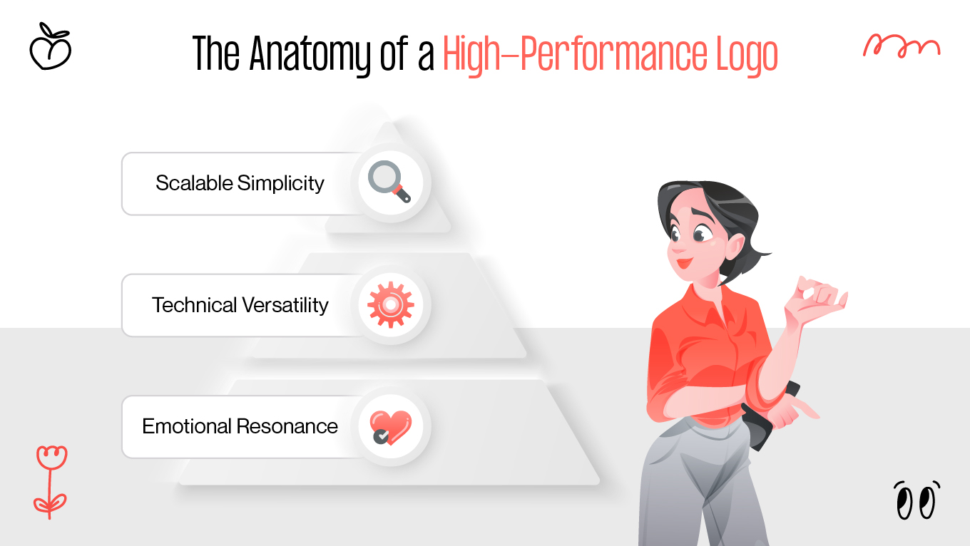
When auditing a brand at Gapsy Studio, we analyze a logo's performance through three critical layers." If one is missing, the brand's signal weakens.

The Anatomy of a High-Performance Logo

Scalable Simplicity

A logo must be legible at 16 pixels (as a favicon) and at 16 feet (on a billboard). Minimalist logo design trends have taught us that clarity is king, but the 2026 standard takes this further. We design for "glance-ability"—the ability for a human brain to recognize your brand in less than 100 milliseconds amidst a sea of notifications.

Technical Versatility

Your logo lives in a fragmented world. It must look equally "at home" on an OLED smartphone screen, inside a high-contrast interface, and on a physical piece of recycled packaging. This requires a logic-first approach to color and weight, ensuring the brand never loses its human signal, regardless of the medium.

Emotional Resonance

Data can tell you if a logo is legible, but only empathy can tell you if it’s right. A successful mark acts as a psychological "anchor." In high-stress industries like fintech or logistics, the logo should project stability and calm. In creative sectors, it should project energy. 

If you’re questioning whether your current logo can perform at this level or planning a new one from scratch, we’re happy to look at it with you. Reach out, and we’ll help you understand what your mark is communicating and what it could do better with a more deliberate structure.

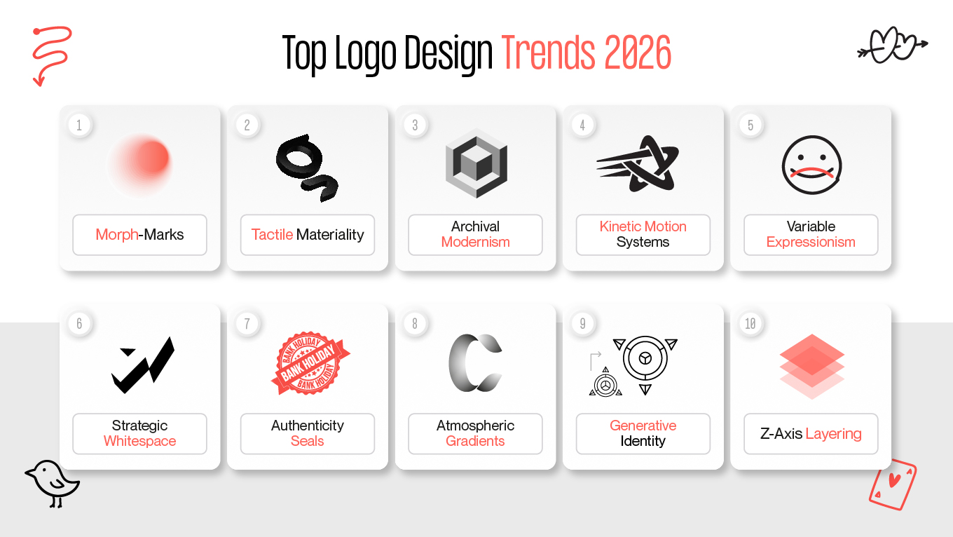
10 Top Logo Design Trends for 2026

The visual landscape of 2026 is a reaction to the "perfect" digital saturation of the early 2020s. As businesses seek to reclaim their voice in an automated world, these popular logo design trends move away from sterile vectors toward identities that breathe, move, and tell a story.

1. Morph-Marks for Adaptive Identity

In 2026, a static logo is a functional liability. "Morph-marks" move beyond simple responsive resizing; they are intelligent systems that physically alter their complexity based on their environment. A brand might present an intricate, storied crest on a 4K desktop display but intelligently simplify itself into a high-contrast geometric "blip" for a smartwatch notification. This isn't just about fitting the screen; it's about respecting the user's cognitive load in different contexts.

At Gapsy Studio, we treat this trend as a strategic necessity for high-growth tech companies. By maintaining a recognizable "core" while shedding unnecessary detail for smaller touchpoints, a brand ensures its visual equity remains intact across a fragmented digital landscape. This level of environmental awareness signals to the user that the brand is technologically sophisticated and mindful of their experience.

2. Tactile Materiality: Beyond Minimalist Logo Design Trends

As our daily interactions become increasingly abstract and screen-based, the human brain craves the sensation of the physical. This trend rejects the flat, weightless vectors of the past decade in favor of marks that appear to have mass and texture. 

We see a rise in:

  • Liquid Glass: Translucent depth that feels premium and modern.
  • Brushed Clay: Soft, matte finishes that suggest handcrafted care.
  • Organic Fiber: Subtle grain that grounds a digital brand in the real world.

It is a psychological anchor, using visual cues of craftsmanship to signal that a brand is "real" and substantial. In a world of infinite digital replicas, a tactile logo provides a sense of quality that flat vectors can no longer provide, making the brand feel like a tangible, premium asset.

3. Archival Modernism as The New Nostalgia

In 2026, we are witnessing a powerful "return to the source." Archival Modernism is the strategic fusion of mid-century design principles (heavy geometric lines, brutalist shapes, and radical simplicity) with futuristic, high-fidelity finishes. It is a reaction to the fleeting nature of digital trends, offering a visual "grounding" that feels both timeless and cutting-edge. By reaching back to the eras of pioneering graphic design, brands are reclaiming a sense of permanence that was lost in the "vector vacuum" of the last decade.

At Gapsy Studio, we view this trend as a tool for building immediate authority. When a brand adopts the sturdy, architectural logic of the 1960s and 70s but polishes it with 2026 technical precision (such as ultra-fine line weights or responsive lighting), it creates a "New Nostalgia." This aesthetic serves a specific business purpose:

This is not a simple "retro" revival; it is an evolution of modern logo design trends that prioritizes structural integrity over decorative noise. For the business audience, Archival Modernism signals that while your technology is moving at light speed, your foundational values are set in stone. It is the visual equivalent of a high-tech skyscraper built on ancient bedrock. 

4. Kinetic Motion Systems: Popular Logo Design Trends in Action

Static symbols are becoming the secondary version of a brand’s identity. This is a "motion-first" philosophy where the logo is defined not just by its shape, but by its behavior; its pulse, flow, and the energy with which it enters a space. A fintech brand might arrive with stable, architectural precision, while a creative platform might burst with fluid, unpredictable energy.

The movement is no longer decoration; it is the brand's temperament made visible. When a logo "breathes" or "reacts" to user interaction, it transcends being a mere image and becomes a living participant in the product experience. This kinetic signature often becomes more recognizable than the static mark itself in high-speed digital feeds.

5. Variable Expressionism: Typography with Tone

Typography is evolving from a static container for language into a living voice. In these wordmarks, individual letters subtly shift their weight, width, or stance to emphasize emotion or intent in real-time, much like human inflection. It allows a digital brand to modulate its "volume," whispering in intimate settings or projecting authority in crowded ones.

This trend is driven by the following business needs:

  • Custom font-marks that are harder for AI tools to replicate.
  • Adjusting the brand's "voice" to match the user's current task.
  • Creating a dynamic reading experience that keeps users engaged.

6. Strategic Whitespace: The Logic of the Hidden Narrative

This is minimalism matured. Instead of stripping away detail for the sake of simplicity, this trend uses negative space as an active design element to hide secondary metaphors or narratives. It is a respectful nod to the audience’s intelligence, inviting them to discover a "visual secret" hidden within the brand mark.

That moment of discovery creates a "sticky" cognitive bond that mere simplicity cannot achieve. At Gapsy, we use this to bake "logic puzzles" into identities, rewarding the user for their attention and increasing long-term brand recall without adding visual clutter.

7. Authenticity Seals: The Verified Human Stamp

In a marketplace flooded with faceless entities and synthetic media, the "seal" aesthetic returns as a powerful signifier of verified authority. These circular, dense marks draw on the visual language of physical wax seals or official stamps. They provide a sense of old-world security and accountability, acting as a visual promise of human origin.

For businesses in high-trust sectors like law or finance, the seal acts as a "verified human" signal. It moves the brand away from "disposable" digital aesthetics and toward something that feels permanent and official. It is a visual contract with the user, signaling that the brand is accountable and safe.

8. Atmospheric Gradients for Cinematic Mood

Moving away from the aggressive, high-saturation neon gradients of recent years, this trend uses soft, cinematic lighting to create mood and depth. These marks don't just sit on a background; they appear to be lit from within, using smoky fades and soft glows.

They are specifically designed to live harmoniously inside Dark Mode 3.0 interfaces. By acting as a natural light source rather than a jarring sticker, they reduce visual fatigue. This makes the brand feel sophisticated and integrated into the user’s environment rather than fighting for attention.

9. Generative Identity for The Personalized Interface

The ultimate expression of adaptive logic, generative identities are logo systems programmed to subtly shift based on user data. A logo might change its internal pattern based on the user's loyalty tier, or shift its color palette to reflect the current time of day in the user's location.

It moves branding away from a monolithic broadcast and toward a personalized dialogue. This trend signals that the brand is not a static monolith but a living service that is aware of the individual user. It tells the user: "This version of our brand is specifically for you, right now."

10. Z-Axis Layering: Preparing for Spatiality

As we prepare for the mainstream adoption of spatial computing (AR/VR), logos must learn to exist in three dimensions without looking like dated "3D renders." This trend uses sophisticated layering, translucency, and subtle depth-of-field effects to create a sense of volume.

The goal is to make the digital brand feel like an object that occupies physical space in the room with the user. By designing for the Z-axis now, businesses future-proof their identity for the next generation of headsets and immersive web environments, ensuring they remain "present" in every dimension.

TOP logo design trends 2026

Why Your Brand Identity Needs a "Logic Audit"

Many companies fall into the trap of chasing popular logo design trends without asking if those trends actually serve their long-term business goals. A "Logic Audit" is the process of stripping away decorative noise to determine if your brand identity is functioning as a strategic asset or a decorative liability. 

In a 2026 market where AI-generated clutter is the norm, a "pretty" logo is no longer enough; your identity must be a piece of high-performance engineering that protects your market position.

  • The Invisibility Test: If you removed your company name, would the visual logic of your mark still unmistakably tell your story?
  • Technical Resilience: Does your logo maintain its integrity in dark mode, on high-density OLED screens, or as a tiny 16-pixel favicon?
  • Cognitive Friction: Does your brand identity act as a "mental rest stop" for the user, or is it adding to the digital noise they are already trying to ignore?

By identifying where your visual logic fails to connect with human psychology or technical requirements, you can pivot from a generic presence to a resilient authority. Investing in an audit prevents the high cost of a total rebrand later, ensuring your identity grows faster alongside your technology.

If any of these questions gave you pause, that’s a signal worth listening to. If you want a clear, practical read on whether your identity is engineered to scale or quietly holding you back, get in touch. We’ll walk through your mark with a technical and human lens and outline what needs to change and what doesn’t.

Case Studies: Popular Logo Design Trends in Practice

A brand identity is only as strong as the business results it generates. The Gapsy team moves beyond the "vector vacuum" to ensure every logo and visual system serves a specific, measurable objective. By applying the top logo design trends of 2026, we transform digital presence into market authority.

Here is how we have applied modern logo design trends to help our partners outpace their competition:

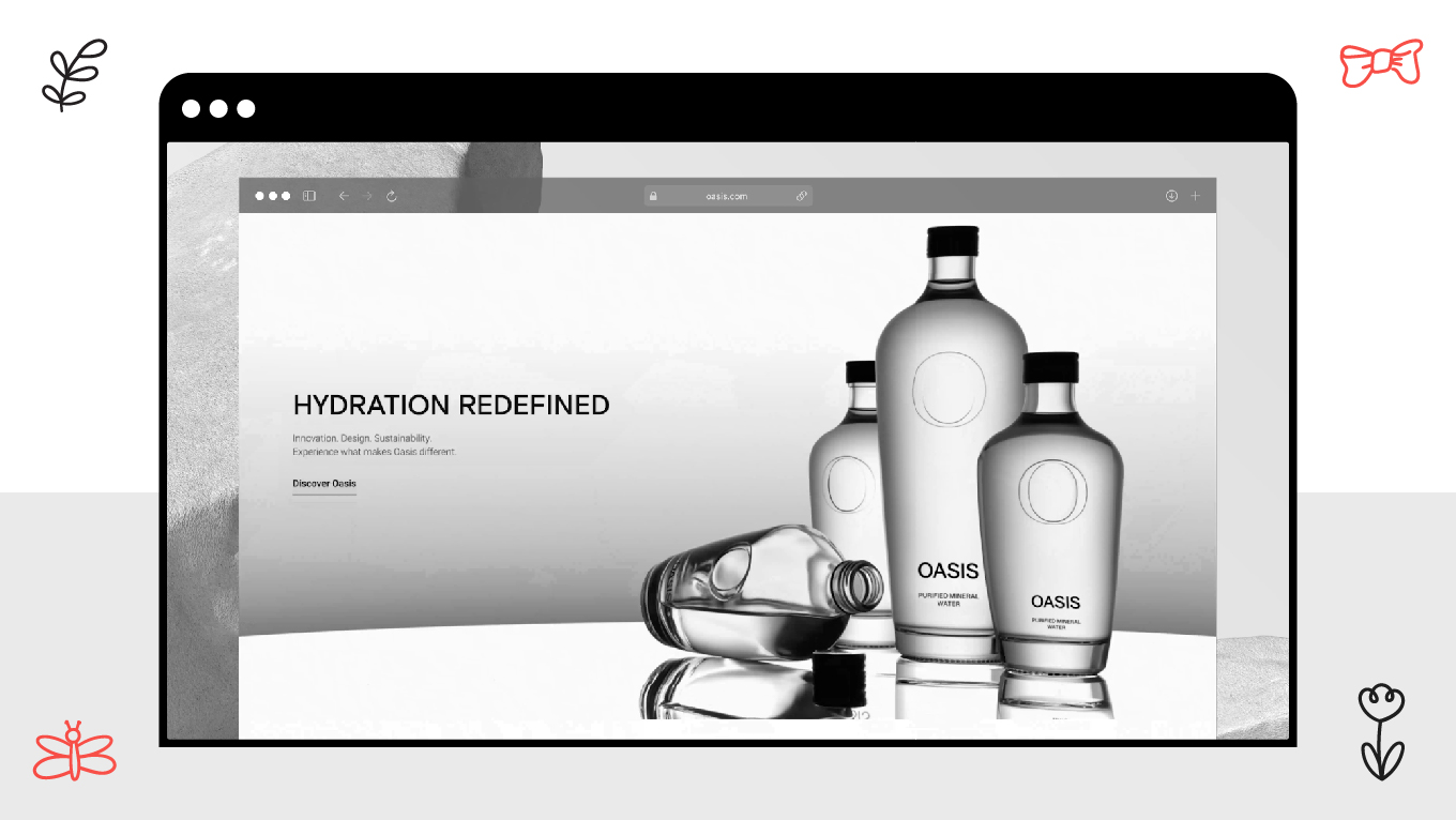
Oasis Water: Purity Through Minimalist Logic

In the hyper-competitive beverage sector, standing out requires a human signal. For Oasis Water, we moved away from generic "water drop" tropes to create a minimalist yet bold identity.

We utilized clean, refined lines and subtle wave motifs that symbolize purity without adding cognitive noise. By pairing a palette of cool blues and whites with custom iconography, we built an identity that feels "fresh" at a glance.

This cohesive approach directly increased brand recognition and improved website engagement, leading to significantly higher user retention.

This project exemplifies minimalist logo design trends used as a tool for "glance-ability" and premium market positioning.

Oasis Water: Purity Through Minimalist Logic

MistPeak: Serenity in the Luxury Hospitality Market

MistPeak required a visual identity that felt like an extension of the nature-connected luxury experience they provide. As travel booking is stressed, the identity needed to act as a psychological "anchor."

We integrated custom mountain and mist motifs into the logo, utilizing atmospheric gradients with earthy greens and neutrals to evoke a sense of calm. The branding was woven into every UI element, ensuring the "luxury vibe" was felt from the first click. The strategic shift led to a 25% increase in direct bookings and 30% more time spent on the site.

This case illustrates emotional resonance, proving that branding tied to user experience is a powerful driver of direct ROI.

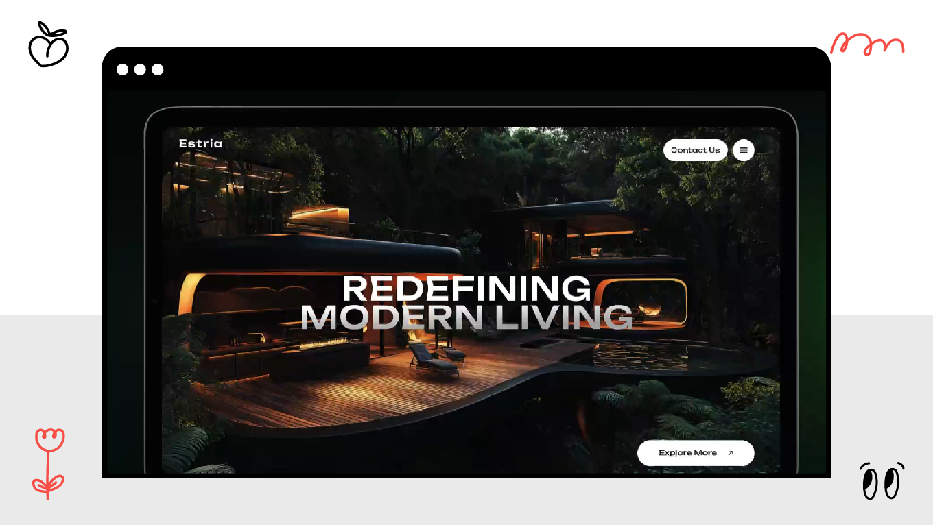
Estria: Architectural Precision and the Z-Axis

For an architecture bureau like Estria, the brand identity must be a testament to their design philosophy. We moved away from decorative flourishes toward a look that emphasizes structural integrity and geometric logic.

The logo uses sleek, geometric shapes that mirror architectural precision. Combined with a minimalist black-and-white scheme, we created a high-contrast environment that showcases their portfolio without clutter. By focusing on technical versatility, we boosted site engagement by 50% and generated a higher volume of qualified leads from partners who recognized the firm's creative authority.

Estria represents the archival modernism trend, reclaiming the sturdy logic of mid-century design and polishing it for a digital-first world.

MistPeak: Serenity in the Luxury Hospitality Market

Bonus: The Fortune 500 "Insider" Logo Playbook

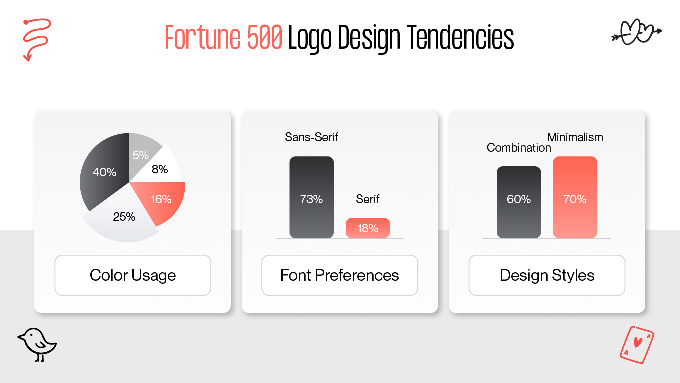
While design trends provide the aesthetic direction, the Fortune 500 approach branding as a high-stakes engineering challenge. The gap between a "logo" and a "strategic asset" is wider than ever. Here is the hidden logic driving the world’s most successful brands this year.

The 50-Millisecond Authority

Research shows that consumers form a judgment about a brand’s visual appeal in just 50 milliseconds. Fortune 500 companies are designing for cognitive speed.

If the brain cannot categorize the brand instantly, it categorizes it as "noise." This is why 73% of the giants have moved to high-contrast, sans-serif typography; it is the fastest way to clear the "recognition hurdle."

Biometric Anchors

A subtle but groundbreaking shift has occurred: 5% of Fortune 500 logos now contain hidden "biometric markers." These are precise geometric ratios and embedded patterns designed to trigger specific AR (Augmented Reality) experiences or verify authenticity through spatial computing devices.

It transforms the logo from a simple image into a "digital key" that unlocks immersive brand layers for high-value customers.

The Consistency Premium

For a global leader, visual drift is a financial leak. Companies that maintain a high level of brand consistency across all touchpoints report a 10-20% increase in overall growth.

Consistency is the psychological proxy for reliability. When a logo looks identical on a sustainable shipping box as it does in a VR meeting space, it reinforces the "Trust Signal."

"The New Blue" and Emotional Defense

While blue has always dominated for its "reliability," 2025 has seen the rise of ultra-chroma blues (like "true blue" or "yin-min blue").

In a market flooded with AI-generated generic startups, legacy giants are using these specific, vibrant wavelengths to signal technological superiority while retaining their established "Old World" authority.

The Fortune 500 approach

The Gapsy Studio Philosophy

We don’t view ourselves as a design factory, but as a strategic thought partner for the "Post-Artificial" era. Our team spent years navigating the intersection of high-growth tech and human psychology, helping brands move away from sterile, "salesy" aesthetics toward identities that breathe and build trust.

Our approach is rooted in empathy. We believe that every line, color shift, and kinetic motion should be backed by a clear business "why." That’s why we don't chase trends for the sake of novelty, auditing them instead for their logical fit within your specific ecosystem. 

We are here for the founders and teams who realize that a logo is the ROI of your first impression. If you’re ready to move beyond the "vector vacuum" and build a brand that projects authority and empathy in equal measure, we’re here to help you find your signal.

Conclusion

The 2026 branding landscape is a battle for cognitive space. As AI-based tools continue to democratize design, the true competitive advantage shifts from the ability to create a mark to the ability to sustain a connection. These top logo design trends are the blueprints for strategic empathy. 

Gapsy Studio believes the best logo design trends are those that function as anchors of trust in an automated world. Here, your objective remains the same: to prove that intentionality and logic stand behind your service. By prioritizing structural integrity over decorative noise, you ensure that your brand doesn't just follow the trends, but defines the standard for the post-artificial era.

If this perspective resonates, we’re always open to a thoughtful conversation. Reach out when you’re ready to explore whether your brand is built to endure.

Rate this article

20 ratings
Average: 4.9 out of 5

If you like what we write, we recommend subscribing to our mailing list to always be aware of new publications.

Do you have any questions? We tried to answer most of them!