UX Audit Checklist: How to Identify Usability Gaps and Boost ROI

10minutes read
ux-audit-checklist

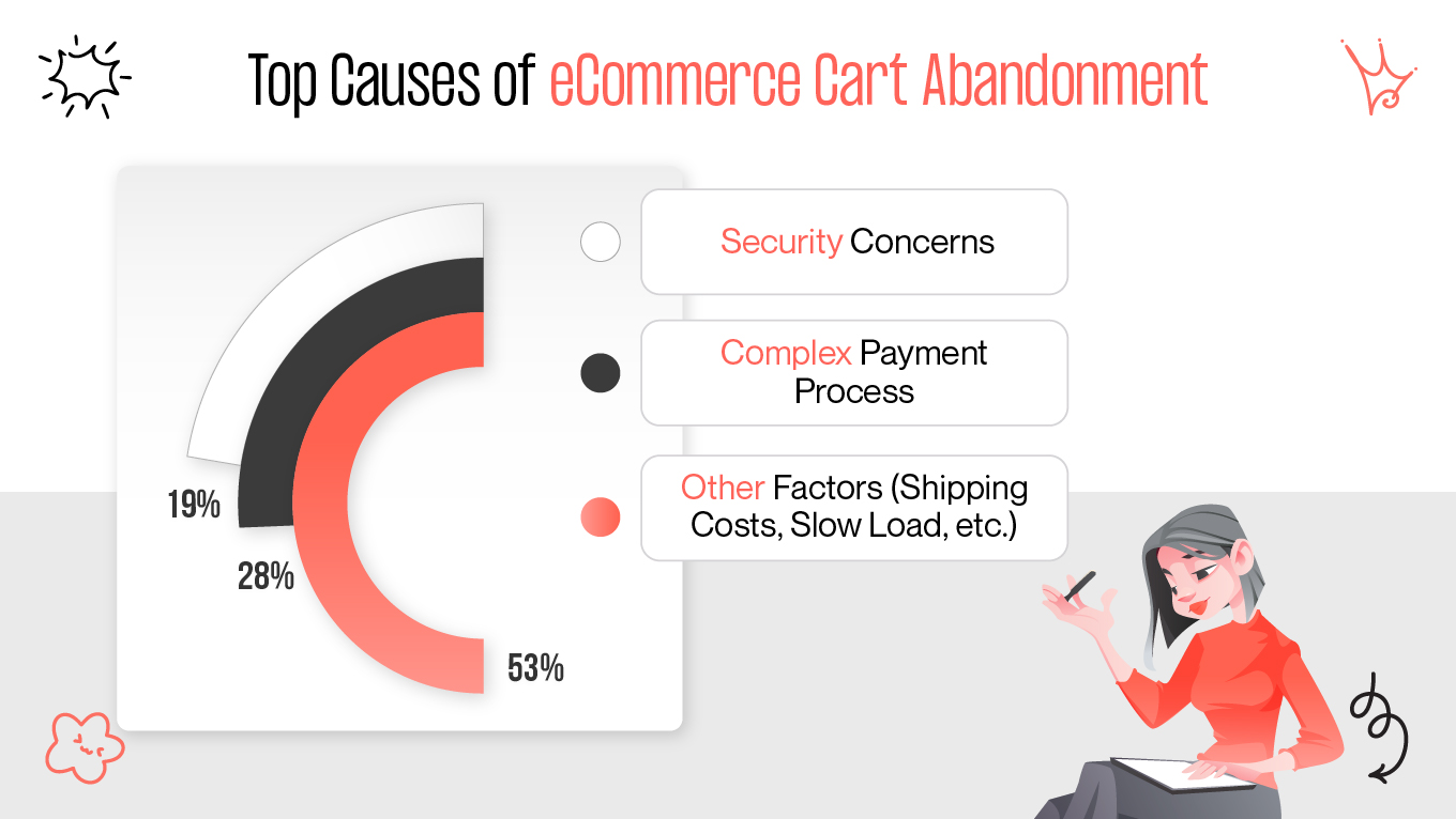
Every year, U.S. companies alone lose $1.4 trillion due to poor user experiences. It’s 35% of potential sales slipping away because users abandon confusing layouts, slow-loading pages, or broken interactions before they ever convert.

If your product analytics reveal high bounce rates, abandoned checkouts, or disengaged users, the problem isn’t always your marketing or pricing—it’s often your UX. Even a well-designed product can quietly lose revenue when usability obstacles frustrate users. The tricky part? Most teams don’t notice these leaks until it’s too late.

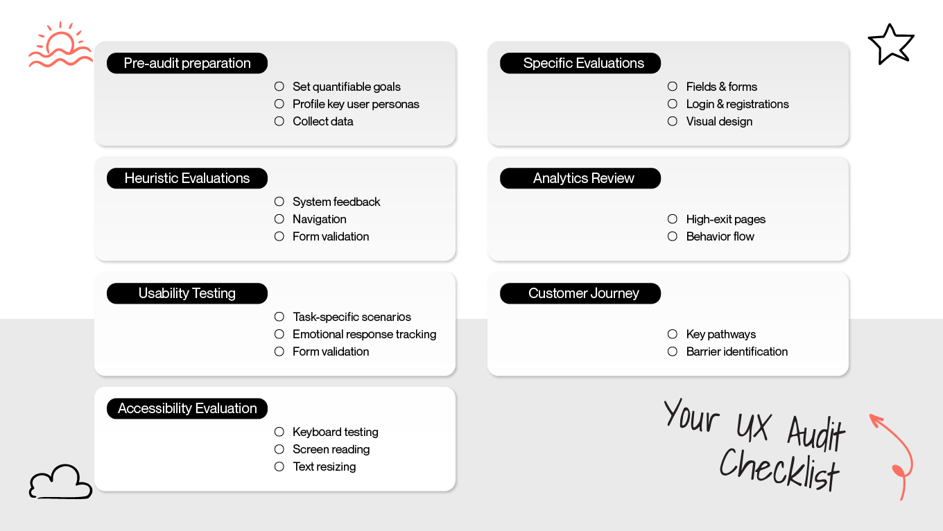
A UX audit checklist lets you uncover these hidden issues before they become costly. By analyzing how real users navigate your digital product, you can translate insights into actionable improvements that impact both satisfaction and revenue.

In this guide, we’ll cover the key elements of a UX audit, explain why it’s critical for your business, and provide a practical, step-by-step checklist to spot problems, prioritize fixes, and boost both usability and ROI.

How Our UX Audit Helped CreatorSet Unlock Growth

A clear example of a data-driven UX audit in action is our work with CreatorSet, a creative marketplace where designers sell icons, illustrations, and templates. The platform faced low conversion rates and inconsistent user engagement, largely due to outdated UX patterns and a confusing navigation system.

What Was the Challenge

CreatorSet’s website struggled with poor content discoverability and a fragmented user journey. Analytics revealed that users often abandoned the site before completing purchases, hindered by cluttered layouts and slow performance. These friction points had a direct effect on revenue.

Our Approach to Audit and Strategy

We performed a comprehensive UX audit to uncover conversion blockers and friction points. Leveraging heatmaps, session recordings, and behavioral analytics, we pinpointed:

  • Navigation confusion between the homepage and the search functions

  • Overloaded visual design that distracted from key CTAs

  • Lack of mobile optimization across devices

Our solution focused on clarity, speed, and usability. We unified the homepage and search functionality, refined category labels, and implemented a mobile-first design. Additionally, we optimized the checkout flow and strengthened customer support, creating a seamless, revenue-focused user experience.

The Business Impact

Post-launch, CreatorSet experienced:

  • Higher user engagement and improved navigation efficiency

  • Increased conversions due to simplified workflows

  • Boosted trust and retention through consistent UI and security upgrades

CreatorSet is now empowering thousands of creators to monetize their designs effortlessly. It’s a clear demonstration of how a well-structured website UX audit checklist transforms design inefficiencies into measurable business success.

If you’re curious what a tailored UX audit could reveal for your product, let’s connect and discuss the areas that can deliver immediate impact.

How a UX Audit Translates Design Insights Into Business Results

Behind every conversion metric or churn statistic lies a story about user experience. A UX audit uncovers it and reveals where users hesitate, abandon tasks, or disengage. By turning fragmented interaction data into actionable insights, it shows how design decisions shape trust, engagement, and revenue.

What a UX Audit Evaluates

A UX audit is a structured analysis of how real users interact with your digital product: what draws them in, where they struggle, and what drives them away. It’s more than spotting obvious design flaws; it identifies subtle friction points that quietly undermine trust and revenue.

A thorough UI/UX audit checklist helps businesses align user behavior with business objectives. It highlights how accessible your product is, whether workflows feel intuitive, and how effectively design supports conversions. In short, it’s a reality check to ensure users experience your product as intended.

Why UX Audits Are a Financial Safeguard

Poor usability doesn’t just frustrate users, but also costs money. Each year, eCommerce brands lose roughly $18 billion to cart abandonments, often due to complicated checkout processes (28%) or security concerns (19%). These aren’t just visual issues; they’re hidden operational inefficiencies in the interface.

When your digital experience falls short of expectations, marketing budgets underperform and acquisition costs rise. A UX audit provides the insights needed to resolve these bottlenecks — before small usability leaks escalate into significant revenue loss.

Improving Performance and Conversions

UX is also about time. A one-second delay in page load can reduce conversions by 7% and contribute to $6.8 billion in annual business losses. Stretch that to ten seconds on mobile, and bounce probability skyrockets by 123%.

A UX audit helps pinpoint where your product slows users down, technically or psychologically. From optimizing page speed to reducing unnecessary steps, small improvements compound into measurable business gains.

Personalization and Experience Drive B2B Decisions

In B2B, 80% of purchase decisions are driven by customer experience rather than price, and 68% of buyers expect a personalized digital journey. That means a well-optimized UX is a baseline expectation.

A UX audit reveals how your digital touchpoints actually support that experience. Do your dashboards make sense to clients? Is onboarding seamless? Are key actions discoverable without support? Each insight helps you build a more intuitive, trustworthy interaction that closes deals faster and retains clients longer.

Closing the Mobile Conversion Gap

Mobile UX has become a silent profit barrier. Mobile cart abandonment rates reach 79–85.7%, compared to 68–73% on desktop, mostly due to unoptimized checkouts and cluttered flows. Simplifying these processes can lift conversions by up to 35%. That’s a massive win for any mobile-first business.

A UX audit prioritizes gaps. It tells you where to focus your team’s time for the highest return — whether that’s a faster checkout, clearer CTAs, or better adaptive layouts.

Turning Data Into ROI

For growth-minded companies, a UX audit is not a creative exercise — it’s an operational one. It ties design to measurable KPIs like retention, average order value, and lifetime customer value. It replaces assumptions with evidence and turns user frustration into optimization opportunities.

When you understand exactly where your users struggle and why, you can invest confidently — improving UX where it matters most and aligning every interaction with your business goals.

Enhance your online presence with Gapsy — contact us to work together!

How UX Audit Can Improve Your Business

Every click, hesitation, or abandoned cart tells you something about your business — but most teams don’t listen closely enough. A UX audit translates those invisible moments into business intelligence, showing where money leaks through friction and where small experience improvements can create measurable growth.

UX Audit Focus Area

Business Problem It Solves

Business Outcome

Checkout & Payment Flow

Complex payment steps and poor trust signals lead to cart abandonment.

Higher completion rate, increased customer trust.

Page Load & Performance

Slow-loading pages cause users to drop before engaging.

Faster engagement, improved conversion and SEO ranking.

Mobile Optimization

Poor responsiveness and cluttered mobile UX discourage purchases.

Increased mobile conversions and retention.

Navigation & Information Architecture

Users struggle to find products or actions quickly.

Improved discoverability and time-on-site.

User Trust & Security Cues

Lack of visible security, inconsistent branding, or confusing forms.

Stronger user confidence and lower churn.

Personalization & Onboarding

Generic experiences reduce perceived value and relevance.

Higher engagement and loyalty.

Visual Hierarchy & Accessibility

Inconsistent design or poor readability affects usability.

Inclusive, professional experience that supports brand equity.

Analytics & User Feedback Loops

Lack of insight into behavioral patterns or pain points.

Data-driven product improvements.


UX Audit Checklist: What to Review for Better Conversions and Retention

Comprehensive UX review steps include a number of tasks, such as:

  • finding patterns in user behavior

  • observing and conversing with users to learn about their experiences

  • identifying areas in which user needs are not being satisfied

  • Identifying errors and technical or design problems

You can find significant areas for improvement and gain a deeper understanding of users by carrying out a UX audit that effectively considers all of these activities.

1. Start With Behavioral Data

Every effective UX audit begins with understanding real user behavior. We start by analyzing quantitative data from Google Analytics, Hotjar, or Mixpanel to identify the moments where users hesitate or drop off.

We look for patterns in bounce rates, session durations, and click heatmaps to pinpoint critical friction points — checkout abandonments, ignored CTAs, or confusing navigation paths.

Our approach:

  • Review top exit pages and funnels to uncover performance bottlenecks.

  • Segment data by device and traffic source to detect inconsistencies.

  • Combine analytics with session recordings to visualize how users truly behave.

Analytics show what users do, but not why they do it. That’s why we always pair data with observation — it turns metrics into meaning.

This first step defines priorities. Instead of redesigning everything, we target high-impact areas where usability directly influences conversions or retention.

2. Simplify Navigation and Structure

Once behavioral bottlenecks are clear, we examine how users move through your platform. The goal is to ensure your site architecture and labeling make sense intuitively.

Our team conducts tree testing and card sorting to validate your information hierarchy. If users can’t reach critical content within three clicks or find it through search, we know it’s time to restructure.

We analyze:

  • Navigation depth and clarity of menu labels.

  • Redundant or unclear content groupings.

  • Search relevance and discoverability.

Streamlined navigation improves task completion, encourages exploration, and strengthens trust — all measurable through longer session durations and higher engagement rates.

3. Test Technical and Performance Factors

No amount of great design can compensate for poor performance. A slow or unstable website silently destroys user confidence.

We run performance audits using tools like Lighthouse and GTmetrix, assessing load times, Core Web Vitals, and interactivity on both desktop and mobile.

 What we test:

  • Largest Contentful Paint (LCP): speed of visible content load.

  • Cumulative Layout Shift (CLS): stability of elements during load.

  • First Input Delay (FID): responsiveness to user actions.

After identifying bottlenecks, we collaborate with developers to optimize perceived performance — implementing image compression, caching, and code cleanup for instant UX gains.

4. Audit Conversion and Checkout Flows

This phase is where design meets psychology. We audit all transactional journeys (checkout, sign-up, demo requests, lead forms, etc) focusing on emotional friction as much as functional obstacles.

We map every interaction step-by-step: what users see, what they expect next, and where trust breaks.

Typical issues we uncover:

  • Overly long forms or unnecessary input fields.

  • Missing progress indicators during multi-step processes.

  • Poor visibility of security assurances at payment points.

5. Optimize for Mobile Experience

With over 60% of traffic coming from mobile, usability across devices is no longer optional. Yet mobile UX is often where businesses lose the most users.

Our mobile audit examines touch precision, content hierarchy, and responsiveness. We simulate real interactions — scrolling with one hand, filling forms on smaller screens, or navigating with spotty internet connections.

What we fix:

  • Buttons that are too small or too close.

  • Horizontal scrolling or layout misalignment.

  • Hidden CTAs due to inconsistent breakpoints.

Small adjustments, like reducing typing, shortening paths, and surfacing CTAs earlier, make an outsized difference.

6. Check Accessibility and Visual Hierarchy

Good design should work for everyone. We evaluate interfaces against WCAG 2.1 accessibility standards, checking contrast ratios, keyboard navigation, and ARIA labels for assistive technologies.

Visual hierarchy is tested through eye-tracking analysis and first-impression heatmaps to confirm users’ attention follows intended flow.

Practical checks:

  • Minimum contrast ratio 4.5:1.

  • Scannable typography hierarchy (H1–H3).

  • Predictable layout patterns for cognitive ease.

Inclusive design is ethical and expands your potential user base and strengthens brand credibility.

7. Evaluate Content and Microcopy

Words guide actions. Our content audit examines whether your microcopy communicates with empathy and clarity, especially during key decision moments.

We assess CTAs, error messages, placeholders, and onboarding text for tone consistency and intent clarity.

Best practices we apply:

  • Use verbs that describe outcomes (“Create Account,” “Get My Quote”).

  • Turn errors into guidance (“Please enter a valid email” → “Let’s try that again” — “Check your email format”).

  • Keep CTA hierarchy consistent across screens.

8. Review Onboarding and Retention Mechanisms

Your product’s first 5 minutes define whether a user becomes loyal or leaves. We evaluate onboarding flows for clarity, momentum, and early value delivery.

We analyze:

  • How quickly users experience their first success (“Aha” moment).

  • Whether tutorials are interactive, skippable, and contextual.

  • How re-engagement mechanisms (emails, push notifications) bring users back.

Our focus: make users feel progress, not pressure.

9. Connect Findings to Business Goals

A UX audit without business alignment is just data. The final step translates findings into a prioritized action roadmap linked to KPIs like conversion rate, average order value, or customer lifetime value.

We use an Impact vs. Effort matrix to identify which improvements deliver the fastest ROI. Each recommendation includes a rationale, estimated impact, and implementation complexity — allowing leadership teams to make confident, data-backed decisions.

Why UX Audits Should Be a Continuous Process

A UX audit isn’t just a one-off task. By analyzing user behavior, applying accessibility standards, and embracing human-centered design, businesses uncover more than usability issues; they gain actionable insights that guide strategic decisions.

The difference between a good product and a truly exceptional one often comes down to these subtle, continuous improvements. At Gapsy Studio, our mission is to make every interaction seamless, every design intentional, and every enhancement measurable.

Reach out to us to collaborate on your future project.

Quick UX Audit Checklist Using Heuristic Evaluation

When time or budget is limited, businesses can still gain valuable insights through a quick UX audit based on Heuristic Evaluation. This expert-led method helps identify usability gaps fast — without full-scale testing — by assessing your product against proven UX principles.

Key areas to review:

  • Visibility & Feedback: Are users informed about what’s happening (loading, errors, success)?

  • Clarity: Is language simple, actionable, and free from jargon?

  • User Control: Can users undo actions or recover from mistakes easily?

  • Consistency: Do layouts, buttons, and flows behave predictably?

  • Error Prevention: Are forms validated before submission?

  • Simplicity: Does each screen focus on one clear goal?

  • Mobile & Accessibility: Is the experience responsive and inclusive for all users?

UX Audit Toolkit to Calculate Heuristics

To systematically assess your product's usability and match it with accepted UX heuristics, you need a UX audit toolkit. These tools assist in locating transgressions of concepts like user control, error prevention, consistency, and feedback clarity. To find usability issues that might not be apparent during normal user testing, heuristic analysis, one of the fundamental techniques in the UX audit checklist, heavily depends on these ideas.

Well-known tools like Chrome DevTools, UXCheck, and the Nielsen Norman Group’s heuristics checklist help designers and researchers systematically evaluate interfaces. These resources make it easier to identify usability issues, prioritize fixes, and combine observations with real user data like bounce rates or drop-offs.

  • Chrome DevTools – A built-in browser tool for inspecting and debugging web pages. Designers can evaluate layout issues, performance bottlenecks, and responsive behavior across devices.

  • UXCheck – A Chrome extension that lets teams run heuristic evaluations directly on live prototypes or websites. Users can document violations, assign severity, and track improvements.

  • Nielsen Norman Group Heuristics Checklist – A comprehensive guideline based on established usability principles. Teams can assess interfaces for consistency, feedback, error prevention, and overall user experience quality.

These tools, when used together, allow teams to combine qualitative observations with quantitative metrics, helping prioritize fixes and improve UX systematically.

How Gapsy Studio Helps Turn UX Audits Into Business Impact

At Gapsy Studio, we see UX audits as more than design checklists — they’re strategic opportunities to drive business growth. Every product has subtle usability gaps that quietly reduce conversions, frustrate users, or erode trust. Our goal is to uncover obstacles and turn them into measurable improvements.

Our Approach

We combine heuristic evaluation, behavioral analytics, and accessibility reviews into a single, focused process. This means we don’t just point out design issues — we show how they impact performance and what fixing them can do for your bottom line. Every audit bridges the gap between user experience and tangible business outcomes.

What This Looks Like in Practice

We’ve partnered with both startups and established enterprises to elevate their digital experiences. Results often include:

  • 50% faster sign-up process, improving onboarding and reducing drop-offs

  • Increased investor engagement, thanks to a clearer, more consistent product presentation

  • Higher conversions and user engagement, by redesigning friction points for clarity

  • Stronger brand perception, with improved usability, boosting credibility

Unlike static reports, we deliver actionable roadmaps. Each recommendation is prioritized by impact and effort, enabling teams to act quickly and see results without wasting development resources.

Create high-quality solutions with Gapsy!

Reach out to work with us — press the button and we will contact you.

Summary: A Great UX Should Become a Strategy

Every design choice, from a button label to an entire navigation flow, influences how users perceive the product and whether they stay, interact, or leave. A well-crafted UX design audit checklist uncovers these details, turning guesswork into data-driven decisions that boost retention, trust, and revenue.

By aligning design with actual user behavior, businesses can transform their trajectory: shortening sign-up times, increasing investor engagement, and raising overall interaction across digital platforms. Our team treats each audit as a strategic growth partnership, combining analytical rigor with creative insight to provide actionable clarity and measurable outcomes.

If you’re ready to discover what a data-driven UX audit can reveal about your product, let’s start the conversation.

Rate this article

20 ratings
Average: 4.9 out of 5

If you like what we write, we recommend subscribing to our mailing list to always be aware of new publications.

Do you have any questions? We tried to answer most of them!