UX Design for Kids: Best Practices for Creating Child-Friendly Digital Experiences

12minutes read
ux for kids

Designing for adults is about efficiency: "Get me from Point A to Point B." Designing for children is about engagement, but it is a much harder target to hit than most realize.

The biggest mistake product teams make is treating "kids" as a single user persona. In reality, the difference between a 4-year-old and a 6-year-old is massive.

Research highlights just how sharp this divide is: children aged 3–5 reacted negatively to content designed even one school grade above or below their level. In one telling example, a 6-year-old dismissed a website as being "for babies, maybe 4 or 5 years old" simply because it featured cartoons and trains. This illustrates the core challenge: If you miss the developmental window by even a year, you lose the user.

Our design studio specializes in navigating these narrow developmental nuances. We understand that a "kid" isn't a monolith. We don't just apply bright colors and call it a day; we engineer age-specific experiences that respect your target audience's motor skills, cognitive stages, and social expectations. Here’s what we’ve learned from years of designing for kids.

Case Study: How We Empowered the Next Generation with CreatorSet

While many agencies focus on toddlers, Gapsy Studio also specializes in the difficult "Tween" demographic (Ages 9–14), a group that rejects "kid" apps but isn't ready for complex pro tools.

CreatorSet is a marketplace for young content creators (Gen Z and Alpha) to find assets for their video edits. The user base is young, impatient, and highly visual. They needed a reimagined platform that felt "cool" (like a pro tool) but was simple enough for a first-time editor to use.

Our Solution

  • Visual-First Navigation: We removed text-heavy descriptions in favor of instant visual previews. Young users browse by "vibe," so we built a system where effects play instantly on hover.

  • "Dark Mode" Aesthetic: To appeal to the gaming generation, we utilized a high-contrast dark UI that mirrors the platforms they love (Discord, Twitch), avoiding the bright primary colors associated with "baby" apps.

  • Simplified Complexity: We took a complex e-commerce flow and flattened it. The search uses visual tags rather than technical jargon, allowing young users to find exactly what they need without needing to know professional terminology.

This resulted in a platform that respects its young audience's intelligence without overwhelming them. CreatorSet has become a go-to hub for the next generation of YouTubers and streamers, proving that UX for kids doesn't always mean cartoons;  sometimes, it means giving them the tools to create.

Want to improve your products’ UX/UI design? Gapsy will give your platform a breath of fresh air — contact us.

The Golden Rule: "Kids" Are Not One User

If you were designing a fitness app, you wouldn't treat a professional athlete and a patient recovering from surgery as the same user. The same goes for kids. Designing UX for children fails when all ages are treated the same way.

A 4-year-old struggling to hold a pencil is not the same as a twelve-year-old building worlds in Roblox. Yet many products still try a one-size-fits-all method, combining toddlers and pre-teens into a single experience.

UX design for children only succeeds when the audience is split by cognitive ability. Here are the three core developmental groups every product team must design for.

Preschoolers (Ages 3–5): The "Here and Now" Explorers

For preschoolers, the screen feels almost magical. They approach digital products with curiosity rather than intention. At this age, children are pre-literate, which means written language doesn’t guide behavior at all. For them, text is visual noise rather than instruction. Navigation happens through images, sounds, motion, and experimentation.

The Cognitive State

Preschoolers live entirely in the present. They have limited impulse control and extremely short attention spans, and they don’t yet form mental models of how systems work. Cause and effect should be immediate and obvious.

If preschoolers tap an element and nothing happens, they assume the product is broken or boring and move on.

The UX Strategy

"What You See Is What You Get." Abstract symbols don't work here. A "Save" icon means nothing, but putting a toy in a box does. Interfaces should be immediate and reactive. Every tap needs a sound, a wiggle, or a pop. These micro-responses confirm understanding and reinforce confidence. The lack of sound or motion in visuals after interaction creates confusion and frustration.

Key Design Pattern

Full-Screen Voiceovers. Since they can't read "Tap the Blue Circle," the app needs to speak it. Use a friendly character mascot with entertaining animation to deliver instructions, turning the tutorial into a conversation rather than a lecture.

Early Elementary (Ages 6–8): The Collectors

This age marks the transition from pure exploration to structured interaction. Children begin reading simple words and sentences, but text-heavy interfaces still quickly exhaust them. They are developing a sense of rules, fairness, progress, and achievement and expect digital experiences to reflect that. “The Collectors” want to complete things.

The Cognitive State

Children in this age group are motivated by order and accumulation. Collecting items, finishing levels, unlocking rewards, and tracking progress all trigger strong engagement. They can follow multi-step instructions, but only if the steps feel purposeful and rewarding.

However, the moment an app starts to feel like homework (too much reading, too many explanations, or unclear rewards), they leave. Effort should feel worthwhile and visible.

The UX Strategy

Scaffolding. Don't dump all the features at once. Start with a single mechanic and slowly introduce complexity as they master it. Text can now be used, but sparingly and strategically. Labels like “Play,” “Shop,” or “Build” work best when paired with clear, recognizable icons. Navigation should never rely on reading alone. Visual recognition has to remain the primary driver of engagement.

Key Design Pattern

The Trophy Room. Visual progress bars, unlockable badges, and digital shelves where they can see what they’ve earned. This visual proof of effort triggers a powerful sense of pride and persistence.

Tweens (Ages 9–12): The Aspirational Users

Tweens are the most demanding audience in UX design for kids. They are socially aware, visually literate, and highly sensitive to tone. By this age, standard UI patterns have already been mastered; scrolling, swiping, menus, and gestures feel natural, and target users are culturally attuned to what’s "cool." What matters most is identity and perception.

The Cognitive State

Twens’ reference point is teenage culture and the platforms that shape it. They want to be on YouTube, TikTok, Instagram, and gaming communities, or at least feel like they belong in that world.

Because of this, they instantly reject anything that looks childish. Primary colors, exaggerated animations, or overly playful UI elements signal that a product isn’t for them. Rejection is immediate and often permanent.

The UX Strategy

Don't Patronize Them. Design an interface that mimics the "grown-up" apps they admire, like clean lines, dark modes, and modern typography. Nonetheless, you should build invisible safety guardrails underneath. Give them the feeling of autonomy without the risks of the open internet.

Key Design Pattern

Controlled Self-Expression. Tweens are actively forming their identity, and digital spaces play a role in that process. Avatar creators, customizable themes, and safe social features (such as predefined messages or moderated interactions) give them ownership without compromising safety. In a nutshell: the product becomes their space.

Feature

Preschoolers (Ages 3–5)

Early Elementary (Ages 6–8)

Tweens (Ages 9–12)

Cognitive State

Pre-literate. Concrete thinkers with short attention spans. Rely on immediate cause-and-effect.

Emerging Readers. Can follow simple rules and multi-step tasks. Motivated by collection and completion.

Social & Sophisticated. abstract thinkers conscious of peer perception. Mastered standard UI patterns.

Literacy Level

No reading ability. Rely on audio and visuals.

Limited reading. Can read labels but prefer icons.

Full reading ability. Can handle complex text but prefer scannable content.

Motor Skills

Developing. Use whole hand or multiple fingers to tap. Often hold device with two hands.

Improving. Better dexterity for single-finger tapping, but complex gestures are still frustrating.

Adult-like. Good fine motor control for precise tapping, scrolling, and varied gestures.

Touch Targets

Massive (60-80pt). Needs large, forgiving tap areas with significant spacing.

Large (50-60pt). Needs bigger-than-adult targets to prevent errors.

Standard (44pt+). Can handle standard adult target sizes.

UX Strategy

"What You See Is What You Get." Immediate, sensory feedback for every action. Use a VUI mentor.

Scaffolding. Start simple and unlock complexity. Use visual progress bars and rewards.

Controlled Autonomy. Mimic "adult" apps but with invisible safety guardrails. Allow customization.

Key UI Pattern

Full-Screen Voiceovers. A character that "speaks" instructions.

The Trophy Room. A dedicated space to view collected badges and progress.

Avatar Creator. Robust tools for self-expression and identity building.

What to Avoid

Abstract icons, text instructions, complex gestures, "dead" screens with no feedback.

Walls of text, punishing failure states, abstract rules.

Anything "babyish" (primary colors, cartoonish UI), patronizing tone.


The Physical Constraints in UI/UX for Kids

Cognition is just part of the challenge. Smaller audiences interact with devices differently than adults. When talking about UI/UX for kids, we often focus on what they think (cognitive load). But we should also design for how they move (motor skills).

Their hand-eye coordination is still developing, their grip is often unstable, and their movements can be imprecise. UX for kids should reflect this reality.

Designing for children requires adjusting your "Fitts's Law" calculations to account for smaller hands with lower dexterity. Here is how to engineer your interface for the physical reality of a child.

The "Clumsy Grip" Factor

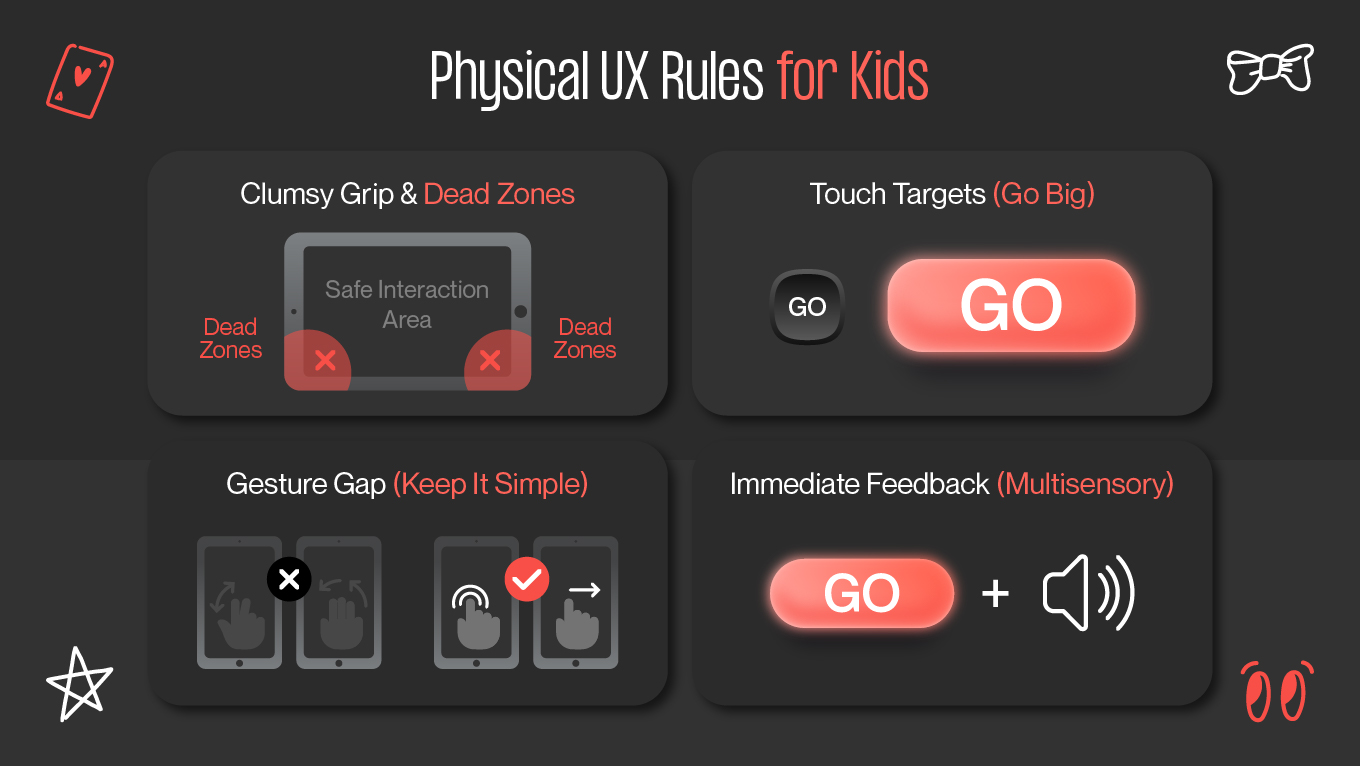
Watch a 4-year-old hold an iPad, and you will notice a distinct difference from adults. Children often hold tablets with both hands or lay them flat on a surface. Their thumbs accidentally rest on the screen, causing unintended taps. If the interface doesn’t account for this, accidental navigation becomes inevitable.

The Design Fix

Interfaces for children should include intentional “dead zones” along the edges of the screen. These are areas that do not trigger critical actions. Placing “Home,” “Back,” or exit controls near the bottom corners causes constant false taps due to gripping thumbs.

Instead, critical navigation should be pulled inward toward the visual center of the screen. Edge areas should be reserved for non-destructive actions or ignored entirely.

Touch Targets (Go Big or Go Home)

Apple’s Human Interface Guidelines suggest a minimum tap area of 44x44 points for adults. For children, this size requires a level of precision they simply don’t have.

Kids don’t tap with a fingertip. They press with the full finger pad, often at an angle, and sometimes with multiple fingers landing at once. Accuracy is secondary to force and enthusiasm.

The Design Fix

Interactive elements should start at a minimum of 60×80 points for young users. However, size alone is not enough; correct spacing between elements is equally critical. Buttons placed too close together will register accidental or multiple inputs, causing confusion and irritation. Generous padding allows the interface to adapt to kids’ vague movements.

The Gesture Gap: Keep It Simple

Modern apps rely on complex gestures: pinch-to-zoom, three-finger swipes, or long-press context menus. For children under 7, these gestures are not intuitive, so they are physically demanding.

A pinch gesture, for example, requires coordinating two fingers moving in opposite directions simultaneously. Preschool-aged children haven’t yet mastered this level of motor control, making such gestures unreliable and frustrating.

The Design Fix

Stick to “Primal Gestures”: 

  • Avoid double-taps, which often register as two slow taps rather than a single intentional action.

  • Avoid multi-touch gestures entirely. 

  • Embrace simple, single-direction swipes (like turning a page in a book), which lead directly to physical experiences children already understand.

If a gesture cannot be demonstrated visually in under one second, it is too complex.

Durability and Feedback

Children are "heavy-handed" users. They press with confidence, repeat actions rapidly, and expect instant results. When feedback is delayed even by half a second, they assume the input didn’t register and try again, often repeatedly.

This leads to “rage tapping,” not because the child is impatient, but because the system is silent.

The Design Fix

Provide immediate, exaggerated feedback. 

  • Visually, buttons should respond the moment they’re touched: squashing, growing, changing color. 

  • Audibly, a clear click, pop, or confirmation sound reinforces the action. This multisensory response reassures the child that the system has understood them.

Good feedback teaches trust. When children feel heard by the interface, they stop testing it and start engaging with it.

physical ux rules for kids
how to design ux for kids

Designing for the Pre-Literate Mind

Imagine trying to navigate a website written entirely in a language you don't speak. You would rely on pictures, shapes, eye-catching illustrations, and trial-and-error to find your way. This is the exact experience of a pre-literate child (ages 3–5) using an app.

For this demographic, text is invisible noise. To build a successful UX for kids at this age, you should abandon the reliance on written instructions and embrace a "Show, Don't Tell" philosophy.

Voice User Interface (VUI) is Mandatory

If a child cannot read “Tap the green button,” the interface has to say it out loud. For users aged 3 to 6, Voice User Interface can be a navigation system.

Voice guidance replaces written onboarding, tooltips, and error messages. It explains actions, confirms success, and gently redirects mistakes in real time.

  • Don't use a robotic voice (like Siri or Alexa). Pre-literate children respond much better to character-driven narration. A friendly mascot, like a bear, animal, or character similar to a peer, turns instructions into dialogue.

  • Pre-literate children forget instructions almost immediately. VUI should account for this by automatically repeating prompts if no action occurs within a short time. A gentle reminder, like “Remember, drag the star to the moon!” reinforces learning without causing stress.

Icon Literalism

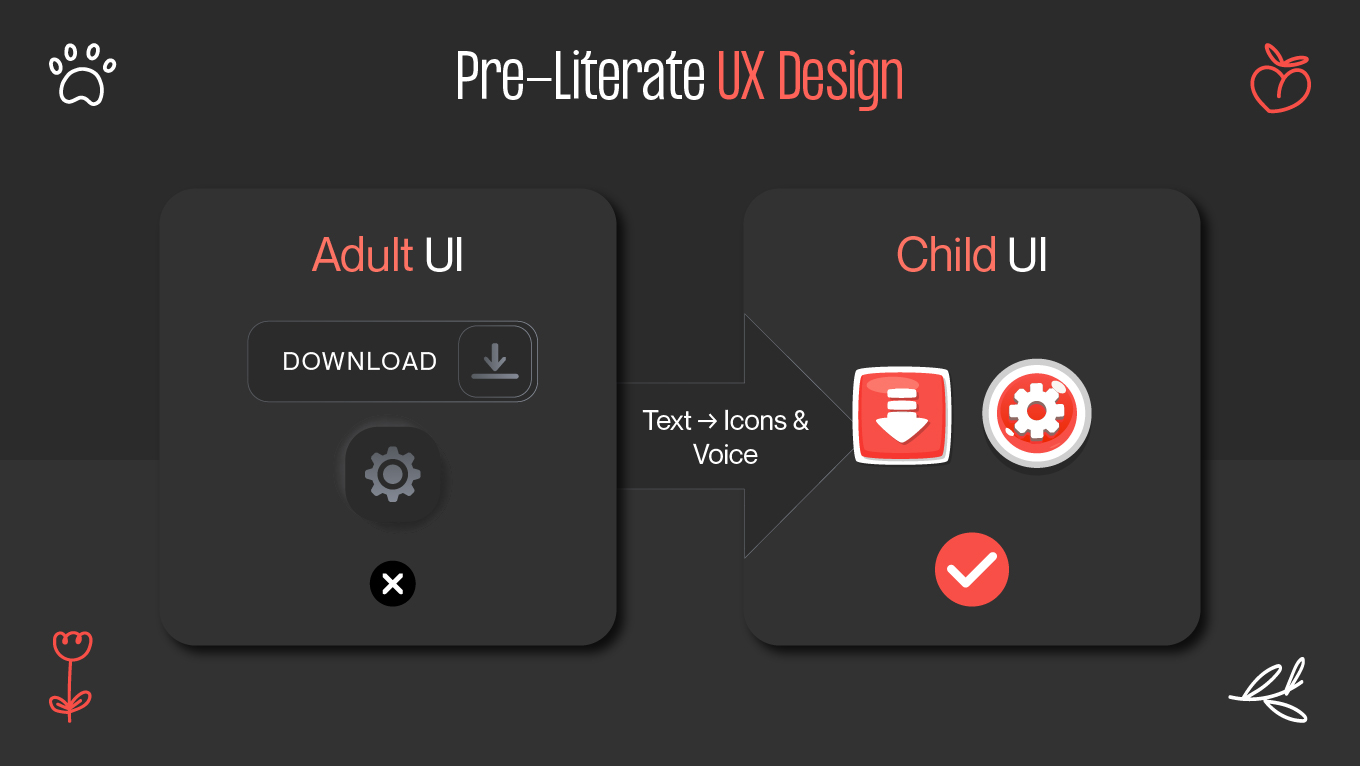
Adults navigate interfaces using learned visual shortcuts. We know that three horizontal lines mean “menu” and a magnifying glass signifies “search” because we have seen them many times.

Children haven’t. To a 4-year-old, these icons are just abstract shapes without meaning. Without prior exposure, the symbolism fails completely.

Use the rule of literalism: Icons should look exactly like the physical object they represent. Consider creating corresponding engaging illustrations.

Concept

Don't Use (Abstract) ❌

Do Use (Literal) ✅

Why?

Settings

Gear / Cog ⚙️

Parent / Wrench 🔧

Kids don't understand system configuration; they understand "fixing" or "adult help."

Back / Exit

Arrow ⬅️

Door / House 🏠

An arrow is a direction; a door is a physical exit they recognize.

Save

Floppy Disk 💾

Backpack / Chest 🎒

Children have never seen a floppy disk. A backpack is where they physically "keep" things.

Menu

Hamburger (3 lines) ☰

Literal Objects

Three lines mean nothing. Show the actual items (e.g., a map for levels).

The "State Change" Feedback Loop

Since pre-literate users cannot read confirmation messages such as “Saved successfully” or “Action completed,” they rely entirely on visual and sensory cues to determine whether something worked.

  • Visual Confirmation: When a child correctly places a puzzle piece, it should not just fit in place; it should glow, animate, sparkle, and produce a satisfying sound to let them know they succeeded.

  • Negative Feedback: Mistakes should never feel like failure. Avoid red “X” symbols, sharp sounds, or buzzer effects. Instead, incorrect actions should gently reset, such as a piece bouncing back with a soft “whoops” sound, framing the error as playful exploration rather than something to avoid.

By designing for the pre-literate mind, you aren't "dumbing down" your interface. You are making it universally accessible, relying on intuition and sensory feedback rather than the artificial crutch of text. The key to effective design is the understanding of your target audience.

pre-literate ux design
designing for the pre-leterate mind

Safety and Ethics in UX Design for Children

In adult UX, friction is seen as a flaw. In UX design for children, friction can often be a necessary safety measure.

One of the most important responsibilities when designing for kids is to maintain a clear boundary between “Child Space” (play, learning, exploration) and “Parent Space” (settings, payments, external links). Without this separation, children can accidentally exit apps, trigger purchases, or access content meant for adults. Good UX intentionally places barriers to keep the safe space.

The Parent Gate Pattern

A simple “Are you an adult?” button offers no real protection. Children will tap whatever lets them continue. Effective protection requires a cognitive gate, a challenge that is easy for adults but difficult for children.

  • The Math Challenge: "What is 18 + 5?" (Requires abstract calculation).

  • The Gesture Challenge: "Swipe down with two fingers while holding the volume button." (Requires complex motor coordination).

  • The Literacy Challenge: "Press and hold for 3 seconds." (Requires reading and patience).

No "Dark Patterns"

Children lack the impulse control, skepticism, and contextual awareness that adults have. Using manipulative UX techniques on them is unethical.

  • No "Pay-to-Win": Never design a level that is mathematically impossible to beat without buying a power-up. This holds the child’s progress hostage for money.

  • No "FOMO" (Fear Of Missing Out): Avoid countdown timers that pressure children ("Buy this skin in the next 5 minutes or it's gone forever!"). This creates unnecessary anxiety.

  • Clear Ad Distinctions: If your app has ads, they must be clearly visually distinct from the content. A "Play" button for an ad should never look like the "Play" button for the game.

Data Privacy Is The Invisible Shield

Regulations such as COPPA and GDPR-K are safeguards that show how children should be protected by design.

Collect only what is absolutely necessary. Avoid real names, phone numbers, or exact locations. Use generated usernames instead (e.g., “FastTiger123”). Whenever possible, store data locally rather than in the cloud to minimize exposure.

In the children’s market, safety is the foundation of trust. Parents do not just assess what your app does; they also evaluate whether it respects their child. Lose that trust, and the product is gone, no matter how polished the user experience looks.

Create a safe space for kids with UX design with Gapsy Studio. Drop a line and let’s discuss all the details.

Success Stories: Who Got the UX for Kids Formula Right?

Seeing the rules in action is the fastest way to understand their power. The best examples of UX design for children don't just rely on famous names; they reveal brilliant strategic decisions that directly solved a cognitive or motor challenge.

Toca Boca: The Power of Open Exploration

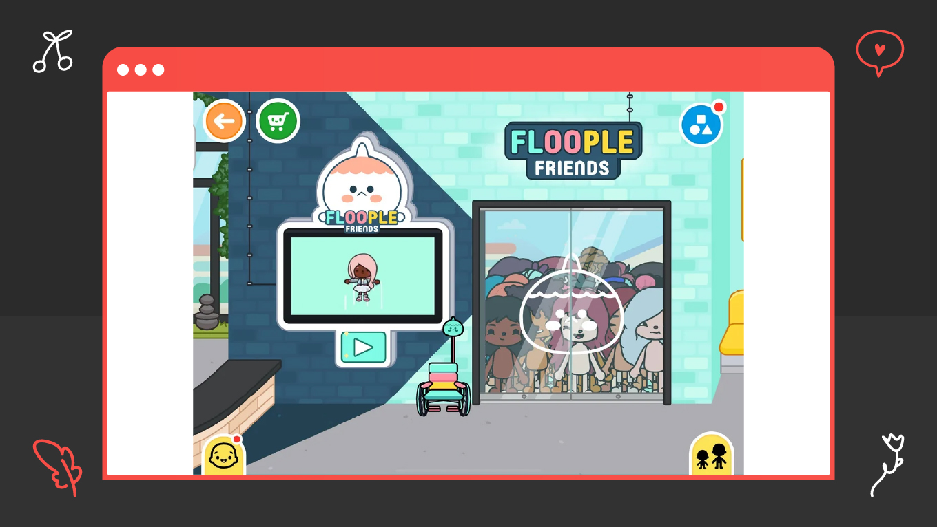
Most apps are goal-oriented ("Match this tile," "Get to Level 5"). Toca Boca wanted to appeal to a child's natural desire for open-ended, consequence-free play.

Toca Boca is committed to Non-Destructive Design and Icon Literalism. Their apps have no scores, no levels, and no text tutorials. The interface relies entirely on drag-and-drop and touch interaction: if a user taps something, it moves, changes, or makes a sound. If they "mess up" the virtual kitchen, they simply reset and start over, eliminating the fear of failure.

Toca Boca proved that the highest form of UX for preschoolers is simplicity through elimination. By removing text, points, and timers, they put the focus entirely on the physical interaction, fostering creativity rather than competition.

toca boca ux for kids
toca boca ux for kids example

Duolingo Kids: Gamified Literacy

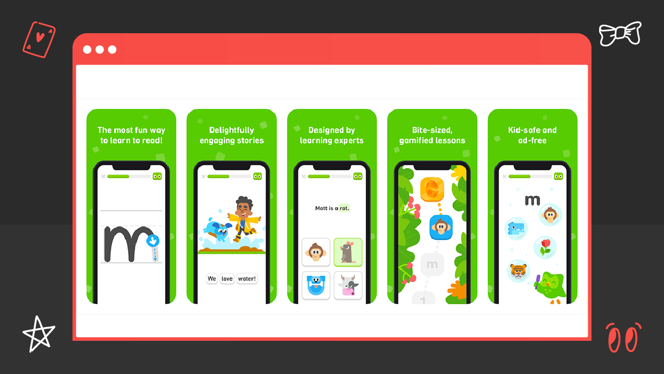
Teaching young children (ages 3–6) to read requires relentless repetition, which is boring. The engagement needed to be sustainable, not just a novelty. UX gamification keeps children interested.

Duolingo’s Gamified Scaffolding became the face of the brand and fits perfectly for kids: 

  1. It begins with simple tracing letters, helping the child master the physical act of writing.
  2. It provides instant, exaggerated reward loops (confetti, happy sounds, mascots cheering) for correct answers.
  3. The app adjusts the pace based on the child’s mistakes, ensuring they stay challenged but not overwhelmed.

For educational apps, the best UX for children blends learning seamlessly with reward loops. Keep in mind that design makes the child want to keep trying, triggering the dopamine necessary for memory retention.

duolingo ux for kids
duolingo ux for kids example

Sesame Street's Digital Experiences: The VUI Masterclass

Sesame Street needed to translate its decades-long success with pre-literate viewers onto digital devices without losing the comforting, instructional voice of its characters.

They heavily relied on a Voice User Interface (VUI) guided by characters like Elmo. Every activity, instruction, and confirmation is narrated by the character the child knows and trusts. This is VUI as emotional guidance.

For the youngest users, VUI is the primary navigation. Using familiar voices (like Big Bird or Elmo) significantly reduces anxiety and makes complex actions seem simple, boosting trust and engagement.

Ready to Build an App That Kids Love and Parents Trust?

You've seen the complexity: the need to manage four different cognitive stages, adhere to strict motor skill guidelines, and implement ethical "Parent Gates."

This level of precision requires expertise in both developmental psychology and product engineering. Gapsy Studio provides that blend. We move beyond generic design to architect experiences that are safe, educational, and delightfully intuitive for your target users.

If you are looking to launch a children's app, educational platform, or family-focused game, let's start with a strategic conversation. We will help you define the key aspects and exact cognitive and motor constraints for your specific age group, ensuring your product succeeds from the very first tap.

Conclusion

The findings in this guide, from the necessity of icon literalism to the strict 60-80 point touch targets, all converge on a single imperative: Design for children is the most nuanced form of user experience design.

You cannot approach the children's market with simplified adult methodologies. To build a product that achieves retention and earns parental trust, you must align your interface with the distinct cognitive, physical, and emotional stages of development.

The future success of your platform depends on its stability, safety, and its ability to seamlessly scale from a pre-literate 4-year-old to a media-savvy 12-year-old without alienating either.

At Gapsy Studio, we treat this challenge as a specialized field of product engineering. We move beyond generic design to architect experiences that are safe, educational, and delightfully intuitive for your target audience.

Create UX for Kids with Gapsy Studio!

We're here to help you develop a product for your target audience.

Rate this article

20 ratings
Average: 4.9 out of 5

If you like what we write, we recommend subscribing to our mailing list to always be aware of new publications.

Do you have any questions? We tried to answer most of them!