Web Design Standards

6minutes read
web design standards

In creating a website design, you remember that it has already developed specific patterns or web design standards. This is influential for new designers or those who have created a site for the first time. According to Google’s study, it only takes 50 milliseconds (that’s 0.05 seconds) for visitors to form a first impression of your website. Sad statistics, isn’t it?

The essential goal of the designer is to catch the user's attention and hold them on the page for further actions. Users can quickly rate a website based solely on emotional reactions and visual attractiveness. However, 38% of users will only leave the site if they find it attractive.

That doesn't mean that your website should consist only of decorative elements. They distract the user from the content they came to the page for. The designer shouldn't pursue personal interests. Good design is different from the one that catches the eye. But one that is business-specific and has a structure in its content. 

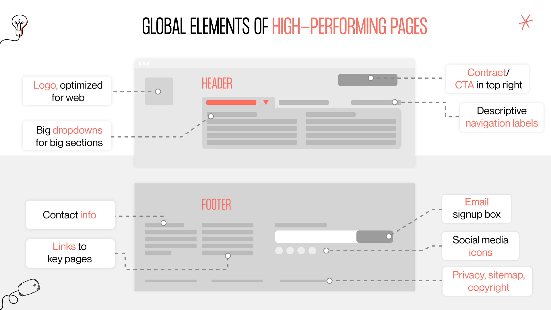
Some standard web design principles make your website convenient and easy to use for visitors. Let’s talk about them.

What are web design standards?

Web design standards are a kind of foundations that the user is completely used to and knows exactly where it is located on the site and such as rules and recommendations for finding something on the site A web design standard is something that website visitors are easily to accept visit after visit no matter which website they use. For instance, you won’t find many websites prominently featuring the company logo in the bottom right section of the footer.

Why web design standards are important?

  • standards help designers to make the site / application intuitive for their users
  • standards help users to immediately find the necessary elements on the site without thinking about where and how the element is located
  • standards will never scare you away from your product because everything in it will be familiar and understandable
  • standards help designers to hold down all the important elements on the site and following them, for sure, nothing important will be missed

Current web design standards

More than 1.5 billion sites currently exist. Their number is increasing every day. Therefore, the competition between sites becomes insanely large. Nearly 50% of small businesses that create their website need to pay more attention to the leading web design standards, and their business has less chance to succeed. The more standards you follow, the more likely your site will be successful and attractive to the user.

It’s very significant to comply with the basic standards for web design since people have become accustomed to it over the years.

Logo in the top left corner

A logo is one of the first and most significant elements of any web design. A lot depends on your logotype's style and aesthetic content, but its location on the site is also influential. Make the logo manageable concerning other elements. But comfortable enough to be clicked on from a smartphone touchscreen, as logos are often the clickable element that brings the user back to the home page.

logo layout as web design standard
standard web design principles for website logo

Site search at the top of the page

One of the essential usability principles is searching for information on the site. The search bar can already be one of the standard provisions in design development. More than half of all sites have a search in the profile header so that the user can easily find something simply by entering a word in the investigation. 

If you look at the page, it has anchor points where the key and most powerful elements should be located. The top side of the page is one of the anchor points — the most prominent place. That's where you should put what you want to draw the most attention to. For example, 68% of users start their interaction with the page from a search engine. In this case — search on the page, which can be placed in the upper right corner.

Social media icons in the header and footer

Social media is an element we should also pay attention to. So, placing them at the top of the page on one of the anchor points, for example, on the left side or at the very top, is a great solution. But also, you can add social networks in the footer so that the user on each page can pay attention to them. This simplifies the user’s task to not search for the company's social networks or the site itself; you can click on these social networks and look at them quickly. 

Contact button (CTA button) in the right top corner

The contact button is crucial for your site, as thanks to this, users can contact you for further cooperation. The probability of future collaboration with your company depends on locating your contact information. Almost half of all websites have a contact button or a link to them in the right corner of each page. This placement is common and standard.

contact button in web page design standards
web design standards for contact information

Horizontal navigation system at the header

The navigation system of your site also plays an essential role. Therefore, it’s vital to think of a navigation system that allows the user to navigate through the pages of your website easily. According to standards, the horizontal navigation placement at the header at the top of every page. 

navigation in web page design standards
navigation web design standards

After looking at common web design standards, it’s time to determine by knowing your location which trends and standards will be present in web design in 2023. 

Bold colors and minimalism

As more and more brands strive to be more visible against the backdrop of many competitors, in 2023, the trend to use bright and bold colors with minimalism in web design continues. However, the essential thing to remember is that the design should be user-friendly to the users' perception, and the content comes first. Therefore, use bright colors with caution and don't go overboard with the colors.

web design standards 2023 for colors
color web design standards in 2023

Website loading speed

Fast page load speed is also a web design standard. It gives sites priority in search engine rankings and improves conversion rates. And according to statistics, users, on average, expect a web page to load in 3 seconds. If it takes longer, they can switch to another, faster site. 

Read more about conversion-centered design principlesin our blog.

Personalized content

The personalized web page content is based on the fact that the site can track users' location and search history to offer them the most relevant information. For example, the site can provide content relevant to you by knowing your location. Or, it remembers the results of your recent searches and offers similar information. 

web page design guidelines
personalization as web design standards

Voice Input

41% of young people use voice input to search for information, and at least half of all smartphone users do. This contributes to changes in interface design and the addition of voice assistants. For example, the well-known Google search engine has a voice-activated search capability. 

Microinteractions

We remember that micro-interactions are small animations that provide user interaction and feedback. The designer can draw more attention and encourage the user to take the action they want. In 2023, it’s still actually in web design. 

Learn more about Microinteractions in Design by reading an article on our blog. 

Dark mode

Designs with a dark mode feature are gaining in popularity. So, this can already be included among the standards for 2023. Designers use The dark mode for a variety of reasons. On the one hand, it positively affects the users' eyesight and helps relieve the strain of a long view of the screen. But dark design also has an aesthetic function. It looks modern and elegant. And it's easy to distinguish the rest interface elements. 

web design standards 2023
dark mode in web design

Space

The design goal is the proper presentation of content to users. For this purpose, the “white space” was applied. However, it isn't necessarily white, so its other name is “negative space” or “space.” This is the space between the individual elements of the interface. The more of it, the better users perceive the content, and it's easier to highlight key features. 

Wrapping up

Having examined website design rules and standards above, you can easily attract a lot more customers to website by following them. Web design standards will help you make your site more acceptable to the user because well-known and easily accessible elements are always pleasing to eyes and easier to use then heavy and complex website interfaces.

This simple web design standards checklist can make your site much more profitable and popular among your customers and users, so if you want to get an unforgettable, fashionable, and good looking website or application, you can contact our Gapsy Studio design team and you will definitely get a website or app that you have long dreamed about and which was so lacking to promote your business that meets your business needs. You can observe our studio web design services to make sure that we give our whole soul to our projects and are ready to help you achieve your goal in creating your best website or app.

Rate this article

20 ratings
Average: 4.9 out of 5

If you like what we write, we recommend subscribing to our mailing list to always be aware of new publications.

Do you have any questions? We tried to answer most of them!