What Is a Style Guide And Why You Need It?

8minutes read
what is a style guide

Website creation is becoming an increasingly complex task that requires the involvement of more and more people. It is crucial that the result looks holistic and organic, meets business requirements, and creates a pleasant user experience.

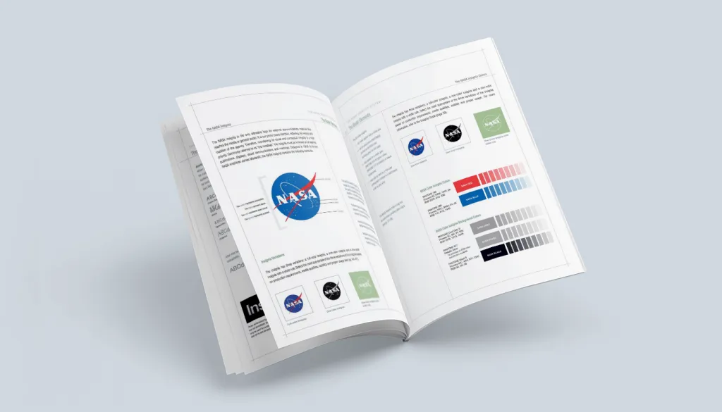
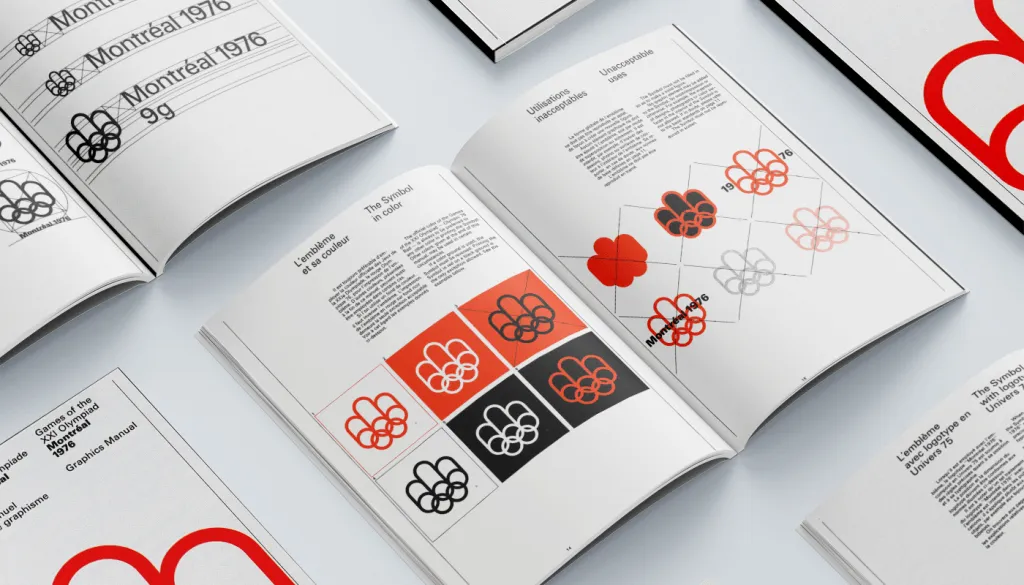
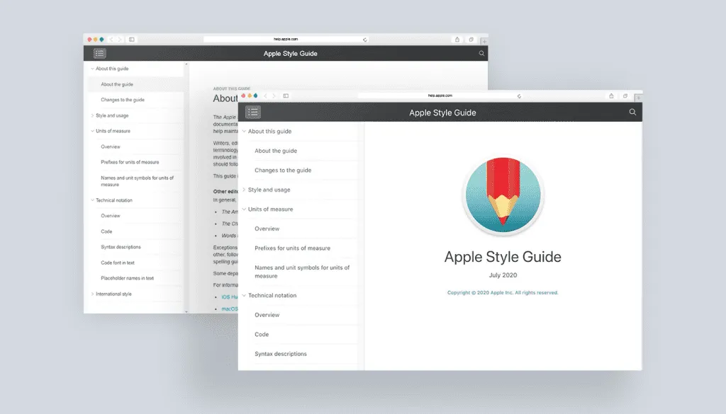
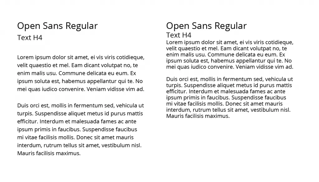
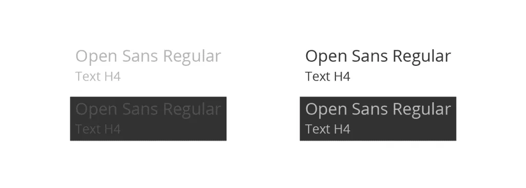
When many specialists work on one task, it becomes necessary to create design documentation or a style guide. In this case, even if different specialists will work on other pages, the overall design will be holistic and compatible. This style guide will help all team members in the future.

In this article, we’ll show you what it is, what it is for, and how to create a style guide. Don’t miss it!

What is a style guide?

A style guide means a specially designed system of carefully selected and arranged elements and rules. The style guide should form a single style and holistic design for both developers and designers when creating a site, its pages, and components. Specialists from various fields are involved in implementing such projects. Such a kind of “set of laws” allows avoiding mistakes and inconsistencies of the result with the original design idea in the process. Each stage of the style guide is a crucial brick; the final result will depend on the correct form, color, and installation timelines.

Great style guide examples

We would like to give you an example of several companies and their style guides. Each one showcases its own unique brand identity design that sets it apart from the competition yet delivers a personalized and familiar experience to its audience. According to the study, 86 percent of interviewed think it’s essential to present their brand consistency in all the places people might encounter. And to follow brand consistency, you need to follow the style guide.

NASA style guide

They use a Chicago-style guide and educational approach. They present their editorial style, allocate a separate place for grammar, spelling, and naming.

Nasa style guide example
style guide example Nasa company

Montreal Olympics style guide

The graphic design of the Olympic Games in Montreal, created by designers Georges Huel and Pierre-Yves Pelletier, is considered one of the most successful and the Olympics’ identities in Munich and Mexico City. In 1976, a detailed guideline was also published, which, like the Montreal Olympics’ souvenirs, is still hunted by collectors today.

Montreal Olimpic games style guide example
style guide example Montreal Olympics

Apple inc

These are detailed guidelines for companies selling Apple products. It describes how online stores, advertising posters, banners, and other materials related to Apple products’ sales should look. Besides, the guideline shows common mistakes made by the company’s resellers.

Apple style guide example
style guide example of Apple incorporation

Why is a style guide important?

SG is essential when more than one designer is working on a project. This will ensure that they don’t add too much to the detriment of the overall design concept. In development, a style guide is also helpful because developers initially receive a list of elements that can be created and reused. They will understand exactly which parts need to be written and how they should look in the end. The designer should include in the manual a complete description of the elements: their state when clicked, hovered over, etc.,choosing to make the developer’s life easier.

Style guide benefits

Why does your project need a SG? Style guide gives a business the following benefits:

  • Encourages designers and other team members to make the interface organic, scalable and flexible in the system;
  • It helps to make a consistent visual identity and a more logical interface system, which leads to better UX design;
  • Makes the development of interfaces systematized and additive;
  • Helps broadcast the identity of the interface to other team members or clients;
  • Provides a more cohesive proposal and quickly makes clear interface elements that vary;
  • Provides clients with benefits in terms of the project’s quality and as a means of communication;
  • Provide the company a brand consistency. Researches show that 95% of organizations have branding guidelines, but only 1/4th have formal guidelines that are consistently enforced.

Style Guide Template from Gapsy

We offer you 6 points to create the right style guide that will be a faithful assistant to your team and provide a systematized and flexible interface. Each stage of the leadership is a vital brick; the final result will depend on the correct form, color, and installation timelines.

1) Color palette

For each site, the color scheme is selected individually. The palette includes primary, secondary, and neutral colors. At the same stage, color solutions for buttons and hovers are chosen.

The likelihood of errors and subsequent design revisions during layout is excluded since each of the colors is assigned a unique code. The percentage of the colors of the future site relative to each other is also recorded here.

Advice

Color palette harmonization allows you to correctly place style accents and highlight areas you want to focus on users’ attention.

choose right colors for a style guide
style guide colors

Read more on how to choose the right color in our article How to Choose the Correct UI Design Colors for Your Product to Reinforce Your Business.

2) Typography

Good typography is a quality that a person visiting your site doesn’t notice but feels. The success of the resource largely depends on the correct choice of font.

A properly designed site evokes a sense of logical completeness. And the illiterate use of typography, on the contrary, will cause bewilderment among users. The website design should be clear and understandable.

Advice

Use the minimum number of fonts. More than three different fonts on one site will look as if it was not a professional who worked on its creation but an amateur. A study conducted by Dr. Kevin Larson of Microsoft and Dr. Rosalind Picard of MIT showed that when the passage was typographically well-formatted, people were so engrossed in the subject that they underestimated the time they spent reading it.

Here are some typography rules:

Rule 1 – Minimize fonts number

Reduce the number of typefaces (font families) used to a minimum: two is more than enough, one is the best option. And stick to a consistent style when developing your site. Here’s an example of how not to do it:

wrong fonts example for style guide typography
style guide wrong fonts example

Rule 2 – Length of Strings

Place about 60 characters per line if you want your text to be easy to read. The correct line length is the key to the readability of your text.

Rule 3 – Line Spacing

Increasing the spacing enhances the vertical space between text lines, improving readability and reducing text. The line spacing should be 30% larger than the height of the characters themselves to be well-read.

make proper line spacing in your style guide typography
style guide typography line spacing

Rule 4 – Contrast

The play of contrasts is also essential. Identical colors for background and text are not allowed. And the text that is highlighted with space will draw attention to important information.

try contrast in style guide typography
style guide typography contrast

3) Components

This section contains all types of buttons used to create the resource. Also, links, checkboxes, check buttons, and other tools allow you to conduct a dialogue with the user. This is a familiar and standard site design element, but you need to pay special attention to it during work. This is important because the components provide interaction between the resource and the user.

Advice

The task of the buttons is to lead the user to perform the required action. The inability to quickly find the one you need is, at least, an annoying hindrance, but at the most, a fiasco.

Tips for creating:

Rule 1 – Buttons should look like buttons

How does the user know which element is in front of him? The button should be in the form of a button for ease of understanding—the main guideline for color and shape.

components of style guide like buttons
style guide components: buttons

Rule 2 – Inscriptions

The labels on them must be appropriate for the action being performed. Describe clearly what happens when you click it.

components of style guide like inscriptions
style guide components: inscriptions

Rule 3 – Unity of Style

It is essential to maintain a consistent style throughout the interface to find the application buttons easily.

Rule 4 – Accents

A call to action button should be contrasting, and an unused button should indicate that an action is possible.

components of style guide like accents
style guide components: accents

4) Text fields

The states of input fields (normal, active, erroneous) and drop-down lists are displayed here. Dimension is also written in this block. A single design style will subtly push the user to enter the necessary information.

Advice

The chances of filling out the form you want will increase significantly if you leave only the required fields. It is necessary to highlight the information about the errors made when filling out.

5) Logo

This block contains the rules for using the logo on the site, listing the allowed color combinations and the correct ratio of indents and lines. Here you can see its vertical and horizontal arrangement, methods of working on the background, permitted and prohibited (changing color, font size, letter spacing, transformation, word wrap) actions with a corporate font inscription.

Take a look at how the logo should look like in one of our recent projects. Here are the options for using the logo.

logo design for style guide
style guide logo

Advice

A logo is the first step towards the formation of a corporate identity. It sets the tone for the entire site and sets the mood.

Still not sure how to make a cool logo for your business? Then read our Ultimate Guide on How to Design a Great Logo For a Business soon.

6) Grid and padding

In a well-developed design project, a bootstrap grid is used, along which all the components of the site are aligned. This is important for creating a general compositional concept and the possibility of adapting the resource for various devices – netbooks, tablets, and smartphones.

The grid helps you maintain the correct proportions without calculating the required parameters and distances each time. Having laid down their basic patterns once, when building a grid, it will be enough to adhere to them in the future simply.

Advice

The most common layout used in layouts is a 12-column grid. But exceptions are possible. Both in theory and reality, it can have any number of them and adapt to each project’s parameters.

Summing up

In general – The style guide ensures the integrity and inviolability of many components of the values ​​identified at the beginning of the brand and acts as a custodian of these values ​​throughout its path. Thus, when taking any steps, we must compare them with the constants set out in the Style Guide to not accidentally betray the expectations of the target audience and not violate the values ​​that they have declared. The task of the Style Guide is to keep the brand within the chosen course. When he is not there or is not fully fulfilling his task, the brand will throw from side to side from campaign to campaign, and this clearly will not help build trust with the audience.

If you are looking for a company that can make you a quality style guide that will provide a functional interface for your product in the long run, we offer you our professional designers’ services. We know exactly what you need because we keep up with all fashion design trends and constantly learn new things. Convince yourself of our professionalism by our projects at Dribbble and Behance and take a look at our services and what we can provide you in your work.

Rate this article

20 ratings
Average: 4.9 out of 5

If you like what we write, we recommend subscribing to our mailing list to always be aware of new publications.

Do you have any questions? We tried to answer most of them!