Uncovering the Latest B2B Website Design Trends

13minutes read
b2b web design trends

Your сustomers don't care about your "E-books" tab.

In fact, according to the latest Demand Gen Report, only 18% of buyers want content organized by format. What are they looking for? Solutions to their pain points (52%) and answers to specific business topics (51%).

This signals a massive shift in B2B web design trends: your site structure is no longer just a sitemap; it is now an active part of the product evaluation process. If your navigation doesn't align with buyer intent, you just frustrate users and slow down deal velocity.

With 12+ years of hands-on design experience, we at the Gapsy team prepared a comprehensive guide to B2B website design trends for 2026. This article provides strategies to remove friction, accelerate consensus, and turn your UX into a revenue engine.

Key Takeaways

  • B2B website design trends now prioritize self-serve evaluation that proves fit, risk, and time-to-value without a call

  • Rep-free buying expectations raise the bar for interactive demos, scannable integration, security clarity, and proof that is easy to forward internally

  • “Zero-learning” UX wins when pre-built workspaces and embedded guidance reduce time-to-first-value in a measurable way

  • Role-based personalization should help buying committees align by tailoring hierarchy and evidence without fragmenting the core narrative

  • AI becomes differentiated only when it is embedded in decision moments with explainability, guardrails, and auditability

How B2B Website Design Trends Shape the Buying Journey

B2B web design trends are converging on one central requirement: the website has to function as a self-serve evaluation environment. In practice, that means the site should help a buyer do real pre-sales work without guidance. 

Buyer expectations have shifted toward meaningful evaluation before sales contact. Gartner reports that 61% of B2B buyers prefer an overall rep-free buying experience. Demand Gen Report also cites research showing buyers are nearly 70% through their purchasing process before engaging sellers, and that buyers initiate first contact 80% of the time. 

To support this rep-free journey, design should pivot from storytelling to proof. This requires interactive demos that mimic real workflows, scannable security protocols, and "forward-ready" assets that stakeholders can validate independently.

Below is a short table that maps each trend to what it actually is, where it hits the journey, and what it changes for the buyer.

Trend

What the trend is about

Where it impacts the journey

What does it change for the buyer

“Zero-learning” first session experiences

Guided product exploration that delivers immediate value with pre-built workspaces, embedded guidance, and fast setup

Early evaluation

Buyers reach a credible “I can see this working” moment quickly, without training or calls

Role-based personalization

Dynamic content and UI hierarchy tuned to exec, ops, IT, and procurement needs, while keeping one consistent story

Committee alignment

Each stakeholder finds relevant proof fast and can share it internally without rewriting the narrative

Intent-driven navigation and task-led search

Navigation built around user intent and tasks, where search returns actions and destinations

Self-serve exploration

Buyers get answers by stating what they are trying to do, instead of learning your menu structure

Trust-building interface patterns

Governance made visible through audit trails, data lineage, security posture, and clear compliance cues inside workflows

Risk and approval stages

Reviewers can validate controls and accountability quickly, which reduces uncertainty and back-and-forth.

AI shown as decision support

AI integrated into decision moments via summaries, scenarios, and next-step guidance with explainability and guardrails

Differentiation and adoption

Buyers experience AI as a practical leverage that they can

If your site relies on "Contact Sales" forms rather than self-serve proof, you are likely losing buyers who prefer a rep-free experience. Drop us a line to audit your current flow and identify the friction points slowing down your deals.

“Zero-Learning” B2B UX Design Trends

Gartner has found a strong preference for rep-free motion, and research also shows buyers do a large share of evaluation before they ever talk to a supplier. That combination creates a design requirement that many B2B sites still underinvest in: the first session has to feel like progress.

This is a classic B2B vs B2C website design gap. B2C onboarding can lean on exploration and delayed payoff, but B2B buyers need early proof of workflow fit because they are evaluating operational impact. Let’s review key zero-learning B2B UX design trends.

Using Pre-Built Workspaces for Instant Engagement

Pre-built workspaces are the cleanest way to collapse the distance between “I get it” and “I can use it.” Instead of dropping a first-time visitor into an empty state with generic onboarding, you give them a working environment that already reflects a real job to be done.

Examples

  • SOC triage queue with sample alerts

  • RevOps pipeline view with realistic deal stages

  • Procurement savings dashboard with a believable category breakdown

On the website, the equivalent pattern is a guided product environment that behaves like the first screen of the application. Think interactive “choose your role” entry points that load a relevant workspace, populated with sample data and a short, structured sequence of actions: 

  1. Review
  2. Filter
  3. Explain
  4. Export
  5. Share

Contextual AI Guidance in Core User Actions

Contextual AI is useful in B2B only when it is attached to a specific action the user is already taking. If your “AI assistant” lives as a chat box that requires the customer to ask the right question, it is still a learning burden. The stronger pattern is AI guidance that appears inside decision moments: 

  • When a user configures a report, the UI offers a suggested view with a short rationale

  • When they adjust thresholds, the UI shows expected impact ranges

  • When they investigate an anomaly, the UI proposes likely drivers and links them to the underlying data

For a marketing site, you can bring that same pattern into self-serve evaluation through interactive explainability. 

Example

In a sandbox demo for an analytics product, a user clicks “forecast,” and the interface reveals a “why this result” panel with the top contributors and the data sources involved. That is trust-building and time-saving, and it reduces the cognitive load of figuring out whether the product is doing something sensible. 

Time-to-First-Value as a UX Performance Metric

If you want to get a real business impact from a B2B web design trend like “zero-learning”, you have to operationalize it. Time-to-first-value is the metric that forces clarity: define the first meaningful outcome a new user should achieve, then measure how long it takes and where they get stuck.

Amplitude’s benchmark research draws a straight line between early value and long-term loyalty, revealing that 69% of top performers in seven-day activation also lead the pack in three-month retention. If your website design delays that "aha!" moment, you risk a bounce and cap your future LTV.

From a website or mobile app design and acquisition standpoint, treat Time-to-First-Value (TTFV) as a bridge metric between marketing and product branding design. If your site drives sign-ups but your first value event takes days, your funnel is structurally leaky, and sales will feel it in a lower-quality pipeline.

B2B UI Design Trends for Role-Based Personalization

It sounds counterintuitive, but the data is clear. While marketers are obsessed with hyper-personalizing content for individual leads, Gartner research reveals a dangerous side effect: delivering conflicting narratives to different stakeholders creates "unhealthy conflict" in 74% of buying teams.

Even worse, when personalization focuses solely on individual relevance without a shared framework, it can negatively impact consensus by 59%.

The average enterprise buying group now includes 6 to 11 stakeholders across incompatible functions (e.g., Finance, Security, Ops). If your UI serves the CFO a narrative about "cost reduction" while serving the CTO a narrative about "innovation," you fragment the committee. Moreover, your website forces stakeholders to agree on which goal matters more, rather than agreeing that your product solves both.

This is why the best role-based UI patterns do two things at once: they speak directly to the person in front of the screen and make the story easy to share across the committee without losing consistency. 

So now, we’ll discuss some of the B2B UI design trends for role-based personalization.

Dynamic Content Rendering by Buyer Role

The simplest signal is the declared role, but the strongest one is behavior. If someone lands on your site and immediately goes to security, integration docs, or deployment guides, they are telling you what they are accountable for. Shift visual weight in design toward the proof that the role cares about, and reduce it on secondary content. 

Your UI should respond with a role-appropriate path that is still consistent with the core narrative. 

How this can work 

An example can be a data platform vendor that can render the same product page in three role modes without UI/UX redesign:

  • The CIO's view defaults to architecture, governance, and security posture

  • The analytics lead view defaults to time-to-insight, semantic layer, and reporting workflows

  • The finance view defaults to cost drivers, consolidation scenarios, and an ROI calculator

The page is structurally the same, but the hierarchy shifts to match the reader’s job.

Stakeholder-Specific Value Messaging

Most teams underinvest in value messaging because they treat it as “copy.” In B2B, value messaging is a coordination mechanism. Demand Gen Report’s data is blunt about what triggers engagement. Buyers said memorable content should use data and research to support claims (51%), be research-based (41%), tell a strong story that resonates with the buying committee (49%), and be packed with shareable stats and quick-hitting insights (41%). 

That maps directly to B2B UI design trends requirements: every role-specific view should include “forwardable proof” in the interface. Put the numbers, assumptions, and constraints where they can be screenshot, copied, or shared in a buying-team thread without losing context.

Scaling Demos with Adaptive UI

Role-based personalization becomes commercially serious when it changes the demo. 

Static demos force every stakeholder through the same “tour,” which usually fits nobody. Adaptive demos and responsive design trends let each stakeholder validate what they care about in minutes, then hand off a coherent narrative to the rest of the group.

An adaptive demo is one of the few website-level investments that can be designed for that hybrid reality. It gives buyers control, while providing sales a shared artifact to anchor the conversation. This way, the committee does not fracture into parallel interpretations.

How an implementation may look like 

  1. The demo starts with role selection and industry context, then loads a pre-built workspace with realistic data, KPIs, and tasks
  2. The CFO path opens on a cost and risk dashboard with scenario toggles and an exportable business case summary
  3. The operations path opens on workflow views, alerts, and exception handling. The admin path opens on SSO, RBAC, audit logs, and integrations
  4. The UI provides “share with your team” outputs that are consistent across roles, so each person can bring the others along instead of starting a new argument

Intent-Driven Navigation in B2B UX/UI Design Trends

Intent-driven navigation is a response to a basic reality: in complex B2B products, users arrive with a job to finish, usually under time pressure, often while juggling multiple systems. McKinsey Global Institute’s breakdown of an interaction worker’s week puts “searching and gathering information” at 19% of the time, and it estimates that better collaboration and knowledge flows can lift productivity by 20% to 25%.

That’s why B2B website design trends for intent-driven navigation are vital. Let’s take a look at them.

Search-Led Navigation for Real Work Tasks

Task-based search becomes the primary interaction layer when it is treated as navigation. The design shift is that search needs to return actions and destinations. 

In a procurement platform, “create PO for vendor X,” “find approvals stuck,” or “policy for exception limits” should resolve to the exact workflow step, with pre-filtered context. In a security product, “show critical alerts last 24h,” “who changed this policy,” or “export audit trail for system Y” should land users directly in the right view with the right scope.

The common thread is relevance. The same discipline you apply to buyer journeys, “get me to what I need quickly, without forcing a conversation,” should also show up in product navigation patterns and SaaS design.

Natural-Language Commands That Convert Intent Into Actions

Natural-language commands earn their place in B2B UX design trends when they remove the translation work between a user’s intent and the system’s required inputs. The payoff is highest in analytics, reporting, and admin-heavy surfaces where legacy UI patterns force people to think in filters, objects, and field names instead of outcomes. 

A paper on a natural-language search capability inside a major CRM reported user studies where creating dynamic reports via natural language saved users more than 50% of their time compared with navigational search. 

The possible implication

  • Natural-language commands work best in analytics, reporting, and admin workflows where “UI-as-a-schema” slows users down

  • They convert intent into an executable draft (report, view, action), then expose parameters for refinement

  • These commands should surface assumptions explicitly so users can confirm or correct before acting on outputs

  • Their success metric is reduced steps and time-to-completion

B2B Website Design Trends for Trust-Building Interface Patterns

As more of the evaluation happens without a seller in the room, trust has to be designed into the experience. A Dynatrace survey reported security and compliance as one of the top barriers to scaling agentic AI, cited by 52% of respondents. 

Trust-building patterns work best when they are embedded in the exact moments where enterprise risk is evaluated: security posture, data handling, auditability, and the reliability of AI outputs. We’ll reveal the main B2B web design trends for trust-building interfaces.

Audit Visualization for Enterprise Accountability

In modern B2B website and illustration design, trust is won when governance is visible at the moment a buyer is evaluating risk. This is why audit visualization is showing up as a front-stage pattern in B2B UX/UI design trends. Buyers increasingly prefer to self-educate without a rep, so the site and product UI have to carry more of the accountability narrative.

A strong implementation makes “what happened and why” readable inside core flows. Think of an audit drawer attached to critical objects like invoices, design for accessibility, policy changes, data models, or AI-generated outputs. The buyer clicks once and sees a timeline of changes, approvals, actors, and the prior state.

What this looks like in practice

  • Timeline-style audit history embedded in key objects

  • One-click “who changed what” views with before and after snapshots for sensitive fields

  • Inline data lineage paths for KPI cards and reports, including sources and transformations

  • Exportable audit evidence that supports internal reviews and external audits

Explainable AI Panels in Operational Dashboards

A lot of B2B UI design trends around AI are still presentation-first. Enterprise teams buy AI when they can defend it operationally. McKinsey reported that 40% of respondents see explainability as a key risk in adopting gen AI, while only 17% say they are currently working to mitigate it. That gap is why explainability needs to live in the interface.

The most credible pattern is an explainability panel attached to each recommendation, forecast, or summary. It should show inputs used, top drivers, confidence signals, and clear caveats. In an ops dashboard, that could mean a “why this alert was prioritized” panel with evidence references. 

What this looks like in practice

  • A “Why this result” panel next to AI outputs, with drivers, inputs, and confidence cues

  • Assumption disclosure, including what data was missing or inferred

  • User controls to adjust inputs and immediately see the impact

  • Audit-friendly capture of the explanation, suitable for sharing and recordkeeping

Procurement Confidence Through Trust Signals

Procurement gets unblocked when reviewers can quickly verify the controls, the boundaries, and the operational posture. This is why B2B web design trends increasingly treat trust assets as part of the primary navigation. The trust-center pattern is becoming table stakes, but the differentiator is how well you embed trust signals into product exploration. 

If a buyer is reading about integrations, show SSO, RBAC, and permission scoping right there. If they are evaluating AI features, show explainability and governance mechanics in the same flow. If they are assessing reliability, surface a transparent status page and incident communication norms.

What this looks like in practice

  • A trust center that is easy to find, structured for reviewers, and kept current

  • Contextual trust callouts on integration and AI pages, including permissioning and controls

  • Clear evidence paths for SOC 2 or ISO posture, data residency, subprocessors, and DPAs

  • Reliability transparency via status visibility and incident communication expectations

  • Explicit AI safety and oversight cues that reduce perceived governance risk

Security is the new sales pitch. If your interface doesn't visualize safety, you are asking the buyer to take a risk they can't afford. Let’s design your website for trust together.

AI in B2B UI/UX Design Trends

AI is now a baseline expectation in modern B2B website design and product UX, but most teams still ship it as a feature bundle instead of an interaction advantage. The opportunity is to put AI where enterprise users feel leverage: inside decision moments, reporting, and handoffs across teams. We’ve prepared key AI UI/UX design trends:

AI-Generated Operational Summaries

Operational summaries are one of the most defensible AI patterns because they collapse time. The best versions summarize what changed, why it likely changed, what the user should check first, and what is safe to ignore. This is a core B2B UX design trend because it targets the real cost center in enterprise work, such as attention fragmentation across tools, tickets, dashboards, and approvals.

A credible example is in RevOps or customer success. The system generates a weekly account brief that highlights expansion signals, support risk, product usage anomalies, and stakeholder changes. It links each claim to the underlying events and lets the user edit assumptions, for example, “treat churn risk as high only if usage drops for 14 days, not 7.” 

Strong implementations also include

  • Summaries anchored to specific objects and moments, for example, account, visual identity, renewal, deployment

  • Evidence links for every key claim so operators can quickly validate

  • Editable assumptions and thresholds so the summary reflects how the business actually runs

  • Export and share formats that support buying committees and internal stakeholders

Predictive Insights in Management Interfaces

Predictive insights are persuasive in B2B UI design trends only when they are coupled to decisions the manager already owns, such as staffing, budget, inventory, risk, pipeline, and SLA adherence. A static chart simply tells a buyer what happened; it’s a history lesson. A dynamic interface allows them to control what happens next.

A practical example is a pipeline health cockpit. Instead of showing a static forecast, the may interface flag which segments are slipping, attributes likely drivers (stage aging, activity decay, stakeholder turnover), then offers scenario toggles such as “what if win rate returns to last quarter baseline” or “what if cycle time increases by 10% in region X.”

Strong implementations may include

  • Predictions tied to a managerial decision, with explicit “what would you do next” framing.

  • Driver transparency and sensitivity ranges, so the forecast is interrogable

  • Scenario planning that is fast enough to use in real meetings

  • Clear boundaries around confidence and data coverage, so stakeholders understand when to trust and when to verify.

AI-Guided Next-Step Recommendations

Productivity is great. Liability is not. We are moving from "suggestive AI" to "agentic AI". These are systems that chat and execute. While this unlocks compounding gains, it creates massive anxiety. Deloitte’s 2026 State of AI highlights a tension: organizations are pushing for autonomy, but their governance maturity can’t keep up.

This B2B website design trend means that the era of the magic button is over. Buyers are now evaluating operational risk as much as feature sets. If your product pages and demos focus solely on speed, you will lose to the vendor that emphasizes safety.

Strong implementations include

  • Recommendations embedded inside the user’s existing flow

  • Clear rationale, policy link, and “what will happen if you accept” preview

  • Permission-aware actions with human-in-the-loop checkpoints for risky steps

  • Built-in audit capture for recommended actions, so compliance review is not an afterthought

How to Apply B2B Website Design Trends for Your Product Growth Strategy

Treat B2B website design trends as a product growth system. The website is now where buyers form their first concrete opinion about fit, risk, and time-to-value. If that experience is generic, sales inherits the cost in longer cycles, more re-education, and late-stage surprises.

The practical move is to align product, design, marketing, sales, and RevOps around three self-serve buyer experiences that you can map and improve end-to-end: 

  1. Evaluate fit
  2. De-risk purchase
  3. Commit.

This is where B2B UX/UI design trends stop being “ideas” and become a prioritized roadmap tied to pipeline quality and cycle time. We’ve prepared a table that will help you align design trends with your product growth strategy:

Design investment 

What changes in the buying journey

Sales performance link

What to measure

Role-based paths for exec, operator, IT, procurement

Faster relevance, less translation across stakeholders

Higher-quality inbound, fewer stalled deals

Conversion by entry path, stage velocity, and internal sharing signals

Interactive demos with pre-built workspaces

Buyers validate workflow fit without a call

Better first meetings, fewer “custom demo” loops

Demo completion, time-to-first-value, follow-on high-intent actions

Trust center plus contextual trust signals on key pages

Security and compliance questions answered earlier

Shorter procurement cycles, fewer late-stage blockers

Time from first trust touch to clearance, repeat question rate

Intent-driven navigation and search that resolves to actions

Less hunting, faster self-serve evaluation

Lower drop-off on pricing, integrations, and docs

Search success rate, exit rates on high-intent pages

AI positioned as decision support inside workflows

Differentiation that feels usable

Stronger competitive positioning, fewer AI objections

Adoption of AI-assisted flows, rollback frequency, escalation rate


How Gapsy Studio Will Help You Stay in Line With B2B Website Design Trends

We have been navigating the evolution of B2B website design trends and mastering UI/UX design to build product experiences that drive business impact since 2014. 

Here is how we partner with B2B organizations to turn their digital presence into a competitive advantage.

  1. We reject generic themes that force your value proposition into a box. Instead, we design tailored architectures that map directly to your buyer's mental model, not the limitations of a template.
  2. Inconsistency kills trust. We handle the full cycle under one roof, from deep-dive research to high-fidelity UI, ensuring your marketing promise aligns perfectly with the product reality.
  3. “Validate before build” is our rule. Each workflow enforces a strict discovery phase (user research, competitive analysis, journey maps) followed by design execution (IA, prototyping), ensuring your product is built on data and strategy.

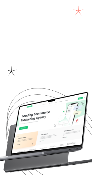
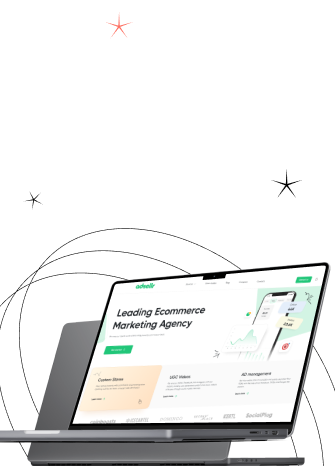
How We Work: Structuring Complexity for Adsellr

To demonstrate how we handle complex B2B workflows, look at Adsellr. This platform helps users launch Shopify stores using templates and video content, then immediately promote products via campaigns.

The workflow was inherently dense. We needed to simplify a multi-step process for two distinct audiences—beginners needing guidance and advanced users needing speed—while maintaining a bold brand identity and enough technical depth for serious use.

Gapsy delivered a clean interface with over 50 responsive screens spanning store creation, product uploads, video preview, and ad campaign setup, using a modular layout to support fast onboarding and flexible customization. Also, we optimized the experience for mobile so users could go from idea to live store in a few steps.

Stop designing for "users" and start delivering for buyers. We help B2B companies translate market trends into measurable business impact. Contact us to audit your current experience and build a strategy that drives conversion.

Final Thoughts

B2B website design trends for 2026 are converging on one operational reality: buyers use your site to do serious evaluation work before they ever speak to sales. This shifts the definition of "good design" from aesthetic appeal to functional clarity. To protect deal velocity, the interface should reduce learning effort, align diverse stakeholders, and make governance legible enough for an internal champion to defend the purchase.

Throughout this guide, we have explored how this shift manifests in specific strategies, from "zero-learning" interfaces that shorten time-to-value to role-based pathways that foster committee consensus rather than fragmenting it. We also examined the necessity of making trust visible, ensuring that AI behavior and security protocols are transparent parts of the user flow. 

When you treat the website as a self-serve evaluation layer, such design choices stop being subjective preferences and become measurable revenue inputs.

Treat adapting to the self-serve model as a strategic pivot. If you are ready to align your site structure with evolving buyer expectations, the Gapsy team is here to translate insights into a concrete roadmap for your brand.

Rate this article

21 ratings
Average: 4.9 out of 5

If you like what we write, we recommend subscribing to our mailing list to always be aware of new publications.

Do you have any questions? We tried to answer most of them!