Marketplace Design Guide: Best Practices and Common Mistakes

14minutes read
ui ux design marketplace

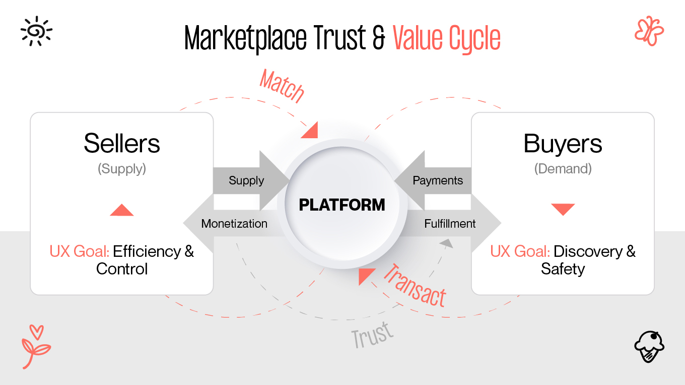
Marketplace web design is arguably the most complex challenge in e-commerce. Unlike a standard online store, where you control inventory, shipping, and quality, a marketplace requires you to act as a referee. You are designing an ecosystem where two distinct user groups — buyers and sellers — have to trust each other enough to transact, often without ever meeting.

The business case for high-quality design is undeniable. Analysis shows that design-centric companies outperform the S&P 500 by 228%. Conversely, 32% of users will abandon a brand after just one poor experience. In the high-stakes, there is zero margin for error.

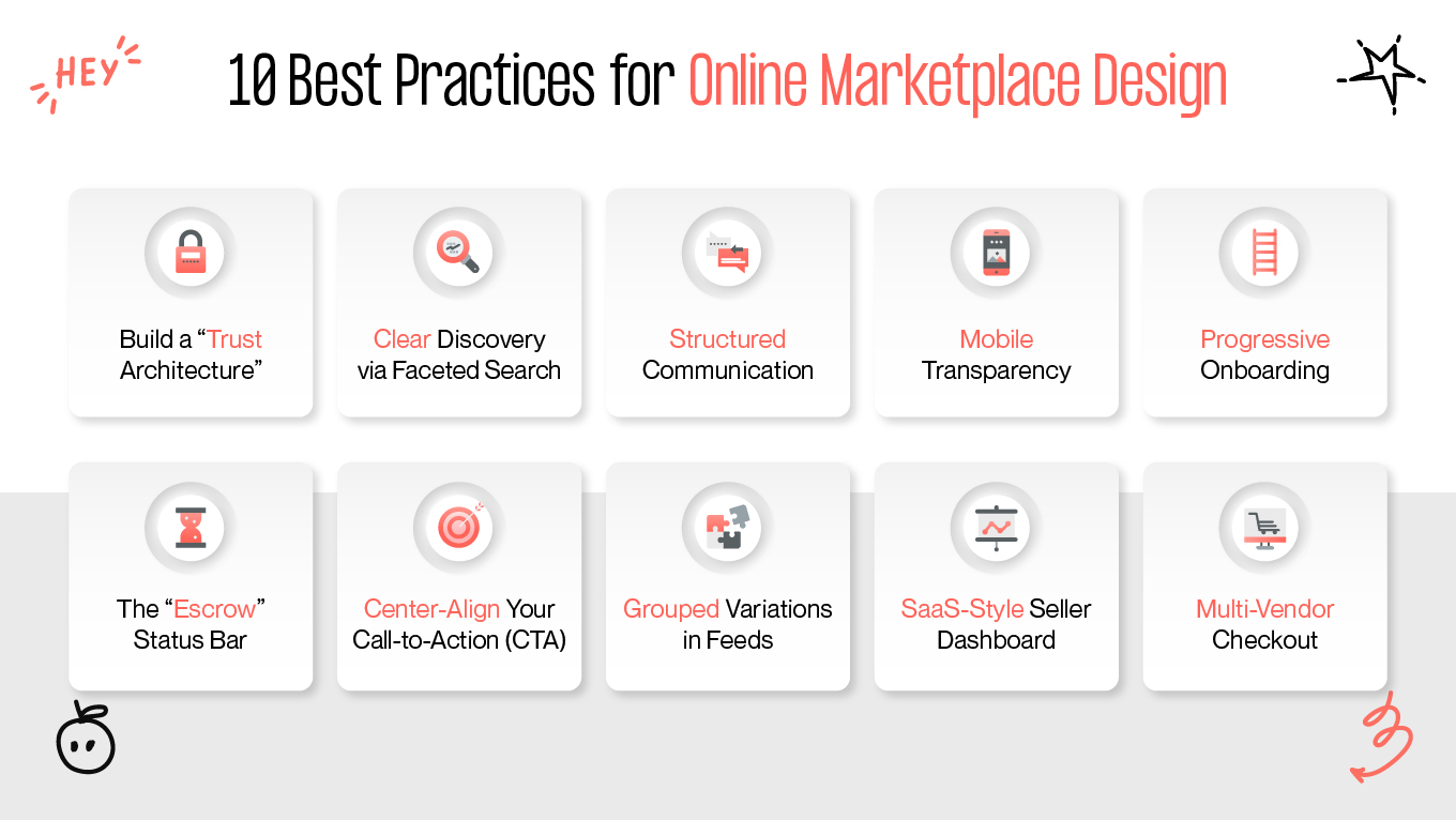
At Gapsy Studio, we don't just "skin" marketplaces; we engineer them. This guide covers how to design an online marketplace that solves the unique friction points of two-sided platforms, focusing on proven best practices and the costly mistakes you should avoid.

How Our Team Engineered Trust in Mylagro Agriculture Marketplace

Theory is useful, but execution is everything. Let's look at how we applied the marketplace design principles in practice for Mylagro, a global platform connecting farmers with international buyers.

The Challenge: The "Low-Tech" Barrier

Mylagro faced a unique version of the "Chicken and Egg" problem. Their supply side (farmers) often had limited tech literacy and low trust in digital payments, while their demand side (international buyers) required rigorous verification and standardized data to make bulk purchases.

So, the friction was: How do you convince a farmer to trust a digital platform with their livelihood?

The Solution: Designing for "Safety First"

How did Gapsy help? We built a governance engine that created an original product:

Solved the Trust Deficit 

After thorough research, we implemented the Tiered Verification System.

  • For farmers: We designed a "Verified Grower" badge system. To get it, farmers didn't just upload IDs; the UI guided them to upload geo-tagged photos of their fields. This visual proof killed two birds with one stone: it verified the user and enriched the product listing with authentic imagery (avoiding the "Stock Photo Trap").

  • For buyers: We designed a visible Escrow Status Bar in the order dashboard. This UI feature visually reassured farmers that the funds were secured by Mylagro before they shipped a single crate.

Simplified Complex Inventory

Agricultural products are complex (varieties, grades, harvest dates). That’s why we avoided "Listings Clutter" by grouping variations. Instead of 50 separate listings for "Gala Apples," we designed a single parent card that allows buyers to select Grade A, B, or C from a dropdown. This kept the search feed clean and scannable.

The "Empty State" Fix

To keep farmers engaged during onboarding, we gamified the dashboard. Instead of a blank screen, new users saw a "Farm Profile Strength" meter. This subtle UI nudge encouraged them to complete their profiles and add payment methods without feeling overwhelmed by a long form.

The Impact

By prioritizing trust architecture and frictionless onboarding, Mylagro successfully bridged the gap between traditional farming and digital commerce. The platform connects thousands of users who previously relied on inefficient, offline middlemen, proving that good marketplace UX design creates economic opportunity.

Gapsy’s team of experienced professionals can help you develop a competitive marketplace. Contact us to discuss all the details.

What Makes Marketplace UX Design Unique?

The fundamental difficulty in UI/UX design marketplace projects is the "Chicken and Egg" problem. You need sellers to attract buyers, but you also require buyers to attract sellers. Your UI should cater to both without favoring one over the other.

This requires a unique approach to marketplace UI design. After all, you build two distinct experiences that intersect at the point of transaction.

While standard e-commerce focuses on "Show → Buy," digital marketplace design focuses on "Match → Trust → Transact." If it fails to facilitate trust between strangers, the platform collapses.

10 Best Practices for Online Marketplace Design

Building a marketplace is a balancing act. You need to provide enough friction to ensure safety, but also enough speed to ensure liquidity. 

So, how to design a marketplace? Based on our experience engineering platforms at Gapsy Studio, here are the ten design standards that separate thriving ecosystems from ghost towns.

Build a "Trust Architecture"

In online marketplace website design, trust sells. 

If buyers don’t trust sellers, they won’t buy. If sellers don’t trust the platform to pay them fairly and on time, they won’t list. That’s why we treat trust as a system of intentional UI elements that work together as psychological safety nets.

  • Visual trust signals: Visual cues are processed faster than text. By following your brand elements across the platform and using stable, familiar colors like blue or green for verification, you tap into well-established psychological associations, reducing anxiety during decision-making.

  • Contextual reviews: A generic 5-star rating rarely tells the full story. Stronger credibility comes from review cards that show “Verified Purchase” tags, timestamps, and context such as “Item as described” or “Fast shipping,” helping users assess relevance. 

  • Tiered verification: Make legitimacy visible and aspirational. A basic email check might earn a grey badge, while ID or business verification unlocks a gold badge. These subtle gamification elements both inform buyers and incentivize sellers to upgrade voluntarily.

Streamline Discovery with Faceted Search

Discoverability is one of the most frequent problem areas in marketplace design. It is easy to see why: a large and unorganized inventory confuses customers, leading to irrelevant results and abandonment. The solution to this problem is Faceted Search.

Instead of simple dropdowns, allow users to combine multiple filters at once, such as “Size: M” + “Color: Red” + “Price: <$50” — with results updating instantly. 

Just as important, always display a clear “Applied Filters” row to keep users oriented, prevent confusion, and reduce the dreaded “zero results” dead end.

Implement Structured Communication

Many marketplace displays are open to interpretation, meaning that some information has to be elaborated or negotiated (e.g., "Is this still available?"). The presence of blank boxes for messages means this process becomes unnecessarily inconvenient. A user will pause, trying to decide what to say and whether to say anything at all.

Open-ended communication should be replaced by systematic communication channels. Quick action buttons such as “Make An Offer,” “Request More Photos,” or “Ask About Availability” make it easy to take action. It turns passive browsing into active browsing by directing a conversation instead of leaving the user to start a discussion on their own.

Prioritize Transparency on Mobile

Mobile users are fast, distracted, and impatient when information is missing. One common oversight is hiding unit pricing. For example, showing “$50” for a bag of coffee without clarifying quantity or weight.

Display price-per-unit (e.g., “$5/oz” or “$2 per item”) directly on the listing card. This small detail builds immediate trust, allows for effortless comparison while scrolling, and significantly reduces unnecessary tap-throughs and bounce rates on mobile.

Master “Progressive” Onboarding

Demanding sensitive information too early, like passport uploads or tax IDs, is a proven conversion killer. Instead, implement progressive onboarding.

Let users sign up with just an email and explore freely. Trigger heavier compliance steps (KYC, AML, payout details) only when users attempt high-intent actions, such as listing a product or withdrawing funds. This way, you’ll keep the top of the funnel frictionless while maintaining full compliance where it matters.

The “Escrow” Status Bar

Uncertainty kills conversions. Buyers worry about receiving the item; sellers care about getting paid. A simple, visual solution is an escrow status bar within the order tracker:

Buyer Pays → Funds Held by Platform → Item Delivered → Seller Paid

This UI element clearly demonstrates the value of your platform’s service fee and positions you as a neutral, protective mediator for both sides.

Center-Align Your Call-to-Action (CTA)

Marketplace product pages are naturally information-dense. Specs, ratings, shipping details, and seller profiles all compete for attention. Your primary CTA has to cut through the noise.

Center-aligned CTAs consistently outperform left-aligned ones because they interrupt scanning behavior and force a moment of focus. On mobile, the CTA should be “sticky” at the bottom of the screen to ensure the path to purchase is always visible, regardless of scroll depth.

Clean Up Feeds by Grouping Variations

Treating every product variation as a separate listing is a fast way to clutter your marketplace. Twenty identical t-shirts in different colors dilute discovery and frustrate comparison.

Instead, use “Parent/Child” listing logic. Show one primary product card and allow users to select variations (color, grade, condition) within the card or on the detail page. This keeps search results clean and makes decision-making easier.

Treat the Seller Dashboard Like a SaaS Tool

Sellers are your supply engine. If managing their business feels painful, they’ll leave. A seller dashboard should function like a lightweight SaaS platform rather than a static order list.

Include clear data visualization: views vs. conversions, pricing benchmarks, fulfillment performance. When something isn’t working, the UI should explain why, for example: “Your shipping price is 15% higher than average.” Insightful feedback turns the platform into a partner. 

Design a Thoughtful Multi-Vendor Checkout

Multi-vendor purchases introduce hidden complexity. Buying a scarf from New York and a hat from London means different shipping costs, timelines, and expectations.

Merging the shipping costs into one lump sum creates "sticker shock." What to do? Visually split the checkout summary into “Package 1 (Seller A)” and “Package 2 (Seller B).” This transparency explains higher shipping totals and sets realistic delivery expectations, significantly reducing post-purchase confusion and support tickets.

Not sure where to start with your marketplace design? Reach out, and let’s create a high-quality product together.

Top Mistakes in Marketplace UI/UX Design And How to Fix Them

Even experienced design teams make common “spacing traps” when transitioning from a typical e-commerce platform to a two-sided marketplace. The idea of designing for the customer and the seller simultaneously is inherently more challenging. So, a small detail in UX can be the precursor to a giant churn.

Designing a successful retail platform requires balancing the needs of customers and suppliers while building trust and ensuring smooth transactions. Based on our audits of struggling platforms, here are the four most common mistakes and the specific UI fixes for each.

The "Zero Results" Dead End

The huge mistake is to leave users alone when a search fails. Also, new marketplaces tend to have limited products, yet many display a blank results page with the depressing “No results found.” A user searches for “Vintage 1990s lamp,” but no results appear. They conclude the site is empty, and that’s the end of the relationship.

How to fix: Never show dead ends. Instead, create “Soft landings”. If a direct match isn't found, point the user forward:

  • Similar matches: “We couldn't find a 90s Lamp, but here are similar Vintage Lamps you may like.”

  • Demand signalling: Include a prominent "Notify Me" or "Request This Item" CTA. Users' intent to view the item later should be saved.

This turns empty supply data into actionable demand information, the one you can use to attract sellers, confirm categories, and build liquidity smartly.

The "Generic" Listing Form

Requiring each seller to follow the same strict upload flow is a trap. When a bicycle seller is asked for “Size” and a book seller for “Mileage,” it becomes apparent that it’s tone deaf. Sellers don’t think “This is inconvenient.” They think, “This platform isn’t for me.”

How to fix: Employ dynamic attribute logic capable of real-time adjustments. The form will change to adapt to the chosen category:

  • Electronics — Brand, Model, Voltage

  • Clothing — Fabric Type, Clothing Sizes, Fit Type

  • Vehicles — Year, Mileage, Engine Type

This is how you deliver a personalized, professional user experience that enables more robust information input, enhances search capabilities, and reinforces that your marketplace fully understands your sellers.

The "Stock Photo" Trap

A marketplace may fall into visual uniformity instead of authenticity. Some markets enforce strict image requirements that make every product look sterile. Although the layout may look clean and organized, buyers will unconsciously associate this cleanliness with dropshipping, knockoffs, or fake merchandise. Authenticity, combined with a creative approach, makes the marketplace desirable to scroll through.

How to fix: Design your listing flow to encourage "realness." During the upload process, use UI nudges like: “Buyers trust photos taken in natural light more than stock images.” 

On listing cards, authenticity can be emphasized again by using tags such as “Real Photo” or “Verified Image.” Such tiny details help to make the product more human and restore trust.

Accidental "Platform Leakage"

When the UI encourages offline transactions, it’s a mistake. This happens when the design allows users to share their contact information freely without any trust having been built. Each transaction that occurs off-platform translates into lost revenue and reduced control over issues such as safety and data.

How to fix: You cannot just ban exchanging numbers; you should design a better alternative. Strengthen the Escrow Safety Net in the UI itself. In pre-transaction chats, use smart masking to blur phone numbers, accompanied by a friendly (not scary) warning: "Your funds are only safe when held in our secure escrow system." You have to sell the safety of your fee.

Are you building a marketplace and want to ensure your UI facilitates? Let’s talk! We can review your current user flows and identify where you might be losing revenue or users.

3 Marketplace Examples That Are Winning via Design

To see the mentioned earlier principles in action, look beyond the giants. Many lesser-known marketplaces are adapting to the latest practices, making them as good as popular platforms. What does it say about them? Being considerate of users' needs instills trust.

These three platforms have disrupted their specific niches by solving the core "Trust vs. Transaction" conflict through brilliant UI.

1. StockX: Treating Products like Assets

Before StockX, buying rare sneakers was a chaotic experience of browsing thousands of individual eBay listings, never knowing if a price was fair. StockX solved this by removing the "listing" entirely.

Instead of a messy feed, they designed a "Bid/Ask" interface that looks more like a stock market ticker than a clothing store. By standardizing the product page (showing one single graph of price history instead of 50 different seller photos), they gave buyers instant clarity on "Fair Market Value." 

This UI choice transformed the emotional experience from "risky thrift shopping" to "calculated investing," proving that data visualization can be the ultimate trust signal.

2. Back Market: Visualizing "Imperfection"

Selling refurbished electronics is a nightmare for trust. A buyer’s biggest fear is: "Is this 'used' phone going to look like trash?" Back Market conquered this fear not by hiding flaws, but by designing a rigorous condition grading system.

Their interface forces users to select between "Fair," "Good," and "Excellent," with crystal-clear visual definitions for each (e.g., "Micro-scratches visible from 20cm"). 

By turning the "defect" into a transparent, selectable attribute, they manage expectations before the purchase happens. The design tells the user: "We aren't hiding anything," which is the most powerful message a marketplace can send.

3. Turo: Making Insurance "Shoppable"

The most significant friction in peer-to-peer car sharing is the fear of a crash. Turo tackled this by bringing the boring, legalistic concept of insurance front-and-center in the UX.

During checkout, they don't bury protection plans in fine print. They present them as large, comparative "protection cards" (Premier vs. Standard vs. Minimum) that look like choosing a software pricing tier. This simple design choice turns a complex legal necessity into a simple shopping decision, making the "safety net" feel tangible and accessible to the average user.

Future Tendencies: Where Marketplace Design is Heading

The marketplace UI scene becomes much more than a static catalog-based offering; it has to be a dynamic, adaptive system. The developments represent fundamental shifts in how people will interact with the digital economy.

The Shift from Static Grids to Video Commerce

The motionless product grid is becoming less common. Thanks to social media platforms, marketplaces are introducing video-first discovery. 

Short video content shows products in motion and context, replacing search-heavy entry points with immersive feeds. Buyers today (especially Gen Z) want to experience motion in context and in use. 

This requires new UX thinking: fast-loading media, “shop the look” overlays, and tools for sellers to upload short-form content instead of static images. The marketplace is starting to feel more like a channel that holds your attention.

The Decoupling of Front and Back Ends ("Headless" UX)

"Headless Commerce" is gaining traction because it separates the visual frontend (what the user sees) from the database backend (where transactions occur). This gives much more space for designers to create.

It allows rapid experimentation, such as redesigning flows, testing new layouts, launching apps, without risking backend stability, which is essential for today’s users. Here, the ability to iterate on UX weekly gives you a competitive advantage.

The Rise of Voice-First and Ambient Discovery

As voice assistants and wearables become more common, hands-free shopping is now normalized. The market for voice UI is projected to reach $92 billion by 2030.

Your design needs to be ready for "screen-less" interaction. This means structuring your product data so it can be read aloud by an assistant. The focus of design shifts to the “conversational hierarchy”: organizing data where the assistant can confidently answer with a single best response, rather than offering ten poor choices.

Let’s Engineer Your Ecosystem

At Gapsy Studio, we understand that building a marketplace is arguably the most complex challenge in web design. You aren't just launching a website but an economy.

Our team partners with founders to solve the deep strategic puzzles of two-sided networks: reducing friction for sellers, visualizing trust for buyers, and scaling governance as the platform grows.

Here is how we turn complexity into a competitive advantage for our clients:

  • We build living ecosystems. Instead of designing static screens, we nurture the natural flow between buyers and sellers. Our focus is on the human loop of match → trust → transact, ensuring connections happen easily and without friction.

  • Design that respects your business health. A pretty interface is useless if it doesn't perform. We focus on sustainability by creating smooth onboarding that lowers your costs (CAC) and meaningful experiences that naturally keep users coming back (LTV).

  • Roots deep enough for growth. We build foundations through anticipating the heavy lifting of tomorrow (like complex payments and global rules). So, you can scale naturally without having to tear everything down and rebuild in six months.

  • Humanizing the complex. We make technology feel invisible. Whether for farmers or financiers, our team knows how to turn complicated, heavy workflows into simple tools that feel natural to use, no matter how "low-tech" the user might be.

If you want a partner who looks at your marketplace as a business engine rather than a design project, let’s collaborate. We can audit your current ecosystem to see where friction is hurting your unit economics and propose a structural plan to fix it.

Want to Develop a User-Friendly Marketplace UX?

Gapsy is ready to help you, so press the button and let's talk.

Conclusion: Design for the "Invisible" Economy

Building a marketplace is fundamentally different from creating any other type of digital product. You are engineering a miniature society, writing the laws, building the roads, and hiring the police force that allows two strangers to trust each other enough to trade.

The technology behind such platforms has become a commodity. The competitive advantage no longer lies in the code, but in the nuance of the experience. The winners of the next decade won't be the platforms with the most features; they will be the ones that master the art of reducing friction. They will be the platforms where safety is felt but not seen, where discovery feels like magic, and where the complex machinery of governance is hidden behind a simple, human interface.

If you focus on your users' human psychology, their fears, motivations, and need for connection, the liquidity will follow.

Rate this article

21 ratings
Average: 4.9 out of 5

If you like what we write, we recommend subscribing to our mailing list to always be aware of new publications.

Do you have any questions? We tried to answer most of them!