Guide to the Proximity Principle of Design

12minutes read
proximity in principles of design

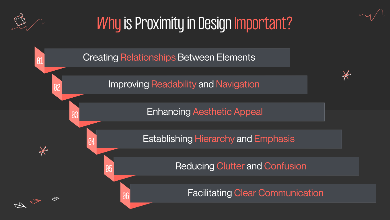
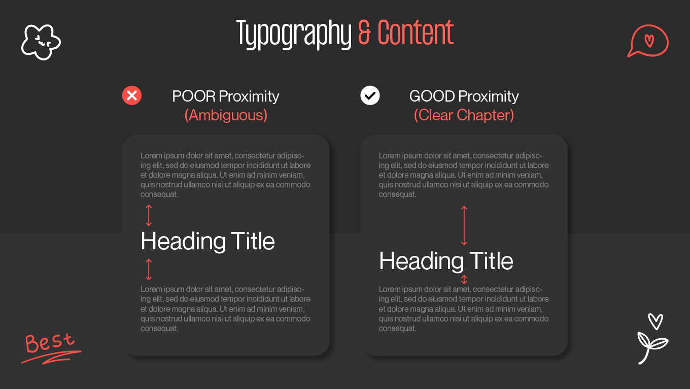
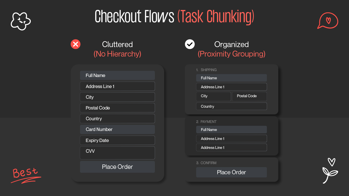
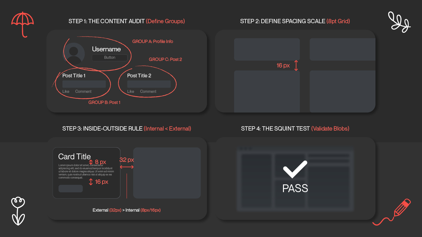
Good design is invisible. When a layout feels "right," it is usually because the spacing is doing the heavy lifting. The proximity design principle is that quiet architect; it tells your brain instantly which headline belongs to which text and which button solves your problem, all before you read a single word. It is effective, too; data suggests that proper visual grouping can boost user comprehension by nearly 30%, turning a chaotic scan into a focused journey.

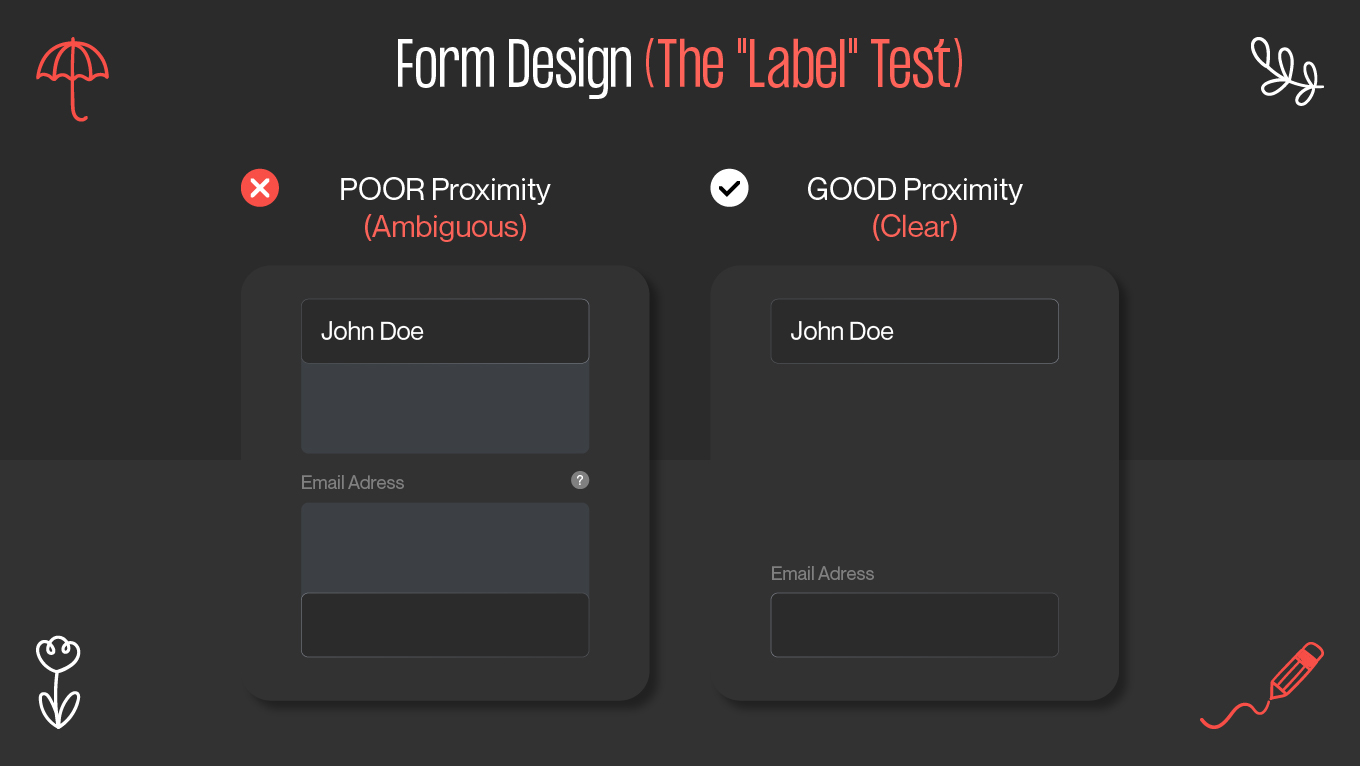
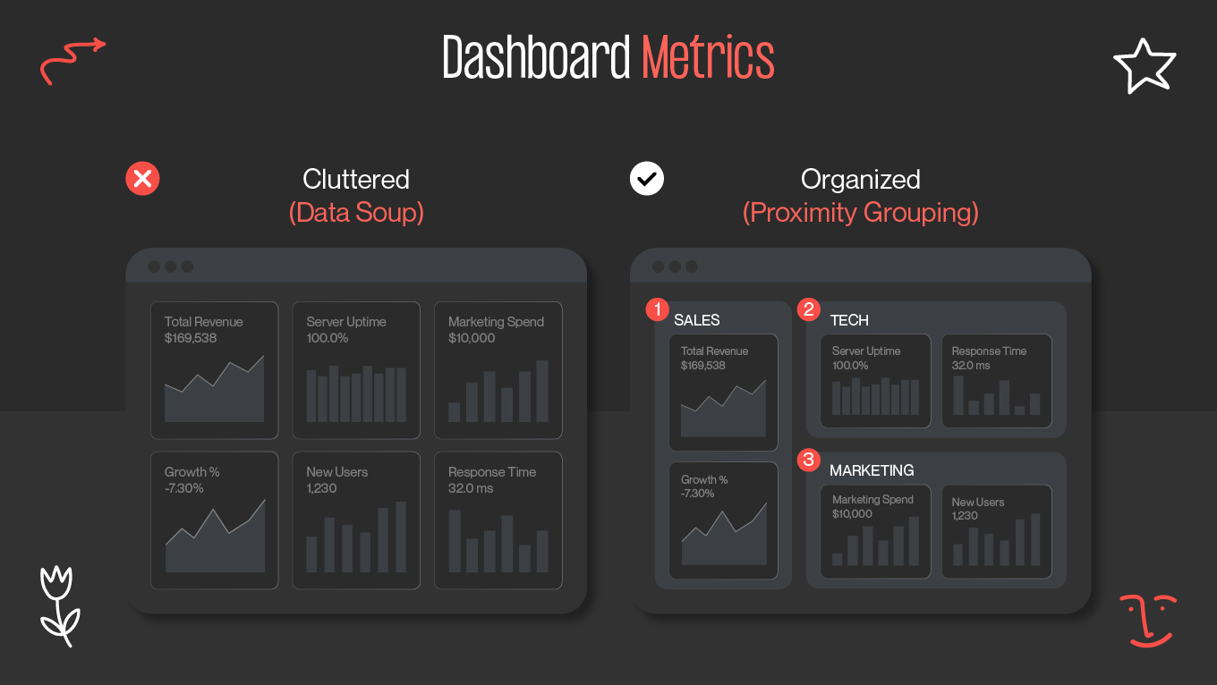
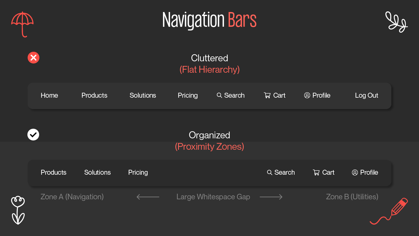
We don't view whitespace as "empty"; we view it as active functionality. It is the tool our design team uses to turn complex dashboards into intuitive products and messy forms into high-converting flows. In this guide, we are stripping away the academic jargon to show you exactly how to use the proximity principle in design to build interfaces that look organized and feel effortless to use.

Proximity Design Principle Definition: The Science of Connection

The proximity design principle is deceptively simple: it states that objects located near each other are perceived as a group, while objects spaced far apart are perceived as unrelated.

However, this is not just an aesthetic rule; it is a fundamental law of human perception rooted in Gestalt psychology. This is the core of the principle of design proximity: the brain is wired to organize visual chaos into patterns. When seeing elements clustered together, we instinctively assume they share a context, like a caption sitting directly under a photo

In a user interface, this principle performs three critical jobs:

  • Creating structure: It visually "lumps" content into digestible units (e.g., a card containing an image, title, and date) without needing lines or boxes.
  • Establishing hierarchy: A tightly grouped block of text signals a single, cohesive idea, distinguishing it from surrounding noise.
  • Reducing cognitive load: By defining relationships through space, you save the user from having to guess what belongs to what. The layout explains itself instantly.

If you ignore proximity, you force the user's brain to work overtime to establish relationships that should be obvious. If you master it, you create layouts that explain themselves.

What is proximity in design?

Why is Proximity a Valuable Design Principle?

Proximity is valuable because it is the fastest way to communicate context. In a fraction of a second, before a user reads a single word, the spacing in your design has already told them what is related, what is separate, and where they should look next.

When applied correctly, proximity transforms a passive layout into an active guide. Here is why it is indispensable for modern interfaces:

Defining Relationships Without Words

You shouldn't need a label to tell a user that a "Submit" button belongs to a specific form field. By placing them close together, you create an immediate, non-verbal connection. The proximity design principle bridges the gap between elements, allowing users to intuitively understand which image, caption, and button operate as a single unit.

Reduced Cognitive Load

Clutter is about having too much unorganized stuff. When elements are scattered, the user's brain has to work overtime to categorize them. Proximity does that work for them. By grouping related items into distinct visual "chunks," you free up the user’s mental energy to focus on the content itself.

Enhanced Scannability

Users rarely read digital content top-to-bottom; they scan. Proximity creates the "breathing room" (white space) that makes scanning possible. It separates different sections (like a sidebar vs. a main article) so the eye can skip to the relevant information instantly without getting lost in a wall of text.

Established Visual Hierarchy

White space is an active design element. By surrounding a key element (like a Call to Action) with ample space, you isolate it, giving it more visual weight. Proximity allows you to dictate what is most important by separating the signal from the noise.

Accelerated Decision Making

In digital interfaces, friction kills conversion. If a user has to pause to figure out which price tag belongs to which product, you are introducing micro-frustrations that delay the sale. Proximity removes this friction. By tightly grouping critical information (Product + Benefit + Buy Button), you create a seamless "visual sentence" that allows users to process the offer and act on it instantly.

Creating Credibility and Trust

Users judge the credibility of a business in 50 milliseconds, primarily based on visual appeal. A cluttered, poorly spaced layout signals incompetence and chaos. A design that uses sophisticated spacing and clear grouping signals organization and authority. Proper proximity tells your customer, "We know what we are doing," building the subconscious trust necessary for them to enter their credit card details.

Improving "Time-to-Value"

Your users are busy. They don't read; they scan. Proximity acts as a high-speed filter, allowing users to skip irrelevant sections and zero in on the solution they need. By using white space to clearly separate value propositions, you ensure that the user finds their "Aha!" moment faster, reducing bounce rates and increasing retention. 

If your users are hesitating at checkout or getting lost in your navigation, the issue often is your structure. Gapsy Studio engineers clarity. We turn cluttered interfaces into intuitive, high-conversion products by applying behavioral principles like proximity to clear the path for your customers. Don't let bad spacing hurt your bottom line. Let's look at your UX together.

Why is proximity important?

Real-World Examples: Proximity in UI Design

The best way to understand spacing is to see a proximity principle of design example in action. In UI design, proximity isn't just about "clumpiness"; it is about creating distinct functional zones.

Form Design (The "Label" Test)

Forms are the biggest source of user friction. A common mistake is placing a field label equidistant between two input fields. The user has to pause and calculate: "Does this label belong to the box above it or below it?"

The label must be significantly closer to its corresponding input field than to the field above it. This creates a single visual unit (Label + Input) that the user processes instantly. This is a classic proximity design principle example.

The "Label" Test
The "Label" Test

E-Commerce Product Cards

An e-commerce card is a dense cluster of information: Image, Title, Price, Rating, and "Add to Cart" button.

To fix this density with proximity design principle, you should visually divide your product cards into two categories: 

  • Group 1 (Product info): The Price should be visually glued to the Title.
  • Group 2 (Action): The "Add to Cart" button needs enough white space around it to stand out, but must still be close enough to the product info to be recognized as belonging to that specific item, not the one next to it.
E-commerce product cards

Dashboard Metrics

Dashboards often suffer from "data soup", where numbers everywhere with no clear relationship. 

The proximity fix will require related metrics (e.g., "Total Revenue" and "Revenue Growth %") should be enclosed in a common container or card with tight internal spacing. Large gutters (gaps) should separate this card from unrelated metrics (like "Server Uptime"). This allows the executive to scan by category (Sales vs. Tech) rather than reading every number individually.

Dashboard metrics
Dashboard metrics

Navigation Bars 

A common header mistake is spacing every element evenly across the top of the screen. This flattens the hierarchy: the "Home" link looks just as important as the "Log Out" button.

Use spacing to create distinct functional zones.

  • Zone A (Navigation): Group "Products," "Solutions," and "Pricing" tightly together on the left or center.
  • Zone B (Utilities): Group "Search," "Cart," and "Profile" tightly together on the far right.
  • The gap: A large span of whitespace should separate Zone A from Zone B. This tells the user, "These are places to go" vs. "These are tools to use."
Navigation Bar
Navigation Bar

Typography and Content 

In long-form content, users scan for headings to find relevant sections. A layout fails if a heading is placed explicitly halfway between the paragraph above it and the paragraph below it. The user halts, unsure which section the heading belongs to.

A heading should always have less margin-bottom and more margin-top.

  • It should be visually "magnetized" to the paragraph below it.
  • It should be pushed away from the paragraph above it.
  • This creates a clear "chapter" effect, allowing users to scan down the page without losing context.
Typograpthy and content
Typography and content

Checkout Flows (Task Chunking)

Checkout abandonment often happens when a form feels like one endless, overwhelming list of fields.

Apply the proximity design principle by creating “visual islands.” Group Shipping fields tightly. Use a significant gap to separate them from Payment fields. By breaking one long task into three distinct visual chunks, the checkout feels faster.

Checkout Flows
Checkout Flows 

How to Apply the Proximity Principle Step-By-Step

Understanding that things should be grouped is easy. Knowing exactly how much space to put between them is the challenge. Effective UI designers use systematic approaches.

Step 1: The Content Audit (Before You Design)

You cannot group elements visually until you understand how they relate logically. Before drawing a single box, look at your raw content and identify the natural relationships.

  • List out every element required on the screen.
  • Draw circles around items that share a functional goal.

For example, on a profile page, you might circle [Profile Photo + Username + "Edit Profile" button] as one logical group. You would circle [Recent Posts list] as a separate logical group.

Step 2: Define Your Spacing Scale (The 8pt Grid)

Consistency is the bedrock of good design. If you arbitrarily use 13px spacing in one area and 22px in another, your layout will feel chaotic. Most modern product teams use an 8pt grid system to standardize proximity.

According to it, all dimensions, padding, and margins should be multiples of 8 (8, 16, 24, 32, 64, etc.). To apply 8pt grid system, create a set of "spacing tokens" for your project to ensure consistency:

  • Space-small (8px): For tight internal grouping (e.g., space between a label and its input field).
  • Space-medium (16px-24px): The standard gap between distinct elements within a container.
  • Space-large (32px-48px): To separate major sections or different "visual islands."

Step 3: Apply the "Inside-Outside" Rule

This is the most critical practical rule of proximity: Internal spacing must always be smaller than external spacing.

To make a group feel cohesive, the space between the elements inside the group must be significantly less than the space separating that whole group from the next group.

If the elements inside a card have 16px of padding between them, the margin separating that card from the next card should be at least 32px (double the internal spacing). This dramatic difference is what signals to the brain, "Here ends one thought, here begins another."

Step 4: The "Squint Test" (Validation)

How do you know if your proximity is working? You remove the details.First, sit back from your screen and squint your eyes until the text becomes unreadable and the images blur. Then, evaluate your design

  • Pass: Do you see distinct, organized "blobs" of content with clear avenues of white space between them?
  • Fail: Does the entire page look like one uniform shade of grey soup?

If you fail the squint test, your external margins aren't big enough. Go back to Step 3 and increase the space between your major groups.

The "Squint Test"
The "Squint Test"

Good design shouldn't feel like a puzzle. If your users have to pause to figure out which button belongs to which text, you are already losing them. Our team solves this by turning visual chaos into intuitive structure. Let's turn your complex product into an effortless experience.

Common Proximity Mistakes to Avoid

Even experienced designers fall into "spacing traps." Here are three common proximity design principle examples of what not to do.

1. The "Trapped" Heading

This is the most common typographic error on the web. It happens when a heading has equal margins on the top and bottom.

The heading floats in "no man's land." The user’s brain pauses, unsure if this title belongs to the paragraph above it (which they just finished) or the paragraph below it (which is coming next).

A heading should always look like it is magnetically pulled to the text below it. A good rule of thumb is that margin-top should be at least 3x larger than margin-bottom.

2. The "Orphan" Button

This occurs often in card design. To make cards look uniform, designers sometimes force the "Call to Action" button to stick to the very bottom of the card container, regardless of how short the text is above it.

If the content is short, a massive gap appears between the value proposition (the text) and the action (the button). The button feels disconnected, like a footer rather than a next step.

Allow the button to "float up." It is better to have the button sit directly under the content it relates to, even if that means the bottom of the cards aren't perfectly aligned.

3. The Border Trap (Fear of White Space)

When a designer doesn't trust proximity to do the job, they use lines (borders) to separate everything.

Putting a border around every widget, list item, and section creates "visual noise." It makes the interface look like a spreadsheet. The user spends mental energy processing the lines rather than the content.

Subtract, don't add. Before drawing a line, ask: "Can I achieve this separation just by adding 20px of white space?" Usually, the answer is yes.

About Gapsy Studio: We Design for Clarity

At Gapsy Studio, we believe that great design goes unnoticed. When a user flows through your application without hesitation, it is precision engineering. We view whitespace not as empty space, but as active functionality, using it to turn complex, data-heavy products into intuitive experiences.

We don't just arrange pixels; we solve business problems. Whether it’s reducing churn in a SaaS dashboard or increasing average order value in e-commerce, we apply behavioral principles like proximity to clear the path for your users.

Let's stop making your customers think so hard. Drop us a line to build an interface that feels as good as it looks.

Final Thoughts

The proximity principle in design is the invisible architect of user experience. It works in the subconscious, telling the user’s brain exactly how to process information before they have even consciously read it.

Mastering the art of spacing transforms design from simple decoration into strategic communication. It structures the narrative, sets the pace for content consumption, and defines the relationships between complex data points, crucially removing the friction that stands in the way of the user's goal.

When fighting for attention, clarity is your strongest competitive advantage. Don't just fill the space. Use it.

Got a project in mind? Let's talk.

Rate this article

33 ratings
Average: 4.9 out of 5

If you like what we write, we recommend subscribing to our mailing list to always be aware of new publications.

Do you have any questions? We tried to answer most of them!