What E-Commerce Teams Need to Know About Shopping Cart Design

15minutes read
shopping-cart-design

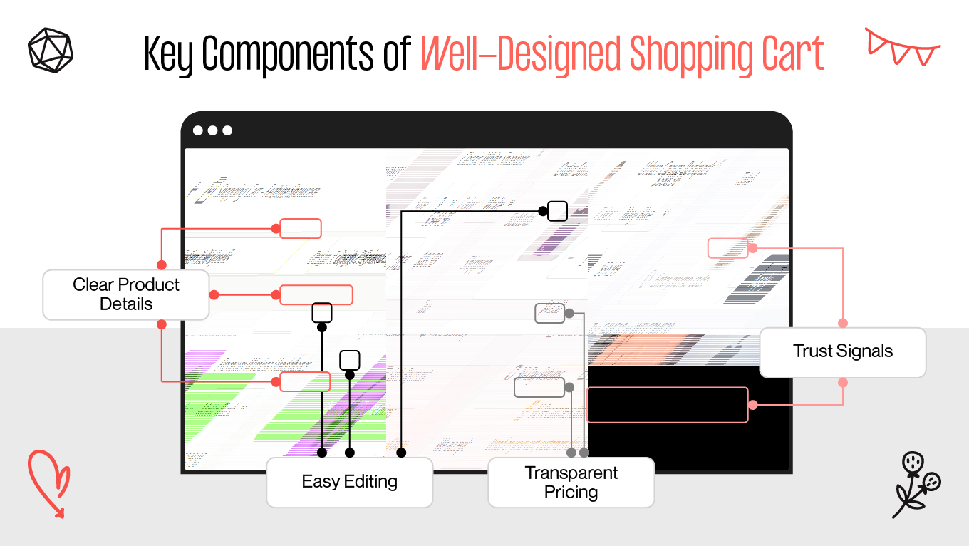
A shopping cart is where revenue is either secured or lost. For e-commerce, this moment is incredibly fragile: in 2025, according to Baymard, global cart abandonment reached around 70%, with spikes up to 73–78% during high-traffic events like Black Friday. That’s a clear signal that shopping cart design is a core part of your growth strategy.

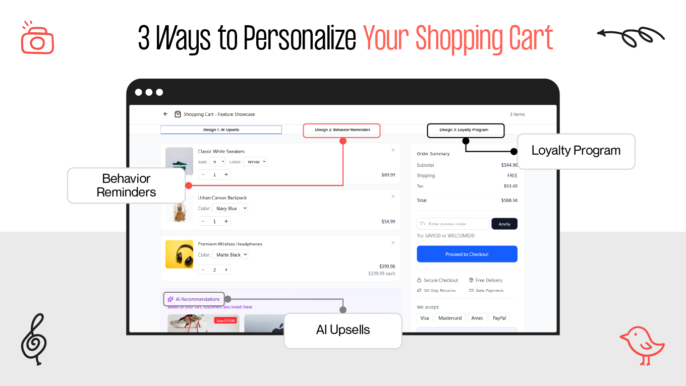
Modern shopping cart design shapes how confident customers feel, how quickly they move through checkout, and whether they ever come back. When it is clear, trustworthy, and mobile-friendly, people complete their orders. When it’s confusing or overloaded, they leave, even if they love the product.

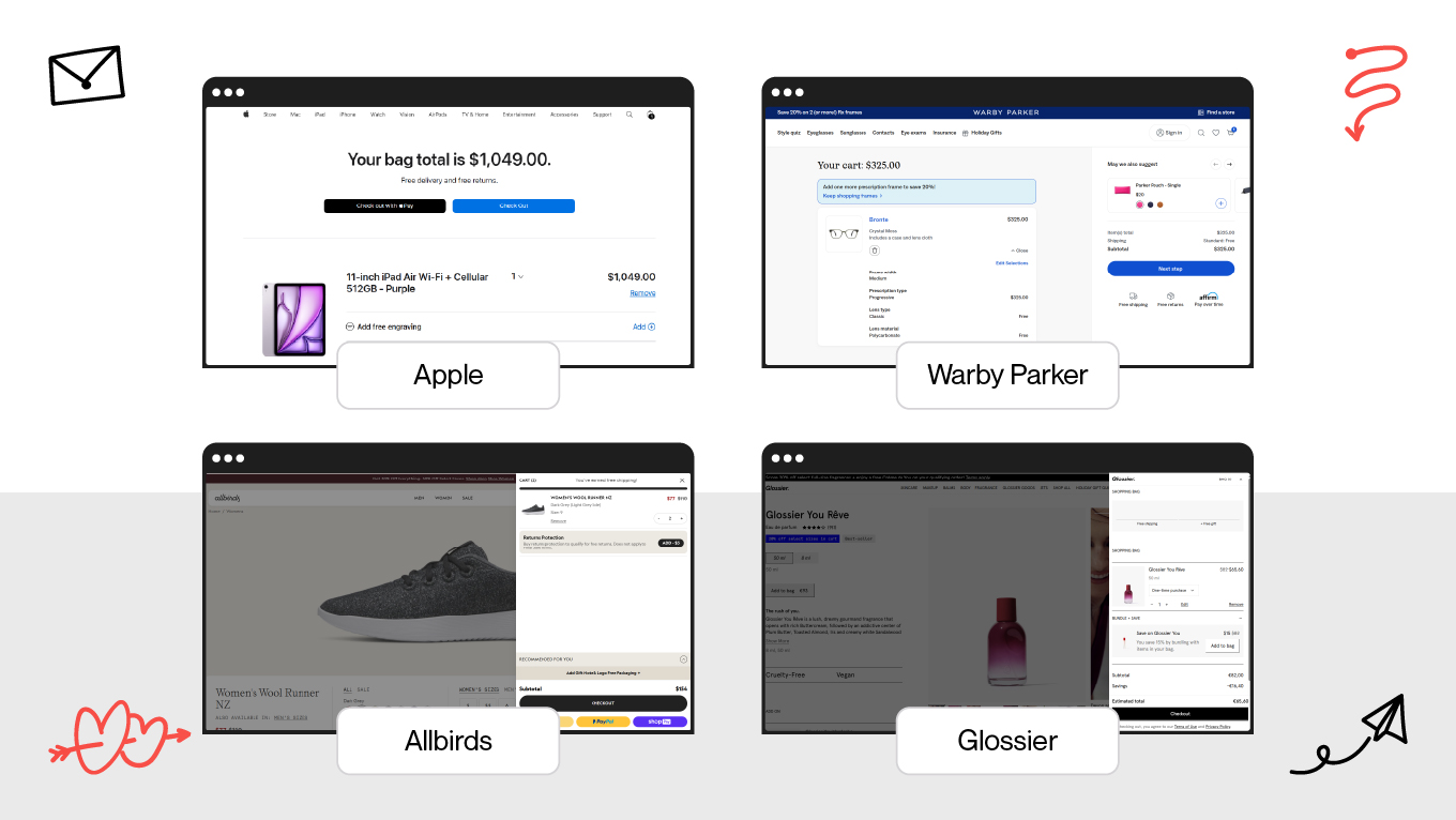
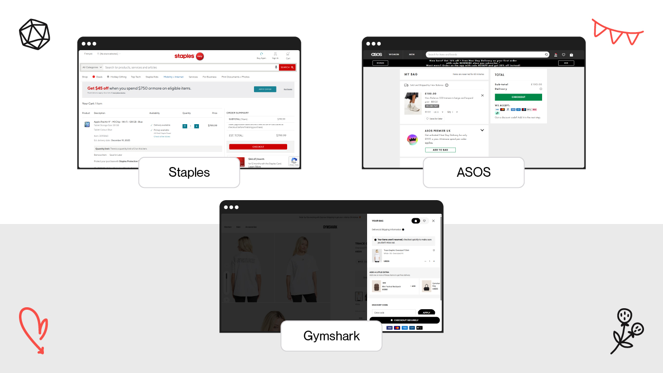
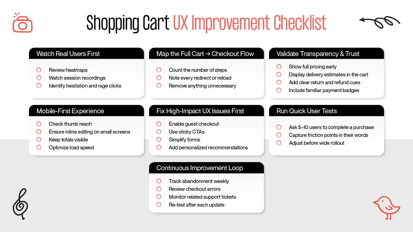
In this guide, we’ll break down what makes effective shopping cart web design, which UX patterns lift conversions, and how e-commerce teams can treat the cart as a strategic revenue driver instead of a static list of items.

How Gapsy Helped Shopify Merchants Improve Their Shopping Cart Experience

When Adsellr came to us, they were working with hundreds of Shopify merchants who had a similar problem: traffic wasn’t the issue — conversions were. Product pages performed well enough, but customers kept dropping off at or just before the cart.

The Challenge

Most merchants joining Adsellr had:

  • Shopify themes stitched together from outdated or mismatched templates
  • Cart layouts with unclear price breakdowns and hidden fees
  • Long, multi-step checkout journeys that felt heavy
  • Weak mobile shopping cart design with tiny tap targets and awkward forms
  • Inconsistent branding between product pages and cart, which created subtle distrust

As a result, ads and influencer campaigns sent qualified visitors into online stores, but poor shopping cart UX design pushed them away right before payment.

What Adsellr Needed

The platform needed to give every merchant (even those without design experience) a way to:

  • Launch online stores with a clear, professional structure
  • Use a frictionless, mobile-first shopping cart page design
  • Keep branding and visual language consistent from PDP to cart
  • Edit products and content quickly without breaking layouts
  • Plug in promotional traffic that lands on clean, conversion-ready experiences

Our Design and Platform Approach

While Adsellr isn’t a direct cart-focused solution, improving this system design became central to the platform.

We focused on:

  • Pre-built, conversion-oriented templates. Structured add-to-cart sections, logical information hierarchy, and recognizable patterns built from modern shopping cart UI design.
  • Visual consistency. We aligned typography, spacing, and CTA styles across product pages and website shopping cart design, removing the feeling of “jumping to another site.”
  • Responsive layouts by default. Every template shipped with mobile-first shopping cart web design, thumb-friendly controls, and simplified editing.
  • Analytics + Voice of Customer. Session data showed exactly where users dropped off; merchants could adapt content, offers, or shipping info accordingly.
  • Creator-driven traffic. High-intent traffic from video creators landed on pages where the cart and checkout no longer introduced friction.

The Results

In the first three months after launch, Adsellr-powered stores saw:

  • 45,000+ unique visitors exploring stores built via the platform
  • Noticeable drops in cart abandonment after switching to structured, consistent layouts
  • Higher add-to-cart and completion rates driven by clearer product presentation
  • Stronger mobile checkout engagement thanks to optimized e-commerce shopping cart design
  • Better performance from video ads that now sent users into cleaner, more trustworthy flows

CTA: If you are ready to refine your cart experience with the same level of precision, let’s talk.

3 Key Principles of High-Performing E-Commerce Shopping Cart Design

A well-designed cart creates the conditions for a customer to complete a purchase without hesitation. Over the years, we’ve seen the same three principles consistently improve conversion rates across Shopify, WooCommerce, and custom e-commerce platforms.

1. Prioritize Simplicity and Total Clarity

A cluttered shopping cart introduces friction at the worst possible moment. When a customer is ready to buy, your cart should support that momentum, not disrupt it.

What simplicity looks like:

  • Clear separation between product details, totals, and actions
  • Predictable layout: image → title → variant → price → quantity → remove
  • No competing CTAs; checkout stands out as the primary action
  • Visible price breakdown without expandable sections
  • Neutral, breathable spacing to avoid overwhelming the user

What clarity looks like:

  • Shipping, taxes, and discounts shown early—not revealed at the last second
  • Simple, human language (e.g., “Arrives by Friday” rather than “Standard shipping”)
  • Upfront final cost or at least an honest estimate
  • Consistent formatting between cart and product page

When cognitive load drops, cart abandonment follows. Retailers significantly improve add-to-cart completion simply by stripping away secondary distractions. It proves that surfacing the right information at the right time is often the most effective conversion strategy.

How we’ve applied this at Gapsy Studio 

In one  project, we found that users frequently stalled at the cart stage when final costs weren’t fully transparent. The hesitation had nothing to do with product value; it came from unclear shipping and fee expectations.

To fix it, we:

  • Surfaced estimated delivery and costs directly inside the cart
  • Replaced the vague “Calculated at checkout” line with real projected totals
  • Reorganized pricing into a single glance-friendly section
  • Removed low-priority actions that distracted from the main CTA

Thanks to this, users moved into checkout more confidently, because the path to payment felt predictable and calm. Clarity reduced hesitation, and friction quietly disappeared. This approach is something we repeat across projects: clarity first, friction last.

2. Use Trust Signals to Reduce Perceived Risk

Online shoppers hesitate when something feels uncertain (e.g., delivery times, returns, payment reliability, etc.) Your cart should eliminate these doubts immediately.

Effective trust signals include:

  • Small reassurance copy near the checkout button (“Secure checkout • Encrypted payments”)
  • Clear returns policy condensed into one friendly sentence
  • Delivery expectations placed near totals, not buried in FAQs
  • Payment method logos (PayPal, Apple Pay, Klarna) to reinforce reliability
  • Positive reinforcement (“You can always return this if it’s not right”)

Risk reducers that help customers commit:

  • Price guarantees or “No hidden fees” messaging
  • Estimated delivery ranges using real data
  • Icons representing trust without overwhelming the layout
  • Microcopy explaining how personal data is handled

Most abandonment happens when customers feel unsure about what happens after they click “Pay.” Trust-focused microcopy and visual cues directly reduce drop-off, while thoughtful UX writing around delivery, returns, and data handling often has as much impact on customer confidence as the visual design itself.

Example from our work 

During the redesign of an e-commerce project, we noticed users frequently paused at the cart stage due to uncertainty about cancellation terms. The issue was lack of reassurance. Instead of hiding policies in the footer, we placed a single trust line directly below the checkout CTA: “Free cancellation up to 24h before appointment. Secure payment processing.”

That one sentence removed hesitation for first-time users, and checkout completion increased without changing the UI structure. Clear reassurance beat long policy pages and confidence converted where layout alone could not.

3. Design Mobile-First Shopping Cart Experiences

For most retailers, mobile accounts for 70% or more of cart traffic. This shift makes the device choice clear: if the mobile cart isn’t frictionless, the rest of the strategy simply doesn’t matter.

Mobile-first practices we implement:

  • Placing key actions in thumb-friendly zones
  • Keeping product cards compact but scannable
  • Using autofill for address and payment fields
  • Sticky CTAs at the bottom of the screen
  • Eliminating modals that cover the entire view
  • Ensuring quantity and remove actions require minimal tapping
  • Optimizing images to load instantly on slower connections

Mobile behavior insights that matter:

  • Most shoppers edit cart items more on mobile than on desktop
  • Users often return to the cart after scrolling product pages—persistent carts reduce this friction
  • Express checkout buttons (Apple Pay, Google Pay, Shop Pay) dramatically reduce abandonment
  • Busy layouts feel more overwhelming on small screens, not less

Scaling down a desktop site doesn't work. Mobile is about ergonomics. Users expect speed and the physical ease to check out without needing two hands or a magnifying glass.

Example from our work 

In one redesign, we noticed users frequently mistyped “Remove” when adjusting quantity, which is a classic mobile friction point. We moved core actions into a thumb-friendly bottom bar and added a swipe-to-remove gesture with an undo state.

As a result, shoppers edited items confidently rather than hesitating, and mobile checkout attempts increased because the interaction no longer felt risky or fragile. Better control = higher completion.

The Anatomy of an Effective Shopping Cart Page

A good shopping cart page design prioritizes usability over visual noise. The steps below highlight what makes a cart intuitive for customers.

Key Components of Well-Designed Shopping Cart

Clear Product Details

Users open the cart to verify, not research. A professional layout should present information clearly enough that a customer never needs to return to the PDP (Product Detail Page). 

How we structure product info at Gapsy Studio:

  • Thumbnail large enough for instant visual recognition.
  • Product title + variant (size, color, material) displayed directly together.
  • Price and line total aligned visually for fast scanning.
  • Quantity controls are accessible without extra taps or dropdowns.
  • No hidden links or expanders for essential information.

When a cart behaves like a well-organized summary, it reduces cognitive effort and builds clarity. Instead of rechecking details elsewhere, users finalize decisions right where they stand.

Transparent Pricing

Pricing should be obvious, predictable, and complete before checkout. Structure should eliminate surprises. 

What we ensure in pricing design:

  • Subtotal, tax, and shipping shown upfront.
  • Delivery cost or estimation not hidden behind the final payment step.
  • Promo code field placed near totals, not buried in checkout flow.
  • Any additional fees communicated before the user commits.
  • Clear pricing prevents hesitation loops, because when a shopper sees exactly what they pay, trust forms naturally and checkout feels like agreement.

Easy Editing in Place

Every unnecessary redirect is friction. Carts should support adjustments inside the same screen. 

How we design editing UX:

  • One-tap quantity control (+/–), never multi-step dropdowns.
  • Variant change available inline (modal or dropdown), not via navigation.
  • Remove = instant action with soft-undo to hi avoid frustration.
  • Totals update in real time after any adjustment.

A cart that adapts instantly builds the flow where the user stays anchored in one context, makes micro-corrections seamlessly, and moves forward without losing momentum.

Trust Signals & Reassurances

Reassurance matters most at the moment of commitment — near the Primary Checkout CTA, not somewhere out of sight.

Our placement logic at Gapsy:

  • Delivery expectation in one clear line (no fine print hunting).
  • Short return/refund statement directly near checkout.
  • Payment trust markers or short security copy in immediate view.
  • Support access visible, even if subtle (“Need help?” link or chat icon).

Trust works best when it's timed perfectly. By placing reassurance exactly where user doubt creeps in, the hesitation window shuts tight. Such an approach transforms a potentially risky interaction into a reliable experience, clearing the path to the finish line.

A Strong, Simple Checkout Button

The CTA should lead, not compete. It’s the primary path forward,  everything else is secondary.

How we build CTA hierarchy:

  • One dominant action, not multiple “primary” buttons.
  • Text states intent clearly: “Proceed to Checkout” > creative wording.
  • “Continue Shopping” stays visually weaker by design.
  • Sticky CTA on mobile for persistent readiness.

A great Checkout CTA acts as a guided exit. By making "Proceed to Checkout" the obvious visual anchor, the interface removes the need to think. This clarity eliminates decision friction, ensuring the user moves naturally toward purchase completion without pausing to evaluate alternatives.

Mobile-First Layout

Adapting down from the desktop is a backward strategy. Because mobile carts represent the core reality of modern shopping, the design process has to begin there. This ensures the interface fits the user's actual context, avoiding the clunky compromises that come from scaling down.

Mobile UX design we implement:

  • Compact product modules with clean vertical rhythm.
  • CTA and totals are accessible without scrolling back up.
  • Tap targets sized for thumb usage, not cursor precision.
  • Visual hierarchy that leads the eye toward completion, not exploration.

True mobile-first design respects the thumb zone. It ensures the cart is operable with one hand, pinning the primary CTA and totals for instant access. By keeping key info above the fold and enabling inline editing, the layout prevents the friction of page jumps, preserving user momentum.

CTA: When clarity drives revenue, every detail matters. If you want a cart that converts, not confuses, our team is ready to help you. Start the conversation

Modern Shopping Cart UX Design Patterns That Increase Conversions

Great carts feel invisible. They reduce mental effort, prevent unpleasant moments, and let the user move forward without thinking twice. This is an engine behind successful conversions.

Many modern shopping cart patterns originate from the same UX trends we see shaping e-commerce overall— less clutter, more clarity, and decisions that happen in one smooth motion.

When UX works with human behavior instead of against it, the cart becomes a natural bridge to checkout, not an extra step users must fight through. And when built right, great carts tend to share a set of recurring UX patterns:

Carts That Follow the User

Shoppers rarely complete a purchase in one sitting. They browse on mobile during a commute, compare products later on a laptop, and sometimes return days after discovering an item. Real buying decisions happen not in a single session.

That’s why a persistent cart matters.

When a user adds an item on mobile but finds the cart empty on desktop, the intent resets. They need to search again, reselect the variant, repeat steps they have already completed — and every repeated action increases the chance they’ll drop off. A cart that seamlessly follows the user across devices removes the friction: the product is already waiting, so the experience feels continuous. 

This continuity mirrors the same logic we use in UX onboarding — guiding users forward without forcing them to reorient or start over, preserving momentum instead of breaking it.

Persistent carts respect real behavior: browsing now, buying later. They reduce cognitive effort, maintain intent, and turn return visits into conversions rather than lost opportunities.

Small UX Touches That Reduce Mental Overload

Decision fatigue is real, especially in e-commerce, where users have already spent mental energy comparing products, checking sizes, reviewing returns, and calculating totals. By the time they reach the cart, cognitive resources are low. If the interface asks them to think even more, hesitation appears. It is where abandonment happens and micro-UX patterns become high-impact. 

At Gapsy, we often see that seemingly minor details influence conversion more than full UI overhauls. When small decisions feel effortless, checkout becomes the natural next step rather than a task to complete.

Micro-patterns we implement to reduce thinking load:

  • Progress indicators that quietly show how close users are to completion. 
  • Smart defaults for shipping and payment so customers confirm instead of deciding from scratch.
  • Calm spacing and clear hierarchy that guide attention toward the primary CTA instead of scattering it.
  • Upsells placed after the cart, not inside it, supporting AOV (Average Order Value) growth without interrupting the payment path.

These touches look small, but prevent doubt loops, reduce friction, and preserve momentum. Well-crafted microinteractions in the cart — from subtle state changes to instant feedback on user actions — make the experience feel responsive and trustworthy instead of static.

Slide-Out Carts That Keep Shoppers Anchored

Slide-out carts work because they keep users inside the browsing flow instead of forcing a full page switch. People can review items, adjust quantity, or move to checkout while still seeing the product context, meaning no cognitive reset and back-and-forth navigation. This is especially valuable when discovery is still active.

Such shopping carts usually include:

  •  Full editing controls inside the panel
  •  Instant feedback after adding items
  •  Clear path to checkout + option to continue exploring

Brands use them to maintain momentum, where the cart becomes a companion, not a detour.

Payment Paths That Match Shopper Expectations

Friction kills sales. Payment hesitation disappears when the interface anticipates the user's needs. Displaying the correct, region-specific payment method instantly bridges the gap between interest and action.

Effective tactics:

  • Quick-pay buttons for returning customers
  • BNPL (Buy Now, Pay Later)  visibility inside the cart
  • Local payment methods surfaced contextually
  • Direct-to-checkout flows for simple purchases

Match payment to behavior → abandonment drops naturally.

Support That Appears Only When Needed

Abandonment is often blamed on price, but more often it’s uncertainty. Users hesitate when one last question remains unanswered. Good UX doesn’t drown them in info — it reveals help only when friction appears.

How we solve it:

  • Lightweight chat that opens when confusion signals appear
  • Tooltips for delivery/returns instead of external pages
  • Micro-FAQs inside the cart for common doubts
  • Human, actionable error messages

Contextual support keeps users from leaving to “check one thing” — they stay, decide, and convert.

Checkout Flows Without the Cart (When Appropriate)

Not every purchase needs a full review step. For small orders or returning customers, sending them through a full cart page creates unnecessary friction. Sometimes the fastest flow is the best one.

Where it works:

  • “Buy now” → direct to payment
  • One-click checkout for logged-in users
  • Lightweight bundles and impulse items

If the intent is already clear, remove steps. Speed converts better than ceremony.

CTA: Want to streamline your checkout or build a cart flow that converts instead of leaking intent? Our team at Gapsy Studio is ready to help. We audit, design, and refine e-commerce journeys with real user behavior in mind. Let’s build it together.

4 Psychological Techniques to Improve Cart Performance

Clarity is the ultimate persuasion. We don't believe in dark patterns. Instead, Gapsy Studio focuses on user behavior. Our team designs carts that answer questions before they are asked, ensuring that UX supports the decision to buy rather than obstructing it.

Visual Anchoring

Visual anchoring reframes price perception. When users see the original and discounted prices together, the value becomes obvious without cognitive effort; the brain instantly compares them, so the discount feels meaningful rather than abstract. This small UX move reduces resistance and turns price into a positive signal instead of a barrier.

How we implement anchoring in cart UI:

  • Original price is lighter or stroked — still visible, but not dominant
  • New price is highlighted with clean contrast, not aggressive styling
  • Savings appear as subtle reinforcement (“You save 15%” or “Save $10”)

When done correctly, the cart communicates value at a glance and feels like a smart purchase, not just another spend.

Progress Indicators & “Almost There” Patterns

Users abandon checkout not because they don’t want the product, but because they can’t predict how long the process will take. Uncertainty feels heavy. A simple progress indicator or “2 steps left” label gives structure and restores control. That's because the finish line becomes visible, effort feels lighter, and continuing is perceived as the most natural choice.

What we use in real projects:

  • “You’re almost there” or “2 steps left” micro-messages
  • A clean progress bar during checkout
  • Clear labels for upcoming steps (“Next: Shipping details”)

These cues reduce perceived friction (especially in multi-step flows) and turn ambiguity into forward momentum.

Social Proof & Real-Time Signals

People trust decisions others have already made. When users see ratings, purchases, or real activity, anxiety drops: “if others bought it and were satisfied, I probably will be too.” Social proof reassures, confirms safety, reduces the fear of making a wrong choice, and strengthens commitment at the point of hesitation.

How we bring social proof into cart UX:

  • Star ratings or review counts next to product names
  • Live demand cues (“32 bought today”, “Trending this week”)
  • Verified-buyer labels that reinforce authenticity

Social signals act like a confidence layer, validating the user’s choice so checkout feels certain. 

Scarcity & Low-Stock Cues

Absolute scarcity accelerates decisions because it introduces temporal relevance. When users know stock is low or an offer is expiring, postponing becomes less attractive. 

But honesty matters. Artificial pressure harms trust, while transparent scarcity builds urgency and credibility simultaneously.

Ethical scarcity patterns we use:

  • Genuine low-stock notices (“Only two left in your size”)
  • “Selling fast” badges based on real activity
  • Time-bound promotions with clear countdown rules

Actual scarcity clarifies and helps users act when waiting means losing the opportunity.

If you'd like to apply these principles to your store or refine how your cart drives conversions, Gapsy Studio can redesign your cart experience end-to-end—not just visually, but behavior-first —with UX logic that keeps users moving confidently to checkout.

How to Use Personalization and Smart Recommendations in Cart Design

Effective cart personalization reduces uncertainty by offering relevant recommendations that make sense for the user. When suggestions feel logical rather than promotional, they help the customer finalize the purchase with confidence instead of second-guessing the cost.

At Gapsy Studio, we treat personalization as a clarity tool, which simplifies choices, supports the shopper’s current goal, and makes the order feel like the best, most complete version of what they already intended to buy.

3 Ways to Personalize Your Shopping Cart

Personalization works when it:

  • Lowers effort instead of creating new decisions
  • Resolves hesitation (“Do I have everything I need?”)
  • Increases the sense of value, not expense
  • Moves the user closer to checkout, not sideways

Once that foundation is set, recommendations can support conversion. 

AI-Powered Upsells & Cross-Sells

AI shouldn’t recommend random products; it should extend the user’s logic. Upsells work when they are a natural continuation of the purchase. 

How we apply this at Gapsy:

  • Accessories that complete the order (cases, chargers, care kits)
  • Replenishable items based on purchase history
  • Smart substitutions if the selected item/variant is out of stock

When recommendations align with purchase intent, they lift AOV organically and without feeling salesy or manipulative.

Behavior-Based Reminders & Abandonment Flows

An abandoned cart is rarely a "no"; it’s usually just an interruption. Life gets in the way, or users switch from mobile to desktop. So, the most effective recovery strategy here is to use smart reminders that restore the context. This invites the user back to a seamless return rather than demanding a sale.

What we design into flows:

  • Exit-intent prompts that answer the last open questions (delivery, sizing, returns)
  • Email or SMS reminders that restore the exact cart state in one click
  • Conditional discounts only for high-value or repeat abandonments
  • Personalized nudges like “Still thinking about this item?” instead of hard promos

The goal is to remove the friction that made them leave in the first place.

Loyalty Program Integration Inside the Cart

Loyalty rewards are useless if they appear on the receipt. To influence behavior, they must be visible before checkout. Showing rewards at the moment of purchase reframes the decision: I’m not just spending — I’m earning, collecting, and progressing. This shifts perception from loss to gain.

Effective loyalty placement:

  • Points earned shown directly in cart (“You’ll earn 230 points”)
  • Quick view of membership perks relevant to the order
  • Small nudges like “200 more points to reach Silver level.
  • When loyalty is surfaced contextually, it becomes a conversion driver. 
Integrating personalization, upsells, and loyalty cues requires a delicate balance. We help you weave these features into the cart without breaking the flow. Need professional help? Contact us to get support.

Mobile Shopping Cart Design Standards

Mobile carts live in fast, distracted contexts. After all, people browse on the go, hold phones with one hand, and expect decisions to take seconds. A high-performing cart respects these constraints and removes anything that slows the flow.

Our design team focuses on creating mobile carts around ease, speed, and clarity. One screen, one hand, one uninterrupted path to checkout.

Core standards are: 

  • One-thumb navigation for key actions — core controls (quantity, remove, checkout) must sit within thumb reach, so users don’t stretch or reposition the device. Mobile UX fails when interaction requires effort.
  • Compact product cards with visible essentials — photo, variant, price, and quantity should be readable at a glance. No hidden info → no rechecking → fewer drop-offs.
  • Inline editing for size, color, and quantity — changes should happen in place, not through page transitions. The cart is where decisions finalize, not restart.
  • Sticky checkout button always visible — when CTA stays in view, progress is continuous. If users need to scroll back up to pay, conversion leaks.
  • One-tap, trusted payment options — Apple Pay, Google Pay, PayPal shortcuts reduce friction and remove typing from the process.
  • Autofill for all possible fields — mobile users won’t manually re-enter data if the device can do it for them. Efficiency = completion.
  • Short screens with collapsible secondary info — shipping, returns and details can be hidden behind accordions until needed, keeping the main path clean.
  • Optimized performance for slow networks — mobile retail often happens outside WiFi. Instant load states and lightweight assets keep users from abandoning.
  • Honest, upfront pricing — clarity prevents frustration. Hidden fees kill trust faster on mobile because attention span is limited.
  • Calm, minimal visual hierarchy — fewer competing elements = faster cognition. The layout must guide, not decorate.

As users are trained by the best apps they use daily, these UX standards shape the baseline for shopper expectations. A mobile shopping cart design that ignores them feels "heavy" and difficult, creating a friction gap that modern customers simply won't tolerate.

Key Differences of Web and Mobile Shopping Cart Design

Understanding the difference between how people shop on desktop versus mobile is essential for building a high-performing cart experience. While the goals remain the same — clarity, trust, and ease of checkout — the execution differs drastically by device. 

Here, it becomes less about UI alone and more about UX strategy that adapts to multi-device behavior and purchase patterns.

Aspect

Web Shopping Cart Design

Mobile Shopping Cart Design

User Behavior

Longer browsing sessions, more willingness to review details

Fast, task-oriented behavior; decisions made in seconds

Screen Real Estate

Multiple columns, larger product cards, more visible information at once

Single-column layouts; information must be compressed and prioritized

Navigation

Mouse navigation allows precise clicks and small UI elements

One-thumb navigation requires large tap targets and simplified paths

Editing Items

Users tolerate page reloads or separate edit pages

Must allow inline editing — every redirect increases abandonment

Checkout CTA Placement

CTA usually at bottom of cart or in a sidebar

Sticky bottom CTA required to stay visible as users scroll

Payment Methods

More willingness to enter card details manually

Strong preference for one-tap payments (Apple Pay, Google Pay, Shop Pay)

Form Input

Keyboard input is easy; users can fill out longer forms

Typing is painful — autofill and minimal fields are essential

Visual Hierarchy

Can present rich info, larger imagery, supportive details

Must strip down non-essential content; too much detail overwhelms

Performance Expectations

Users tolerate slightly heavier pages

Slow or laggy carts cause immediate exits; performance is critical

Abandonment Behavior

Abandonment often driven by pricing, trust, or shipping issues

Abandonment heavily tied t

Shopping Cart Design Examples Online Retailers Can Learn From

Every feature in a checkout flow should be a direct answer to a customer's unspoken question. These real-world examples demonstrate how shopping cart design can dismantle the "friction points" that lead to abandonment. By replacing uncertainty with clarity, the UX patterns shift the user's mindset from hesitation to action, proving that intentional design is the most effective lever for increasing both conversion rates and AOV.

Amazon: Personalized Bundles + One-Click Purchasing

Amazon places AI-driven “Frequently Bought Together” bundles near the cart and enables one-click checkout for logged-in users. The system reads purchase history and intent, so suggestions feel helpful — not pushy.

Why it works:

  • Bundles reduce decision effort by showing what complements the order
  • Returning customers skip friction — checkout → one tap
  • Cart UI adapts dynamically to context and need

Thanks to this, AOV grew by nearly a third, and cart abandonment dropped significantly after their 2024 mobile optimization.

Nike: Better Visualization = Fewer Returns

Nike integrates 360° product views, fit advisors, and AR try-ons before checkout, closing doubts around size and appearance — the №1 reason people hesitate.

Why it works:

  • Buyers confirm fit visually instead of guessing
  • Fewer sizing doubts → fewer returns
  • Users stay inside the flow instead of leaving to research elsewhere

Result: confidence increases, returns drop, and more carts reach payment instead of stalling at uncertainty.

Sephora: Loyalty That Feels Like a Reward, Not a Program

Sephora surfaces points, perks, and free sample options in the cart — right where decisions are made. Loyalty isn’t hidden behind post-purchase emails; it becomes part of the motivation to finish.

Why it works:

  • Visible rewards shift perception from “spending” to “earning.”
  • Samples raise the perceived value of the cart
  • Benefits activate engagement, not sit unused

By applying these specific strategies, Sephora turned the cart into a growth engine. The strategic placement of sample add-ons lifted AOV, while optimized flows for loyalty members drove significantly stronger completion rates.

Walmart: Real-Time Stock + Embedded Support

Walmart shows live stock status, delivery estimates, and on-page assistance directly in the cart. No forced navigation → no lost momentum.

Why it works:

  • No surprise out-of-stock moments at checkout
  • Support answers doubts without leaving the page
  • Delivery clarity removes risk perception

The primary outcome is a reduction in friction. By eliminating common abandonment points, the design creates a smoother decision flow. This clarity is vital for first-time buyers and cautious shoppers, who need a seamless, reassuring environment to commit to a purchase.

Minimalist Cart Design Patterns (Apple, Warby Parker, Allbirds, Glossier)

Minimalism works when it removes noise and keeps attention on checkout. Different brands do it in various ways, but the principle stays the same: less clutter = less hesitation.

Minimalist Shopping Cart Designs

Examples:

  • Apple — clean sidebar cart, large thumbnails, swipe edits, collapsible shipping
  • Warby Parker — one-column clarity with instant pricing and gentle navigation
  • Allbirds — eco-focused detail cards that reinforce brand trust
  • Glossier — bottom-sheet mobile cart keeping CTA always in reach

The result is fewer distractions → faster decisions → more completed purchases.

Conversion-Focused Redesigns Backed by Data

Data-Backed Cart Redesigns

Function over form. Here’s how e-commerce brands apply the rule: 

  • Staples: Reduced abandonment with a single-page checkout.
  • ASOS: Improved decision speed with sticky header totals and BNPL.
  • Gymshark: Increased confidence using social proof and easy size-swaps. These examples show that removing friction is more profitable than just updating the visuals.

Common Shopping Cart Design Mistakes We Fix at Gapsy

Our team audits e-commerce flows for redesign daily, and we see the same patterns repeat. Many online retailers unknowingly create barriers into their own checkout. These are subtle shopping cart design mistakes that silently kill conversions. 

Here are the specific issues we are called in to fix most often.

Treating the Cart as a Static “List”

Momentum is fragile. When users are forced to leave the cart to adjust quantity or see a total, they "fall out of flow." 

We solve this by ensuring every key action, from editing variants to previewing shipping costs, happens without a reload. Static carts create friction; our approach ensures the cart is a place where decisions are closed. 

Adding More Marketing When Users Are Ready to Buy

Once a shopper reaches the cart, the hard work of selling is mostly done. At this stage, high intent is fragile; disrupting it with intrusive pop-ups or aggressive cross-sells creates doubt rather than value. 

Our experience shows: a high-performing cart strips away this noise, preserving momentum by simplifying the path to completion.

Visual Break Between PDP and Cart

Consistency is a subconscious security signal; when a pixel is out of place at the moment of payment, users see a potential risk. In our projects, we treat the design system as a security protocol, ensuring the cart feels like a seamless, authoritative extension of the storefront rather than a disconnected third-party plugin.

This level of detail is particularly vital in marketplace store design. When a platform hosts dozens of independent vendors, a unified and consistent checkout experience is the "trust anchor" that reassures the customer they make a single, secure transaction. By eliminating visual friction, we allow the design to stand as a silent guarantee of the platform's integrity.

Overlooking Empty-Cart States

A blank screen is a wasted opportunity. So, instead of treating an empty cart as a stopping point, you should make it a bridge back to the product. By displaying recently viewed items or trending picks, the interface transforms a dead end into a smart re-entry point, actively pulling the user back into the shopping loop.

Hiding Delivery Details Until Checkout

Shipping costs and delivery dates heavily influence purchase decisions. When this information is revealed only during checkout, users feel misled and abandoned. What you can do to fix it is to bring shipping calculators, ETAs (Electronic Tags/Weights/Accessories), and return clarity into the cart itself. Transparency early = disappointment later.

Poor Error Handling That Halts Progress

Problems happen, but stagnation is a choice. When a user hits a snag, like a card decline or inventory issue, the interface should explain why and offer a solution. By acknowledging the error and instantly suggesting a fix or an alternative product, the design prevents frustration. It proves that errors don't kill sales; a lack of guidance does.

No Personalization for Logged-In Users

Returning customers shouldn't feel like strangers. When a cart remembers context (e.g., sizes, past items, loyalty status, etc), it shifts the experience from generic to personal. This recognition signals value, drastically shortening decision time and boosting repeat revenue by making the checkout feel tailored to your customers.

Accessibility Treated as an Afterthought

If they can't use it, they can't buy it. Accessibility barriers, such as missing keyboard access or slow mobile optimization, force real users to abandon the cart. 

Designing for constraints like motion sensitivity or poor network conditions isn't just about following rules; it's about maximizing the addressable market. A truly accessible site turns frustration into revenue.

Blending “Review” and “Checkout” Modes

The cart is for review; the checkout is for commitment. Blurring these distinct stages on a single screen creates ambiguity. Users become unsure if an action is editable or final, spiking cognitive load. Maintaining a clear stage separation aligns with the user's mental model, reducing friction and preventing hesitation.

Showing Total Cost Without Emotional Framing

A raw price tag often triggers sticker shock. To convert, the design has to reframe the cost. Features like free shipping progress bars, loyalty points, and savings cues shift the user's perception from "loss" to "value." 

These are psychological levers that soften the blow of the total price.

CTA: Stop losing sales at the finish line due to a bad layout. Reach out to us to fix shopping cart issues with logic.

How to Evaluate and Improve Your Shopping Cart UX

You cannot fix a conversion problem with just a new coat of paint. Strong results come from a structured approach. 

Our design studio treats cart redesigns and audits as an engineering challenge, not just a visual one. Here is the step-by-step framework we apply to every project to lift conversion rates and remove the friction that slows down decision-making.

Shopping Cart UX Improvement Checklist

Shopping Cart UX Improvement Checklist

Step 1: Observe Real Behavior

Analytics show the what; session replays show the why. 

Our team moves beyond the dashboard to analyze heatmaps, scroll depth, and hesitation zones, identifying the behavioral friction points (rage clicks or anxious backtracking) that standard tracking often misses. 

At Gapsy, we pair these observations with a structured UX audit checklist to transform raw sessions into systemic patterns. Our goal is to pinpoint the exact moment a user loses confidence or struggles, allowing us to replace doubt with a clear, guided path toward conversion.

Step 2: Map the Whole Journey From Cart to Checkout

Every extra step is a revenue leak. That’s why a complex journey kills conversion. 

On this step, we audit the full cart-to-checkout experience to find the hidden drop-off points. By scrutinizing every micro-interaction, our team identifies where the user is working too hard. 

The objective is to eliminate interruptions and keep the checkout process effortless and direct.

Step 3: Audit Clarity, Transparency and Trust Signals

Here, we examine the psychology of your pricing: how totals are presented, how delivery is framed, and if the return policy is visible early. 

In this phase, we apply our specialized consulting workflows. It’s the same rigorous method our team uses to organize decision-critical information to ensure that every element builds trust rather than creating confusion.

Step 4: Validate Mobile First (Even if Desktop Looks Perfect)

As the real battle for conversion happens on mobile, we rigorously stress-test every ergonomic detail, such as thumb reach, tap size, and inline editing. Beyond the interface, our team audits technical resilience, checking performance on slow networks and autofill reliability. 

Our standard is strict: a user must be able to complete a one-hand checkout without ever needing to zoom or struggle.

Step 5: Run A/B Tests on High-Impact Elements

Test smart, not hard. 

Our approach here is “not everything needs a redesign”. We focus resources strictly on top friction levers, like totals visibility, guest checkout access, and form length. By prioritizing the elements users interact with most, we ensure that even small UI changes deliver a surprisingly large ROI. This way, you get optimized critical paths, not just the easy parts.

Step 6: Validate with Real User

5 users can teach you more than 5,000 rows of data. To see the full picture, we watch real people struggle. Through structured UX research methods, our team can catch the nuance: unclear wording, price anxiety, or navigation fatigue. This approach finds the human problems hiding behind the numeric trends, revealing exactly why users get stuck rather than just where they left.

Step 7: Build a Continuous Improvement Cycle

Improvement must be ongoing. To consider this, Gapsy treats shopping cart design as a cycle: Test, Launch, Measure, and Iterate. We track key metrics post-launch, and our dedicated development team is ready to implement updates quickly. Such a systematic approach ensures your cart always optimizes for performance.

Why Choose Gapsy Studio for Your Conversion-Driven Cart Redesign

A cart redesign is one of the fastest levers for revenue growth, but only when approached with a holistic view of UX, UI, and project development. That's our difference.

Our redesigns are engineered to move the needle on key performance indicators:

  • Design for real behavior. We observe how people browse, hesitate, compare, and commit — then translate those patterns into decisions users complete, not abandon.
  • Reduce friction without adding noise. From mobile thumb-reach layouts to clearer totals and simplified flows, we prioritize high-impact improvements over visual clutter.
  • Align UX craft with business goals. Better carts drive higher conversion, AOV, retention, and lifetime value — and we design with those metrics in mind.
  • Bring clarity, not complexity. Predictable structure, transparent pricing, and calm visual hierarchy build trust when it matters most — at checkout.
  • Deliver consistently as a partner. We don’t hand off screens and disappear — we iterate, measure results, and support you long-term.

To build an e-commerce shopping cart that guides decisions instead of overloading them, your next step is contact us and request a consultation.

Conclusion

The shopping cart holds the final decision. Its interface is strategic and critical to revenue. By integrating its design into your core product experience, you build customer trust and immediately see a lift in conversion and AOV.

Nonetheless, a single redesign isn't enough; ongoing optimization is key. To stay relevant, your cart should continually adapt to the latest devices and user expectations. The best cart design is never a stagnant asset, but a living part of your strategy that evolves alongside your audience. 

Is your cart costing you sales? It's time to act. With your interface either past its one-year review mark or currently slated for an update, the moment to optimize is now. Fill out the contact form to discuss your project and define a conversion-focused improvement plan tailored to your store.

Rate this article

20 ratings
Average: 4.9 out of 5

If you like what we write, we recommend subscribing to our mailing list to always be aware of new publications.

Table of contents

desktop bannermobile banner

Need a design expert?

Do you have any questions? We tried to answer most of them!