UX Design in Financial Services: Principles, Best Practices, and Trends

8minutes read
financial services ux design

In finance, users are far less forgiving of products that make money feel complicated. While financial services account for nearly a quarter of the global economy, a critical gap remains: most digital products fail to translate complex backend logic into a language people understand. This "complexity tax" is expensive. Statistics show that over 70% of users abandon fintech apps within the first 30 days, even after a successful onboarding. This is a failure of the experience.

People turn to fintech to solve high-stakes problems: moving savings, analyzing balances, or making split-second investment decisions. In these moments, clarity is a prerequisite for confidence. When an interface feels overwhelming, the psychological contract of trust breaks instantly. This is why high-quality UX design in financial services is a business requirement that directly dictates retention.

Our work with fintech platforms has proven that engagement is a byproduct of simplicity. By distilling dense data into intuitive decision paths and cleaner flows, we help brands move from being a "tool" to becoming a trusted financial partner. In this article, we’ll unpack the core principles of UX in finance: the design techniques that transform complex numbers into human, usable, and high-performing interfaces.

How We Helped Touch2pay Turn a Complex Financial Flow Into a Lifestyle Experience Through Proper UX

Our collaboration with Touch2pay serves as a powerful testament to how proper UX can evolve a fintech product from a one-time utility into a seamless, daily lifestyle experience. 

In financial services UX design, success is built on a foundation of clarity, trust, and emotional comfort. So, our goal was to design a system that supports real human behavior, ensuring that managing money feels like a natural extension of a user’s day. 

Challenge: Users Felt Overwhelmed and Uncertain

When auditing fintech platforms, we consistently see the same friction points. Touch2pay had them too: an interface overloaded with dense numbers, long tables, and fragmented flows that created cognitive fatigue. Even after completing onboarding, users would explore briefly and then drop off because the experience felt heavy and unintuitive.

The core issues included:

  • Data overload is making it difficult to understand financial health at a glance
  • Low perceived trust, caused by outdated styling and inconsistent hierarchy
  • Friction-heavy authentication, relying on passwords instead of biometrics
  • Unclear navigation, forcing users to hunt for essential information

To address these problems, we needed to rethink the entire experience, not just redesign screens.

What We Did: Reframed Finance as a Habit

Our team approached the redesign by reframing Touch2pay: we moved away from the cold “banking tool” archetype and toward a lifestyle product shaped by the rhythm of daily financial habits. This shift is at the heart of modern financial services UX design, where reducing cognitive friction is the most direct path to earning user trust. 

As a dedicated fintech web design agency, we’ve observed that users treat financial tools as daily companions. By ensuring the experience feels reliable, rapid, and emotionally low-effort, our team created a flow that respects how people manage their lives, driving engagement without the need for added complexity

We focused on:

  • Reducing cognitive load through modular card layouts and progressive disclosure
  • Restructuring the information hierarchy to surface the most critical data instantly
  • Rebuilding trust visually with a cleaner design system, consistent spacing, and modern color cues
  • Enhancing security without friction by introducing fingerprint/FaceID flows
  • Refining navigation paths so users could complete core tasks with minimal steps

At each stage, we validated decisions through UX principles and practical user behavior patterns.

Solution: A Command Center Rooted in Simplicity and Confidence

To rebuild user confidence and reduce hesitation, we designed Touch2pay around a set of features that made money feel understandable, actionable, and safe. 

This approach mirrors the strategic framework we implement across all our fintech web design projects: a careful orchestration where clarity, visual hierarchy, and trust signals work in tandem to simplify high-stakes decisions.

  • Smart Financial Dashboard

    • Clear widgets for balance, income, and expenses

    • Visual hierarchy that allows users to grasp their financial status at a glance

  • Reassuring Micro-Interactions

    • Smooth animations for payments, transfers, and data loading

    • Immediate feedback that removes uncertainty during critical actions

  • Biometric-First Authentication

    • One-touch fingerprint or FaceID access for login and confirmation flows

    • A faster, more secure alternative to traditional password-based verification

These features successfully shifted the Touch2pay experience from a dense, transactional interface into a streamlined financial command center. Rather than demanding unnecessary cognitive effort, the new design anticipates and supports daily financial habits, transforming a complex utility into a silent, intuitive partner that respects the user's time and attention.

Results: Higher Confidence and Better Engagement

The redesign directly addressed the barriers that cause people to abandon financial apps. Clearer onboarding, improved data hierarchy, and a calmer visual rhythm helped users feel more in control of their financial decisions, which is an essential factor in user experience for financial services.

After launch, Touch2pay saw:

  • Reduced early churn through clearer value communication
  • Increased daily engagement thanks to a dashboard that answers questions instantly
  • Stronger trust indicators via modern design patterns and biometric-led security
  • Faster task completion due to simplified flows and consistent interaction patterns

Touch2pay proves how a well-structured UX can turn a demanding financial flow into an experience that feels simple, familiar, and dependable. When users understand their next step instantly, they stay engaged and confident. If you want to bring this level of clarity to your own fintech product, let’s talk.

Why UX Matters in Financial Services

In finance, UX design is the unseen security layer. It is the primary factor in whether a user feels safe enough to move their life savings, share sensitive data, or commit to a product long-term. Unlike almost any other industry, user experience in financial services should find the perfect balance between rigid regulatory requirements, dense technical data, and the high emotional pressure that naturally accompanies money management.

These standards are moving targets. We stay ahead by closely monitoring fintech UX design trends to understand how user behaviors are moving away from traditional "bank-like" coldness toward interfaces that offer both institutional-grade security and consumer-grade simplicity.

Trust Is the First UX Barrier

In financial products, trust is binary: users either feel safe or they leave. Nearly 7 in 10 Americans have abandoned a transaction due to a lack of confidence, often because something in the interface felt unclear, outdated, or suspicious. A polished fintech UI is a signal of stability, technical maturity, and operational reliability.

Good UX design in financial services makes trust visible. That means going beyond clean layouts and including explicit cues throughout the experience, such as:

  • “Encryption active” or “Secure connection” indicators near sensitive actions
  • Precise “Last login” timestamps that help users detect unusual activity
  • Easy-to-find privacy and security settings that feel transparent, not hidden

When these elements are integrated thoughtfully, users can see that their data and money are protected. That matters, especially when 81% of consumers say they trust companies more when privacy policies are transparent. In practice, trust in financial services is not implied by aesthetics — it must be demonstrated through observable signals. By utilizing a range of UX research services, from usability testing to ethnographic interviews, we can pinpoint exactly where users feel confident and where they feel friction.

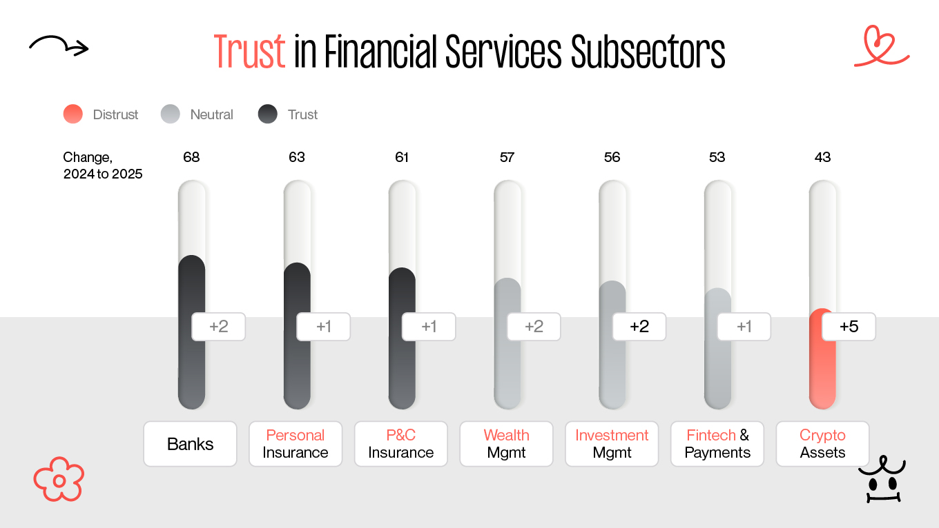
Trust in financial services

Cognitive Load and Dashboard Clarity

That’s why clarity is the ultimate form of sophistication. Users don’t open a product to admire the density of their data; they open it to answer visceral, high-stakes questions like, “Am I okay financially today?” Effective financial dashboard UX design respects the user's cognitive load by compressing back-end complexity into clear, digestible views. This means t translating "big data" into actionable "small insights" that provide immediate peace of mind.

A good rule is the “3-second check”: within a few seconds, users should understand their current status (balance, upcoming obligations, or risk level) without zooming in on small numbers or decoding multiple graphs. When dashboards focus on vanity metrics or decorative charts, they look impressive but fail at real decision support. 

To keep dashboards useful, you can:

  • Prioritize a small set of primary indicators over dozens of secondary metrics
  • Use clear labeling instead of ambiguous or technical abbreviations
  • Highlight changes and trends, not just static numbers

Financial UX design moves from “raw data” toward “actionable insight.” For example, instead of displaying only monthly spending totals, an AI-driven insight chip might say:

“Your spending is 12% lower than last month. You’re on track to save $200.”

This kind of pattern reflects the data-driven methods we apply in fintech projects, where complex audit and analytics are distilled into clear, meaningful insights that help users make confident decisions instead of leaving them overwhelmed by numbers.

Onboarding and the Abandonment Cliff

In financial products, onboarding determines whether users stay long enough to experience real value. Because money is a high-stakes category, any friction during the first steps can push people to abandon the product before they form a habit. Complex flows, too many fields, or unclear next steps create an early drop-off that is difficult to recover from.

Strong financial UX design mitigates the risk of early-stage abandonment by ensuring that the initial interaction feels safe, rapid, and entirely predictable. The design here acts as a guardian rather than a gatekeeper. For example, biometric authentication is now a default path. With 46% of users reporting that biometrics feel significantly more secure than traditional passwords, integrating FaceID or fingerprint scanning serves as psychological reassurance. It replaces the friction of memory with the ease of identity, allowing users to access their finances with zero "cognitive overhead."

Mobile-First UX and SoftPOS Realities

For fintech, mobile-first is the baseline. Whether checking a balance or completing a SoftPOS transaction, users treat their phones as a primary financial terminal. This requires a shift in financial app UX design from simply "shrinking a desktop layout" to prioritizing the physical reality of a hand holding a device.

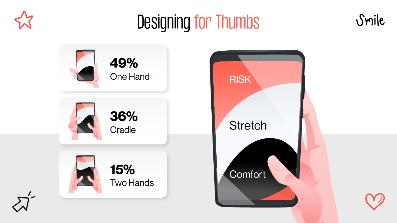
Our team solves this through the “thumb zone” principle. We place high-stakes actions like Pay, Transfer, or Confirm in the bottom-right of the screen, the natural "sweet spot" for one-handed use. Moving these buttons out of the hard-to-reach top corners eliminates the "grip-stretching" that causes frustration and input errors. When building a fintech app, such ergonomic choices accumulate into a sense of speed and reliability. 

Designing for thumbs

Want to create a compelling financial UX design?

You are in the right place! Gapsy is looking forward to working with you. Press the button and we will contact you.

Personalization and AI as the New UX Standard

Fintech evolves from static ledgers into adaptive partners. Personalization here is the ultimate retention tool, as 40% of users remain loyal when a product feels built specifically for them. Instead of overwhelming people with generic charts, effective UX surfaces "predictive nudges" that turn data into confidence.

For a merchant, this might look like an AI-driven prompt: “Your sales peak on Tuesdays; consider scheduling extra staff.” By moving the conversation from "what happened" to "what to do next," the interface stops being a spreadsheet and starts being a mentor that users rely on every day.

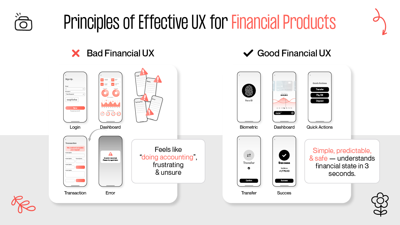
Principles of Effective UX for Financial Products

In fintech, the stakes are measured in heartbeats and hard-earned savings. A UX designer’s true job is to lower the "anxiety tax", the mental strain users feel when money is involved. To create an experience that sticks, you should move beyond functional screens to an interface that acts as a silent, calming protector.

Principles of Effective UX for Financial Products

1. Make Financial Data Immediately Understandable

Most financial apps fail because they assume users want more data. In reality, they want answers. 

Effective data visualization in fintech should:

  • Surface key insights without overwhelming users
  • Turn complex numbers into intuitive visual cues
  • Highlight what changed, why it matters, and what action to take
  • Follow the “3-second rule”: users must understand their financial situation at a glance

With T2PAY, we replaced exhaustive tables with card-based summaries and trend indicators, transforming the UI from a data puzzle into a clear narrative. By swapping rows of raw numbers for visual shorthands, we eliminated the need for users to "decode" their finances. 

What to avoid: Vanity metrics, decorative charts, and anything that looks impressive but adds no decision-making value.

2. Build Information Architecture Around Real User Intent

Financial products often fail not because the features are weak, but because users cannot find what they need.

A strong information architecture should reflect how people naturally think about money:

  • What’s my current status?
  • What changed?
  • Am I safe to spend?
  • What action should I take now?

So, design for the user’s intent instead of your internal logic. In fintech, the most effective experiences translate complex financial behaviors into simple, predictable sequences, minimizing the number of decisions required per screen.

When navigation remains stable across every device, it builds the muscle memory required for long-term trust. This is the essence of design thinking in fintech: moving away from "feature lists" toward intuitive flows that guide users past common UX traps and straight to their goals.

Financial UX is never “finished”, as user needs evolve, regulations change, and product complexity grows. Architecture should be reviewed and refined continuously.

3. Communicate Value Through Design

In fintech, the true value proposition is the feeling of control. A user’s trust is won when an interface replaces the "anxiety of the unknown" with a sense of effortless certainty. This is the cornerstone of financial services website design, where every pixel must work to reduce cognitive friction and guide the user toward clear, low-stress decisions.

A strong UX-driven value proposition should:

  • Communicate safety and stability
  • Show users they are in control
  • Reduce steps in critical flows
  • Highlight the product’s differentiators through interaction patterns

On T2PAY, confident visual hierarchy, predictable transitions, and clear feedback loops worked together to reinforce the product’s core promise: simplicity without sacrificing security.

4. Design for Reliability and Trust at Every Touchpoint

Trust is fragile in finance. A slow screen, an unexpected error, or a confusing confirmation message can cause users to abandon the product entirely.

High-quality UX in financial services requires:

  • Consistent performance
  • Error-prevention patterns (not just error messaging)
  • Transparent security indicators
  • Reassuring micro-interactions during sensitive tasks
  • Visible privacy controls

Users must feel that the system is stable, secure, and built with their protection in mind. 

When every interaction shapes trust, thoughtful UX becomes one of the strongest advantages a financial product can have. If you’re exploring how to bring more clarity, confidence, and reliability into your fintech experience, we’d be happy to help. You can reach our team to discuss your goals.

Financial Website UX Design Tips from Our Team

Financial websites win by dismantling doubt. UX here is your primary tool for risk management and the engine behind long-term loyalty. When a user feels they can navigate a complex payment or SoftPOS flow with minimal effort, that "ease" translates directly into trust. 

Below are four principles our team applies when designing high-stakes financial experiences for clients across banking, payments, SoftPOS, and wealth products.

Use “Smart Friction” to Strengthen Trust and Prevent Losses

"Frictionless" can easily slide into "thoughtless." While convenience is a goal, removing every barrier triggers a psychological red flag: when a significant transaction happens too fast, users feel out of control. In finance, deliberate friction is a security signal. People inherently expect a "pause and verify" moment for irreversible actions like sending large sums, approving withdrawals, or changing sensitive personal data.

Smart friction (FaceID, fingerprint confirmation, slide-to-confirm gestures) signals that the system is both secure and intentional. It reassures users without slowing them down.

Use "Smart Friction"

Example:
A payment service added FaceID confirmation only for transfers above $500. This small intervention reduced failed or disputed transactions and noticeably lowered support ticket volume. The additional friction didn’t slow users down, but reassured them.

Make KYC Transparent and Human to Reduce Drop-Off

Identity verification is one of the most significant points of friction in a fintech user's journey. Abandonment here rarely stems from the time required, but from a lack of psychological safety. When a user is asked to upload a passport photo or record a video of their face without clear context, the process shifts from "onboarding" to "intrusion."

KYC (Know Your Customer) should feel like a conversation rather than a hurdle. By replacing dense, legalistic language with short, human explanations (e.g., "We need this to protect your account from unauthorized access"), you can transform a mandatory fraud-prevention step into a trust-building exercise. When the "why" is as clear as the "how," users move through the flow with confidence. 

Example:
While working on T2PAY, we discovered that users weren’t abandoning the KYC process because it was difficult, but because the "black box" nature of the request felt intrusive. To bridge this trust gap, our team transformed the flow by replacing compliance-heavy jargon with human-centered "whys" and adding real-time progress indicators like "Reviewing your ID. Usually it takes 2 minutes." 

Treat Accessibility as a Growth Lever

While a significant portion of global wealth is held by users over 50, this demographic is often the most alienated by standard design choices like low-contrast text and dense interaction patterns. Nonetheless, accessibility can be a powerful growth strategy in fintech. When you optimize an interface for readability and ease of movement, you don't just help older users; you reduce the "cognitive load" for everyone, leading to higher conversion rates across the board.

Example:
A banking app simplified its visual hierarchy, increased default font sizes, and optimized button placement for thumb reach. Sign-ups from users aged 55+ increased noticeably, opening a high-value segment without additional marketing spend.

Defensive Design Cuts Support Costs and Reinforces User Confidence

In fintech, a cryptic error message is a direct driver of support tickets and anxiety. When a transaction fails without a clear reason, users panic, flood your support desk, or attempt risky workarounds. 

Defensive design replaces dead-end alerts with solution-oriented guidance. Instead of a generic "An error occurred," a high-trust interface explains exactly what happened and how to fix it—such as "Your card was declined due to a daily limit; try a smaller amount or adjust your settings here." 

Example:
While working on T2PAY, we saw how silence from an interface can be interpreted as a failure. Early testing showed that when a payment didn’t process instantly, users immediately panicked, assuming the system was broken. To solve this, we moved away from generic status indicators toward high-transparency feedback.

By replacing "Loading..." with specific explanations like "Your payment is processing, this may take up to 30 seconds" and providing clear next steps for failed attempts, we replaced anxiety with a sense of control.

The Cost of Bad UX in Financial Services

Bad UX in the financial sector is an expensive liability rather than a minor inconvenience. Every cryptic error message, confusing screen, or friction point during onboarding carries a measurable cost: it drives users to churn, spikes support volume, and erodes customer lifetime value. When leadership views UX through this lens, it stops being a "design expense" and becomes a critical operational and revenue driver.

By systematically removing these friction points, a fintech product shifts from a cost center to a growth engine. A 10% reduction in onboarding abandonment or a 15% drop in support tickets directly impacts the bottom line. 

Wasted Customer Acquisition Budget (CAC Loss)

Financial institutions invest heavily to acquire new users. When onboarding is confusing or feels unsafe, users abandon the funnel before becoming customers, meaning paid acquisition never converts into revenue.

How this cost is created:

  • Users hesitate when asked for documents without context
  • Long or unpredictable KYC flows reduce trust
  • Lack of progress indicators makes onboarding feel endless
  • Users drop off before account activation, wasting CAC

Bad UX in onboarding effectively turns marketing spend into sunk cost, because every user who leaves the flow early represents a paid acquisition that never converts into revenue. Instead of fueling growth, the budget allocated to attracting those users is lost before they even experience the product's value.

Lower Retention Reduces Lifetime Value (LTV)

Retention in fintech depends on how confidently and efficiently users can complete tasks. If the product is difficult to understand or requires too much effort, customers return less often, limiting revenue opportunities.

How this cost is created:

  • Users avoid apps that require cognitive effort to interpret their financial status
  • Lack of actionable insights diminishes daily engagement
  • Overly complex navigation reduces feature adoption
  • Low engagement means fewer chances to cross-sell and upsell

Poor UX is a silent leak in your revenue. When users struggle to navigate or find value, they shrink their usage to the bare minimum or disengage entirely. This "habit-killing" friction shortens the active customer lifecycle, ensuring that users never stick around long enough to explore high-value features or build long-term loyalty. In fintech, every confusing moment effectively shortens your window to generate revenue, turning a potential lifelong partner into a one-time visitor and dragging down your overall Customer Lifetime Value (LTV).

Increased Support Volume Raises Operational Expenses (OpEx)

Most support tickets in financial services originate from preventable UX issues. Confusing flows force users to seek human assistance for tasks the product should clarify.

How this cost is created:

  • Unclear error messages push users to contact support
  • Ambiguous transaction states create anxiety and require confirmation
  • Users can’t self-solve issues because instructions are missing or unclear
  • Support teams must absorb questions that the interface failed to answer

Every unresolved UX issue is a hidden debt that your support team ends up paying. When an interface is confusing, it shifts the burden from the software onto human agents, forcing them to spend their time on avoidable "how-to" questions instead of solving complex problems. Over time, these preventable support calls turn an efficient business into a high-overhead operation. 

Compliance Friction Increases Processing Costs and Risk

Compliance steps — especially KYC and AML — are sensitive, regulated, and complex. Poorly designed flows increase internal workloads and regulatory exposure.

How this cost is created:

  • Users submit incomplete or incorrect information
  • Repeated document resubmissions increase manual review time
  • Misunderstood requirements slow down approvals
  • Noncompliance risk rises when users bypass or misinterpret instructions

Bad UX is a compliance bottleneck. Instead of moving users through regulated steps independently, a confusing interface generates a stream of edge cases that require human intervention. This increases overall development cost, slows down approvals, and makes scaling your product twice as expensive. 

Loss of Brand Trust Limits Revenue Potential

In financial services, brand perception is formed through the product. Users associate poor UX with instability, lack of professionalism, or weak security, all of which reduce long-term revenue potential.

How this cost is created:

  • Visual inconsistencies erode confidence in the company’s reliability
  • Slow interfaces or unclear flows suggest weak infrastructure
  • Users become hesitant to store money, make transactions, or adopt high-value products
  • Negative impressions spread quickly, reducing referrals and organic growth

Bad UX here is a silent erosion of your credibility. When friction accumulates across onboarding, support, and compliance, it undermines your brand equity and weakens your competitive edge. In fintech, UX serves as the vital signs of your business, directly shaping your financial resilience and growth potential.

If you’re looking to replace friction with clarity and turn your financial product into a high-performance growth engine, our team is ready to help.

How to Evaluate the Effectiveness of Your Financial UX

A strong financial UX is judged by how well it drives core business outcomes: conversion, retention, trust, and operational efficiency. Below are the key evaluation points leadership teams should use when assessing whether the product’s UX is helping or hurting the business.

Users complete critical flows without friction

  • Onboarding completion rate
  • KYC verification success rate
  • First successful transaction rate
  • Number of users linking external accounts

If users fail here, CAC is being wasted.

Users reach value quickly (Time to Value)

  • How long until a new user understands their financial status
  • How many steps until the app becomes useful
  • Whether users can complete a meaningful action within one minute

Long time-to-value is a leading cause of early churn.

Error states are clear and solvable inside the UI

  • Frequency of failed transactions
  • Whether users know what went wrong and how to fix it
  • Whether users retry actions multiple times
  • How many support tickets come from preventable UX issues

Confusing errors directly increases OpEx.

Users feel safe and reassured at key moments

  • Visibility of security indicators (encryption badge, last login, trusted devices)
  • Use of biometrics for sensitive actions
  • Predictable confirmation screens
  • Clear distinction between reversible and irreversible actions

Trust drives retention and adoption of high-value financial products.

Engagement shows quality, not just activity

  • Frequency of return visits without prompts
  • Use of insight-based features vs. only transactions
  • Dashboard interactions as a daily habit

Insight-driven engagement increases LTV.

Accessibility supports all key demographics

  • Readability and contrast levels
  • Thumb-reach optimization for mobile
  • Consistency between mobile and desktop flows
  • Smooth performance during peak usage

Accessibility expands market reach, especially among wealthier older users.

The product reduces internal operational load, not increases it

  • Fewer manual KYC corrections
  • Lower error-resolution workload
  • Reduced support escalations
  • Minimal back-office intervention
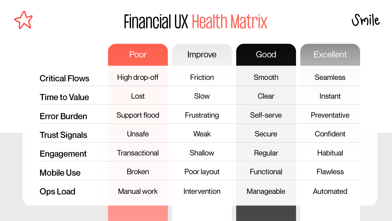
    Financial UX Health Matrix
    Financial UX Health Matrix

How Gapsy Helps Financial Teams Build Products Users Trust

A significant part of our work is dedicated to the financial and payments space. With more than 200 projects delivered across fintech, crypto, e-commerce, complex SaaS platforms, and data-heavy platforms, our team has developed a practical understanding of how real users behave when money, security, and complex flows are at stake. For early-stage companies, specialized UI/UX expertise is the engine behind market traction

Our approach produces measurable shifts in both user behavior and business health:

  • Streamlined onboarding: Rebuilt flows became 40% faster, turning a typically high-drop-off zone into a smooth entry point.
  • Active trading: Simplified dashboards removed the "analysis paralysis," leading to higher trading frequency as users felt more confident in their decisions.
  • Deals and engagement: User-centric refinements boosted engagement by 35% during beta, proving that clarity keeps people coming back.
  • Lasting traction: Across various redesigns, we consistently see deeper sessions and lower bounce rates. These metrics that translate directly into stronger, long-term financial habits.

If you’re working on a financial product and want to strengthen clarity, trust, and user confidence, our team is ready to support you. Contact us to discuss your next steps.

Wrapping Up

Financial products are built on trust, and UX is the mechanism that delivers it. By prioritizing clarity over complexity and empathy over "frictionless" speed, an interface transforms from a high-stress utility into a reliable partner. These strategies are direct interventions that lower operational costs, clear compliance bottlenecks, and build a growth engine that compounds over time.

Most successful transformations begin by identifying exactly where friction hurts the bottom line. Whether it is a drop-off during identity verification or a spike in support tickets, these gaps are opportunities to improve resilience. 

If you’re evaluating how to strengthen your product’s clarity, trust, or performance, our team is always open to a conversation. Contact us to explore where your UX can create the most meaningful shift.

Rate this article

20 ratings
Average: 4.9 out of 5

If you like what we write, we recommend subscribing to our mailing list to always be aware of new publications.

Table of contents

desktop bannermobile banner

Need a design expert?

Do you have any questions? We tried to answer most of them!