A Complete Guide on How To Create an E-commerce App Design

7minutes read
ecommerce app design

The e-commerce market has grown by 25.7% by 2021. This is due to the increased interest in online shopping among customers. The reason for this is the COVID-19 pandemic. As a result, people began to actively use the online marketplace to buy food and necessities during home sitting. Thus, online shopping apps received a record 22 billion visits worldwide.

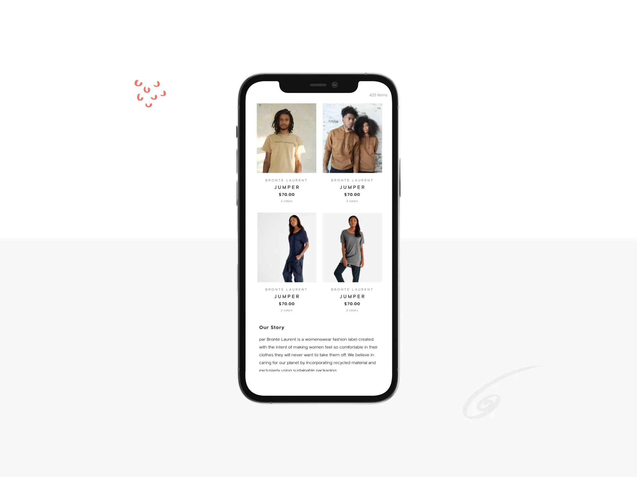
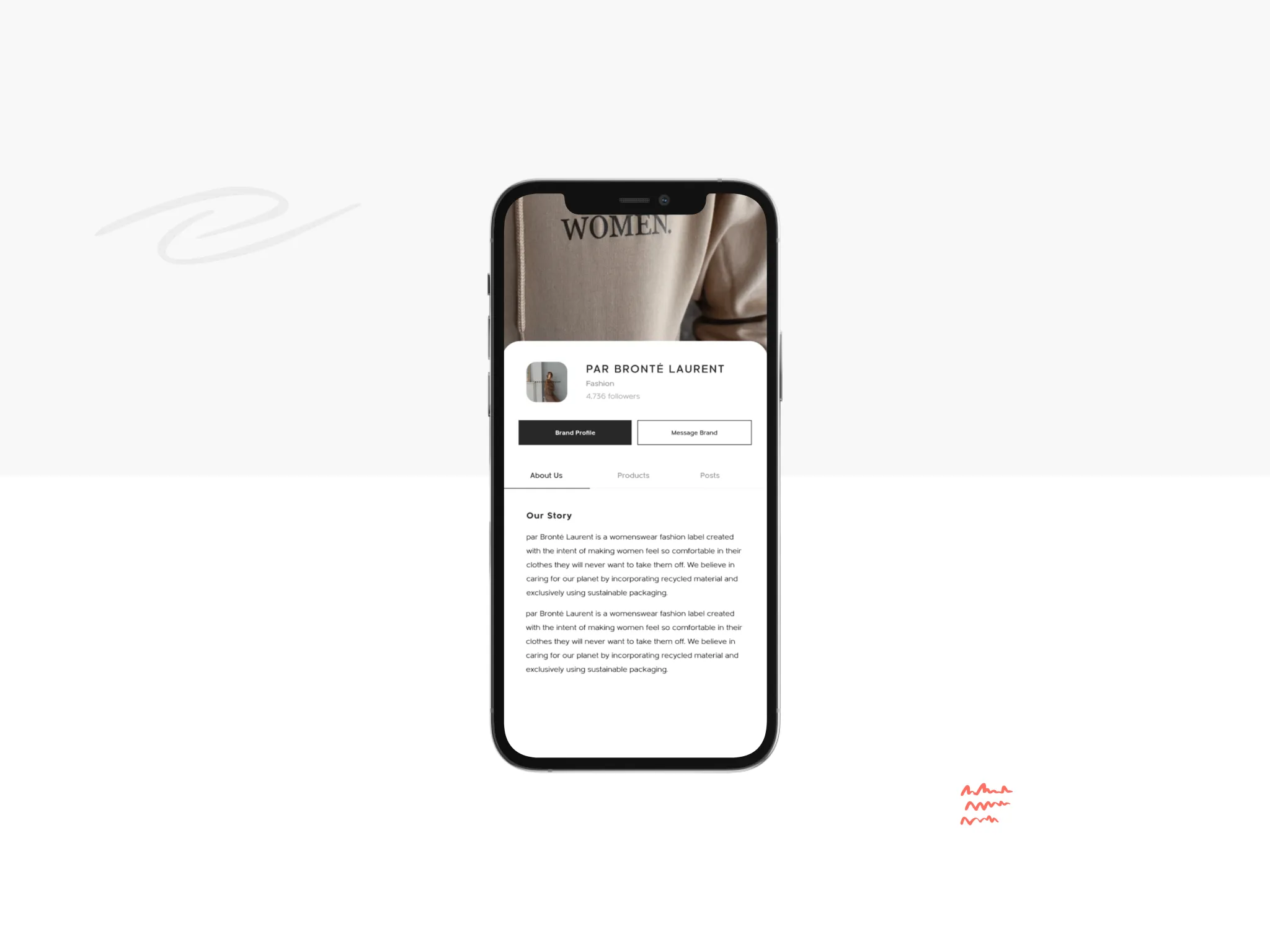
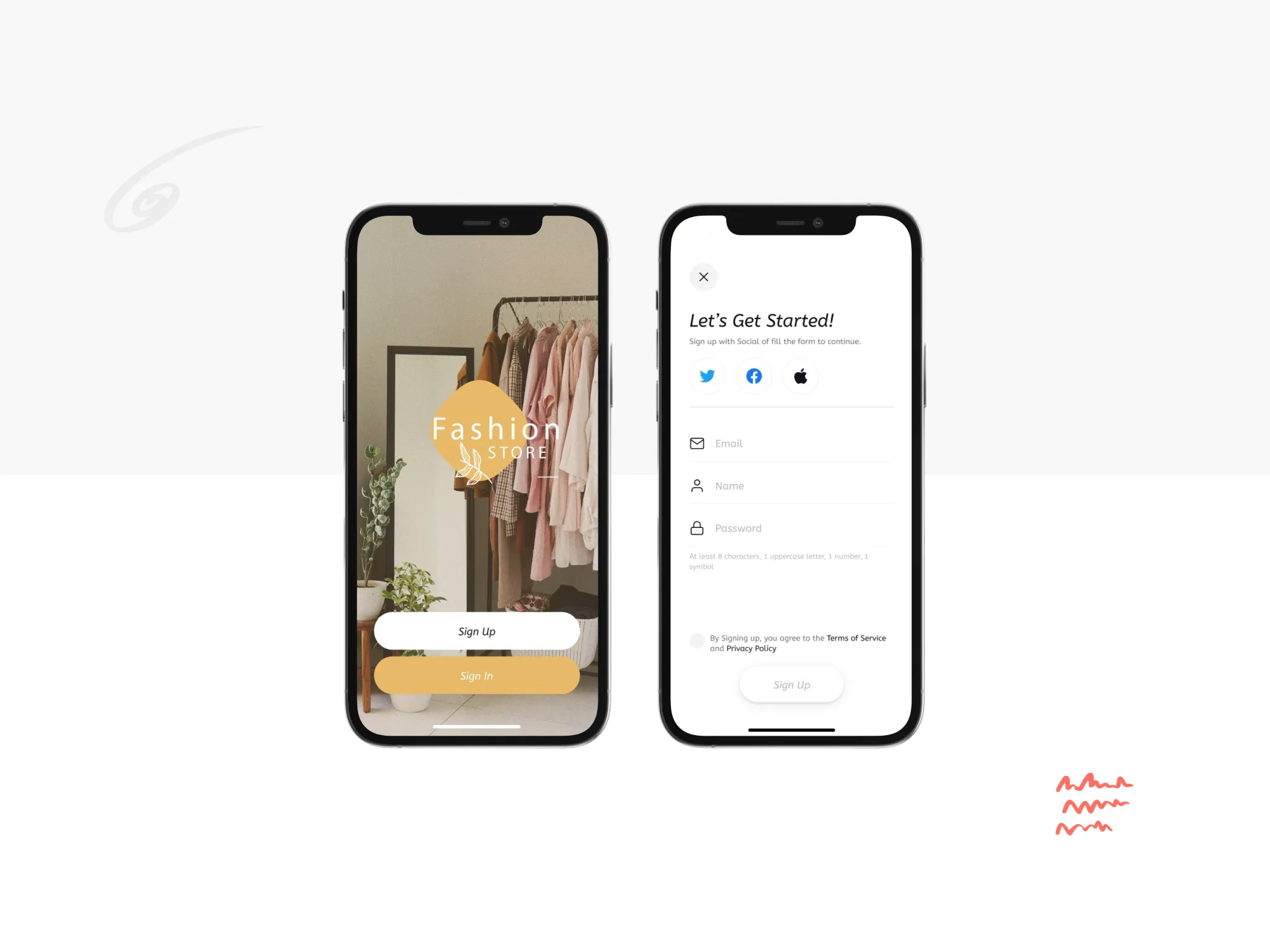
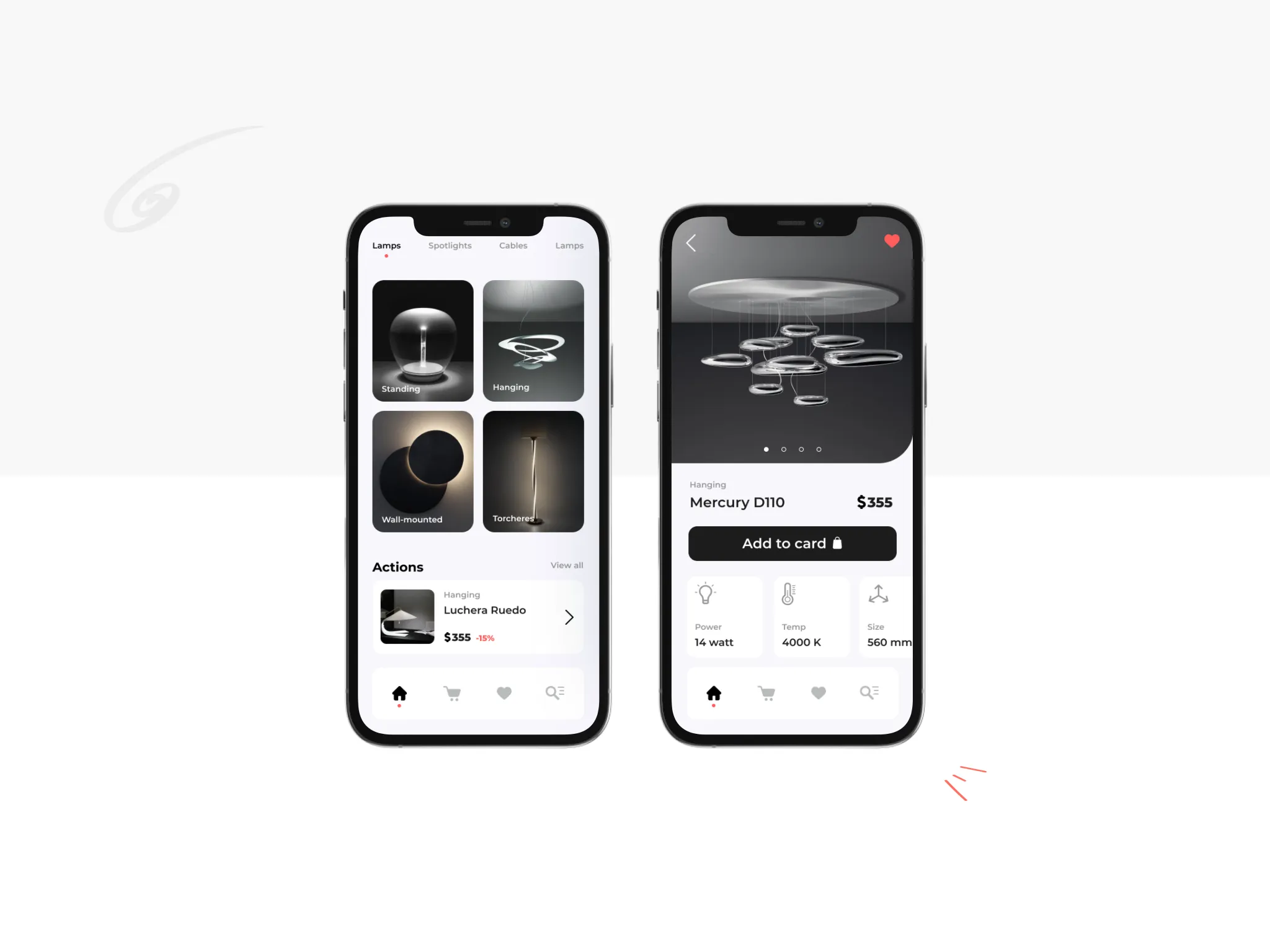
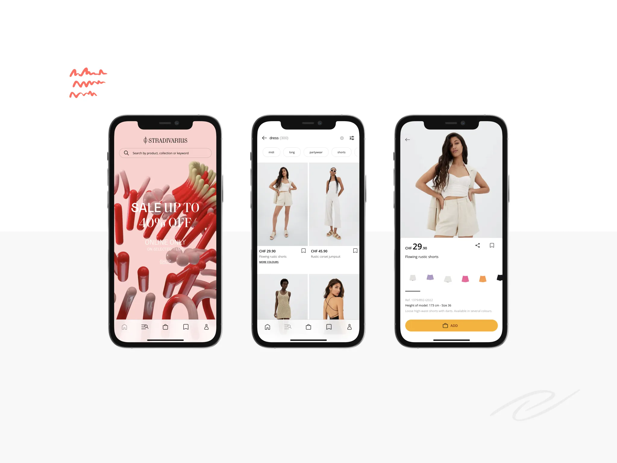
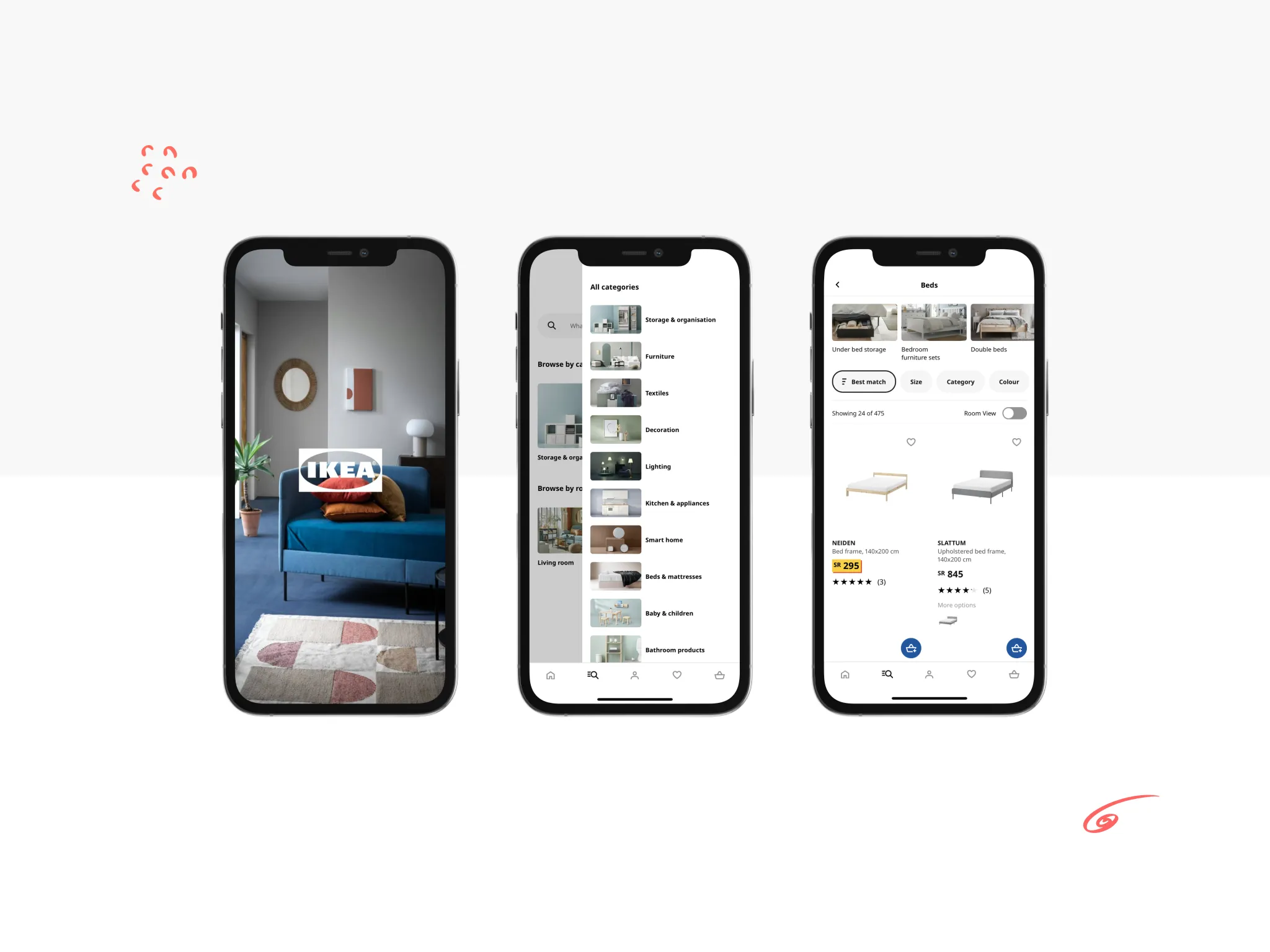
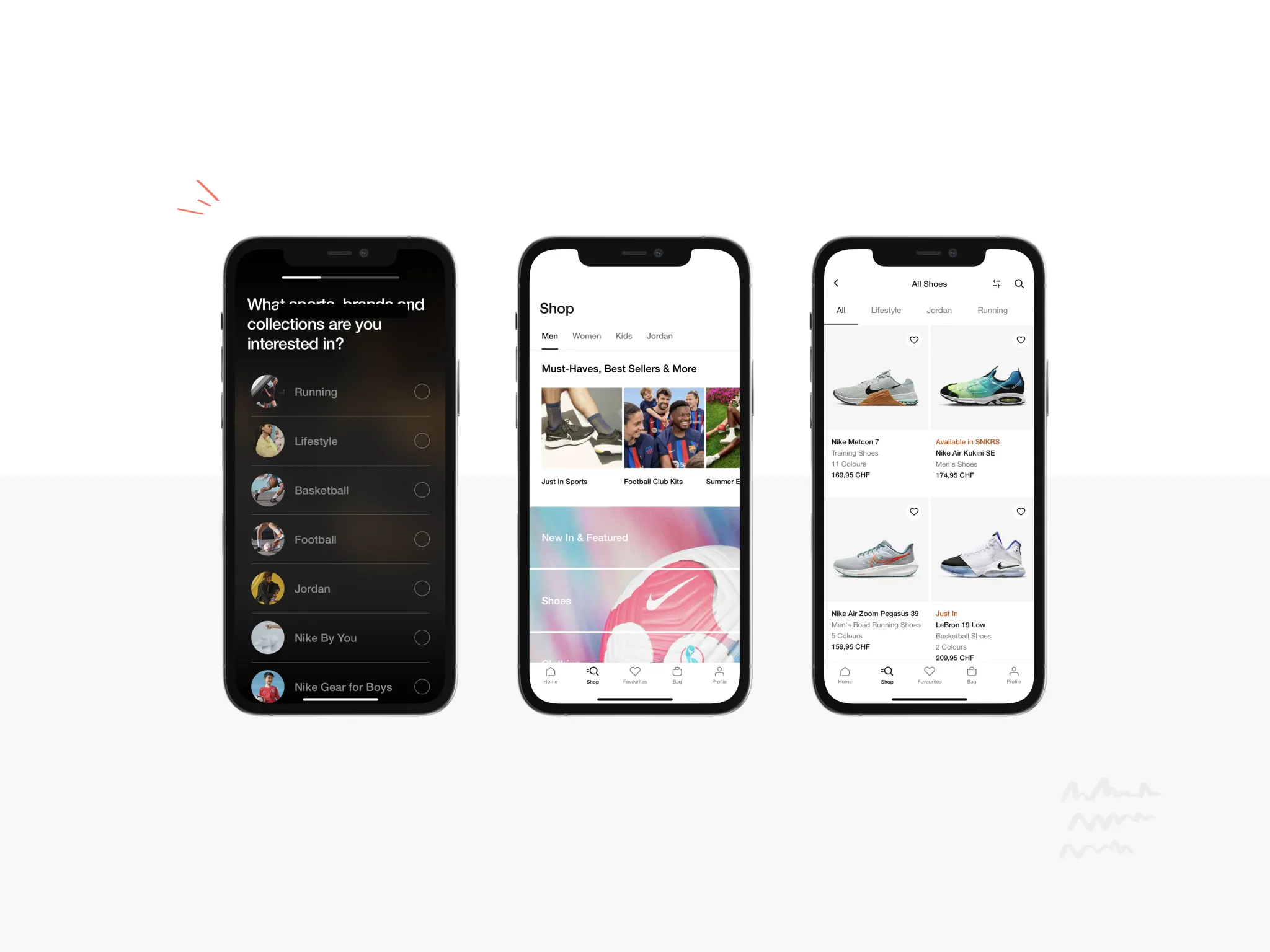
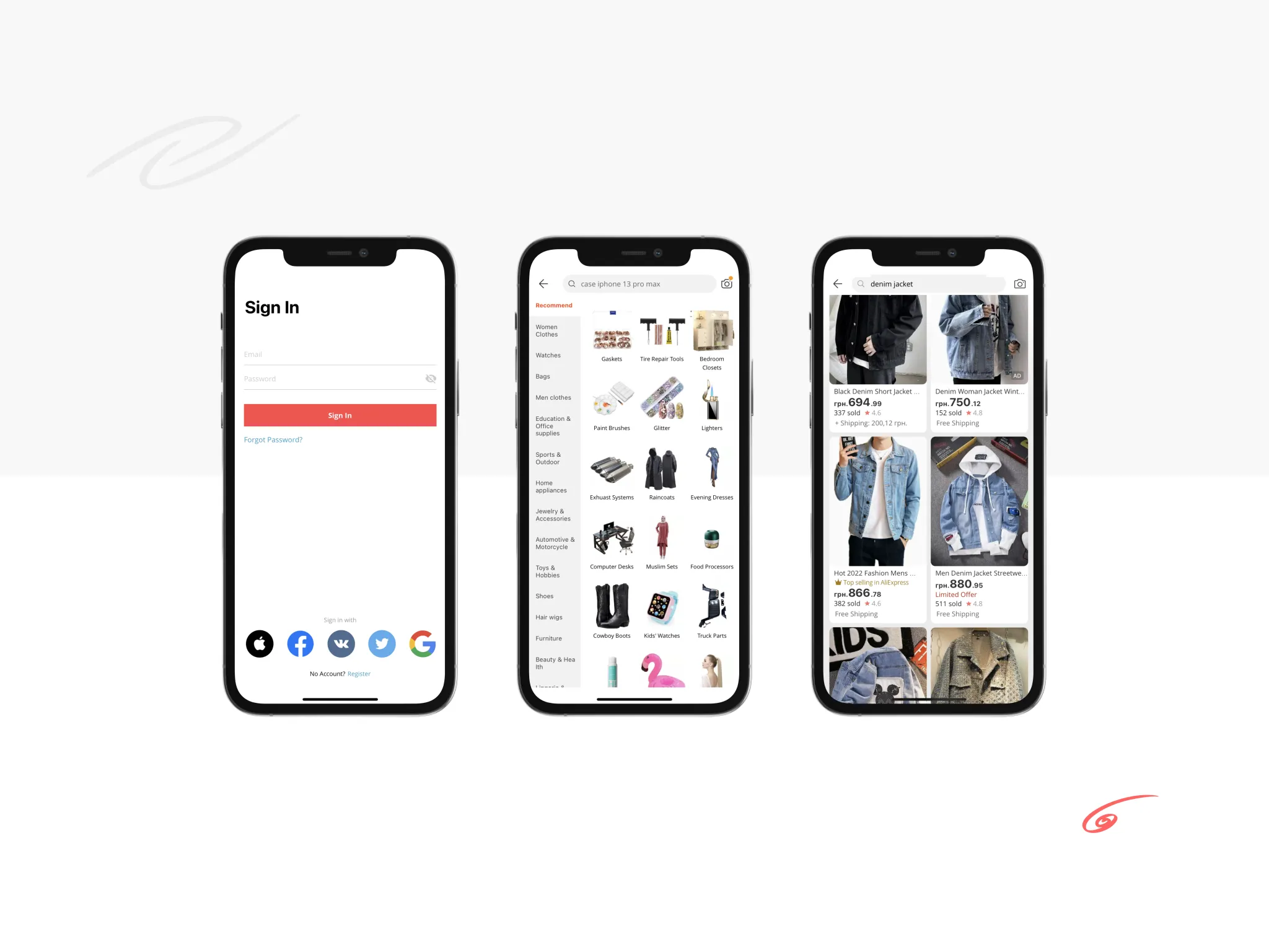
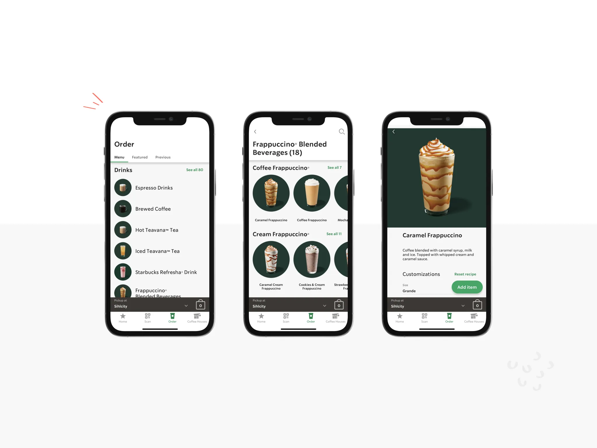
To attract new customers, your online store not only needs quality service and a good product but also constant communication with your potential customers. You can launch a mobile e-commerce app to achieve it. According to research, 57% of online orders come from such apps.

This article will look at essential tips appropriate for the two mobile platforms and summarize a list of qualities that you can apply during e-commerce mobile app designing. Let’s go!

Tips on how to create an e-commerce app design

The e-commerce mobile apps design should be aimed at attracting and properly distributing user attention. Therefore, each interface element should be used with a purpose. Also, during working with the design of the mobile apps, UI kits require being well-thought-out, as they affect the user’s interaction with the product.

Before launching a mobile e-commerce app, you require choosing which mobile platform you will work with — iOS or Android. Your target audience will depend on this and the details of the development and further app operation. The choice of platform will also determine your future app design because each of them has its qualities and rules, which designers should follow.

We will look at the essential tips for e-commerce mobile app design services that will help increase user engagement and activity.

Structure and hierarchy

All content in the user interface should have its purpose, not be in chaos. As a rule, designers build a hierarchy for all elements and regulate their importance through typography, color, and element size.

Hierarchy and structuring are essential in mobile e-commerce apps design. Because in this way, you can focus the user’s attention on the elements responsible for sales and conversion.

Read more about conversion design in our blog.

For example, use the typography to observe the user’s gaze behavior and information priority. First, we pay attention to the photo, then to the name of the sale item and its price, because it’s highlighted in bold and saturated color, and only after then do we look at the information written in pale gray.

Read more about design typography on our blog.

mobile e-commerce design
example of e-commerce design

Or, apply the hierarchy to the buttons to highlight them differently. For example, the one with a dark fill, “Buy now” is the main button and attracts more attention, and the one that is transparent and with a stroke is always secondary.

e-commerce mobile app design
e-commerce mobile app example

Element placement

Think ahead about the positions of the essential active elements, like buttons, calls to action (CTA), and others. Everyone has a different way of holding a smartphone. Mostly it’s a one-handed index finger control or one thumb control. Try to place all the critical elements in an area that the user can easily reach with his thumb when holding his smartphone in the same hand: locate it in the lower-left corner of the center. The other elements that aren’t responsible for the call to action can be placed at the top of the screen.

mobile e-commerce design interface
e-commerce app interface

Why is it important to follow this rule? Users don’t like to strain, and if the interface doesn’t meet their expectations or complicates their interaction with the product, they leave the app irretrievably.

Elements that must be in the area of easy access:

  • add an item to the cart;
  • go from cart to payment;
  • item pay.

The three-touch rule

Don’t make your mobile app too layered. For example, the rule of three taps says that the user needs to tap the screen three times to get to the desired product. So, the shorter and more accessible the user’s path through the app, the better.

You can add a search or intelligent search function, and when customers enter the first letter, possible variants of the product they’re looking for appear.

Easy ordering

All users are extremely lazy and impatient. A lengthy registration or a complicated purchase process can throw customers off, and they don’t want to bother. It’s essential to follow the rule here, not to ask for unnecessary information. Do NOT ask for it if you don’t need the customer’s address or passport information to place an order.

mobile app design for e-commerce
registration in e-commerce app

Integrates with social networks to speed up the process. The mobile e-commerce app will take the necessary information there. And to avoid having to enter a long card number, you can add a feature to read its number through the photo.

Minimalism in app design

When designing an e-commerce app, remember that its purpose is to sell products. It means that you should not overload the interface with unnecessary details because the user may overlook the critical information and calls to action.

design e-commerce app
example of minimalism in e-commerce app

Three essential points to make the design of a mobile app easy:

  • Use one maximum of two fonts in your design.
  • Spacing between elements. The user should see a clear line between the elements. The one product description related to this picture, and the next to another. Don’t be afraid of space. It frees up and gives air to your application. It would help if you didn’t try to fill the entire screen.
  • Choose a color scheme and stick to one color in the design.

Read more about the Minimalism web design in our blog.

One design style

You need to prescribe a view for each element in the same group and its behavior in different situations. Then you apply a single template to each of the screens. In such a way, your e-commerce application design will be consistent.

To stick to one style in your application, you require creating UI kits. This file will contain all elements’ fonts, colors, and design, such as buttons, searches, dropdowns, and more. So, you don’t need to design a new element again each time, but take it from the file.

e-commerce mobile app interface design
ui kits for e-commerce mobile app

The app interface should be intuitive for the user. Consistency of elements gives this good predictability. The users move from screen to screen but already understand what each part can be responsible for because they have experience using it before.

Consistency gives the app structure and helps arrange the content by its importance, making navigation more precise.

The sales funnel in design

The sales funnel — the path a customer takes from first encountering a product to purchasing it. Creating a UX design that will direct the user to the purchase and go through the entire sales funnel is necessary.

It includes such stages:

  • Getting to know the product;
  • Study of the product, interest in information or content related to the product;
  • Choosing the best, comparing it to other products;
  • Call to action, decision-making;
  • Purchase.

Knowing these steps, a designer can apply different chips to designing an e-commerce app to draw the user into a purchase.

Read more about Top E-commerce web design trends 2022 and E-commerce web design tips in our blog.

Want to design an e-commerce app?

Gapsy is here to help! Press the button and we will contact you.

Best e-commerce mobile apps design example

Attendance at online stores has risen significantly amid the pandemic. According to statistics, Amazon has 3.68 billion visits per month, eBay has 1.01 billion, AliExpress has 596 million, and Ikea has 232 million visitors per month.

Now, let’s look at five examples of famous e-commerce apps design:

1) Stradivarius

A single color scheme improves the perception of the interface. Position of each element correct in relation to the other. Also, you can note the clear hierarchy.

mobile e-commerce design
stradivarius e-commerce app design

2) Ikea

The clear navigation of the app allows the user to move freely from screen to screen. There is also a clear hierarchical row, and groups and subgroups of products for ease of use.

e-commerce application design
ikea e-commerce app design

3) Nike

The color scheme of the brand and its style are clearly visible. The proper choice of the app typography and hierarchy of all content.

best e-commerce app design
nike e-commerce app design

4) Aliexpress

Interaction with social media provides quick registration. Well-done accents help draw the user’s attention to the key things.

mobile app design for e-commerce
aliexpress e-commerce app design

5) Starbucks

Convenient navigation allows the user to quickly make a choice. In this app, well observe the rule of three clicks, after which the user reaches the desired screen.

e-commerce mobile app design
starbucks e-commerce app design

Conclusions

A mobile e-commerce app design should have a straightforward interface, visible hierarchy, and easy navigation. It should also display the company’s style and its main characteristics, such as the color scheme. Finally, and most importantly, pursue its personal goal — selling goods. Use various calls to action (CTA) and UX design that accompanies the user from the moment they open the app until made the purchase.

If you still have questions about mobile app design for e-commerce — contact us, and we’ll discuss your project. Check out the finished projects on Behance and Dribbble. And also take a look at the services we provide.

Rate this article

20 ratings
Average: 4.9 out of 5

If you like what we write, we recommend subscribing to our mailing list to always be aware of new publications.

Do you have any questions? We tried to answer most of them!