Financial App Design: The Complete Guide to UX, UI, and Patterns

12minutes read
financial app design

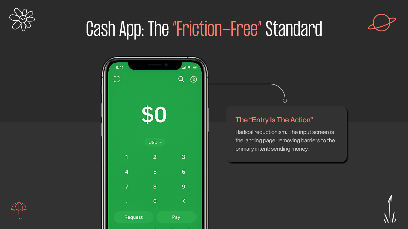
Money is no longer just currency; it’s data, which lives in our pockets. The shift has been absolute: 72% of users prefer managing their entire financial lives through apps, with 68% relying solely on mobile to view their accounts. But this convenience comes with a heavy psychological weight. Unlike a social media glitch, a banking app one causes genuine panic. This is why design in fintech is the very architecture of trust.

That trust is exactly why finance apps see a 35% retention rate after 30 days, outperforming almost every other category. Users don't just "use" applications; they rely on them. At Gapsy Studio, we’ve spent 9 years creating this reliance, learning that the difference between a user churning and committing often comes down to a single micro-interaction or a reassuring color choice.

In this guide, our team shares our practical knowledge. We explore deeper ideas about how people view money, the security practices influencing today’s fintech products, and the real choices in financial app UI design that lead to financial experiences that are both strong and approachable.

Key Takeaways

  • Trust is built through behavior, not visuals alone — performance, motion, and feedback matter as much as aesthetics.
  • Security must scale with risk, staying invisible during low-stakes actions and deliberate when money is on the line.
  • Financial data should be interpreted for users, not dumped on them — clarity beats completeness every time.
  • Speed, accessibility, and context-awareness directly impact retention, especially in stressful real-world moments.
  • Great fintech design balances contradictions: secure yet fast, data-rich yet simple, serious yet human.

Case Study: Making Investment Data Human with AYATA

When partnering with AYATA, we faced a challenge that defines modern fintech: how do you offer professional-grade depth without overwhelming the user? Beneath the surface, the platform managed complex portfolio intelligence and live advisory logic. Our responsibility was to turn that complexity into an experience that felt easy, not tiring.

Our Approach: Narrative Over Data

Instead of creating another data-heavy dashboard, we redesigned the interface as an environment where users can actively work and streamline the complexity. Two key financial app UX design strategies guided the solution:

  • Modular Customization: We replaced fixed dashboards with a flexible widget-driven system. Now, users can customize their workspace, highlight the insights that matter to their investment strategy, and ignore irrelevant details. The result is a dashboard that adjusts to the user, not the other way around.

  • Motion as Function: In AYATA, motion serves an instructional purpose. Subtle transitions and small animations help users grasp how summaries link to more detailed analysis. As they shift from an overview to specific assets, spatial and visual consistency keeps them oriented and confident.

The Result: Clarity Drives Engagement

The final product feels user-friendly from the first interaction. A clear hierarchy, intentional contrast, and obvious focal points help users grasp information quickly and act confidently.

Based on our experience, switching static data tables for an experience focused on understanding, not volume, leads to noticeable results:

  • Less difficulty in finding relevant information.

  • More confident, real-time user actions.

  • A consistent 20 to 40% increase in engagement, caused by one simple change: users finally get what the data is trying to convey.

If you’re building a financial product where trust is non-negotiable, let’s talk. We help fintech teams turn complexity into clarity and users into long-term customers.

What Distinguishes "Good" vs. "Exceptional" Finance Design?

Most financial apps do their job. They process payments, show balances, and track expenses. But just being “functional” doesn’t keep an app on a device. What sets apart the apps that people trust from those they delete typically comes down to three subtle layers that users may not articulate but can feel right away.

Security You Feel, Don't See

Good design adds a padlock icon to tell you the app is secure. A flawless financial interface earns trust. In our process, we see responsiveness as a signal of reliability.

Even small delays, like a button lagging or a screen loading unevenly, can create doubt at a subconscious level. When something feels off by just a fraction of a second, users don’t blame the user interface; they start to question the system behind it. That’s why we design every interaction, from biometric login to transaction feedback, to feel intentional, steady, and solid. Smoothness shows proof.

Databases that Become Stories

Financial information is dense by nature. When it’s unstructured, it becomes noise. A good product shows transactions. A great one explains what they mean.

We design with understanding in mind. Instead of asking users to analyze numbers and calculate patterns themselves, we bring conclusions to the forefront through visual cues and summaries. We don't just say, “Here’s your spending”; we say, “You’re dining out 15% less than last month.” When insight replaces analysis, the product stops feeling like a ledger and starts acting like guidance.

The 3-Click Rule

Nothing shows respect for a user’s time more clearly than speed. That’s why we follow a simple rule: essential actions should be accessible in three taps or fewer. Sending money, locking a card, or paying a bill shouldn’t mean searching through menus or settings.

When common actions are hidden, frustration follows. We create clear “Happy Paths” that position these actions where users expect them — within easy reach of the thumb — so the interface responds as quickly as the intention forms.

Visual Language in Financial App User Interface Design

In financial product design, all the visuals have a purpose. Every choice of color, typography, and chart behavior influences how users understand information, identify risk, and act within the app. When executed well, the interface conveys its state and intent immediately, without the need for explanation.

We view this visual system as a language with its own set of rules, based on three main components: color, typography, and data expression.

Color Psychology

For years, finance relied on conservative “Bank Blue” to convey trust. Today, color systems are more purposeful. They aim to influence emotions and behavior, not just provide comfort.

  • Green vs. red. This is the most primal signal in finance, but it requires nuance. Green isn’t just a signal of approval; it shows stability, progress, and financial health. Red, in contrast, is reserved for situations that really need attention, such as losses, failed transactions, and critical warnings. But using red for minor issues creates unnecessary stress.

  • The rise of purple and dark mode. We often use deep purples or muted gold accents to set advanced tools or features aimed at the premium part, subtly conveying expertise and exclusivity. At the same time, a well-designed dark mode is no longer optional. It’s crucial for users who work in high-focus, long-session environments.

Typography and The Science of Numbers

In financial mobile app design, text is secondary, while numbers take center stage. The biggest mistake we see is designers using standard typefaces for financial data.

Here are our tips to avoid this:

  • Enforce the use of tabular figures (monospaced numbers) rather than proportional figures. In a transaction list, $1,111.00 must take up the same width as $8,888.00. If they don't, the decimal points won't align vertically, making the list impossible to scan.

  • The user's balance should be the loudest element on the screen. We use scale to create a visual hierarchy that answers the user's primary question ("How much do I have?") before they even read a word.

Data Visualization

Spreadsheets belong in accounting software. Consumer-facing apps should help users understand it. At Gapsy Studio, our philosophy is to transform raw rows of data into interactive stories.

We design financial data to be explored, not just observed. Static charts often end the conversation at “Here’s what happened.” Interactive visuals keep it going. Users can scrub timelines, explore categories, and move easily between overview and detail, following their own curiosity.

Context is also critical. A downward trend without explanation creates unease. By adding notes directly to the visualization, such as marking a recurring charge that caused a dip, the interface offers clarity when confusion might arise. The result is a system that explains itself, letting users grasp their financial reality right away, without switching between screens or sorting through raw lists.

Partner with Gapsy to build a financial app that users can trust instantly — drop a line and let’s talk.

Essential Features Your User Expects in Financial Services App Design

What once felt innovative has quietly become standard. Dark mode, spending charts, and basic automation no longer earn goodwill. Today’s users expect financial products to anticipate their needs, reduce effort, and make smart decisions on their behalf.

As we observe the evolving market, here are seven financial mobile app design features you should adopt.

1. Biometric "Passkeys" and Behavioral Security

Traditional passwords are an outdated problem. Biometric login is now standard, but the real advancement comes from behavior-based protection. Top financial platforms continuously watch interaction patterns, such as how a person types, swipes, or navigates.

When that behavior changes suddenly, the system quietly raises verification requirements. There are no alarms or interruptions. The security works in the background and only appears when something seems wrong.

2. Predictive AI Dashboards

Yesterday's data is no longer enough. Modern financial tools help users understand what comes next.

Instead of showing a raw balance, smart dashboards provide guidance on what is realistically available to spend after considering upcoming habits and obligations. When combined with contextual feedback, such as "You usually spend $50 on coffee by this time of the month. You are currently $15 under budget. Great job.”

3. One-Tap Ecosystem Integrations

Users don’t think in platforms. They think in ecosystems. Your app needs to connect smoothly with the rest of their financial life. This means linking to banks, cards, and payment services almost instantly through trusted systems. Any experience that requires users to manually enter sensitive details feels old and undermines trust. Integration should feel immediate, not like an administrative task.

4. The Subscription "Command Center"

Recurring payments are easy to start but difficult to manage. Users want control over their finances. A good subscription hub automatically identifies repeat charges and lets users take action immediately. They can pause, cancel, or upgrade — all without leaving the app. This level of control changes a simple overview into a real retention driver.

5. Context-Aware "Travel Mode"

Context matters, especially when money is involved. A financial app should change when a user’s environment changes.

When traveling, the interface can shift priorities. For example, you can display the local exchange rate on the home screen, hide the total net worth (for privacy in public), and prioritize card controls (like "Freeze Card") in case of loss. The product becomes aware of the situation, responding to where the user is, not just who they are.

6. Conversational Intelligence

Interaction is moving beyond buttons and menus. Users increasingly expect to speak to their financial tools as easily as they would ask a question out loud.

Voice-driven queries and commands, such as "Hey, how much did I spend on Uber last month?" or "Send $20 to Mom," should be executed seamlessly, with clear visual confirmation before any irreversible action occurs. The challenge is building trust into the response.

7. Social Financial Loops

Finance is becoming social. From splitting costs to saving for shared goals, working together on money management has become a primary focus. These interactions deserve top-notch design. Shared balances, group goals, and social payments should feel quick and familiar, more like messaging than banking. When collaboration is easy, financial behavior becomes more consistent and more human.

Analyzing the Best Fintech App Designs

To build the future, you should deconstruct the present. We evaluated three market leaders not to copy them, but to reverse-engineer the specific design decisions that drove their dominance.

Revolut: The Challenger 

Revolut broke the cardinal rule of mobile design — "Do one thing well" — and succeeded anyway. It is a bank, a crypto exchange, a travel agent, and a robo-advisor all in one. Managing this much density without overwhelming the user is a masterclass in architecture.

Their design secret is modular widgetization. Instead of forcing users into a static list of rows, Revolut’s home screen functions like a modular operating system that follows financial app UI design best practices. It acknowledges that no two users are alike. A crypto trader can pin "Bitcoin" to the top, while a frequent flyer pins "Lounge Access." This flexibility turns the dashboard into a personal workspace rather than a generic menu.

So, if you are building a feature-rich app, do not force a rigid hierarchy. Use a "Hub-and-Spoke" navigation pattern where the user returns to a customizable dashboard (Hub) before branching out to distinct services (Spokes). This prevents the "deep nesting" that kills engagement in legacy banking apps.

Copilot Money: The Visualizer

Copilot Money is not a simple budgeting tool; it’s a financial heads-up display. They targeted the "Pro" user (the person who finds spreadsheets comforting but visually uninspiring) and gave them a tool that feels alive.

Copilot makes data feel physical. When you scrub through a spending graph, the phone vibrates with subtle haptic feedback for every data point. It turns a passive activity (budgeting) into a tactile, engaging experience.

What’s more, Copilot’s neon-on-black aesthetic uses high-contrast colors (green vs. grey) to make complex data readable at a glance. By treating financial data like a high-performance gaming interface, they turn "budgeting" into a dopamine loop.

Cash App: The Simplifier

While most banks show you a login screen or a dashboard, Cash App shows you a keypad. They understood a fundamental truth: for P2P (Peer-to-Peer) payments, the app is the wallet.

Cash App’s most radical design decision was making the "Send Money" input the landing screen. There is no friction, as there is neither a dashboard to check nor a menu to navigate. When opening the app, you are already performing the core task.

The main lesson you can learn from this solution is to identify your user's primary intent and remove every barrier between opening the app and executing that intent. If 80% of your users open the app to transfer funds, why hide that function behind a "Log In" button? Cash App proves that radical reductionism builds trust faster than institutional complexity.

8 Proven Financial App Design Patterns Based on Our Experience

We don’t seek out new ideas when it comes to user safety. In financial apps, originality comes from how brands present themselves, not from changing established patterns that users already trust.

The best products are grounded in principles that users naturally grasp. Here are eight financial app UI design patterns we often use to make interactions feel controlled, clear, and empowering.

The "Breadcrumb" Approach to Onboarding

KYC (Know Your Customer) regulatory requirements often require teams to complete identity checks in a single batch. This approach usually results in losing users before they see any value.

Our solution is sequential onboarding with single-input screens. Each screen requests one piece of information and provides visible progress feedback. Users focus on the current step rather than the entire process. Momentum takes the place of resistance.

Context Preservation via Bottom Sheets

Constant page jumps break mental flow. When users are redirected too often, they lose their sense of direction and confidence. 

We address this by layering information using modal bottom sheets. Details show up without completely replacing the current screen, which keeps the original context visible. The user always knows their location and how to return.

The "Privacy Blur" Gesture

Money isn’t always handled in private. Public settings can create discomfort that many apps overlook. 

We focus on discretion by letting users easily hide their balances and sensitive numbers using gesture-based privacy mode. With a single action, the interface adapts to its surroundings, not the other way around.

Turning Empty States into On-Ramps

A new user has no transaction history, which often makes the dashboard look broken or depressingly empty. 

We never leave a screen blank. Instead, we use educational zero-states. Rather than a dry "No Investments Found" text, we display a graphical illustration with a "Start Your First Investment" button or a mini-tutorial. This turns a design dead-end into an educational on-ramp.

Positive Friction for High-Stakes Actions

Speed is valuable, but it can create doubt, leading users to worry they tapped by mistake. In finance, actions involving money require careful thought. 

For transfers and actions that can't be undone, we add intentional friction, such as “Slide-to-Send”. Gestures, confirmations, or biometric checks slow things down and add just enough “weight” to build confidence. The user feels in control, not hurried.

Humanizing the Error Message

Nothing induces panic quite like a robotic "Error 503" during a money transfer. We replace technical jargon with conversational recovery. If a transaction fails, the interface should explain the issue in plain English and offer an immediate solution. For example, "We couldn't reach your bank just now. Your money is safe. Please try again in 5 minutes." This turns a technical failure into a moment of customer support.

Treat Transfers Like Drafts

Network interruptions are inevitable, but losing progress shouldn’t be. We design transfer flows to behave like email drafts: auto-save everything. If a connection drops, the app closes, or the user gets distracted mid-action, nothing is lost.

When they return, the interface picks up exactly where they left off, with amounts, recipients, and notes intact. This reduces re-entry errors, prevents duplicate transfers, and reinforces a sense of continuity. The system adapts to real-world conditions rather than punishing the user for them.

Just-in-Time Jargon Busting

Financial language creates friction. Forcing users to leave their task to learn breaks trust and flow. Instead, we prefer dotted-line definitions.

We gently highlight complex terms and explain them in place through tooltips or micro-overlays that disappear quickly. Definitions are short, human, and contextual, not encyclopedic. This approach allows users to build understanding over time without feeling tested or slowed down. Education becomes supportive, not instructional.

Want to create a platform where users feel confident? Gapsy Studio is here to help you make it happen — contact us and let’s work together.

Common Pitfalls: Where Good Fintech Designs Fail

Even the best visual systems can fail when they focus on flawless behavior rather than real life. In our audits, we find the same four mistakes occurring repeatedly. These choices prioritize formal correctness over how people actually think, feel, and behave in financial apps.

The "Wall of Text" Legal Trap

Regulation and compliance are essential, but that doesn’t equal boring UI. Presenting users with pages of complex legal text during onboarding doesn’t help them understand; it just makes them tired.

Most people won’t read it, but everyone will feel its burden. The answer isn’t to eliminate legal content, but to rearrange it. In this case, we use progressive disclosure. Important commitments should be highlighted in simple language, with the complete documentation available for those who want to learn more. This way, users stay informed without letting compliance get in the way of conversions.

The Over-Security Paradox

Protection loses its value when it prevents use. Requiring multiple verification steps for low-risk actions trains users to disengage.

Instead, security should respond to user intent. To fix this, you can use adaptive authentication, allowing passive entry (like FaceID) for "Read-Only" views, such as checking a balance or tracking a budget. Simple access methods work well for viewing information, while higher-risk actions need stronger confirmation. When safeguards match the level of consequence, users feel protected rather than monitored.

Banning Your Wealthiest Users

Many interfaces are designed for perfect conditions: clear eyesight, small text, and the newest devices. However, the users who provide the most financial value often don't match that profile.

If an interface fails when text size increases, it quietly leaves out an entire group of users. Dynamic type layouts that adapt well to accessibility settings aren't just an extra feature; they are crucial for keeping users over time. In 2026, inclusive design is a key part of any business strategy.

Ignoring the "Stress Case"

Most products are designed for calm, uninterrupted flows. Financial apps, however, are often opened in stressful situations when something has already gone wrong.

When critical controls are hidden behind menus and submenus, the design fails when it’s needed most. We argue that controls like "Freeze Card" or "Dispute Transaction" should be accessible with a single tap. The interface must help users when they are most anxious, not just when they are most relaxed.

Your Partners in Fintech Innovation

Gapsy Studio is a design agency that has spent the last half-decade specializing in the intersection of finance and human behavior. We don't just "make apps pretty". Years of delicate work and thorough research in the field helped our team to balance aesthetics with trust and reliability. We understand that in fintech, a pixel is the difference between a user feeling secure or feeling scammed.

We believe that exceptional design is the only competitive advantage left in a crowded market.

By the numbers: 

  • Specialized focus. We don't dabble. Our team has delivered over 50+ complex financial products, ranging from neobanks and crypto wallets to institutional trading platforms like AYATA.

  • Retention over acquisition. Our designs focus on the long game. On average, our clients see a 30% increase in user retention after a UX overhaul, simply because we remove the anxiety from the user journey.

  • Global compliance. We design for the real world. Our team is fluent in the constraints of GDPR, KYC, and SEC regulations, ensuring our creative concepts never breach compliance requirements.

Ready to Upgrade Your Design?

Gapsy Studio is here to bring a fresh perspective to financial app design.

Conclusion: Don't Leave Trust to Chance

The financial products that succeed in 2026 won’t be defined by the number of features. They will be remembered for how empowered they make users feel. 

Great fintech design exists in a delicate balance. It must be quick but secure, strong yet friendly, serious without being harsh. Finding that balance requires more than just UI skills; it needs a deep understanding of how people react to stress, make decisions, and find reassurance in large numbers. 

In a market where trust is the only real currency, design is not just decoration. It is your insurance policy. Gapsy Studio is your reliable partner — we’re with you from consulting to the final product. Let’s discuss all the details of your product and create something special.

Rate this article

21 ratings
Average: 4.9 out of 5

If you like what we write, we recommend subscribing to our mailing list to always be aware of new publications.

Do you have any questions? We tried to answer most of them!