Mental Health App Design: Best Practices for User Retention and Clinical Safety

13minutes read
mental health app design

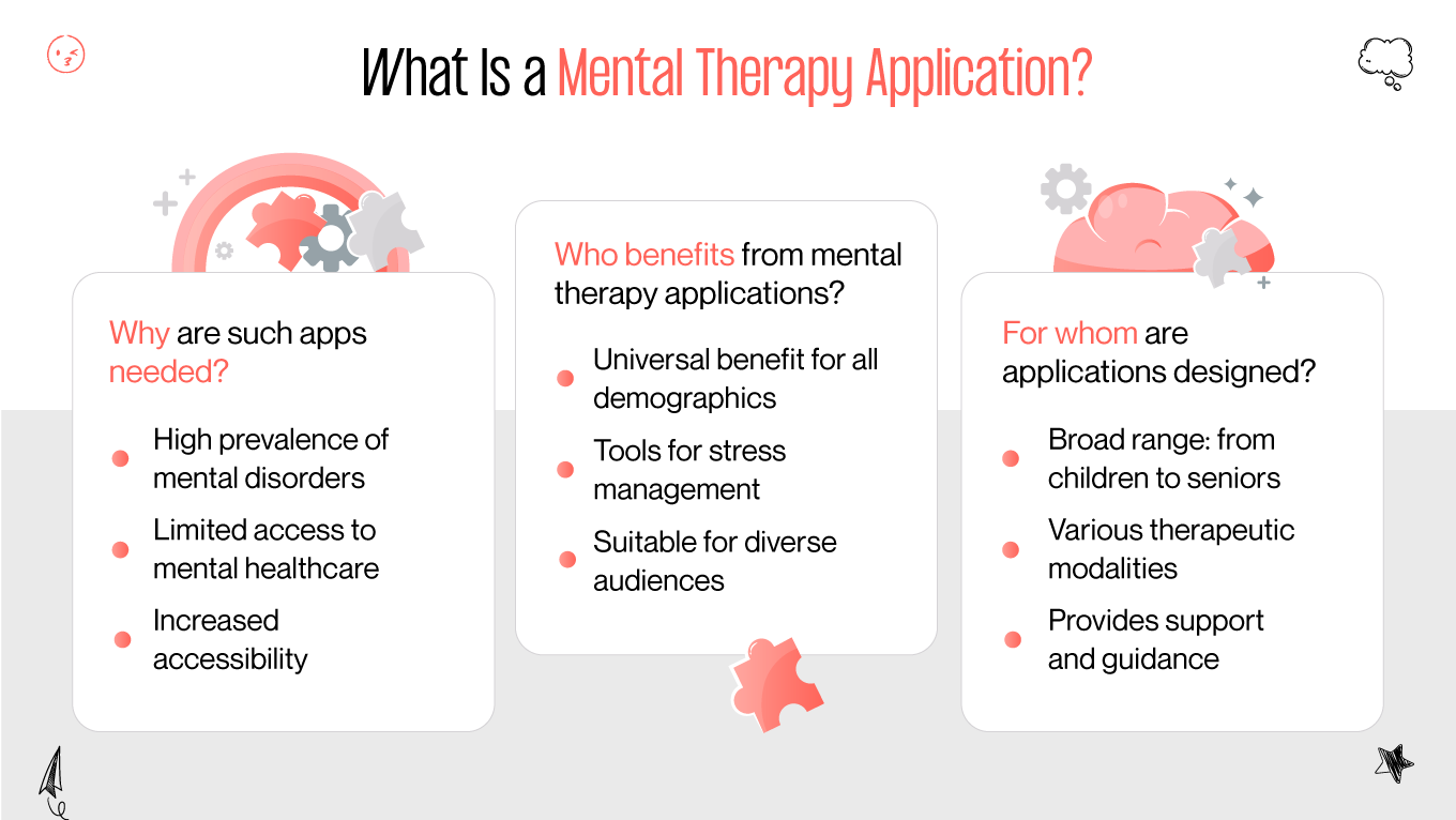
About 70% of users abandon mental health apps within 30 days. This high turnover suggests a disconnect between design complexity and the actual mental capacity of a person in distress. For the 46% of young adults who now use these platforms, a demanding interface often becomes another task to manage rather than a source of relief.

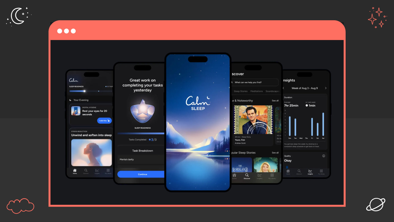
Our approach to mental health app design at Gapsy centers on closing this gap through simplicity. We’ve learned that sustained engagement comes from helping users feel genuinely understood, which is achieved through clear, context-aware feedback. When an interface is successful, it reinforces a sense of control, using quiet UI signals to ease anxiety and foster trust without demanding extra mental effort.

This article explores the strategic dimension of digital wellness. We’ll examine the mental health app design principles that support long-term retention, the UI patterns that create a “safe” user experience, and the guidelines for developing products that balance clinical value with ease of use.

Case Study: How We Designed a Digital Sanctuary with Mind Cleanse

The partnership for Mind Cleanse began with a conversation about the weight of modern digital life. The founders came to us with a vision for a tool that would act as a sanctuary rather than another demanding application. They recognized a fundamental friction in the market: the very people who need support often have the least amount of energy to seek it out.

The Challenge 

During UX research, our team identified that the primary hurdle wasn't a lack of features, but an excess of noise. Most wellness tools follow standard engagement patterns: frequent notifications, complex data tracking, and high-energy visuals. For someone experiencing burnout or anxiety, these patterns are obstacles.

The core challenge in this mental health app design was to build an interface that requires almost nothing of the user while providing a clear path to relief. We had to rethink "engagement" not as time spent on the screen, but as the ease with which a user finds a moment of peace.

Our Work 

We approached the UI with the intent of lowering the user's heart rate as soon as the splash screen appears. Every design choice served to reduce cognitive friction:

  • Visual Softness: Following the mental health app UI design best practices, we moved away from high-contrast colors and sharp edges. Instead, we used a palette of de-saturated blues and greens. These tones create a stable environment that feels safe and non-intrusive, a critical standard in professional mental health app design.

  • Intuitive Pathways: Navigation was stripped down to a single-focus hub. Instead of a menu of twenty options, the app highlights one primary action based on the user's immediate needs. This removes the "choice paralysis" that often leads users to close an app in frustration.

  • Tactile Reassurance: We integrated subtle haptic feedback. A soft vibration when a user logs a thought or finishes a breathing exercise provides a sense of physical accomplishment. It makes the digital experience feel grounded and human.

During development, we realized that showing a user a history of their "bad" days can inadvertently increase stress. We pivoted our reporting strategy. Instead of just displaying data, the app offers context. If a user logs a restless night, the interface adapts to suggest low-energy activities, acting more like a supportive companion than a diagnostic tool.

The Result

The final version of Mind Cleanse is a product that balances clinical necessity with human warmth. We integrated secure, HIPAA-compliant consultation features, ensuring the app functions as a reliable bridge to professional therapists without losing its approachable feel.

By prioritizing the user’s state over traditional growth metrics, we created a mental health app that stays on the phone because it offers genuine relief. It stands as a testament to the idea that in healthcare and telemedicine, the most effective technology is the one that knows when to get out of the way.

Creating a mental health app requires experience. Gapsy Studio is here to help you design an effective platform — let’s talk about your project.

Types of Apps for Mental Health Issues

Unlike a traditional website, a mental health app is often opened in moments of emotional vulnerability, making it a “safe space” in the pocket. The demand for digital support varies wildly based on a user’s immediate state of mind. During global shifts like COVID-19 pandemic, searches for mindfulness apps surged by 2,500%, while depression-specific tools saw a much smaller increase of 156%. This suggests that most people reach for "wellness" and "calm" as their first line of defense, often avoiding tools that feel overly clinical or diagnostic.

In our work, we’ve found that a "one-size-fits-all" approach to mental health app design fails because the psychological "weight" of each category is different. A meditation app should feel like a quiet exhale, whereas a teletherapy platform has to prioritize the feeling of professional security. We categorize these tools not just by their features, but by the mental energy they require from the user. Let’s explore each type.

Tools that assist in managing anxiety and depression

Interfaces for depression and anxiety focus on reducing the energy required to participate. Since users in these states often feel depleted, the design prioritizes "micro-interactions", like selecting an icon rather than typing a journal entry. This approach lowers the barrier to self-expression when mental energy is at its lowest.

Tools for mental disorders

Designing for specific mental disorders means designing for highly variable states, routines, and limits. These interfaces should adapt to fluctuating cognition, perception, and motivation without overwhelming the user. 

Designers often solve this by prioritizing predictability, clear structure, and gradual disclosure, so the app feels stable even when the user doesn’t. The challenge is to provide enough guidance and clinical structure while preserving autonomy, avoiding anything that feels prescriptive or controlling.

Addiction helpers

Addiction-focused apps are built around moments of vulnerability, urgency, and relapse risk. From a design standpoint, timing is more important than richness. The interface should present the right action immediately when cravings peak. It also requires reducing navigation depth and replacing complex processes with quick-access tools, such as one-tap check-ins or grounding prompts. The tone is equally important. Interfaces should remain neutral and supportive, avoiding any visual or verbal cues that might trigger shame after setbacks.

Eating disorders assistants

Apps in this area need to be very sensitive to language, metrics, and visual feedback. Designers aim to avoid reinforcing obsessive behaviors while still promoting awareness and recovery. 

This may involve simplifying or softening data, limiting the focus on numbers, and carefully framing progress in qualitative terms. The main challenge is balancing structure with flexibility. The goal is to provide guidance without enabling harmful patterns or encouraging unhealthy comparisons.

Self-development tools

Self-development apps are designed for motivation that can be inconsistent. The main issue is preventing burnout from over-optimization or constant self-tracking. Design in such applications emphasizes non-linear progress, encouraging reflection instead of pressure-based metrics. Interfaces are created to feel welcoming rather than demanding, which helps users reconnect with personal goals without turning growth into another obligation.

Mindfulness and meditation platforms

Mindfulness apps aim to compete with distractions while promoting presence, which presents a fundamental design challenge. The interface should feel calm and unobtrusive while still guiding users forward. 

Designers address this by reducing visual clutter, slowing interaction speed, and using gentle transitions that reflect the intended mental state. The goal is for the UI to step back quietly, letting the practice take priority over the product.

App Category

Primary User Challenge

Design Priority

Strategic UI Approach

Anxiety & Depression

Cognitive fatigue and depletion.

Reducing Effort

Use voice-to-text, emoji check-ins, and "single-tap" interactions to minimize mental energy.

Complex Clinical (OCD, Bipolar)

Need for stability and order.

Predictability

Maintain fixed layouts and rigid navigation to prevent disorientation. Avoid experimental UI updates.

Recovery (Addiction, ED)

Vulnerability to shame and relapse.

Non-Punitive Support

Replace "streak" counters with cumulative progress markers. Ensure crisis buttons are always persistent.

Mindfulness & Wellness

Digital noise and distraction.

Sensory Calm

Prioritize de-saturated colors, slow-motion animations, and haptic cues for breathing exercises.

Self-Development

Habit-stacking fatigue.

Integrated Flow

Use "invisible" reminders and holistic bundles (sleep + mood) to integrate into existing routines.

Not sure what design approach to adopt for your mental health app? Let’s design with care together — contact us to collaborate.

Essential and Advanced Features in Mental Health App Design

In mental health apps, features fail because they show up at the wrong moment, in the wrong way. Here, users often interact while exhausted, anxious, or emotionally raw. That changes everything. A feature that feels helpful in a productivity app can feel overwhelming or even unsafe. The real measure of success is how gently the platform supports users during their most fragile states. Here are effective mental health app design best practices. 

The Frictionless Entry

Long sign-up processes assume that users have clarity, motivation, and emotional stability, which are often absent during crises. Creating frictionless entry means accepting incomplete information and emotional urgency. 

We advocate for a "gradual onboarding" approach through collecting only what is essential for safety first and allowing the user to complete their profile as they become more comfortable with the app.

The Human-Centric Therapist Profile

From our experience, users don’t search for therapists like they would for service providers. They look for emotional safety. A resume-like profile with qualifications and experience rarely answers the key question: Will I feel understood by this person? The design challenge is capturing human warmth in an interface without oversimplifying or making it look like an advertisement. 

In such situations, we may suggest using introductory video snippets and communication style tags (e.g., Direct, Compassionate, Goal-Oriented) to make professional support feel human and accessible.

The Adaptive Dashboard

Dashboards can quickly become a source of pressure instead of clarity. Users often disengage when tracking progress feels evaluative or overly filled with data. 

Instead of showing everything at once, adaptive dashboards highlight only what’s important today, whether that’s a grounding exercise, a missed habit, or nothing at all. The goal is orientation, reassurance, and a feeling that the app understands where the user is right now.

Non-Intrusive, Supportive Notifications

Poorly timed reminders can create feelings of guilt or anxiety, especially when users are already having a hard time. 

In our practice, we treat notifications as gentle check-ins rather than urgent demands. UX/UI design should strike a balance between being available without being pushy. Customization is important, but so is setting defaults that recognize vulnerability rather than discipline. The most useful notifications feel optional, kind, and easy to ignore without negative effects.

Secure, Low-Latency Communication

When users start an audio or video session on a mental health platform, they’re entering a vulnerable emotional space. Any technical issues, delays, or uncertainty can quickly erode trust. 

From a design perspective, communication tools should feel seamless and dependable, especially when emotions run high. While security features like encryption are crucial, emotional continuity also matters: quick connections, clear session indicators, and predictable controls. The goal is to keep technology from becoming the focus, allowing the user to remain fully engaged in the therapeutic relationship.

The "Crisis Protocol" Interface

A dedicated safety feature is a moral and clinical necessity. This should be a persistent, high-contrast button that remains accessible regardless of which screen the user is on. 

Upon activation, the mental health app design should trigger a pre-set sequence: immediate connection to a crisis line, a "safety plan" document, or a direct alert to a designated emergency contact. The UI here prioritizes speed and extreme simplicity, removing all other navigation options to focus the user on immediate safety.

Biometric Syncing and Passive Monitoring

The most effective mental health app UX design now integrates with wearables (Apple Watch, Oura, etc.) to detect physiological shifts before the user does. If the app detects a spike in heart rate or a significant dip in sleep quality, it can proactively suggest a grounding exercise or a check-in. This moves your solution from a reactive tool to a proactive companion, reducing the burden on the user to "remember" to take care of themselves.

Collaborative Care Modules

Mental health support is rarely a solo endeavor. A "Collaborative Care" feature allows the user to securely share specific data points, like mood trends or sleep logs, directly with their therapist or a family member. 

Your mental health app interface design should ensure this is an "opt-in" experience with granular privacy controls, allowing the user to decide exactly what is shared and for how long. This transparency strengthens the therapeutic alliance and provides the therapist with objective data between sessions.

AI-Augmented, Private Journaling

Traditional journaling often feels like a chore. Modern mental health app design utilizes AI to provide "Gentle Prompts" based on the user's recent activity or biometric data. 

Instead of a blank page, the app might ask, "You've had a busy week; would you like to reflect on your energy levels today?" Importantly, these insights should be processed locally on the device to maintain the highest standard of data privacy and user trust.

Progress Visualization 

Users stay engaged when they can see their evolution. Rather than static charts, we frequently use a "Growth Map", a visual representation of the user’s journey over months or years.

Such a feature focuses on cumulative milestones and resilience patterns. By highlighting how far a user has come, the mental health app UI design fosters a sense of agency and hope, which are critical drivers for long-term recovery.

7 Mental Health App Design Principles From Our Team

At Gapsy, we view the interface as a clinical environment. For someone in a state of distress, the brain’s executive function is often compromised. Every button, notification, or menu choice requires mental energy that the user simply may not have to spare.

Our team approaches this through a framework we call the "Architecture of Calm." This moves the focus away from traditional engagement metrics and toward cognitive conservation. By applying these specific mental health app design principles, we create digital spaces that offer immediate relief rather than adding to the user's mental load.

Strategic Predictability

Predictability is the quiet antidote to anxiety. In a standard consumer app, a surprise "new feature" pop-up might be seen as an update; in a mental health context, it is a disruption of a safe space. To build a stable environment, we prioritize:

  • Persistent Navigation: Elements should never shift positions. A user needs to instinctively know where the “home” or “help” buttons are without having to search or relearn the interface during a crisis. Even small layout changes can increase stress, so consistency across updates is treated as a safety requirement, not a branding choice.

  • Consistent Feedback Loops: Every action should have a gentle, expected reaction — no delayed confirmations, no ambiguous states. This reliability builds a sense of control and security, reinforcing trust at moments when users may already feel powerless or uncertain.

Eliminating Decision Fatigue

Decision fatigue happens when a user is overwhelmed by choice. When someone is experiencing burnout or high anxiety, even choosing between "meditation" or "journaling" can feel paralyzing.

  • The Single-Path Interface: We design state-aware screens that offer one clear next step based on the user’s current mood or energy level. By reducing options to the most relevant action, we remove the pressure to “choose correctly” and help users move forward without overthinking.

  • Progressive Disclosure: Instead of exposing all features at once, we reveal tools only when they become clinically or emotionally relevant, preventing the interface from feeling crowded. This way, users focus on what matters right now, not everything the app can do in theory.

The "Safe Exit" and Emotional Safety Nets

A critical but often overlooked principle is the Safe Exit. Users should never feel "trapped" in a flow, especially during sensitive tasks like trauma-informed journaling or crisis assessments.

  • The No-Guilt Close: If a user starts an exercise but cannot finish it, the design should offer a soft way out. Instead of a harsh "Quit" button, use phrases like "Take a Break" or "Save for Later." This reduces shame-driven disengagement and acknowledges that stopping can be a form of self-regulation, not failure.

  • Instant Grounding: Every screen should include a fast route back to a neutral, safe space. Whether it’s a persistent “Calm” button or a quick-access breathing tool, users need to know they can reset their emotional environment immediately, without navigating away or explaining themselves.

Resilience Over Perfection

Traditional UX often relies on "streaks" to drive engagement, but in a mental health context, a broken streak can feel like a personal failure. If a user misses a day because they were struggling, a "Reset to Zero" notification can trigger a shame spiral.

  • Cumulative Progress: We emphasize long-term patterns and total milestones over consecutive-day metrics, reinforcing the idea that progress isn’t erased by setbacks and that consistency looks different for everyone.

  • Forgiving Mechanics: Design patterns should normalize pauses and returns. Instead of resetting counters, we highlight moments of re-engagement, reframing “coming back” as an act of resilience rather than recovery from failure.

Sensory-Neutrality and Visual Quietness

High-energy design, e.g., bright reds, high-contrast flashes, and aggressive animations, can be overstimulating for someone in a state of sensory overload. Mental health app user experience design strives for a "muted" interface.

  • De-Saturated Palettes: We use colors that don’t require attention or signal urgency. Soft, low-contrast, minimalistic palettes create a visual baseline that feels stable and predictable, helping users remain regulated rather than reactive.

  • Haptic Mindfulness: Instead of attention-grabbing sounds or alerts, we rely on subtle haptic feedback. A gentle vibration during a completed exercise offers reassurance without pulling users out of their emotional state or startling them.

Adaptive Onboarding and Earned Trust

Trust is a design element that has to be earned over time. Demanding a full clinical history or a credit card during the first thirty seconds is a common mistake that leads to immediate abandonment.

  • Gradual Disclosure: We collect only what’s essential at the start, prioritizing safety and access. As users gain confidence in the app and feel supported, we introduce deeper capabilities gradually, aligning data requests with demonstrated value.

  • Transparent Privacy: Privacy controls should feel empowering, so we replace dense legal language with clear explanations that show users exactly what’s protected, what’s optional, and how they stay in control.

Contextual Sensitivity

A successful interface adapts to the user’s immediate reality. If a user logs a high level of distress, the app should not continue with its "business as usual" layout.

  • The "Low-Energy" Mode: When a user reports distress or overwhelm, the interface should simplify automatically. Secondary features fade away, leaving only grounding tools and essential actions, reducing cognitive load at critical moments.

  • Proactive Compassion: By integrating wearable data or behavioral signals, the app can recognize early signs of stress and gently intervene. Offering support before the user asks helps prevent escalation and reinforces the feeling that the app is attentive, not reactive.

Work with us on mental health UX that guides users gently through vulnerable moments.

Mental Health App UI Principles We Implement

The goal is to move past the concept of "looking good" and toward the reality of "feeling safe." Our team uses a deliberate visual language to ensure the interface remains a supportive backdrop for the healing journey.

Color Theory

Colors hold significant psychological weight, especially in moments of crisis. While many consumer apps use high-contrast palettes to drive excitement, we prioritize the opposite approach.

  • De-Saturated Palettes: We focus on de-saturated teals, sage greens, and soft earth tones. These colors are chosen to reduce retinal strain and help lower heart rate and cortisol levels. These are signals to the brain's parasympathetic nervous system to engage.

  • Non-Triggering Alarms: We strictly limit the use of high-vibrancy reds or oranges, which the brain often interprets as a threat. For "delete" or "stop" actions, we utilize muted berry or terracotta tones to convey the message without triggering a stress response.

Typography

Typography dictates the "tone" of the digital space. If a font is too sharp or overly decorative, it can feel aggressive or difficult to process during a moment of fatigue.

  • Low-Energy Readability: We select typefaces with high x-heights and open counters (the spaces within letters like 'o' or 'a'). This ensures text remains legible even if the user’s vision is slightly blurred due to exhaustion.

  • Approachable Shapes: We lean toward rounded geometric sans-serifs. The soft curves feel human and non-judgmental, moving away from the rigid, "corrective" feel of traditional clinical documents.

Adaptive UI

The most effective mental health app user interface design is one that changes based on the user's mental state. 

  • High-Stress Simplification: If a user logs a high level of anxiety, the interface automatically simplifies itself. Secondary features, like community feeds or complex settings, recede.

  • Focusing the Lens: The dashboard shifts to highlight only the most essential tools: a single-tap breathing exercise, a crisis button, or a direct link to a therapist.

  • Visual Breathing Room: During these moments, we intentionally increase white space (negative space). This provides the user "visual room to breathe," reducing the feeling of being trapped by an overcrowded interface.

Essential Mental Health App Design Guidelines for 2026

To move beyond "just another app" and create a real therapeutic tool, you need to consider what defines the next generation of digital care. By 2026, the standard has changed. An app must be more than functional; it should protect the user's mental limits and their right to complete privacy.

1. Designing for the "Depleted Brain"

Standard accessibility usually focuses on screen readers and color contrast (WCAG 2.1). In mental health, we need to ensure cognitive accessibility. When someone experiences a depressive episode or a panic attack, their mental resources are severely limited.

Eliminate tasks that require intense focus. This means no complex forms, hidden menus, or timers. If a user needs to pause a check-in, the app should save their progress automatically.

For someone in turmoil, the app has to remain constant. So, keep navigation consistent: if a "Help" button is in the top right corner on one screen, it stays there on every screen in the app. No exceptions.

2. Radical Data Ethics

In this space, data records a person's most vulnerable moments. If a user feels uneasy about where their information goes, they will stop using the app.

We have moved away from aggressive engagement strategies. In 2026, "streaks" are out and "nudges" are in. We avoid language that feels like a scold. Instead of saying, "You missed your 3-day goal," we say, "We’re here whenever you need a moment." The focus is on being a supportive partner, not a demanding coach.

We create interfaces where "Privacy by Default" is essential. Users should be able to choose what their therapist sees and what stays on their local device. We also support a "Right to Disappear". This is a one-tap button that permanently deletes all sensitive logs without unnecessary steps.

3. AI as a Supportive Substrate

The age of the "fake friend" chatbot is over. Users can sense when they are talking to a scripted response, and in a crisis, such generic replies can feel very isolating.

Modern mental health app design uses AI to detect patterns in the background, like changes in sleep or typing speed (with clear consent). Instead of interrupting the user, it discreetly adjusts the dashboard to highlight calming tools before the user even realizes they are heading toward a crisis.

To ensure privacy, we prioritize "Edge AI." Sensitive analysis, such as tracking emotions in a journal, happens locally on the device. This guarantees that the user's most private thoughts never reach the cloud.

Let’s transform your mental health platform to help users feel better — drop a line.

Mental Health App UI Design Examples to Inspire You

To truly understand how mental health app design translates into market dominance, you can look at the industry leaders who have mastered the balance between clinical utility and emotional resonance. Explore some real-world examples for mental health app UI design inspiration.

Calm: The Master of Sensory Immersion

With over 100 million downloads, Calm is often the first thing people think of when they hear "mental health app." But its success isn't just about the meditations; it’s about the "Architecture of Tranquility."

When you open Calm, you aren't greeted by a menu of tasks. You are greeted by the sound of rain and the visual of a de-saturated, slow-moving lake. By using soft blues and greens, Calm signals to the user's nervous system to "power down" before they even read a single word.

In the past year, Calm’s move into VR-like relaxation environments increased user retention by 25%. They realized that for a user in a crowded city or a stressful office, the app needs to act as a "digital escape pod," visually removing them from their physical environment.

Headspace: Frictionless Support and Tactical Empathy

Headspace has mastered the transition from "daily wellness" to "clinical support." While Calm focuses on the atmosphere, this application emphasizes eliminating the friction of being a beginner.

Its interface is famous for its playful, non-intimidating animations. This is a deliberate choice: by making therapy feel "friendly" and "organized," Headspace removes the stigma of seeking help.

One of their most impactful features is the use of haptic feedback for breathing exercises. The phone literally "pulses" in your hand as you inhale and exhale. For someone in the middle of a panic attack who can't focus on a screen, this physical, tactile guide provides a grounding sensation that a video simply can't match.

The app’s AI companion, Ebb, doesn't just talk; it listens for patterns. If a user’s mood inputs have been declining for a week, Headspace doesn't just suggest a meditation — it creates a bridge to a virtual therapy session, making the path to professional help feel seamless and safe.

Finch: The "Low-Pressure" Revolution

Finch has taken the market by storm by solving a common problem: Self-care guilt. For many, traditional habit trackers feel like another list of things they are "failing" at. Finch flipped the script with a virtual companion.

Instead of "tracking your mood," you are "caring for a bird." When you journal or breathe, your pet grows. This shifts the focus from a stressful self-improvement goal to a nurturing, low-pressure interaction.

Finch is particularly effective for users with ADHD or high anxiety. The interface is filled with micro-rewards, visual celebrations of even the smallest tasks, like drinking a glass of water.

With a 70% retention rate, Finch proves that humanity and humor are just as important as clinical data. Their users don't feel "monitored"; they feel "motivated" by a pet that responds with empathy, creating a safe, judgment-free space for growth.

Gapsy Studio Is Your Reliable Partner for Mental Health App Designs

Our work at Gapsy Studio focuses on the specific psychological and technical requirements of digital health products. We build interfaces based on how the human brain processes information under stress, ensuring that the technology supports rather than complicates the therapeutic process.

  • Evidence-Based Navigation: We apply a "Low-Friction" model to all layouts. By reducing the number of clicks required to reach core features, we directly counter the decision fatigue that leads to high abandonment rates in mental health apps.

  • Privacy-First Architecture: Data security is integrated into the UI. We develop clear, granular controls that allow users to manage their data sharing in real-time, ensuring transparency is a visible part of the user experience.

  • Adaptive Systems: We specialize in creating "State-Aware" interfaces. These systems use passive data or user input to simplify the dashboard automatically during periods of high distress, highlighting only the most essential grounding tools.

Create a Mental Health Platform with Gapsy!

Our team will help you develop an app that engages.

Final Thoughts

Mental health app design is all about asking less of the user. Every choice explored in this guide comes back to one principle: when someone opens your application in a vulnerable state, the interface should reduce effort, not add to it. Simplicity matters because it lowers the barrier to help and preserves a sense of control when emotional energy is limited.

Progress in this space depends on restraint. Personalization should feel supportive, never invasive. Data should be protected by design, not “used,” so trust can form naturally over time. When users feel safe, they’re more likely to show up honestly.

At Gapsy, we design mental health products around one outcome: helping users close the app feeling steadier than when they opened it. This means less pressured, more grounded, and free to decide what comes next. That sense of safety is the real measure of success.

Rate this article

20 ratings
Average: 4.9 out of 5

If you like what we write, we recommend subscribing to our mailing list to always be aware of new publications.

Do you have any questions? We tried to answer most of them!