Steps to Create Incredible Minimalist App Design

12minutes read
minimalist app design

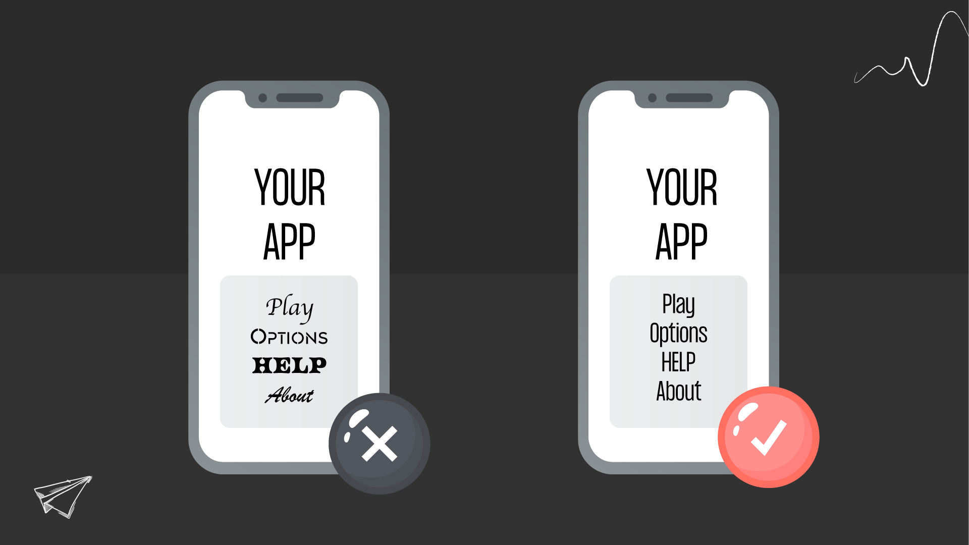
Design is first about the product's usability and the user's quick perception of the content, but also about attracting the users' attention. A simple and understandable interface is the critical factor users want to see in the mobile app’s design. Minimalism is the perfect solution. It combines simplicity, beauty, and functionality. A mobile app with a minimalist interface and good functionality is a great option to get attention. Follow the simple rules below to create an app that will win users’ hearts. 

This article will discuss the benefits of minimal mobile app design and its essential elements and principles. 

What is Minimalist App Design?

The user wants to avoid navigating each time they enter the app. They visit it with a specific goal. Therefore, products that work simply but have robust functionality will always take precedence. According to studies, visually heavy and complex interfaces affect the perception of information by users. Minimalism helps focus on the essentials and make a deal with the product easier for users. Minimalist mobile app design is a balance between functionality and form. Its advantages are simplicity and semantic richness. The minimum amount of graphics and empty space is the essence of minimalist design. 

The fundamental principles of minimalist app design are:

  • Simple isn’t the same as primitive and boring.

  • Limited — doesn’t mean that it isn’t understandable.

  • White space — isn’t synonymous with emptiness in the wrong meaning. 

Each interface element, line, text, photo, and even color should have a specific purpose and be appropriately organized into space. Working in minimalism, the designer should make the app interface very simple and rich, stylish, and not overloaded with unnecessary details that don't carry a semantic load. The essential emphasis in minimalist design is on empty space, which should be sufficient, accent colors and typography. Three elements attract and direct the user's attention to the content. 

Characteristics of minimalism in app design:

  • Simplicity

  • Clarity

  • A pronounced visual hierarchy

  • Each element is functional and has a purpose

  • Plenty of white space

  • Emphasis on typography and color

  • Avoidance of superfluous decorative elements

This doesn't mean you shouldn't decorate your app. On the contrary, it’s necessary to give it an aesthetic and mood. You just need to design it carefully, not cluttering the interface with unnecessary information. Better use a creative font or make a color accent on the element. This will also give the product aesthetic and become an element of brand awareness.  

Minimalists App Design Benefits

Let's look at the benefits minimalist app design offers to make sure it's meaningful and convenient. 

Simplified navigation

Minimalist design implies a lot of white space and fewer elements in the interface. If the app design focuses only on the essential things, it’s easier for the user to navigate there.

Loading speed becomes many times faster

The app’s long loading time irritates users. If your app is heavy, for example, contains many UI elements, photos, and animations, it can take more time to load it. This is the advantage of minimalist app design. It takes much less time to load the app because of the small interface elements. 

The CTA becomes more visible to the user

The emphasis in the minimalist design goes to colors and typography; with their help, it's easy to highlight the essential information for the user, including calls-to-action like “Buy” or “Download” buttons. All you have to do is choose a color accentuated in your design and apply it only when you need to highlight something. The main thing here isn’t to go overboard.

More adaptive design

Previously, we talked about the tablet app design and it’s difference with adaptive one . The minimalist design is a good decision if you want to create an app for both, as it's easier to adapt to any screen extension. This is due to the limited number of elements, so it's simpler to place them and fit them into tablet and mobile. 

Create aesthetic appearance

Minimalist app design is straightforward and easy to use, but it’s also a modern trend in product design. As a result, apps in this style look very modern and aesthetic. 

Essential Elements of Minimalist App Design

Minimalist app design consists of three essential elements: typography, color, and white space. Let's break down each of them in detail. 

Typography

Typography in minimalism acts as a fundamental visual element. This means it gives the users information about the content, but it also defines style and character and gives a product visual representation. Therefore, the designer should approach the choice of font and its location wisely, as it'll be responsible for the emotional message of the apps to users. For example, if it's an application for the care of plants, here they look weird and harsh, picking up something soft and easy to perceive may be necessary. 

In minimalism, typography is part of the decor; it’s still a carrier of information. Read why is typography important in web design in our previous article. Therefore, the text should be legible and well-readable. Don’t combine many fonts in the same app. Choose one, a maximum of two, and work with them. 

typography in minimalism app design
How to choose the typography

For example, the Upper App is a free to-do list. The app design style is minimalist. It has a user-friendly and clear interface, which simplifies user interaction. The main focus goes just on typography and color pairs. 

Gapsy minimal mobile app design
Gapsy’s example of minimal app design

Read more about How to Create a Typography in our blog.

Color

The color palette in minimalist app design is the second essential visual element. Using color, you can easily control the user's attention and emphasize important things. If you use numerous colors in one interface, it can confuse the user and cause negative emotions. You can choose one color and then use it in different shades. Or you can choose colors based on one of these principles:

  1. Monochromatic colors: one color in different shades and tones;
  2. Complementary colors: the two most contrasting colors;
  3. Split-Complementary: one contrasting and two similar colors;
  4. Analogous: the use of colors from a single row without accents or contrasts;

Also, there are such schemes as triadic, tetradic, and square. 

Color in minimalism app design
How to choose color

Read more about How to Choose the Correct UI Design Colors in our blog.

White space

In minimalism, common use of white, or empty, space to focus attention on the essential things. However, empty space should use caution. The sense of white space draws the user's attention to critical elements, increases the content's receptivity, and balances all elements. 

But to achieve a better interaction with the user's attention as a designer, you need to take the following steps concerning the content, such as aligning content on the left edge and arranging everything according to a hierarchy. Finally, and most significant, don't be afraid of empty space, but don't try to fill it with unnecessary elements.

What Else is Important to Consider in Minimalist App Design?

Three aspects make your minimalist app design cleaner and more balanced.

Grid system

During creating a minimal mobile app design, use a grid to visually align all interface elements and make the layout more structured. This doesn't mean all content should be located exclusively on the left edge in a single column. You can apply different layout options, but your app should have a specific structure that you stick to every screen. It’s easier for the users because they will understand how your app works once they see this structure. So it'll be easier for him to navigate there.   

Influential point! The grid shouldn’t dictate your design. You can, and even should, deviate from it and modernize when necessary. It’s only your assistant.

Icons

Icons are a great decision to shorten information and present it as a relevant icon. The main thing to pay attention that all icons should be made in the same style. They shouldn't contain a lot of small details; because of the small size, it's impossible to look through, and in the end, it all will turn into mush. Make the icons as simple as possible and try to convey the essence of what the icon heads. 

Focus point

The fewer elements, the greater their impact on the user. You have to build the design around the content. Content is the main thing in minimalism—the point of focus is to concentrate on the most critical information, such as the CTA button. You remove everything extra in the interface, leaving only the main content. Then, you define the anchor object and shift the entire focus. Thus showing the users why they came here and what they need to do. 

You can also read about Minimalist Web Design in our blog. 

Example of Minimalist App Design


In the example of the app, see what a minimalist app design can look like:

1) Instagram

In 2016, Instagram changed the interface design and the app icon. It became a great example of a minimalist app. The interface includes the essential elements, discarding everything unnecessary. Simple navigation and clear icons improve interaction with the product.  Bright, vivid colors and giant fonts make it easier to find information.  Instagram also offers a personalized user experience. Every account is tailored to the user's preferences, showing the most relevant content.

Minimalist app design example
Instagram minimal mobile app design

2) Medium

The design of this application uses a grid system. All content, namely photos, text, and buttons, is structured.  This helps keep the design neat and organized. The colors and fonts used are in keeping with modern web standards, making it visually appealing to users. The page layout also makes navigating intuitive, as all critical elements are easy to find. The application is responsive and can be easily viewed on any device or browser.  These elements combine to create a visually pleasing, user-friendly experience.

Example of minimal app UI design
Medium, minimal mobile app designCaption

3) Google Calendar

In the interface, accent colors highlighted all events and essential elements. This app also has a grid system, so all information has structure and is visually balanced on the screen.  The mobile version of this app also includes support for syncing and sharing events with other users. This makes planning collaborative projects much more accessible than ever before. It comes with multiple views (Day, Week, Month, Year) to toggle between different periods and, more precisely, plan activities efficiently.

Additionally, you can add attachments to your events and receive notifications for important meetings. Google Calendar is a versatile and helpful tool that makes it easier to stay organized no matter where you are.


minimal app design example
CaptionGoogle minimal mobile app design

4) Apple Music

All of Apple's apps pursue minimalism in their design. Simple and straightforward elements without unnecessary additions make the design laconic and convenient.  Apple Music app is no exception. The application's main screen contains only two buttons: ‘For You’ and ‘Browse’. 'For You' offers users personalized playlists and albums based on their listening history. 'Browse' allows you to search for music by artist, song, or genre.

Additionally, the app offers curated playlists based on moods and activities. Apple Music's design is well-thought-out, allowing users to access their favorite music and discover new artists quickly. It also provides a wide selection of music for any taste. Overall, the Apple Music app has a sleek, simple, intuitive design. Its user-friendly interface makes it easy to explore new music and find exactly what you want. Finally, Apple Music integrates with other Apple services and devices, allowing users to access their music library on any device.

reference of minimal mobile app design
Apple minimal mobile app design


5) Lyft

A handy app for renting a car or ordering a cab. The app has well-done typography, making navigating the content quick.  With the app's help, riders can choose from various car types and book their ride in advance. There is also an option to tip the driver. Lyft is available in more than 60 cities across America, including New York City, Los Angeles, Seattle, and Chicago. It is also available in several countries outside the US, such as Canada and Australia. 

The company is constantly working on expanding its service and has become one of the world's leading ride-sharing services. In addition to its car rental and cab services, Lyft offers a food delivery service, allowing customers to order food from local restaurants. The app will enable them to track their order in real time and provide a delivery route map. 

Sample of minimalist app design
Lyft minimal mobile app design

Summing up

Minimalist design app has held their leading position for over a year, and they will likely continue to be a trend. At first glance, it isn't as simple as it seems, but its essence is evident.  The task isn't to throw out as many elements as possible from the interface. But to skillfully arrange them and keep them clean and clear. There is an excellent line between simplicity and primitivism and brevity in minimalism. As a rule, the more minimalistic you want to make your app, the more time you will spend on design. We have significant experience in design. Contact us to gain clarity. Check out the finished projects on Behance and Dribbble. And also take a look at the services we provide.

Rate this article

20 ratings
Average: 4.9 out of 5

If you like what we write, we recommend subscribing to our mailing list to always be aware of new publications.

Do you have any questions? We tried to answer most of them!