UX Design Patterns: The Business Guide to Consistent Digital Experiences

11minutes read
ux patterns

A single pixel of friction can cost you a million dollars. It sounds like an exaggeration until you look at the math: With a 70% average cart abandonment rate, most digital products are "leaking" revenue every hour. According to the Baymard Institute, a massive chunk of such a loss is due to avoidable friction like vague forms and disjointed navigation.

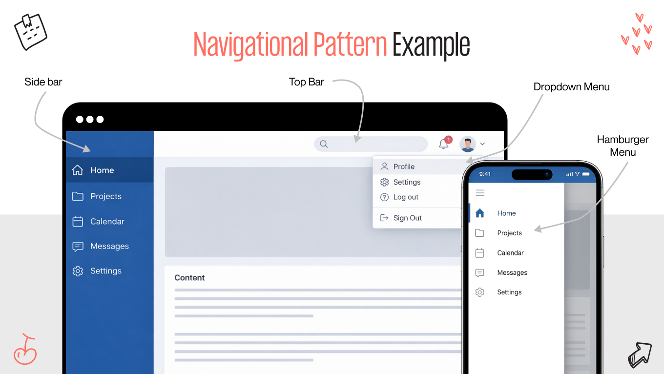
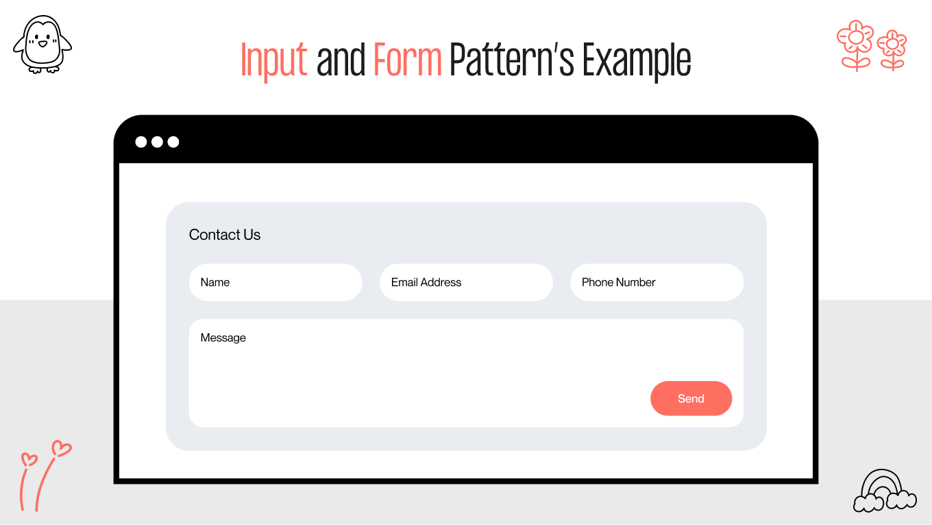
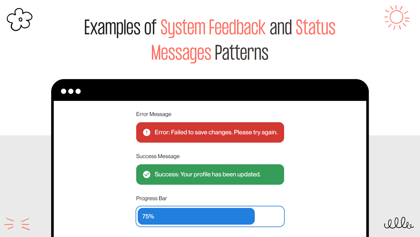
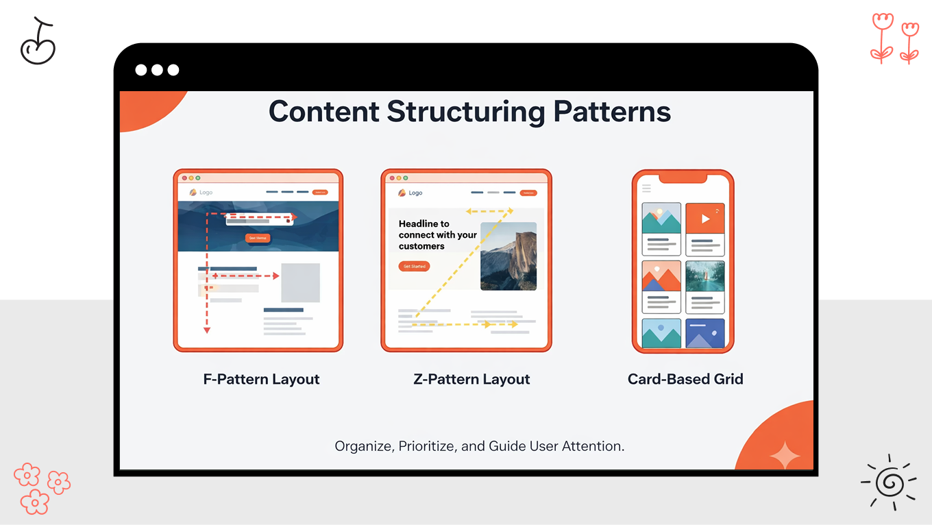
At Gapsy, we’ve spent 12 years plugging these leaks with our design experience. In this guide, we move beyond pretty interfaces to explore the disciplined UX design patterns that standardize decision-making, eliminate design debt, and, most importantly, protect your bottom line.

Key Takeaways

  • UX design patterns reduce cognitive load and decision friction when they make critical actions predictable across the product

  • UX patterns scale delivery by aligning design, product, and engineering on buildable, testable interaction defaults

  • Web application UX design patterns improve onboarding and retention by accelerating time-to-first-success and reinforcing user muscle memory

  • Over-standardized web UX design patterns can dilute differentiation, so pattern governance must preserve context where it matters

  • UX best practices only hold over time when interaction design patterns are owned, versioned, and regularly reviewed to prevent design debt

How Gapsy Studio Harmonized Complex Interaction Patterns for Pickle

The Pickle app is a prime example of how disciplined UX design patterns can turn a multi-tool platform into a seamless user experience. By merging event tracking, real-time chat, and task delegation, the solution risked becoming a "cluttered" interface.

At Gapsy, we used a strategic pattern system to ensure these distinct functions felt like a single, unified conversation.

Unified Navigation and Global Patterns

To manage the "super-app" complexity, we implemented a persistent navigation and layout stability pattern. Whether a user is assigning a task or chatting with a friend, the core anchors of the app remain consistent. This reduces the "learning curve" for new features, as the interaction logic for a "task" mirrors the logic for an "event."

Feedback and System Status in Real-Time

Because Pickle relies on real-time social interaction and task updates, we prioritized feedback and system status patterns.

  • When a user syncs an event to their calendar, subtle but clear success states provide immediate reassurance.

  • Sharing activities in real-time requires transparent "processing" and "active" indicators so users stay oriented during collaborative planning.

Progressive Disclosure for Customization

Pickle offers deep customization for reminders, notifications, and event durations. To prevent information overload, we utilized progressive disclosure. Our team kept the primary Home/Feed clean and focused, revealing advanced customization tools only when the user is ready to dive into the details of an event.

The Result is A Frictionless Ecosystem

The "fresh look and feel" noted by viewers was the result of a consistent visual hierarchy that guided users through high-stakes planning without stress. By applying the same UX best practices across the chat, calendar, and feedback modules, the Gapsy team created a stress-free environment where the organization feels like second nature.

Managing multiple complex flows requires a partner who understands how patterns interact at scale. Reach out to us to take your complex feature set and turn it into an intuitive, high-performance experience.

Why UX Design Patterns Matter Beyond Interface Consistency

Consistent UX design patterns reduce avoidable decision friction by making key actions predictable at the moment users are most likely to hesitate. Some research shows that implementing a clear visual hierarchy and consistent navigation patterns can increase task completion effectiveness by up to 40%, directly reducing the "pogosticking" behavior where users bounce between pages in confusion. By utilizing patterns like step indicators and inline validation to anchor the user's journey, you transform uncertainty into momentum.

With this foundation, you can:

  • Recapture lost leads with real-time feedback UX patterns to turn hesitant visitors into confident users, slashing the error rates that lead to abandonment.

  • Stabilize the user journey by ensuring every screen provides a clear, predictable next step, keeping users locked into the critical flow.

  • Scale without complexity. Since interaction design patterns ensure that as your product grows, your users’ cognitive load remains low and their success rate stays high.

Honoring the User’s Rhythm

Web UX design patterns offer a rare "win-win": they protect the user from confusion and the developer from burnout. When a pattern is implemented as a reusable, production-grade decision, it stops being a "task" and starts being an asset.

Sparkbox noted that using a mature design system slashed the development time for a simple form from 4.2 hours to just 2. This is the practical definition of throughput: getting to the finish line twice as fast without tripping over usability gaps.

The result is a more organic collaboration:

  • A shared vocabulary. Patterns give Design, Product, and Engineering a common language for the "unseen" parts of a product—validation, loading states, and permissions.

  • Compounding creativity. When your team stops re-solving the same fundamental problems, they gain the headspace to invent the unique, differentiating features that move the needle. This way, you are using proven UX best practices as a foundation to reach higher levels of innovation.

Guarding the High-Stakes Moments

The true test of a design pattern is in the high-pressure zones where things can go wrong. By constraining variation in "risk zones" (think destructive actions, complex forms, or system status updates), you create a safety net for your users.

This quality protection ensures that under tight delivery deadlines, you don't accidentally reintroduce old usability failures. By using repeatable components in your digital products, you ship a promise that the system will behave exactly as the user expects, every single time.

Core Categories of UX Design Patterns and When to Use Them

A pattern library is just a collection of parts until it’s viewed through the lens of user intent. Grouping UX design patterns into functional categories does more than organize a Figma file; it helps teams understand the "why" behind every interaction. Whether a user is in a state of high-focus exploration or a high-stress checkout, the pattern should adapt to their psychological context.

When patterns are categorized by the problems they solve (rather than just how they look), behavior becomes predictable across every surface. This allows a product to feel like a cohesive experience rather than a series of disconnected screens.

We’ve prepared a table with core categories of UX design patterns:

UX pattern category

What it governs

Use it when

Typical patterns

Navigation

Movement, orientation, task progression

Users need to locate features, switch contexts, or complete multi-step tasks

  • Global navigation

  • Breadcrumbs

  • Tabs

  • Stepper

  • Contextual side panels

Input and forms

Data entry, error prevention, and completion

Users submit information, create records, configure settings, or transact

  • Progressive disclosure

  • Smart defaults

  • Inline validation

  • Input masks

  • Autosuggest

Feedback and system status

Visibility of system behavior and outcomes

Actions take time, affect data, or carry risk, and users need confirmation

  • Loading states

  • Toasts

  • Success confirmations

  • Error messaging

  • Undo

Content structuring

Information hierarchy and comprehension

Users scan, compare, decide, or monitor data repeatedly

  • Card layouts

  • Grouped sections

  • Tables with filters

  • Accordions

  • Summarization blocks

Navigation Patterns That Guide User Flow

Navigation is the skeletal structure of your product; it defines how users build a mental map of what you offer. When done right, it predicts the user's next question. The most effective navigation UX design patterns are often "boring" in the best sense of the word: they are so predictable that the interface fades away, leaving the user to focus entirely on their goal.

For example, in enterprise SaaS platforms, this may look like persistent side navigation, a reliable anchor that supports the rapid-fire context switching power users require. Conversely, in the lean, high-velocity consumer apps, you can rely on progressive disclosure and bottom bars to keep the cognitive load light and the path forward singular.

When navigation fails, the friction is immediately visible in the data:

  • Excessive backtracking and repeated menu-opening are clear signals that your structure is fighting the user’s mental model.

  • Every time a user has to stop and think, "Where was that button?", you are burning their limited attention, which should be spent on your product's value proposition.

The transition from desktop to mobile must feel like a natural evolution, not a compromise. Responsive patterns ensure that the "logic" of your product remains consistent, regardless of the glass the user is touching.

Input and Form Patterns for Higher Conversion

Forms are frequently the final hurdle between a user and their goal. While visual styling grabs the attention, the invisible mechanics, such as inline validation, input masking, and progressive disclosure, are what drive completion. They are the digital equivalent of a helpful store clerk who corrects a mistake before you even realize you’ve made it.

In e-commerce, the "perceived effort" of a task is just as important as the actual effort. Breaking a sprawling, intimidating form into a logical, multi-step flow respects the user’s focus, reducing the "wall of inputs" effect that triggers abandonment.

In 2026, the gold standard for input design is centered on zero-effort principles:

  • Smart defaults and auto-filled fields protect data integrity. When the system does the heavy lifting, human error vanishes.

  • Real-time, inline validation provides a sense of security. It’s the difference between being told "something is wrong" after hitting submit and being gently guided as you type.

  • By only asking for information when it becomes relevant, you reduce the user’s cognitive load, ensuring they feel a sense of momentum rather than a sense of burden.

Feedback and System Status Patterns to Build User Trust

Feedback is the heartbeat of a product. It’s the continuous loop that tells a user, "I heard you, I'm working on it, and here is what happened." When this dialogue is missing or vague, users worry. They click twice, refresh the page, or worse, lose confidence in the integrity of the data.

Well-designed feedback interaction design patterns make the invisible visible. They turn the "black box" of backend processing into a legible, human experience, especially during high-stakes moments involving money, time, or irreversible changes.

Core feedback pillars we use to build a product that feels responsive

  • Visualizing progress. In 2026, a simple spinning wheel isn't enough for complex tasks. Effective patterns use skeleton screens or granular status updates (e.g., Submitted > Processing > Completed) to mirror real system progress. This reduces "perceived wait time" and keeps the user anchored.

  • The safety net. For destructive actions like deletions or permission changes, we favor the "Undo" pattern over the "Confirm" pop-up. It allows for confident, high-speed use while providing a graceful recovery path if a mistake happens.

  • Contextual error recovery. Nothing kills momentum faster than a generic "Error 404" or a red box at the top of a long page. Feedback should live at the point of failure, offering a clear, jargon-free explanation and a direct path to the fix.

  • Explicit confirmation. High-impact operations, like a successful payment or a saved configuration, require a clear "period" at the end of the sentence. A subtle but distinct success state prevents the user from wondering if their action "took."

Content Structuring Patterns for Scannability and Clarity

Content structuring patterns are the difference between a product that feels "powerful" and one that feels "cluttered." Such elements determine how information is revealed, prioritized, and digested over time. Content should be structured in a way that helps a user scan, compare, and decide without the mental tax of information overload.

In complex environments like dashboards or data-heavy SaaS, we use clear visual hierarchy and predictable grouping to create "glanceability." When a user can interpret metrics in seconds, they don't have to re-learn the interface every time they log in. The goal is to make a sophisticated tool feel simpler than it is.

Strategic structuring focuses on:

  • Progressive disclosure. Not everything needs to be seen at once. By using expandable sections and "read more" patterns, especially in settings pages or knowledge bases, you allow users to dig deeper only when they are ready. This is a cornerstone of accessible design, ensuring the interface remains navigable for everyone.

  • Predictable grouping. Humans naturally look for patterns. Consistent spacing and logical categorization allow the eye to skip the irrelevant and land exactly on the needed data point, reducing "time to insight."

  • Wayfinding through hierarchy. Bold headings, meaningful iconography, and contrast act as landmarks. They orient the user in complex environments, ensuring they never feel "lost" in the data.

How to Adapt UX Patterns for Your Specific Product

The true effectiveness of UX design patterns should be measured by their alignment with the user's environment. A high-speed trader, a distracted parent, and a meticulous data scientist all have different "rhythms," and a design component that serves one may frustrate another.

Adapting UX patterns means understanding the delicate balance between momentum and friction. Sometimes, friction is your friend (like a double-confirmation for a high-risk financial transfer), or a destructive action modal that forces a moment of reflection.

Product type

Primary user behavior

Key UX risks

Pattern adaptation focus

SaaS platforms

Repeated, task-driven usage

Fatigue, workflow friction, feature sprawl

Speed, predictability, progressive complexity

Marketplaces

Trust-based, transactional actions

Fraud concern, decision anxiety

Transparency, reassurance, verification

Dashboards

Monitoring, analysis, comparison

Misinterpretation, overload

Hierarchy, clarity, contextual depth

Scalable Patterns for SaaS Platforms

SaaS design succeeds when it honors the Daily Active User. These are individuals who return to your product with a specific job to complete, often under pressure. Here, your elements should prioritize stability and muscle memory over novel interactions that might look good in a portfolio but slow down an expert in the field.

When interactions are inconsistent, they become invisible obstacles that drain productivity and increase training costs as your organization scales. The goal is an interface that feels like an extension of the user’s own intent.

SaaS patterns toolkit

  • The anchor of stability. Persistent navigation and layout stability ensure that core functions live in the same "mental neighborhood" every day. Whether in a CRM or a project management tool, users should never have to search for the tools they use hourly.

  • Intelligence through disclosure. Not every feature belongs on the main stage. By utilizing progressive disclosure, we keep the interface clean for daily tasks while hiding complex configurations behind expandable sections. 

  • High-volume efficiency. To prevent "death by a thousand clicks," we prioritize inline editing and bulk actions. By allowing users to update multiple records at once without switching contexts, you preserve their "flow state" and significantly reduce task completion time.

  • The guided start. Clear empty states and sensible defaults act as a concierge for the first-time user. These patterns guide the initial setup, ensuring the product feels welcoming to a beginner without cluttering the workspace of an experienced power user.

Trust-Building Patterns for Marketplaces

Marketplaces operate under higher emotional and financial stakes than most software products. In these environments, UX patterns should transition from merely "facilitating a task" to actively de-risking a transaction. Because users don't assume the system is safe by default, your design needs to "over-communicate" safety at every touchpoint.

Trust in a marketplace is fragile; it is built in drops and lost in buckets. To prevent abandonment, especially at the point of purchase, the interface should act as a transparent mediator between two strangers.

Key trust-building patterns for a marketplace

  • Visible verification. Identity is the first hurdle. Using verified profiles and seller badges is a signal of legitimacy that reduces the perceived risk of fraud.

  • Pricing transparency. Surprise costs at checkout are the leading cause of "abandonment whiplash." UX best practices dictate showing fee breakdowns and total costs as early as the product page, ensuring the user feels in control before they ever click "Buy."

  • Contextual social proof. Reviews and transaction counts are most effective when they are placed exactly where the user hesitates. Showing a seller’s "Response Time" or "Successful Deliveries" near the CTA provides the emotional nudge needed to close the gap.

  • Safety net messaging. Reassurance shouldn't require a search through an FAQ. Clear messaging about dispute resolution, refunds, and buyer protection should be integrated into the flow, acting as a visible insurance policy that encourages confident use.

Data Visualization Patterns for Dashboards

Dashboards are decision-support tools, not just data repositories. The effective web design trend in this space is to reflect how users scan, compare, and act on anomalies under time pressure. When UX patterns are poorly adapted, they create a "noise" that hides critical signals or, worse, provides false confidence through misleading visuals.

A successful dashboard balances density with clarity, allowing users to move from a high-level overview to granular details without losing their place in the story.

Key UX design patterns for data-driven clarity

  • KPI hierarchy. We place primary indicators at the top-left, which is the natural starting point for the eye’s scanning pattern (the F-pattern). By giving these metrics more visual weight, you ensure the most critical "health check" happens in the first three seconds.

  • Contextual comparison. Raw numbers are sterile without perspective. Your dashboards should include period-over-period deltas or industry benchmarks directly alongside the main metric. Knowing a number is "14%" is useless; knowing it’s "14% above last month’s peak" is actionable.

  • Progressive drill-downs. To prevent information overload, we use "drill-down" patterns. This allows users to click into a chart to see the underlying data layers without navigating away from the dashboard, maintaining their mental model of the system.

  • Cognitive consistency. Using consistent chart types and scales across different views is essential. If "Revenue" is a blue line on one page, it shouldn't be a green bar on the next. This prevents the "mental recalibration" that slows down even the most expert users.

As your feature set grows, the risk of design debt and interaction friction increases. Shipping without a disciplined system of UX patterns quietly erases your revenue by driving up abandonment and support costs.

We have spent over 12 years helping products find the balance between complexity and simplicity. So, if you need a targeted UX audit to find hidden friction or a complete design system, we’re ready to help you scale with confidence.

Common Pitfalls When Standardizing UX Design Patterns

The most common mistake in UX design patterns standardization is treating a design system like a rulebook rather than a toolkit. When consistency becomes a mandate rather than a goal, creativity (and the user) takes a back seat.

Guarding Your Brand’s "Soul"

Over-standardization can lead to "pattern lock-in," creating generic interfaces that are interchangeable with your competitors. This blurs your unique value proposition and weakens user attachment.

We view UX patterns as a foundation, not a ceiling. Gapsy provides context-aware tooling that identifies where a standard pattern helps and where it dilutes your company. We preserve core consistency while allowing "hero moments" to reflect your unique brand identity.

Prioritizing Outcomes Over Output

It is tempting to prioritize "build speed" by using boilerplate web application UX design patterns. However, shipping a feature quickly is meaningless if it increases user error or frustration.

Our team solves this through replacing "speed-first" with "performance-first" design. By tracking how users interact with patterns in production, we correlate design choices with real behavioral signals. If a "standard" form has a high drop-off rate, our designers refine the pattern based on data. 

Preventing Design Decay

Design debt accumulates when UX patterns are set and forgotten. Repeatable elements that served your product three years ago may now be misaligned with your evolving user base, leading to high maintenance costs.

To overcome this challenge, we may build "living" repositories for your product. Every pattern at Gapsy has a designated owner and a lifecycle. By embedding versioning and impact analytics directly into the system, we trigger review workflows the moment a pattern shows declining performance or conflicts with new standards.

UI/UX design standardization should be a springboard for innovation, not a cage for your team. By eliminating the mental drain of re-solving basic problems, you free your designers and engineers to focus on the 20% of your product that truly changes the game.

Ready to see where your current patterns are holding you back? Let’s audit your high-stakes flows and build a pattern system that turns complexity into your competitive advantage.

How UX Design Patterns Support Long-Term Product Strategy

To truly understand the UX strategy value, we have to look past the pixels. Think of web UX design patterns as the operating principles of your product. When calibrated correctly, they act as the "connective tissue" that allows your team to scale, your users to onboard and grow, as well as your technology to evolve without the usual friction of growth.

Here is how disciplined patterns act as the engine for long-term product strategy:

Scaling Without Coordination Chaos

UX design patterns convert hard-won decisions into reusable defaults. In a fast-growing company, you cannot rely on constant cross-team design reviews to maintain quality. Patterns become a scalable substitute for oversight.

  • New squads can ship coherent experiences without re-litigating basic interaction questions every sprint.

  • As you expand your feature surface area, new capabilities "inherit" familiar logic. This prevents user confusion from growing at the same rate as your codebase.

Protecting the User’s Emotional Budget

User retention is often a battle against fatigue. Every time having to "re-learn" how a menu works or figure out a new form, they spend a portion of their emotional budget.

  • Consistent UX patterns build a sense of stability. Even when the underlying functionality is complex, the interface feels reliable, which drastically lowers support demand.

  • For tools used daily, speed is a feature. When repeat users can rely on muscle memory, the "time-to-success" drops, and the product becomes an indispensable part of their workflow.

Future-Proofing Through Intent

Patterns are future-proof only when they are defined by intent (the "why") rather than just visuals (the "what"). For example, a pattern defined as "Progressive disclosure for high-stakes complexity" will remain valid even as you move from desktop to mobile or spatial interfaces.

Patterns also create "safe zones" for experimentation. You can innovate on a specific feature's logic while keeping the core navigation and feedback loops stable, protecting the user during periods of change.

By using versioned patterns with clear governance, you can modernize your product incrementally. You opt for a continuous, graceful evolution, as well as avoid the big bang redesign, which is often expensive and jarring for users.

Partner with Gapsy Studio for Scalable UX Design

Since 2014, Gapsy Studio has been the engine behind multiple product experiences that refuse to break under the pressure of growth. We build the behavioral frameworks that allow your product to evolve as fast as your market does.

When you partner with us, you’re gaining a decade of insight into how UX design drive measurable business outcomes.

What our partnership brings to your product:

  • You receive tailored design patterns that reflect your specific brand constraints and user goals, avoiding the "generic" feel that haunts many modern products.

  • We provide end-to-end coverage, from deep UX research to pixel-perfect mobile app design, to eliminate the fragmentation that typically occurs between discovery and launch.

  • Our process moves through discovery, information architecture, and prototyping, delivering patterns as reusable, production-ready decisions that your engineering team can use.

  • We offer post-launch support and performance monitoring to prevent design debt, ensuring your product feels as fresh in year three as it did on day one.

Let’s collaborate to build a system that turns your complex features into an intuitive, high-growth experience.

Conclusion

UX design patterns are about making interaction decisions repeatable, reliable, and aligned with business goals. When your components are grounded in real user behavior and applied with discipline, they reduce friction, improve delivery speed, and help products scale without accumulating design debt. The teams that treat UX patterns as a strategic asset, rather than a design artifact, are better positioned to adapt, differentiate, and sustain quality as their products and organizations evolve.

Strong UX design patterns build cognitive fluency. By standardizing navigation, forms, and feedback, you create a "silent language" that users already know how to speak. As products are more data-dense and AI-integrated than ever, predictability is the only way to scale complexity without increasing frustration.

Let’s audit your current design and build an interface that feels as natural as muscle memory.

Rate this article

21 ratings
Average: 4.9 out of 5

If you like what we write, we recommend subscribing to our mailing list to always be aware of new publications.

Do you have any questions? We tried to answer most of them!