How to Make User-Friendly Website Design: Standards, Tips, and Best Practices

15minutes read
design user friendly

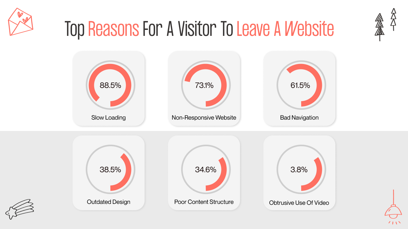
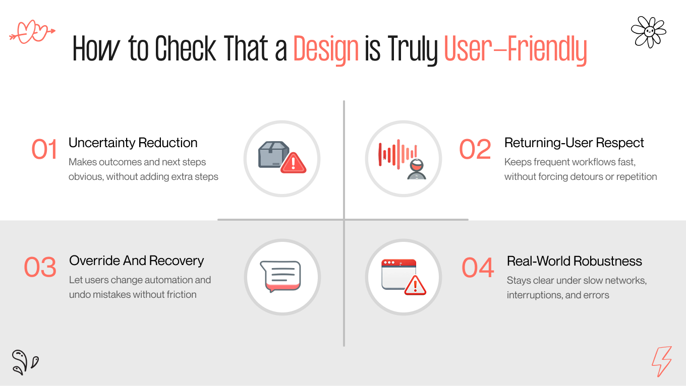
A user-friendly website is one of the few ways to scale revenue without touching your ad budget. Recent statistics prove this, as deploying a seamless UX design may lead to 4 times more conversion actions. It comes down to removing the obstacles that stand between a user and their goal.

This is why experience design has become a core commercial discipline in 2026. When a page is fast, predictable, and transparent, you capture more value from the traffic you already have.

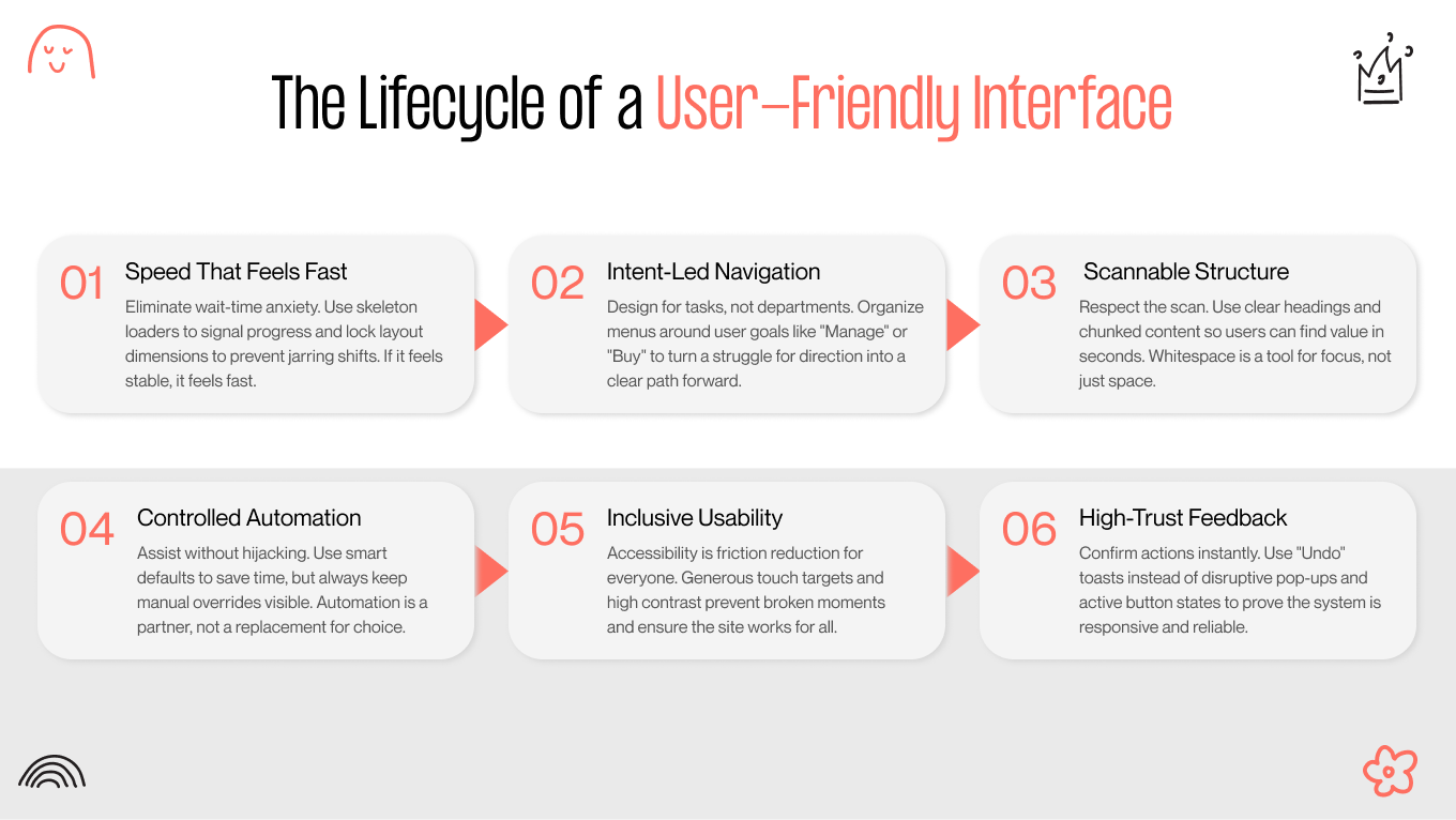
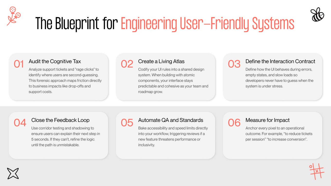
This guide explores the design patterns that eliminate friction, the mistakes to avoid, and the metrics that prove your improvements are paying off.

Key Takeaways

  • User-friendly design increases conversion by reducing hesitation in pricing, signup, and checkout

  • User-friendliness lowers support costs by making actions predictable, recoverable, and self-serve

  • Speed supports growth by improving SEO, engagement, and completion rates

  • Trust drives commitment when pricing, permissions, and privacy are transparent

  • User-friendly web design must be operationalized through standards, guardrails, and measurement to scale

  • Many “friendly” ideas backfire on long tours, intrusive bots, and hidden controls

How Gapsy Studio Built a User-Friendly Design For Creatorset

Too often, utility comes at the cost of personality. Creatorset aimed to prove otherwise, building a workspace where powerful, intuitive features exist within a bold, distinct aesthetic. The result is a platform that feels like home for the people using it

In this project, our team was required to combine modern aesthetics with clear structure and predictable interactions, so the product would stand out in a crowded market without introducing friction that hurts adoption and conversion.

Challenge: Modern Brand Expression Without Sacrificing Usability

Creatorset needed a platform that communicates innovation and creativity, but still feels effortless to use on the first visit. In practice, products like this often fail in two predictable ways. 

They either lean too far into “creative” visuals that compromise clarity, or they over-correct into generic templates that erase brand personality. The goal was to land in the middle, a distinctive interface with a low cognitive tax.

What We Did: A Clean System Built Around Clarity And Flow

In our work on Creatorset, we treated user-friendly web design as an interaction system rather than a styling exercise.

  • Structured, minimal UI with clear hierarchy. We designed a layout that guides attention to primary actions and reduces scanning effort, especially in high-intent moments where users decide whether to proceed.

  • Intuitive navigation that keeps users oriented. We built navigation patterns that make it obvious where the user is and what the next step is, so the experience feels smooth rather than exploratory by force.

  • Brand personality through custom illustrations. We used unique illustrations and graphic elements to express the brand’s identity without compromising usability, keeping the interface modern and functional.

Result: Conversion Lift And Market Traction

Beyond just a visual upgrade, the new site drove immediate improvements in conversion and traction. This was made possible by our hands-on approach to delivery. The co-founder specifically noted the ease of collaboration, citing our team’s organized structure and quick responsiveness as key drivers of the project's success.

creatorset gapsy project
creatorset — gapsy studio project

Let’s get specific about your growth. Schedule a session to identify where your site is leaking revenue define the fastest route to a clearer, higher-converting experience.

What Does User-Friendly Design Mean in 2026?

A lot of teams lose customers when everyday interactions feel uncertain, slow, or risky, even if the product has the right features. The margin for error is incredibly slim, as over 52% of customers will switch to a competitor after just one bad experience.

User-friendly design solves this problem. In 2026, it is about making systems behave in ways people can reliably predict. A user should be able to glance at a screen and answer three questions without effort:

  • What is happening right now?

  • What will happen if I act?

  • How do I recover if it goes wrong? 

When these answers are obvious, users move forward with confidence, conversion improves, and support becomes a smaller part of the operating model. When they are not, even a product with a polished visual identity design feels risky.

reasons why users leave the website

Clean Vs Clear

The design bar in 2026 is clarity: 

  • “Clean” is a styling outcome

  • “Clear” is an operational outcome

Clear design is a web design trend that makes the system legible under real conditions, including interruptions, partial completion, edge cases, and compliance requirements. A useful way to evaluate this in product reviews is to check whether the interface makes these elements explicit at the moment they matter:

  • State: loading, saved, pending, failed, awaiting approval, synced.

  • Scope: what will change, what will not, what is affected downstream.

  • Constraints: limits, dependencies, eligibility, and role permissions.

  • Consequences: charges, renewals, irreversible actions, data sharing, and notifications triggered.

  • Recovery: undo, version history, retries, rollback, support escalation path.

Trust Is Usability Signal

Perceived usability is shaped by how the product communicates risk. Privacy cues, permission requests, and pricing transparency are part of how users decide whether to proceed. 

In business software, especially, users are often acting on behalf of a team and an organization. They are implicitly asking, “Will this create a problem for me later?” Every vague consent modal, every unclear permission scope, and every surprise charge increases the perceived cost of action.

Consistent disclosures to build user-friendly design trust:

  1. Explain what data is used and why at the point of collection
  2. Request permissions with plain language scope, plus a visible way to change them later
  3. Put pricing mechanics inside the flow, including renewal timing, proration, seat changes, and limits
  4. Make escalation paths explicit when the stakes are high, for example, billing, access, compliance, and deletions

Reversibility Is the Business Standard Now

The most reliable predictor of “friendly” is whether users feel safe acting quickly. That safety comes from a UX strategy that builds reversibility and preview. In 2026, products that win in competitive B2B categories reduce the need for caution by designing for recovery.

Core interaction expectations:

  • Preview-before-apply for actions that change data, trigger outreach, or affect billing

  • Undo where possible, and rollback or versioning where undo is not realistic

  • Safe defaults that help users start fast, but are visible and easy to change

  • Explicit confirmation only when it prevents expensive or irreversible harm

Here is a simple way to operationalize it in reviews:

Interaction Type

What Users Expect in 2026

What Breaks “User-Friendly”

Data edits and bulk actions

Preview, scoped impact, undo, or rollback

“Apply” with hidden downstream changes

Invitations and permissions

Clear scope, least-privilege defaults, editable later

Ambiguous roles, irreversible access grants

Billing and subscriptions

Transparent timing and amounts, confirmation on changes

Surprise renewals, unclear seat math

Deletions and compliance actions

Soft delete, retention clarity, restore path

Permanent delete with vague warnings

User-Friendliness Is Controllable AI

AI has redefined what it means to be helpful, but it’s also rewritten the rules for control. Users crave the magic of instant drafting and summarizing, but they need to know they're still in the driver's seat. Success now depends on how easily a user can verify an answer or fix a mistake without feeling like they’re arguing with the software.

If the user cannot tell what the AI did, why it did it, and how to revert it, the experience quickly shifts from helpful to unsafe. User-friendly AI UI/UX design should be built at the interaction level.

The 5 questions AI interface should answer

  • What happened: what action was taken or what output was generated.

  • Why it happened: the basis for the recommendation or automation, expressed simply.

  • How to verify: source previews, diffs, confidence cues that do not pretend certainty.

  • How to adjust: edit controls, constraints, and feedback mechanisms that change future behavior.

  • How to undo: revert actions, restore previous versions, and show what was affected.

Why Businesses Should Care About User-Friendliness

User-friendliness is a measurable driver of revenue efficiency, retention, support cost, and branding design trust. When customers and internal users can predict outcomes, understand system state, and recover quickly, they complete more work with less hesitation. That shows up directly in conversion rates, fewer escalations, and a lower cost-to-serve.

Let’s review the main benefits of user-friendly design for your business: 

Business Outcome

What User-Friendly Design Improves

Practical Design Lever

Conversion

Reduces hesitation and drop-off

Clear consequences, early totals, fast perceived speed

Retention

Prevents “one bad experience” switching

Predictable states, safe recovery, consistent behavior

Support cost

Lowers ticket volume and escalations

Self-serve clarity, actionable errors, contextual help

Trust

Increases willingness to proceed and pay

Transparent privacy, permissions, and pricing disclosure

AI adoption

Improves confidence and reuse

Explanations, previews, undo, verification paths

Conversion And Revenue Efficiency

Growing teams are obsessed with the chase. They pour budget into acquiring new traffic, while losing the users they already have due to avoidable friction. It’s a costly oversight. Data shows that a mere 0.1-second improvement in mobile speed can lift conversions by 8% for retail and 10% for travel sites.

User-friendly design makes that upside repeatable by tightening the moments that create hesitation, unclear CTAs, hidden fees, late-stage surprises, and ambiguous progress. It also forces discipline around performance budgets and perceived speed, so the interface stays in line with responsive design trends where it matters.

Retention And Switching Risk

Customers have become far less tolerant of friction because alternatives are easier to evaluate and adopt than they were even a few years ago. After all, 32% of customers would stop doing business with a brand they loved after just one bad experience. 

User-friendly website design is essentially risk management for your interface. It systematically removes the “gotchas” by making every state obvious and clearly signaling consequences before a user commits. Crucially, it builds in recovery paths, ensuring that a simple mistake is just a detour. 

Support Load And Cost-To-Serve

Every unclear workflow turns into human assistance, and that is one of the most expensive ways to deliver value. Surveys note that 73% of consumers want the ability to solve issues on their own.

User friendly design supports self-service by removing ambiguity at the point of action. This means clearer error messages, better empty states, predictable navigation, and contextual help that answers the question users have at the moment, without forcing a support contact to finish a task.

Trust, Privacy, And Brand Permission

If they don't trust you, they won't pay you. It’s no longer a soft metric; it’s a hard barrier to entry. Cisco’s Consumer Privacy Survey reveals that over 75% of consumers will simply walk away from a purchase if they don't trust an organization with their data.

User-friendly design bridges this gap by proving that you have nothing to hide through every interaction. It replaces vague permissions and hidden costs with radical transparency. By keeping the experience honest, from clear pricing to logical data requests, you prevent the second-guessing that kills conversions right at the finish line.

AI Experiences Need Explainability And Control

AI can scale your capacity; nonetheless, it can just as easily increase confusion. The black box problem is real, as 95% of customers want to know why an AI made a decision, yet only 37% of teams provide that context.

User-friendly AI design is about visibility. It should show what changed and offer a clear way to verify or reverse it. Failure states are core design elements that prove the system is safe to use, even when it’s uncertain.

Is your interface helping or hiding? Complex products often trap users in a maze of features. We can help you straighten out the path. Schedule a strategy session to walk through your current friction points, and we’ll sketch out the fastest route to a more predictable product.

User-Friendly Web Design Patterns Users Notice Immediately

User-friendly web design shows up first in how quickly users gain confidence that the site will behave predictably. It shapes how much traffic you earn and keep, how much of that traffic converts (via SEO and engagement), and how expensive it becomes to support users who get stuck. Speed, navigation, and structure are the visible layer, but the real lever is reducing uncertainty at the exact moments users decide whether to continue.

the lifecycle of a user-friendly interface
patterns of a user-friendly interface

Speed That Feels Fast

Fast experiences win twice. They keep users moving through revenue flows, and they protect discoverability because Google uses page experience signals, including Core Web Vitals, in search ranking systems.

Perceived performance is where most teams have room to improve. Users do not care whether your backend took 900ms or 1.4s. They care whether the interface feels alive and whether they can predict what is happening.

  • Progressive loading with meaningful skeletons. Replace blank screens and generic spinners with placeholders that match the page layout. This reduces perceived wait and prevents the “did it break?” feeling.

  • Avoid layout shifts. Pages that jump while loading create misclicks and make the site feel unstable, especially on mobile. Reserve space for images, ads, dynamic modules, and fonts.

  • Resilience and graceful degradation. Treat flaky networks and third-party dependencies as normal. Cache critical assets, design offline tolerance when relevant (for example, forms that can be resumed), and fail with clarity.

Navigation Built Around Intent

If your users are fighting your interface, you are paying for the privilege of losing them. Friendly navigation is about aligning with the user’s goal. When it breaks, the cost is two-fold: immediate churn followed by the expensive operational drag of increased acquisition and support demands.

A practical way to design intent-led navigation is to treat your top tasks as first-class objects and design pathways around them.

  • Task-based information architecture. Clear categories that reflect user goals (buy, compare, book, manage, support) outperform menus that mirror internal departments.

  • Predictable pathways. Users should know where they are, how they got there, and what the next step is. Breadcrumbs, consistent labels, and stable placement matter more than novelty.

  • Returning-user acceleration. Search, recents, and shortcuts are not “nice extras.” They are the primary navigation for users who already know what they need.

  • Multi-device continuity. Users expect to resume. Preserve state across sessions, keep links deep, and make “continue where you left off” a deliberate capability.

Content And UI Structure That Reduce Cognitive Load

Users judge your site in a heartbeat. Instead of reading word-for-word, they ruthlessly scan for familiar patterns to confirm they haven't wasted a click. Structure is what guides this hunt. It ensures that in these crucial few seconds, your value proposition lands, and the next step is obvious, turning a glance into a confirmed interest. 

  • Scannable hierarchy. Clear headings, sensible chunking, and purposeful whitespace. Each section should answer one question.

  • Microcopy that prevents errors. Put constraints where decisions are made. If there is a limit, a requirement, or a consequence, say it before the user commits.

  • Accessibility as usability. Contrast, focus states, keyboard flows, and adequate touch targets are not compliance chores. They reduce friction for everyone and prevent “site feels broken” moments, being a part of modern UI design trends.

  • Recognition over recall. Interfaces should make options visible so users do not have to remember rules across screens. This is a core usability principle, and it is especially important in complex B2B website design flows.

Interaction Patterns That Build Trust in Milliseconds

Users sense quality. Certain patterns act as psychological shortcuts, signaling competence before a single word is read. When an interface feels familiar and responsive, cognitive load drops and trust spikes. This connects directly to your bottom line: intuitive patterns eliminate the confusion that causes abandonment and drives up support costs.

We have mapped each pattern directly to the commercial metric it improves, proving that a smoother interface is simply a more profitable one: 

Interaction pattern

What The User Experiences

Business Payoff

Practical Implementation

Breathing Forms

Forms feel shorter and safer

Higher completion, fewer retries

Progressive disclosure, smart defaults, real-time validation, input masks for dates, phone, and currency

Skeleton Screens

Waiting feels shorter and more predictable

Lower bounce, less impatience

Layout-matching placeholders, staged hydration, and avoid shifting content

Smart Empty States

“I know what to do next”

Faster activation, fewer tickets

Next-best action, examples, templates, explain why it is empty

Lifebuoys

“I can undo this”

More confident action, fewer confirmations

Undo for high-frequency actions, versioning for high-stakes changes

Contextual Tooltips

Help appears at the right moment

Faster adoption, less training cost

Just-in-time hints tied to the first interaction, dismissible and non-blocking

Real-Time System Status

The interface never feels dead

Higher trust, fewer rage clicks

Clear success and error feedback, progress bars for uploads, queued states for background work


Best Practices for User-Friendly Website Design

Teams already know what a “good website” looks like. The competitive gap in 2026 is whether your site behaves in a way that keeps users confident throughout the journey, especially when they hesitate, get interrupted, or make a mistake.

True user-friendliness means the engine. It moves beyond cosmetic polish to focus on operational clarity. This is all about making costs, constraints, and next steps strictly obvious the moment they become relevant. Besides, a user-friendly website design builds safety nets into every critical flow, ensuring that a user’s progress is protected and that a simple mistake never requires a call to support to fix.

Design for the Full Journey

You don't win the battle for friendliness on the homepage; that’s just the handshake. The relationship is built in the trenches: during onboarding, checkout, billing, and support. These are the high-stakes moments where users actively evaluate risk, and where ambiguity costs you money.  Baymard’s research backs this up: abandonment happens because of avoidable friction like hidden costs, forced account creation, or a checkout process that feels like an obstacle. 

Treat your site as a set of critical tasks. Map the few journeys that directly produce revenue or activation, then remove steps that do not reduce risk or add value. The steps are:

  1. Identify the top 3 to 5 user intents that drive revenue (buy, book, request demo, start trial, manage account)
  2. Design those paths end-to-end, including edge cases like retries, interruptions, and policy blocks
  3. Enforce cross-page consistency in labels, rules, and interaction patterns so users do not have to relearn the system mid-journey

Make Forms And Conversions Feel Safe And Recoverable

Forms are where user-friendly design either proves itself or fails loudly. The goal is to prevent rework and uncertainty while preserving momentum.

Design forms so users can succeed on the first pass, and recover quickly when they do not.

  • Trigger validation at the precise moment it helps (usually on blur or after a meaningful pause) rather than shouting at the user while they type.

  • Accelerate data entry with smart defaults and autofill. This reduces physical effort while ensuring the user remains in the driver’s seat.

  • Preserve progress automatically during multi-step flows. This is a critical safeguard for mobile users navigating complex identity or billing tasks.

  • Guide users through repairs by highlighting the exact field in error and explaining the fix in plain, human language.

Recovery patterns that reduce the perceived risk of acting

  • Use undo and cancel for frequent actions

  • Reserve “Are you sure?” dialogs for truly irreversible or costly actions

  • Put trust signals inside the flow, at the decision point, for example, when asking for payment details, identity documents, or permission grants

Provide Transparent Decisions around Privacy And Personalization

Your consent banner may be the first meaningful interaction a user has with you, and they are judging it. This is why consent design is critical to UX: it establishes the ground rules. If the controls feel coercive or confusing, you are teaching users not to trust you before they’ve even seen your product. 

Best practices that reduce friction while increasing trust: 

  • Provide a preference center that is easy to find and easy to understand

  • Explain why the user is seeing this, especially for recommendations, emails, and targeted content

  • Offer non-punitive opt-outs, meaning the product remains usable, and the user is not forced into worse experiences as a penalty

Сommon anti-patterns that create brand damage to avoid: 

  • Forcing consent through manipulative UI

  • Burying settings behind multiple layers

  • Using vague language that obscures what is collected, shared, or retained

Treat Accessibility and Compliance As Experience Quality

Accessibility is your best proxy for technical integrity. When it is weak, the entire foundation suffers. You won't just hear about it in compliance audits; you’ll see it in your metrics, through abandoned carts and frustrated feedback from everyday users who are struggling with a site that feels heavy, slow, or broken on their mobile devices. 

Think of accessible design less as a checklist and more as code hygiene. When implementing these standards, you make your site robust, logical, and easier to maintain.

  • Structure specifically. Use native tags for headings and forms so the document outline is unbreakable.

  • Limit custom patches. Use ARIA only where necessary, and strictly align it with real interaction events.

  • Support non-visual navigation. Guarantee readable contrast and robust keyboard support so the mouse isn't the only way in.

  • Remove physical friction. Avoid motion triggers that cause nausea and ensure essential actions don't hide behind a hover state.

  • Contextualize failure. Connect error messages directly to their inputs so users don't have to hunt for what went wrong.

How to Build User-Friendly Design Interfaces Step-by-Step

We view user experience as a living operating system. To get reliable results, you need a stable core: clear diagnostics, scalable standards, and ruthless measurement. The workflow below is our blueprint for this. It represents how we move beyond guessing to build user-friendly systems that are engineered to perform.

engineering user-friendly systems
how to engineer a user-friendly system?

Step 1: Audit The Cognitive Tax

Before building anything new, you need a clear view of where users are spending attention unnecessarily. We call this the cognitive tax, the extra reading, hunting, second-guessing, and rework that makes a product feel harder than it should.

  • The friction audit. You should stop guessing and go straight to the evidence. By pulling and tagging the top 10 support complaints, we usually find that the issue is a bug in the clarity. The vast majority of tickets map to four simple failures: "I can't find it," "I don't know what happens next," "I did it, but nothing happened," or "I'm too afraid to click."

  • Behavioral forensics. Support tickets only tell you about the users who complained; behavioral data explains who suffered in silence. We use tools like Hotjar or FullStory to spot rage clicks (the frantic tapping on dead elements or rapid back-and-forth navigation). These are the red flags of a system with unclear affordances and hidden constraints.

  • The North Star alignment. A system needs a clear objective to function. We anchor the entire design process to a single, non-negotiable metric (e.g., time-to-first-value, trial-to-paid conversion, or reducing "tickets per 1,000 sessions). This ensures we drive a specific operational outcome.

How to structure your audit depending on found issues

We organize these findings into a diagnostic matrix that translates raw user symptoms into specific architectural fixes and measurable business impacts.

Finding Type

What It Usually Means

Business Impact

First Fix To Test

“Can’t find it”

IA mismatch, weak navigation cues

Drop-offs, higher CAC to compensate

Task-based nav, better search, clearer labels

Rage clicks

Dead UI, unclear click targets

Lost trust, abandonment

Stronger affordances, clear status, reduce layout shift

“Nothing happened”

Missing feedback, slow response

Repeats, errors, support

Immediate system status, optimistic UI where safe

“Afraid to proceed”

Hidden cost, permissions, consequences

Low conversion, stalled onboarding

Inline disclosures, previews, and undo

Step 2: Create a Living Atlas (Design System)

A user-friendly experience cannot survive if the logic only lives in a designer’s head. To guarantee consistency across different teams, pages, and future releases, you need a shared, enforceable system, one that codifies interaction rules so the standard is maintained automatically. 

  • Build a library of core elements, buttons, forms, inputs, notifications, modals, and empty states. Keep the first version small and strict.

  • Break the interface into atoms (colors, typography, spacing), molecules (field plus validation), and organisms (headers, product cards, checkout modules). This prevents “one-off” variants that quietly create confusion.

  • Name elements the same in code and in layouts, so designers and engineers talk about the same thing. This reduces friction in delivery, and more importantly, it prevents behavioral drift.

Our experience shows that the most valuable deliverable in a design system is the component interaction contract. We explicitly define error states, empty states, and permission blocks alongside the success states. This prevents the fragility that happens when developers have to guess how a button should behave during a slow load or a network failure. 

Step 3: Implement a Feedback Loop

User-friendliness is a process. If the design team only learns at launch, you get expensive fixes and brittle patterns. We prefer lightweight loops that surface confusion early and turn it into specific decisions.

  • Corridor testing. Show a new flow to someone not on the project. If they cannot explain what to do within five seconds, there is a clarity problem, not a “user problem.”

  • Design critiques. Weekly, but with one rule. The team discusses whether the design solves the user’s job and reduces uncertainty. “Nice or bad” is not a useful axis for business outcomes.

  • Shadowing. Monthly, one hour. A developer, PM, or stakeholder watches a real user complete a task. This is where teams usually see the cost of vague microcopy, missing status, and over-clever navigation.

Step 4: Automation and QA

The hardest part is protecting the interface from the slow drift that happens as new features are shipped. Without guardrails, even a pristine UI/UX redesign will inevitably degrade. We prevent this collapse by baking standards directly into the development lifecycle:

  • Automate the basics. We catch accessibility regressions, like contrast failures, in the code. Fixing these issues in the foundation is exponentially cheaper than changing them in production.

  • Enforce speed limits. We treat performance like a budget. If a code change adds more than 100ms to a critical load time, it triggers an optimization review. This prevents the "silent erosion" of SEO and conversion rates.

  • Codify intent. A component library tells you what a button looks like; a true pattern library tells you when to use it. This documentation prevents the lazy reliance on modals and banners that clutter mature products.

In our experience, performance and accessibility guardrails are what make user-friendly interfaces durable. Without them, you improve UX once and then slowly lose it.

Step 5: Measure Success and Scale

If UX work cannot be translated into business results, it gets deprioritized. The goal here is to connect interface improvements to outcomes leaders care about, such as revenue, retention, support cost, and operational risk.

  • Stakeholder reporting. We tie changes to metrics. For example, “reducing form steps lowered abandonment,” “adding a preview reduced support contacts,” “clearer permission copy reduced failed invites.” 

  • Progressive implementation. Beware of updating the entire product at once. Change one high-impact area, test, collect data, then replicate the pattern across the system once it proves out.

Don’t reinvent the wheel with every release. Scalability requires a shared rulebook. We help teams transition from tribal knowledge to an enforceable design operating system. Let’s talk to explore how we can codify your standards and speed up your development cycles.

How You Can Understand That Your Design Is User-Friendly

Many teams track what is easy to count: page views, sessions, bounce rate, and time on page. These numbers help you describe activity, but rarely tell whether the experience is humane or quietly taxing users until they churn, abandon, or contact support. 

Our experience shows that the most useful measurement model breaks “user-friendly design” into three lenses:

  • Efficiency: respect for time

  • Health: friction signals

  • Attitude: how it feels to use

Together, they tell you whether your users succeed cleanly and confidently.

Efficiency Metrics

Efficiency metrics measure the cost of interaction. They answer a simple question: Can the user get the job done without burning unnecessary mental energy? Such metrics form the direct link between “good design” and your bottom line, proving that respecting a user's attention pays off in higher conversion, activation, and retention.

  • Time-to-Value (TTV). How long it takes a new user to reach their first meaningful success moment. Define “success” operationally (first completed checkout, project created, report generated, invoice sent), then measure time from entry to that moment.

  • Task Success Rate. The percentage of users who complete a core flow without errors, retries, or workarounds. This becomes more powerful when segmented by device, user role, and traffic source. After all, “friendly” often fails differently across contexts.

  • Search-to-Action Ratio. Immediate action versus abandonment or refinement. Frequent searches for instructions or how-to guides are a clear failure signal. They indicate that users are fighting the interface to get the job done, relying on the search bar because the navigation structure has let them down.

Health Metrics

Health metrics serve as your early warning system. They pinpoint where the interface causes frustration or forces rework. These numbers are critical for predicting spikes in support volume and churn before they impact your revenue, giving you the chance to fix the leak while it’s still small

  • Rage Click Rate. The share of sessions where users click repeatedly on non-interactive elements or click the same control multiple times rapidly. This is a direct indicator of unclear affordances, missing status feedback, or broken interactions.

  • Support Ticket Deflection. Track the volume of tickets tagged as “how-to” or “clarification”. Normalize this data by measuring it per 1,000 sessions or per active user. It filters out the noise of user acquisition, proving whether a drop in support load is due to better UI/UX design or just lower traffic.

  • Drop-off Granularity. Where exactly users abandon a form or flow. The most actionable view is by field or step (e.g., phone number, company size, payment method). That lets you separate “bad intent” from “bad design.”

Attitudinal Metrics

Attitudinal metrics measure the emotional residue of an interaction; specifically, how safe and confident the user felt while doing the work. This matters because “working” isn't enough. If users consistently feel doubtful even when they complete a task, trust erodes. That accumulating friction is what triggers the “we should switch vendors” conversations inside an organization.

  • System Usability Scale (SUS). Use a fast, standardized 10-question survey to establish a baseline across all your products. Treat the resulting score as a directional indicator. To get honest data, always trigger the survey immediately after a core workflow is finished, capturing the user’s experience while the details are still fresh.

  • Net Emotional Value (NEV): A lightweight check that asks how the experience made users feel, with options like Empowered, Confident, Annoyed, and Confused. This is especially useful after high-stakes flows like billing changes, permissions, deletions, or AI-assisted actions.

Successful Examples of Popular Platforms’ User-Friendly Design

When people say a product “just works,” they are usually describing a small set of design decisions that remove uncertainty in the moments that matter. 

Minimalism is an aesthetic; clarity is a competitive advantage. The best platforms streamline. They win by closing the gap between thought and action, and by designing safety nets that allow users to recover from errors without losing progress

Let’s explore what makes these examples useful for business teams who want to build a user-friendly design.

Amazon: Reducing Checkout Friction And Making Discovery Feel Effortless

Amazon wins by making the complex feel effortless. Their design strategy focuses on two core pillars: reducing search time through predictive architecture and decreasing transaction time via one-click purchasing. 

The business results are staggering: a 28.5% lift in customer spending attributed to one-click tools and a discovery engine that powers 35% of all consumer purchases. For Amazon, user-friendliness is the engine that drives a massive increase in average order value and lifetime customer worth

Transferable pattern: Compress the path from intent to completion. Then protect it with a clear system status and reversible steps where possible.

Netflix: Personalization That Lowers Decision Fatigue

For Netflix, the UI experience is the architect of consumption. Their mobile app design is built to solve the paradox of choice by presenting options that feel tailor-made rather than overwhelming. This relevance-first interface actively guides behavior. 

The data backs this up: recommendations power 75% of all viewing sessions. Besides, more than 80% of discovered content comes directly through the system’s suggestion engine. This illustrates that user-friendly design is about shaping how users engage with the entire ecosystem. 

Transferable pattern: Treat discovery as a product flow with explicit UX ownership. If users routinely feel unsure what to do next, personalization and structure are not “nice to have,” they are retention infrastructure.

Spotify: Personalization That Makes Discovery Feel Low-Effort

Spotify’s design philosophy solves a core problem of the modern era: catalog fatigue. Instead of forcing manual browsing, the interface functions as an adaptive discovery engine, turning search into a routine. 

What sets Spotify apart in the UI/UX design choices is the refusal to let automation become a black box. By introducing genre controls to Discover Weekly in 2025, they provided a vital manual override to their algorithmic suggestions. This pairing of predictive automation with user control is what builds trust; the system feels intelligent, while the user always feels in command.

Transferable pattern: Use personalization to reduce decision fatigue, but always include controls with visual weight that let users correct the system quickly when it drifts.

Common “User-Friendly” Decisions That Create More Friction In Practice

Frequently, usability problems come from well-intended “improvements” that optimize for aesthetics or first-time impressions, then make users struggle during real work. These choices test well in internal reviews because they look modern or feel guided. At the same time, they fail in production due to adding time, interrupting flow, or reducing control, especially for returning users and high-frequency tasks.

If your product's "user-friendly" features drive up support tickets or slow down your power users, it is time for a diagnostic shift. We help teams move beyond aesthetic trends to build interfaces that prioritize clarity, intent, and long-term user confidence. Contact us to schedule a friction audit. 

The Guided Tour Trap

Most product teams view a 15-step onboarding tour as a safety net; in reality, it is a barrier to entry. This trap stems from a fundamental misunderstanding of user intent. A tour competes with the user’s primary goal (which is to extract value) by forcing them to study the interface rather than use it.

  • What teams expect: A 10 to 15 step walkthrough prevents mistakes and explains everything.

  • What happens: Users feel trapped, skip content, and still do not learn because nothing is tied to an immediate task.

  • What we do instead: Contextual hints that trigger only when the user first interacts with a feature. Keep them dismissible and easy to revisit.

The Chatbot Everywhere Problem

Help is valuable, but when it’s forced, it becomes an interruption disguised as service. Most users want assistance when they ask for it, not when the UI decides. This phenomenon often results in an experience that degrades user confidence rather than building it.

  • What teams expect: A chatbot in the corner provides instant answers and reduces support load.

  • What happens: It overlaps content, distracts with proactive prompts, and competes with primary actions.

  • What we do instead: A static, consistently placed help entry point. The bot should stay quiet until invoked, and it should never block interface elements.

Infinite Scroll In Professional Workflows

Infinite scroll is optimized for passive consumption, where the goal is to keep the user engaged with a continuous stream of content. However, business users operate with a different intent: they try to locate, compare, reconcile, or return to a specific item. In a professional context, the lack of a "floor" can lead to disorientation and loss of place.

  • What teams expect: More browsing, more engagement, modern feel.

  • What happens: Users lose their place, cannot anchor items in memory, and struggle to reach utilities like the footer or bulk actions.

  • What we do instead: Pagination or “Load more,” with strong filtering, sorting, and search. Make it easy to return to a known point.

Mystery Meat Navigation

Icons without labels are a common "clean UI" move intended to achieve a minimalist aesthetic. In practice, they often result in interface elements whose destination or function is unknown until the user hovers or clicks. This shifts the cognitive load from the system to the user, forcing them to decode your visual language before they can act.

  • What teams expect: Minimal navigation looks premium and users will figure it out.

  • What happens: Users hover to decode meaning, hesitate, and make mistakes, particularly in dense tools.

  • What we do instead: Label icons by default, especially for non-standard actions. Use icon-only navigation only where conventions are truly universal.

Smart Autofill That Fights The User

Automation that cannot be overridden is not a user-friendly design; it is a negotiation the user never agreed to. When "smart" systems, like predictive text or auto-formatting, overstep, they transform from a helpful assistant into a source of friction that the user has to actively fight to correct.

  • What teams expect: Autofill saves time and reduces formatting errors.

  • What happens: Wrong suggestions create rework, and “helpful” corrections become frustrating when users cannot easily edit or clear them.

  • What we do instead: Offer suggestions without pre-filling critical fields, or pre-fill with an obvious, one-click way to change and clear. Always allow manual entry without resistance.

Animation Overdose

Motion can improve clarity when used to confirm a state change, but it becomes harmful when it turns into mere decoration. This occurs when the desire for a "polished" look overrides the user’s need for functional speed.

  • What teams expect: Animations make the experience feel polished and modern.

  • What happens: Constant motion distracts from task completion, adds latency to interaction, and creates fatigue. For some users, it creates real discomfort.

  • What we do instead: Use animation to communicate cause and effect only. Keep transitions short, typically within 200 to 300 ms, and avoid movement that competes with reading.

Hiding Settings For The Sake Of Cleanliness

Hiding advanced options can protect new users. Nonetheless, burying routine controls punishes experienced users and increases time-on-task. This trend often prioritizes a minimalist aesthetic over the functional reality of a professional workflow, transforming simple adjustments into multi-click scavenger hunts.

  • What teams expect: Putting settings behind a three-dot menu keeps the UI simple.

  • What happens: Power users pay a tax on every repeated action, and teams create “feature sprawl” across nested menus.

  • What we do instead: Progressive disclosure. Put core actions in plain sight. Place advanced controls nearby, not behind multiple layers, and let users pin or favorite frequently used actions.

How We Test for Mistakes

In our experience, the simplest test is to separate visual appeal from operational value. If an element adds beauty but adds time, it is likely working against user-friendliness.

A quick review checklist we use:

  • Does this element reduce uncertainty at the moment of action, or does it add steps?

  • Does it respect returning users who already know what they need?

  • Can users easily override automation and recover from mistakes?

  • Does it make the interface more legible under real conditions, slow network, interruptions, errors?

user-friendly design checklist

Gapsy Studio Experience in User-Friendly Design

For more than 12 years, Gapsy Studio has been a design partner that builds resilient products and web experiences. We help teams ship interfaces that maintain their integrity as usage scales and roadmaps expand, preventing quick fixes from devolving into systemic friction.

What our experience changes for your business:

  • Business-Driven UX. We design for measurable outcomes by reducing hesitation, tightening core flows, and making system status and recovery obvious.

  • Tailored Patterns. We turn your brand constraints, pricing rules, and permissions into reusable patterns that fit how users actually work.

  • End-To-End Delivery. We cover research through interaction and UI execution, so intent does not get lost between discovery and build.

  • Consistency Across States. We standardize loading, error, empty, and edge-case behavior so the product stays predictable as it evolves.

Book a call to review one key flow in your product, pinpoint where users hesitate or drop off, and leave with a clear, implementable plan to improve user-friendliness without redesigning everything.

Conclusion

User-friendly website design has evolved beyond aesthetics. It is now a discipline of making business-critical journeys predictable, fast, and low-risk. When users can interpret system states, view constraints upfront, and recover from errors independently, conversion rates climb while operational drag falls.

Achieving this requires tailored execution. High-performance teams treat navigation, forms, and system status as product infrastructure that have to remain resilient during growth. By measuring efficiency and trust signals, organizations can scale functional clarity across their entire digital footprint.

If you want to move quickly, start with one high-impact flow. Contact us to know what to fix, where to add clarity and recovery, and to let the data tell you what to roll out next.

Rate this article

27 ratings
Average: 4.9 out of 5

If you like what we write, we recommend subscribing to our mailing list to always be aware of new publications.

Table of contents

desktop bannermobile banner

Need a design expert?

Do you have any questions? We tried to answer most of them!