Agriculture App Design Guide: How to Create Field-Ready Tools that Work

10minutes read
agriculture app design

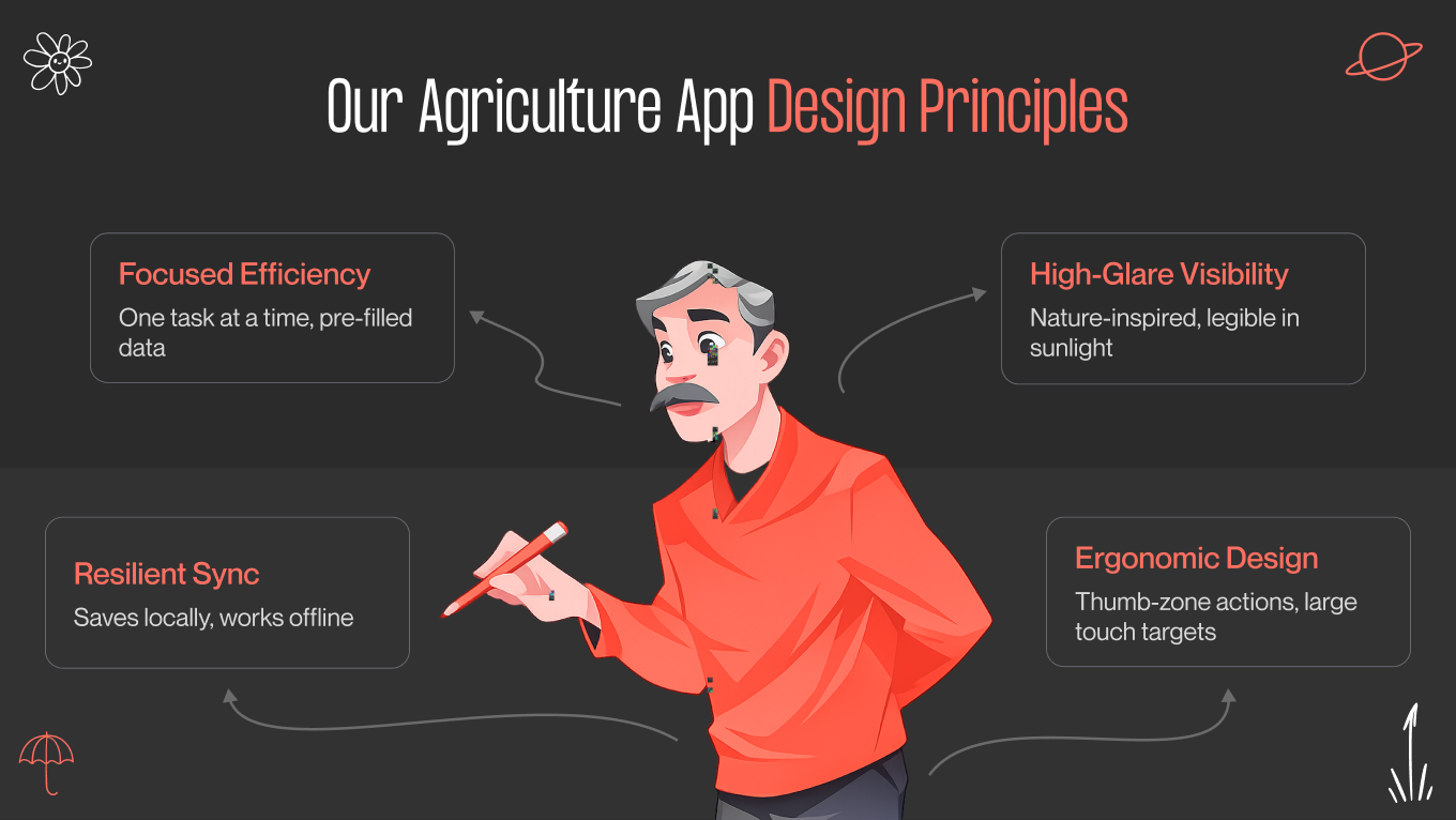
In AgTech, a powerful algorithm is only as good as a farmer’s ability to use it under the glare of a midday sun. While there are approximately 500 million small farms globally, it is estimated that only about 10% of smallholder farmers in low- and middle-income countries are active users of digital agricultural services. This massive adoption gap isn't a lack of interest; it's a failure of design to meet the user in the dirt, where digital literacy gaps and rural connectivity issues are the daily reality.

The friction between sophisticated data and the rugged reality of the field is where adoption dies. We often see this gap widen when performing a UX audit as a necessary stress test to see if a feature can survive the elements. When an interface requires a steep learning curve or fails in a "dead zone," it becomes a liability. This specific challenge is why many technical leaders decide to outsource UI/UX design to partners who understand that if an app feels like an academic exercise, it will never survive in the wild.

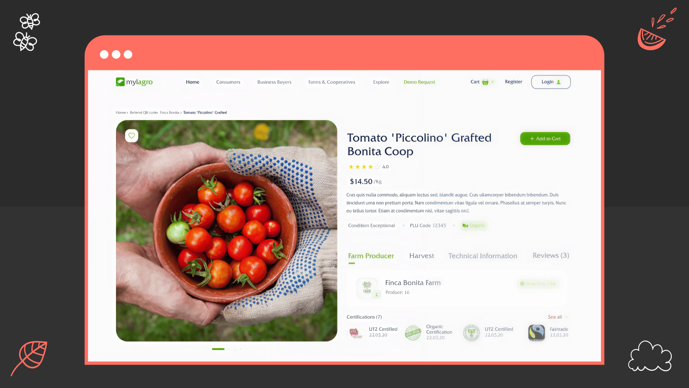
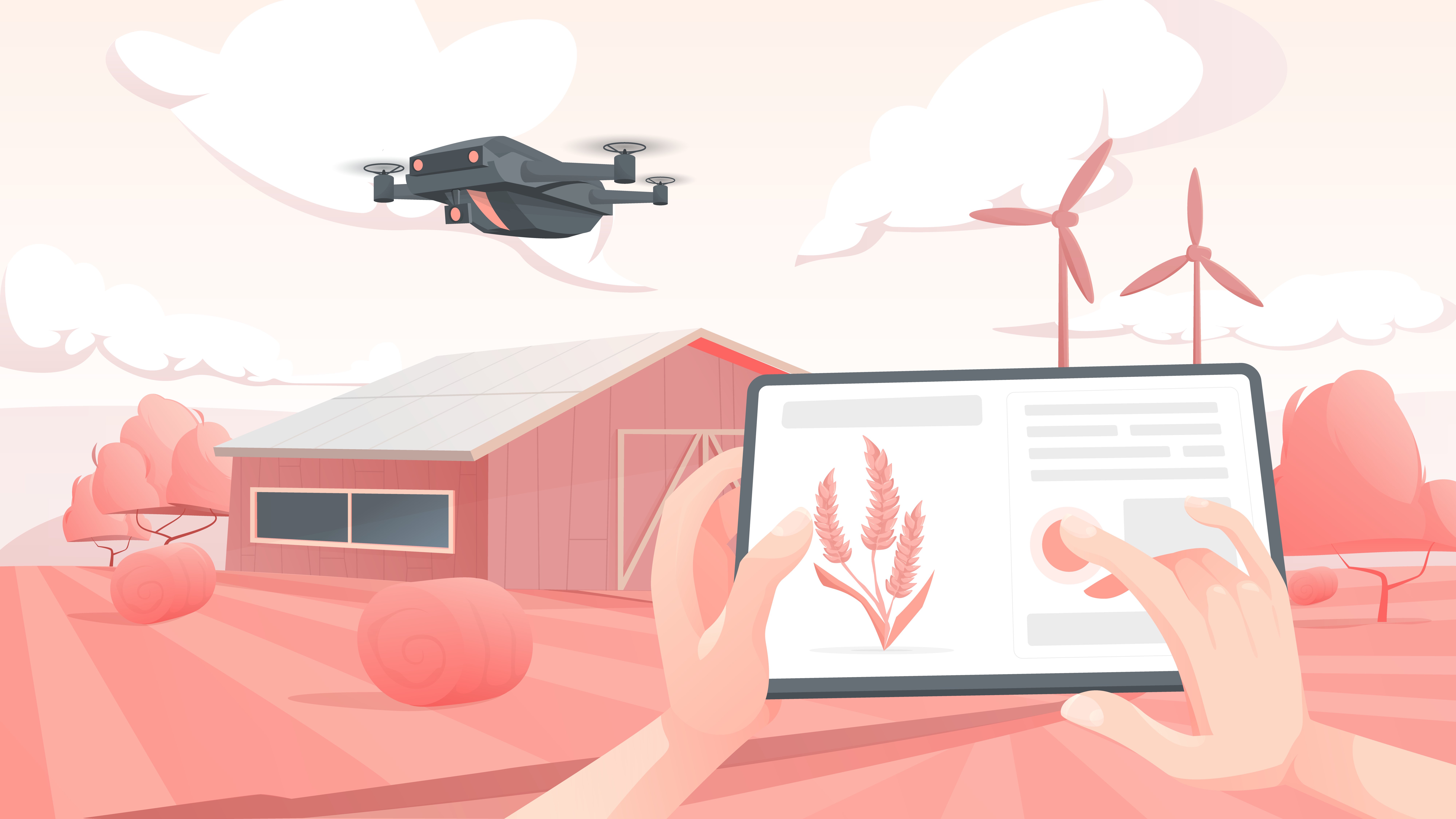
At Gapsy, we treat agriculture app design as a practice of field-tested empathy rather than just pixels. This guide distills our experience into a strategy for building resilient AgTech, covering everything from offline-first mobile workflows to custom web platforms that turn raw data into human-centric decisions.

The Mylargo Case Study: From Internal Tool to Global Marketplace

Every great AgTech innovation starts with a simple “what if", a question that, when shaped into a clear product vision statement, helps teams align technology, design, and long-term business goals from the very beginning.

For Mylagro, the question was: What if we could turn a private farm management tool into a global community for every farmer on the planet? The goal was to democratize market access and remove intermediaries that often dilute farmers' profits.

But as we stepped in, the project faced a classic AgTech crossroads: how do you build a secure, high-stakes marketplace that remains accessible to someone using a five-year-old smartphone in a rural area with 2G speeds?

The Challenge

The dual-user base presented a unique friction point. It’s a classic SaaS design challenge where different groups require distinct workflows within a single platform. Buyers needed a high-performance e-commerce experience with secure encryption, while farmers required a tool that wouldn't fail during a connectivity drop in the field. 

Our market research revealed a deep-seated hesitation toward “complex” tech among non-tech-savvy users. This agricultural mobile app design had to be powerful enough to handle global transactions yet intuitive enough to feel like a digital extension of a handshake. 

Our Approach

We architected a digital ecosystem rooted in best practices. Our team focused on a "resilient design" framework:

  • Offline-First Functionality: Critical elements remained operational even in dead zones, syncing data the moment a signal returned.

  • Visual Empathy: We used earthy, high-contrast tones for readability under direct sunlight and created iconographies that bypassed language barriers. This was made to ensure a visual identity that farmers can instantly recognize and trust.

  • Security by Stealth: We integrated robust encryption and two-factor authentication into a flow that felt seamless, not burdensome.

Key Features of the Mylagro Ecosystem

Instead of a standard feature list, we approached the Mylagro toolkit as a set of strategic levers designed to solve specific friction points in the agricultural supply chain. Here is how the core functionality translates into business value:

  • Customizable Listings and Smart Filters. Farmers can curate their "digital storefront" to reflect the unique quality of their produce, while buyers use advanced search parameters to find exactly what they need, from specific soil certifications to local harvest dates.

  • A Precision Notification System. We designed a real-time alert engine that keeps users informed on transaction statuses, sudden market shifts, and community connections, ensuring no opportunity is lost to a delayed refresh.

  • Secure Transactions. Our team integrated enterprise-grade encryption and two-factor authentication into the workflow, creating a safe environment for high-value sales without complicating the user journey.

  • Community and Advisory Tools. We built integrated forums and direct advisor connections into the app, turning a transactional marketplace into a knowledge-sharing hub where expertise is just a tap away.

  • Field-Optimized Intuitive UI. The hallmark of the project is a simplified dashboard that masks complex backend processes. Whether tracking a cross-border sale or promoting a new crop, the interface is optimized for mobile use in high-pressure, outdoor environments.

The Outcome

Instead of simply digitizing a process, Mylagro democratized a supply chain. By opening the platform up, they removed the gatekeepers, a structural shift that perfectly illustrates our approach to how to design a SaaS application for complex, multi-sided markets. The result is a genuine lifeline: thousands of farmers can now bypass the middlemen and trade directly with the world, turning their harvest into income on their own terms.

If you are building tools for industries that run on trust and grit, like agriculture, logistics, or field ops, we should talk. Let’s discuss how to build digital products that survive and thrive in the real world.

Key Agriculture Mobile App Design Principles

Designing for the field requires a departure from standard software conventions. A farm is a high-pressure environment where technical friction doesn't just cause annoyance, it leads to delays in critical operations. 

Through UX research, we’ve observed the specific friction points of outdoor work and identified four foundational pillars. These principles are what separate a novelty app from a daily utility.

1. Prioritize Efficiency over Cognitive Load

Farmers are often managing multiple streams of information simultaneously (e.g., machinery performance, changing weather patterns, crew coordination, and more). An app should not add to that mental burden, which is why clear hierarchy and restraint are essential in agricultural workflows.

  • Sequential Information Architecture: We replace dense, "all-at-once" dashboards with task-oriented flows. If a user is recording a soil sample, the interface should only show the fields relevant to that specific action.

  • Predictive Data Entry: By leveraging GPS and historical records, our designs pre-populate as much data as possible. Reducing the number of taps required for a record directly increases data accuracy and user adoption.

2. Use Environmental Visual Language

The "clean" aesthetics of a “city-based” B2B product often fail in the field. Sunlight, dust, and physical movement dictate the visual requirements. 

High-Contrast Functional Palettes

In an office, we design for controlled lighting. In the field, we design for the harsh reality of 10,000+ lux. For agriculture app design, meeting standard accessibility guidelines is the floor. We push contrast ratios to 7:1 or higher to ensure that critical data remains readable when the sun is at its zenith.

  • In high-glare environments, the human eye loses the ability to distinguish color (hue) before it loses the ability to perceive brightness (value). We build our interfaces in grayscale first to ensure the hierarchy holds up. If the app isn’t functional in black and white, it won’t survive a midday harvest.

  • We avoid high-vibrancy "neon" tech colors that tend to "bloom" or wash out in high heat. Instead, we use desaturated, earthy tones, like deep slate, clay, and forest green. These colors have low-reflectivity properties, ensuring the screen doesn't become a mirror.

  • Farmers often view their devices from a dashboard mount or at waist height. We use heavy font weights and solid-fill icons because thin lines disappear when viewed at an angle.

  • To reduce eye strain during 12-hour shifts, we replace pure white (#FFFFFF) with high-value off-whites or light grays. This maintains maximum contrast without the blinding "halo effect" caused by backlighting on a bright day.

Literal Iconography 

When your users speak different languages and have different levels of digital literacy, an abstract icon is a barrier. We use functional illustrations to bridge that gap. In agricultural projects, our team opt for literalism over style (for example, depicting equipment and infrastructure exactly as they look in the field) to ensure the interface is understood instantly. 

3. Apply Offline-First Technical Resilience

Rural connectivity is rarely a constant. A professional UI/UX design has to treat a lack of internet as a standard operating state. 

  • The app should record every action to the device’s local database immediately. This ensures zero "loading spinners" during the workday.

  • Data should sync to the cloud only when a stable connection is detected. We include clear but unobtrusive status indicators to give the user confidence that their data is safe, even if it hasn't reached the server yet.

4. Design for Physical Ergonomics

In agriculture, a smartphone is rarely the user's sole focus. It’s often used while driving machinery or inspecting crops. This makes a mobile-first design strategy less about screen size and more about physical reachability. 

That’s why we treat the “One-Handed Rule” as a strict constraint, ensuring the interface remains functional even when the user is wearing gloves or only has a thumb to spare.

  • All primary navigation and critical action buttons should be placed in the lower third of the screen. This allows for comfortable, one-handed operation while the user is on the move.

  • Interactive elements are designed with large, clearly defined touch zones (at least 48x48dp) to prevent "fat-finger" errors and user frustration.

Good design works in a studio, while great design works in the field. Contact us to see how we solve for offline capability, one-handed use, and the unpredictable nature of outdoor work.

Agriculture Technology Mobile App Design Trends

In 2026, AgTech graduated from the “gadget” phase to true industrial utility. The market now rewards reliability. This shift drives the current UI design trends we see dominating the sector, such as patterns that prioritize high-contrast visibility and immediate data comprehension over decorative flair. For Gapsy’s partners, the goal is less about capturing data and more about presenting information in a way that survives the chaos of the field.

Agentic UI: From "What?" to "Now What?"

The primary friction in early AgTech was "data fatigue." Farmers were given beautiful charts of soil moisture and nitrogen levels but were still left to do the mental math. In 2026, agriculture app user interface design has moved toward Agentic UI. These are interfaces that don't just report status but suggest actions. 

For example, instead of showing a moisture percentage, the UI presents a binary choice: "Sector B-12 is 15% below the hydration threshold. Trigger irrigation now?"

We utilize AI in design to hide the "math" behind a primary action button. The interface only surfaces raw data when the user requests a deep dive, supported by subtle mobile app animation cues that guide attention toward the next best action.

Verification UX

As autonomous fleets take over the heavy lifting, the human role shifts from operator to supervisor. The challenge here is proving to the farmer that it worked correctly. We call this “Verification UX.”

A static progress bar doesn't build trust; visual proof does. We integrate low-latency heartbeats, like micro-video snippets or LIDAR point-clouds, to confirm the physical reality matches the digital report. 

In more complex scenarios, we leverage AR/VR design to overlay these data layers directly onto the field view, giving the user absolute clarity. And when data is fuzzy, cryptic error codes are replaced with a “Confidence Score.” This empowers  the farmer to decide when to trust the algorithm and when to drive out and check the soil themselves.

The "Scale-As-You-Grow" Interface 

One of the toughest balances in AgTech is serving both the family farm and the industrial conglomerate. A one-size-fits-all interface inevitably breaks as a farm grows, forcing a costly and disruptive UX/UI redesign just to accommodate new complexity. We prevent this dead-end by creating for progressive complexity.

  • The Telescoping UI: We start users in essential mode, stripping the interface down to core metrics like yield and weather. As the operation scales, the UI simply unlocks new modules. The software grows with the farm, without forcing the user to relearn the tool.

  • Role-Based Context: At the enterprise level, clarity comes from segmentation. An operations manager needs to see fleet fuel efficiency, while a field worker just needs a checklist. We map these distinct needs using detailed user personas, ensuring that each user sees a command center tailored strictly to their role.

Unified Data Layers for Executive Overview

In AgTech, the enemy is fragmented data. That’s why the primary goal of custom web app design for agriculture technology is to break down the silo effect, where critical insights are trapped in separate browser tabs.

Instead of forcing users to mental math, we build 3D terrain maps that serve as a single source of truth. By applying advanced dashboard UI design principles, we stack data layers, overlaying NDVI crop health, drainage patterns, and live fleet movements, into one cohesive view.

The other solution is "Glass Cockpit" designs that unify data from disparate hardware. We design interfaces that ingest streams from John Deere machinery and third-party probes alike, presenting them in a unified, high-performance environment that feels like a single brand experience.

3 Hidden Challenges in AgTech App Design

When talking about agriculture apps, everyone mentions the obvious stuff: muddy hands, bright sunlight, and bad internet. Those are important, but they are just the starting point.

To build a truly successful product in 2026, you need to solve the deeper business problems that keep farmers awake at night: hiring seasonal staff, managing dangerous machinery, and making a profit.

The Seasonal Workers Training

Harvest waits for no one. When bringing on a temporary crew, there is no luxury of a three-day training seminar; you have about five minutes before the work starts. We analyze this high-pressure onboarding using a rigorous customer journey map, identifying every point where a language barrier or complex menu might cause a bottleneck. The goal is a zero-training interface, software that is intuitive enough to pick up and use instantly, keeping the harvest moving.

Our Solution

Design for the "Day-One User." We replace complex text menus with simple, step-by-step pictures (pictograms).

  • Instead of writing "Calibrate Sensor," we show a comic-strip style animation of how to do it.

  • We create a simplified view for temporary staff that only shows the big, essential buttons (like "Start" and "Stop"). This makes it impossible for a new hire to accidentally delete important data or change settings they shouldn't touch.

The Safety Challenge 

As farms start using more autonomous tractors and drones, software becomes a safety tool. If a 10-ton harvester starts driving toward a fence (or a person), the farmer needs to stop it instantly. If the "Emergency Stop" button is hidden inside a menu, that’s a major liability.

Our Solution

We borrow safety rules from industrial design to prevent accidents.

  • For dangerous remote tasks, the user must keep their finger on the button to keep the machine moving. If they lift their finger—because they trip or get distracted—the machine stops instantly.

  • We protect critical actions (like "Reset System") with a "Slide-to-Confirm" motion. This ensures that a slip of a gloved finger never causes a disaster.

Yield vs. Money

There is often a dangerous disconnect in AgTech: apps excel at visualizing agronomy but fail at showing economy. A field might look perfectly green on an NDVI map, but if the input costs destroy the margin, that green is a financial red flag. We fix this by overlaying cost data directly onto crop health views. Shifting the interface from a simple status report to a tool that actively protects the farmer’s bottom line is a prime prime example of value design can bring to your business. 

Our Solution

We help farmers see the bottom line, not just the crop line.

  • We overlay financial data onto the field map. Instead of just seeing green plants, the farmer sees "Green Zones" (making money) and "Red Zones" (losing money).

Before a farmer sprays expensive chemicals, the app calculates the cost. It might say: "Warning: Spraying this field will cost $500, but only save $300 of crop. Do you still want to proceed?" This turns your app from a monitoring tool into a financial advisor.

Build Tools, Not Just Apps with Our Expertise

In an industry defined by grit and unpredictability, good aesthetics are not enough. Success starts from a detailed design estimation, so that complex requirements like offline capability and glare reduction are scoped realistically from day one.

When it comes to agriculture, our team operates less like designers and more like industrial architects. We apply the rigorous standards of enterprise application design to your platforms, ensuring they remain reliable under pressure. 

To us, a screen is a control panel for high-stakes machinery. Through our UI/UX consulting, we bridge the gap between engineering constraints and the muddy reality of the field, building tools for users who need to make split-second decisions without the luxury of a climate-controlled office.

Why Choose Us

  • We engineer interfaces that work when the glare is high, the signal is dead, and the pressure is on.

  • Farmers are experts. We build tools that get out of their way, turning complex "Big Data" into simple, respectful interactions that support their expertise rather than replacing it.

  • From "Edge-First" architecture to legacy hardware integration, we speak the language of your engineering team, ensuring that our designs are as buildable as they are visually pleasing.

We help founders translate complex agronomy data into software that acts as the digital backbone of the farm. This reliability is treated like architectural choice. 

Polish is easy. Reliability is hard. If you are building for mud, noise, spotty internet and all, we’d love to compare notes. Drop us a line and let’s explore how to make your product as resilient as the people using it.

Final Thoughts

The combine harvester and the code running it are now a single ecosystem. In this reality, a confusing interface is a safety risk, where connectivity drops lead the fleet to stop.

Farmers are no longer dazzled by smart labels, especially when the initial app design cost yields features that fail to deliver practical value in the mud. The future belongs to platforms that solve the unglamorous, gritty problems: rapid worker onboarding, accident prevention, and financial clarity.

Our team designs for the field, not the Dribbble feed. Whether we are executing custom web app design for agriculture technology or building a mobile scouting tool, our mandate is “create software that is rugged enough to earn its place on the farm.”

If you’re ready to build agricultural software that performs in real conditions, we’d be glad to explore it with you. Contact us to talk through your product challenges and see how field-ready design can turn complexity into tools farmers rely on.

Rate this article

22 ratings
Average: 4.9 out of 5

If you like what we write, we recommend subscribing to our mailing list to always be aware of new publications.

Do you have any questions? We tried to answer most of them!