B2B vs B2C Website Design: A Practical Guide for Businesses

14minutes read
b2b vs b2c website design

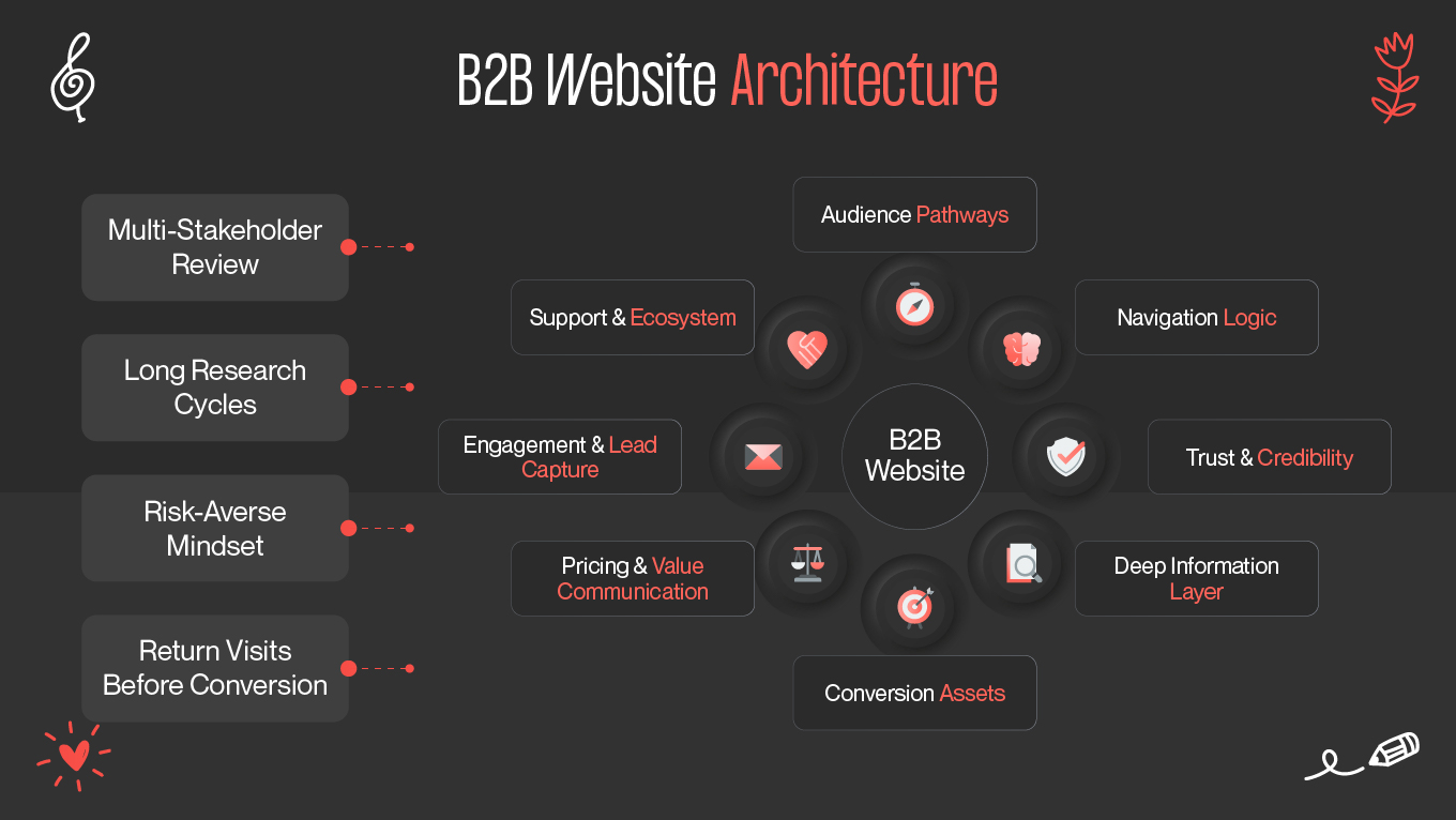
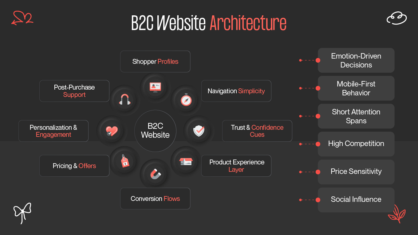
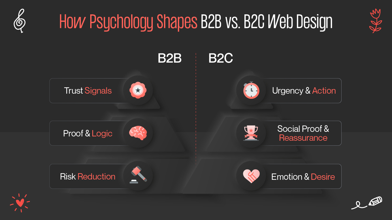
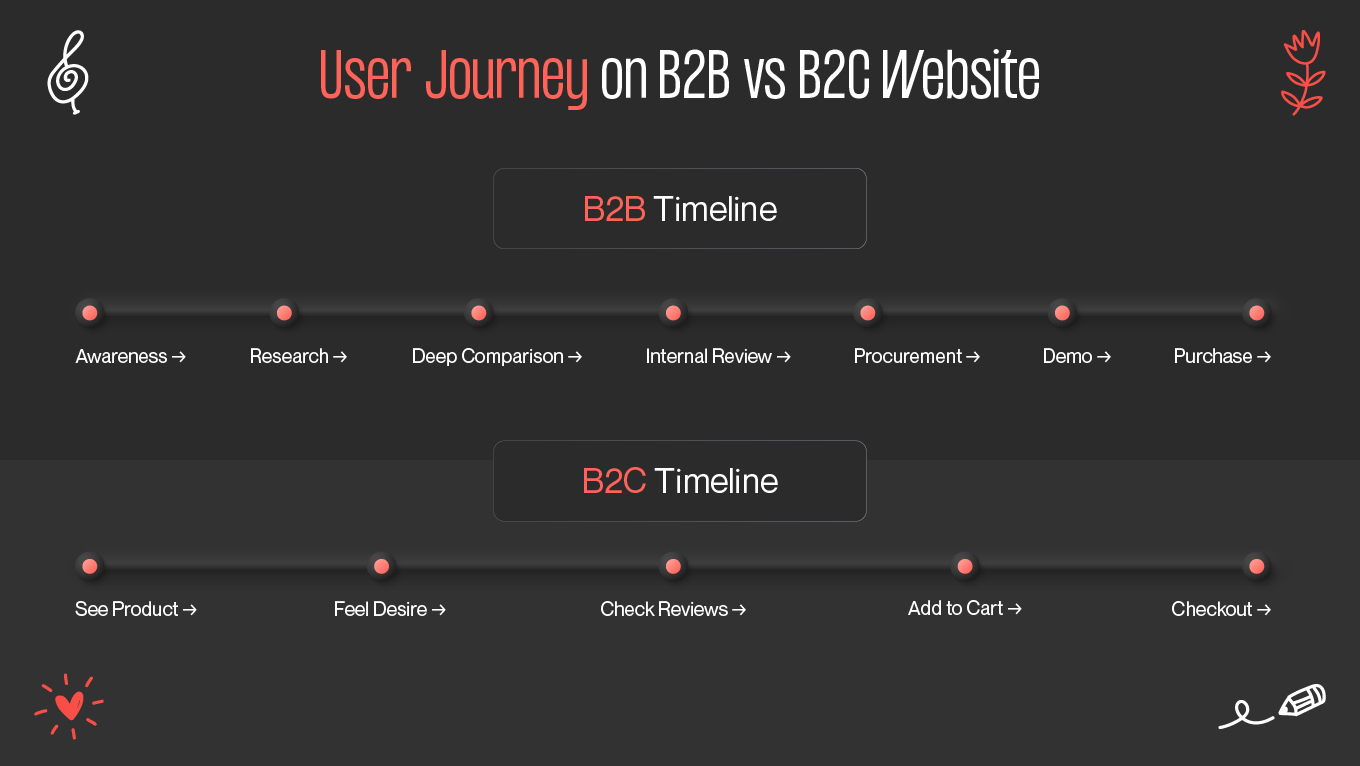
Designing for B2B and B2C requires understanding how two completely different types of buyers think, evaluate, and make decisions. A B2B buyer may spend weeks comparing vendors and validating ROI with colleagues, while a B2C shopper can move from discovery to checkout in under a minute. These differences shape everything from navigation logic to the emotional tone a website needs to convey.

What makes this gap even more pronounced today is the growing expectation for personalization. In B2B, 66% of buyers now expect fully tailored digital experiences, a level of specificity far beyond B2C’s typical product recommendations. 

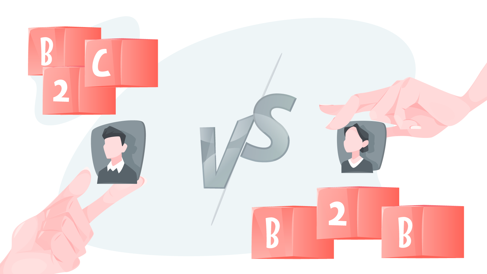
Understanding how these two worlds diverge, in psychology, UX flows, content depth, pricing visibility, and technology, is what allows businesses to design websites that feel intuitive for the people they serve. In this guide, we break down the real differences between B2B and B2C web design, how they impact conversions, and how companies can build digital experiences that speak directly to their audience’s expectations.

How B2B and B2C Web Design Differ in Practice: Two Case Studies from Our Studio

Understanding the contrast between B2B and B2C design becomes much clearer when you see it applied to real projects. Below is a comparison of two recent collaborations—one with a venture capital firm and one with a consumer beauty platform—showing how different audiences, decision cycles, and expectations shape the final product.

B2B Case Study: Venture Capital Firm

FGventures needed a website that could speak to two highly discerning groups at once: founders seeking funding and investors evaluating credibility. Their previous website lacked structure, visual clarity, and the depth required to communicate expertise.

Our B2B approach focused on:

  • Trust and authority: clean layouts, professional typography, structured messaging, and thought-through microinteractions.

  • Deep information architecture: clear pathways for founders, LPs, and startups; detailed sectors, investment criteria, and portfolio insights.

  • Conversion through clarity: simplified navigation, intuitive flows, and friction-free forms that make it easy to pitch or inquire.

  • Consistency and brand image: a modern design system that strengthened credibility and differentiated FGventures in a crowded VC landscape.

This resulted in a more memorable brand presence, a smoother decision journey, stronger engagement, and a site that better reflects the firm’s value proposition and long-term relationship model.

B2C Case Study: Beauty and Service Platform

MANARO serves a very different audience: individual users looking for beauty services and entrepreneurs needing better booking and business-management tools. This required a design that felt personal, intuitive, and visually inviting.

Our B2C approach focused on:

  • Emotion and discovery: clean, modern visuals that make browsing services feel effortless and enjoyable.

  • Fast, simple journeys: clear booking flows, digestible layouts, and mobile-forward interfaces for on-the-go users.

  • Community and trust signals: ratings, reviews, stylist profiles, and transparent service info to reduce hesitation.

  • Dual-experience logic: a consumer experience on one side and simplified business tools on the other—allowing entrepreneurs to track, market, and grow.

Thanks to this approach, we achieved higher satisfaction, better conversions, improved retention, and a strengthened reputation as a community-driven platform in the beauty services space.

What These Case Studies Reveal

These two projects prove a critical point: successful web design depends on aligning strategy with how your audience makes decisions, not on aesthetics alone.

Aspect

FGventures (B2B)

MANARO (B2C)

Primary Goal

Build trust, communicate expertise, support high-value decisions

Make discovery and booking fast, enjoyable, and visually engaging

Audience Behavior

Research-heavy, multi-step evaluation, needs clarity

Quick decisions, emotional motivations, needs simplicity

UX Priorities

Structured navigation, deep content, robust credibility signals

Clean visuals, fast flows, strong personalization + trust badges

Conversion Path

Forms, pitch submissions, investor inquiries

Bookings, sign-ups, service exploration

Design Tone

Professional, authoritative, restrained

Warm, modern, welcoming

No matter you're speaking to founders, investors, or everyday consumers, the right design approach makes all the difference. If you want a website that feels intuitive, earns trust, and supports real business results, we’d be happy to help.

Why You Should Know About The Difference Between B2B & B2C Website Design

User expectations have evolved faster than most websites. Buyers, whether business professionals or everyday consumers, now expect digital experiences to adapt to their needs instantly. In B2B, that shift is especially sharp: only 33% of marketers personalize website content, yet those who do rely heavily on first-party behavioral data and report significantly higher lead quality. In B2C, personalization tends to be lighter and more transactional, but customers still abandon brands when the experience feels generic or inconvenient.

When companies ignore these differences, they end up designing for no one. A B2C-style site built for speed and emotion falls flat for B2B buyers who need depth, trust, and detailed proof points. Conversely, a B2B-style site overloaded with information and multi-step flows frustrates B2C shoppers who expect quick browsing and even quicker checkout. These mismatches slow down decisions, create friction, and quietly drain conversions.

Trying to build a “universal” experience almost always backfires. B2B and B2C audiences don’t follow the same behaviors, don’t evaluate risk the same way, and don’t convert through the same signals. Understanding these distinctions is what allows businesses to design websites that feel natural to the people using them, which means reducing drop-offs, increasing engagement, and aligning the site with real buying journeys.

Create a B2B or B2C Website Design with Gapsy!

We are ready to work on your B2B and B2C website design. Press the button and we will contact you.

What Defines a B2B Website?

A B2B website exists to support complex, high-stakes decisions made by teams. These sites must deliver clarity, credibility, and structure, helping businesses evaluate solutions thoroughly and confidently. Unlike B2C interfaces designed for fast emotional decisions, B2B design emphasizes logic, depth, and long-term trust.

Who B2B Websites Serve 

B2B websites rarely serve a single user. Instead, they support a network of stakeholders, each with unique goals:

  • Decision-makers: executives who want strategic clarity, credibility, and ROI justification.

  • Procurement teams, focused on pricing structures, compliance, scalability, and risk.

  • Technical specialists, like engineers or product teams evaluating integrations, documentation, and feasibility.

  • Distributors and partners, looking for logistics, support, and operational details.

These users often land on the website at different stages, meaning the design must accommodate varied levels of knowledge and priorities. Their behavior is slower, more methodical, and driven by validation. 

How B2B Buyers Make Decisions

B2B buying journeys are rarely linear. They involve multiple cycles of evaluation, comparison, and internal discussions.

  • Long sales cycles, spanning weeks or months, with users returning repeatedly for deeper information.

  • Multiple touchpoints, as buyers move between case studies, whitepapers, product pages, demo forms, and external research.

  • Heavy research and comparison, where users cross-check features, pricing approaches, performance, and competitor positioning.

  • Internal approvals: purchases often require sign-off from finance, IT, leadership, or compliance.

Because decisions involve risk, the website must reduce uncertainty at every step through transparency, structure, and well-presented evidence.

What B2B Buyers Expect in Web Design

B2B users aren’t impressed by flashy visuals; they want purposeful design that helps them get answers quickly and confidently.

  • Detailed specs, documentation, case studies, industry insights, and clearly defined processes.

  • Calculators, configurators, quote requests, comparison charts, and ROI estimators that guide evaluation.

  • Intuitive navigation, clear content hierarchy, and predictable user paths.

  • Clean typography, restrained color palettes, and reliable page structure that signal credibility.

A strong B2B website removes friction, nurtures trust, and helps each stakeholder see how the solution fits their own priorities.

What Defines a B2C Website?

A B2C website is built for individuals making quick, emotionally driven decisions. Unlike B2B platforms, where purchases are researched, compared, and approved, B2C design has to capture attention instantly, communicate value in seconds, and remove every bit of friction that could interrupt the buying moment. This creates a very different design logic focused on visual impact, simplicity, and intuitive paths to purchase.

Who B2C Websites Serve

B2C sites accommodate a wide spectrum of consumer behaviors and motivations, often shifting from one visitor to the next:

  • Individual consumers looking for convenience, clarity, and trustworthy shopping experiences.

  • Deal seekers who compare offers, hunt for discounts, and respond strongly to urgency or scarcity cues.

  • Brand enthusiasts who return for consistent experiences, aesthetics, and a sense of connection.

  • Social-first shoppers discovering products through social media and expecting seamless, mobile-friendly journeys.

Each group comes with different expectations, but all share one thing: they make decisions fast, and they don’t have patience for complexity.

How B2C Buyers Make Decisions

B2C purchases are often impulsive or emotionally led, shaped more by how something feels than by rigorous comparison.

  • Fast, emotional decision-making, where users move from discovery to checkout in a matter of seconds if the experience is compelling.

  • Power of storytelling and visuals: strong imagery, video, and brand voice pull users into the experience.

  • Social proof as a trust shortcut, like ratings, reviews, user-generated content, and influencer validation reduce hesitation instantly.

This means the website must communicate value quickly and keep energy high throughout the experience.

What B2C Audiences Expect in Web Design

B2C buyers have low tolerance for friction. They expect websites to feel modern, responsive, and effortless at every step.

  • Bold imagery, strong branding, and design that sparks emotion.

  • Tailored recommendations, recently viewed items, and dynamic content that feels relevant.

  • Intuitive layouts, large tap targets, scroll-friendly content, and mobile-first flows across the entire site.

  • Minimal steps, fast payments (Apple Pay, Google Pay), and no forced registration.

Great B2C design removes every barrier between desire and purchase. When the experience feels fluid, simple, and visually compelling, conversions follow naturally.

Differences Between B2B and B2C Website Design at a Glance

Before investing in a redesign, it’s crucial to understand that B2B and B2C websites operate under entirely different decision-making environments.

A website that doesn’t reflect these behavioral differences inevitably underperforms. Either by overwhelming consumers with too much information or undeserving B2B buyers who need proof, structure, and clarity.

The table below distills the core differences so teams can align design decisions with the right audience expectations.

Dimension

B2B Web Design

B2C Web Design

Audience Behavior

Research-heavy, multi-visit journeys; decisions influenced by multiple roles (executives, procurement, specialists).

Fast, emotional, impulse-driven behavior; decisions made by individuals with short attention spans.

Complexity of Decisions

High complexity: requires validation, ROI proof, technical details, and stakeholder alignment.

Low to moderate complexity: decisions rely on visuals, reviews, promotions, and product clarity.

UX Patterns

Structured, logical flows; mega menus; industry pathways; dense multi-page architecture.

Simple, visual, mobile-first flows; shallow navigation; minimal friction; high emphasis on speed.

Content Depth

In-depth: case studies, documentation, whitepapers, FAQs, comparison tables, pricing models.

Minimal and emotionally driven: short descriptions, visuals, reviews, social proof, lifestyle content.

Navigation Logic

Hierarchical, predictable, multi-layered; supports extensive research and content discovery.

Streamlined and visual; optimized for browsing, not deep exploration; search and categories dominate.

Pricing Models

Custom quotes, tiered structures, ROI framing, calculators, “request a quote” flows.

Transparent prices, discounts, promotions, bundles, seasonal offers.

Trust & Emotional Design

Built through authority: certifications, leadership profiles, client logos, long-form case studies.

Built through emotions: visuals, reviews, influencer content, ratings, UGC, return guarantees.

Checkout Flows

Lead capture over instant purchase: demo forms, consultation booking, multi-step qualification.

Fast checkout: one-click payments, guest checkout, autofill, mobile-first checkout paths.


How Psychology Differs in B2B vs. B2C UX Design

B2B and B2C audiences don’t just want different things; they think differently during the buying process. Such psychological differences shape everything from layout choices to how much information a page should contain. 

When teams misunderstand this, the interface ends up speaking the wrong language: too emotional for B2B buyers, too dense for consumers, and underperforming for both.

Trust in B2B: Reduces Risk and Increases Clarity

B2B decisions are high-risk. A wrong choice can impact budgets, workflows, security, and team performance for years. That’s why B2B design has to neutralize uncertainty at every touchpoint.

B2B interfaces emphasize:

  • Professional, consistent visuals that communicate stability rather than flair.

  • Transparency in pricing logic, processes, integrations, security, and data handling.

  • Proof and credibility signals, like certifications, compliance, detailed case studies with measurable outcomes.

Why this changes the interface:

B2B buyers need reassurance before they feel comfortable moving forward. Their job, reputation, and resources are on the line, so the UI must provide evidence, structure, and clarity. Heavy content, precise language, and predictable navigation reduce risk and make the buyer feel in control.

Emotion in B2C: Inspires Desire and Instant Action

B2C shoppers don’t operate under the same pressure. They’re not defending a budget to a board. Their decisions are personal, emotional, and often rapid, which means the interface needs to trigger desire and remove obstacles to purchase.

B2C interfaces focus on:

  • Strong branding and personality, creating an emotional connection in seconds.

  • Visual storytelling that makes products feel aspirational or relatable.

  • Social proof — reviews, user-generated content, influencer photos, ratings — that act as shortcuts for trust.

  • FOMO and urgency cues such as limited stock, timers, or fast-shipping labels.

Why this changes the interface:

B2C buyers rely on emotion first and logic second. Interfaces must keep attention high, reduce cognitive load, and create excitement. Clean visuals, bold color, motion, and fast checkout directly support impulse behavior.

If your website feels “one-size-fits-all,” you’re losing the people you want most. Whether your audience buys on logic or emotion, we can help you create a digital experience that speaks their language and moves them to action. Let’s build it together.

Pricing Models and How They Shape Web Design

Pricing defines how users navigate your site, how much information they expect before acting, and how much friction they tolerate. B2B and B2C operate on completely different psychological and operational rules, and your website has to reflect those differences at every step.

B2B Pricing Patterns

B2B buyers rarely make a purchase in one visit, and pricing is often tied to complex variables like usage, seats, contracts, industry, and integrations. This shapes design in very specific ways:

Customized Pricing

B2B sites often avoid fixed numbers because pricing depends on company size, feature sets, or SLAs.

Design impact:

  • “Request a Quote” workflows

  • Configurable pricing calculators

  • Comparison matrices for tiers

  • Clear definitions of what’s included to reduce uncertainty

Contract-Based Pricing

Multi-month or multi-year commitments require clarity.

Design impact:

  • Detailed breakdown of terms

  • Value justification (ROI pages, savings calculators)

  • Dedicated procurement sections

Bulk / Volume Discounts

Enterprise buyers want to see how cost scales with usage.

Design impact:

  • Tiered pricing pages

  • Dynamic sliders for seat/user counts

  • Total cost projections

Quote-Request Journeys

Since most deals require a sales conversation, the website becomes a lead-qualification tool.

Design impact:

  • Progressive forms

  • Smart routing (sales → enterprise → support)

  • CTA hierarchy that pushes toward demos or discovery calls

In B2B, the pricing model forces the site to educate, justify, and reduce perceived financial risk.

B2C Pricing Patterns

B2C users buy quickly. Price is part of the emotional moment, which means it has to be simple, obvious, and persuasive.

Flat Pricing

Most products or services have a clear, immediate cost.

Design impact:

  • Bold, above-the-fold pricing

  • Rapid comparison across variants

  • One-tap purchase flows

Promotions

B2C shoppers respond strongly to urgency and reward.

Design impact:

  • Discount badges

  • Countdown timers

  • “Before/after” visual price anchoring

Bundles

Bundles help increase AOV and simplify choice.

Design impact:

  • “Frequently bought together” modules

  • Bundle builders

  • Price advantage indicators (“Save 18%”)

Psychological Pricing

Small visual cues influence conversion.

Design impact:

  • $19.90 instead of $20

  • Highlighted “Most Popular” tiers

  • Color-coded pricing sections that draw attention to the optimal choice

In B2C, pricing design is about emotion, clarity, and speed, helping shoppers say yes without hesitation.

Why Sales Cycles in B2B & B2C Websites Require Different Design Decisions

A website serves as a direct extension of your sales process. Because B2B and B2C sales cycles couldn’t be more different, the design patterns, content depth, and user journeys must follow entirely separate rules. Ignoring this is one of the fastest ways to lose conversions on both sides.

B2B Sales Cycles

B2B sales cycles are long, layered, and heavily influenced by internal alignment. Nobody buys after one visit: decisions move through stakeholders, budgets, technical reviews, and procurement. The website must support that.

Long, Multi-Step, Information-Heavy Journeys

Decision-makers return multiple times, often comparing vendors for weeks or months.

Design implications:

– Detailed product and feature pages
– Deep content architecture (docs, security, compliance, integrations)
– Research-friendly layouts with structured navigation

Need for Gated Content, Calculators, and Demos

B2B buyers expect value before a salesperson enters the conversation.

Design implications:

– Gated whitepapers, case studies, reports
– ROI and TCO calculators
– Demo request and enterprise inquiry flows
– Multi-step forms that gradually qualify leads

Navigational Depth Matters

Unlike B2C, shallow menus don’t work. Buyers must quickly access specialized information.

Design implications:

– Mega menus with role-, industry-, or problem-based segmentation
– Comparison pages for products, tiers, integrations
– Bread-crumb trails for orientation and long-session browsing

In B2B, the website must behave like a digital consultant, not a storefront.

B2C Sales Cycles

B2C buyers move fast. Their decisions are emotional, visual, and often impulsive. If your site creates even a moment of friction, the sale is gone.

Short, Impulse-Driven Cycles

Shopping decisions happen in minutes, sometimes seconds.

Design implications:

– Direct paths to purchase
– Clear value display above the fold
– Fast-loading product pages

1–3 Step Checkouts

Any extra step kills conversions. B2C thrives on simplicity.

Design implications:

– Express checkout options (Apple Pay, Shop Pay, Google Pay)
– Auto-fill for addresses and payment
– Minimal form fields and visual clutter

Social Proof and Urgency Cues

B2C buyers need confidence, not documentation.

Design implications:

– Ratings, reviews, and UGC
– “Only 3 left” inventory cues
– Delivery/date promises
– Time-limited offers

In B2C, the website must remove hesitation instantly.

Where B2B and B2C Design Overlap (B2B2C)

Some businesses serve both individual consumers and professional buyers. These brands live in a hybrid territory, where the site must feel simple and inspiring for consumers, yet structured and information-rich for business users. This is so-called B2B2C design, a blended approach that respects both emotional buying patterns and rational, research-driven decision-making.

A successful B2B2C website doesn’t split the experience; it creates a unified interface that adapts based on who is browsing. Product pages serve as the shared middle ground — designed to deliver intuitive storytelling for consumers while offering deeper layers of specs, documentation, and ROI insights for business audiences.

Personalization becomes the bridge. Consumers see fast-path checkout cues and social proof, while business users see integrations, bulk pricing eligibility, or case studies. The journeys differ, but the experience remains cohesive.

B2B2C Design Principles

Designing for B2B2C is often about a delicate balance: keeping workflows efficient for teams while making the experience feel effortless for end-users. These principles help you stay grounded in real human needs, so the product works smoothly across the entire journey. 

Flexible User Paths

Both B2B and B2C users must navigate effortlessly, even though their goals differ.

Design implication:

  • Multiple entry points (by industry, by need, by product)
  • Optional depth instead of forced complexity
  • Smart self-segmentation (“I’m buying for myself” vs. “I’m buying for my business”)

Dynamic Content Depth

Not everyone needs a wall of specs or a long story, but those who do should find it instantly.

Design implication:

  • Layered content: highlights first, advanced info beneath
  • Expandable modules for technical data, compliance, integrations
  • Story-driven visuals upfront to engage B2C users

Mixed Pricing Visibility

Consumers expect instant prices; businesses expect custom quotes. B2B2C design must support both without creating cognitive dissonance.

Design implication:

  • Clear retail prices for consumers
  • “Volume pricing available” or “Request a quote” cues for business buyers
  • Hybrid price tables with optional calculators

Hybrid Checkout Flows

Consumers want speed; business buyers want control.

Design implication:

  • Fast, one-click consumer checkout
  • Business purchasing workflows (PO numbers, multi-user accounts, tax exemptions)
  • Saved carts and requisition lists for repeat corporate orders

Common Mistakes Companies Make in B2B and B2C Web Design

After reviewing and redesigning dozens of B2B and B2C websites, we consistently see the same issues slow down conversions and weaken brand credibility. These mistakes don’t come from lack of effort, they usually stem from designing based on assumptions instead of user behavior. Here are the most common pitfalls and how we recommend fixing them.

Designing for Internal Preferences Instead of Real User Behavior

Teams often prioritize what they like rather than what users actually respond to. The result? Pages full of things the company cares about — not what visitors need to make a decision.

Quick fix:

  • Run 3–5 user tests before finalizing layouts
  • Validate assumptions with heatmaps and analytics
  • Prioritize clarity over “cool” internal ideas

Overusing Marketing Layers That Slow Users Down

Endless sliders, banners, animations, pop-ups, or storytelling blocks look impressive internally but exhaust users. Both B2B and B2C audiences drop off when the journey feels like a campaign instead of a path to value

Quick fix:

  • Keep one core message per page
  • Remove any animation that doesn’t help comprehension
  • Let the content carry the message, not layers of decoration

Ignoring Accessibility (Still Far Too Common)

Low contrast text, tiny touch targets, motion-heavy layouts, and missing alt text impact both users and SEO. B2B loses professional audiences with strict accessibility standards; B2C loses shoppers who can’t complete basic actions on mobile.

Quick fix:

  • Meet WCAG contrast ratios
  • Use minimum 44px touch targets
  • Add descriptive alt text and keyboard navigation
  • Test with users on different devices and abilities

Treating All Users the Same

Many companies create a single, generic experience, forgetting that B2B users and consumers enter with different goals, knowledge levels, and decision speeds. This usually leads to shallow B2B sites or overly complex B2C flows.

Quick fix:

  • Build user-path options (“For teams” / “For individuals”)
  • Personalize content blocks dynamically
  • Allow users to navigate based on role, context, or intent

Underestimating Mobile Differences

Most B2C purchases are mobile-first, yet many designs remain desktop concepts forced onto a small screen. And in B2B, where mobile is often the research starting point, poor mobile UX sends potential leads straight to competitors.

Quick fix:

  • Design mobile-first, not mobile-adapted
  • Use thumb-zone safe CTAs and single-column layouts
  • Simplify forms to essential fields only

Why Work on Your Website With Gapsy Studio

Most teams redesign their websites to “look modern,” but real impact comes from understanding how people think, decide, and trust online. That’s the lens we bring to every project. Our team doesn't just polish interfaces. Instead, we uncover what your audience truly needs and build experiences that remove friction, build credibility, and move users toward action.

Our clients choose us because we combine strategy, research, and clean design with measurable outcomes. Faster onboarding, higher conversions, clearer decision paths, stronger brand perception — these aren’t abstract promises; they’re results we deliver consistently. We work as a partner, not a vendor, helping you make decisions rooted in data and user behavior, not guesswork or trends.

If you want a website that feels intuitive, speaks your audience’s language, and supports your growth, we’re here to build it with you.

Final Words

B2B and B2C audiences don’t think, research, or decide in the same way, so your website has to reflect that. A generic, catch-all design might feel efficient, but it usually leads to lower engagement, weaker trust signals, and missed conversions on both sides. The most effective websites are built around real user behavior: how people evaluate value, how quickly they make decisions, and what they need to feel confident moving forward.

Choosing the right approach means understanding your buyers deeply and shaping the experience around their expectations. When done well, design becomes a growth lever, helping people find clarity faster, reducing friction, and turning attention into action.

If you want a website that matches the way your audience actually decides, we can help you get there.

Rate this article

20 ratings
Average: 4.9 out of 5

If you like what we write, we recommend subscribing to our mailing list to always be aware of new publications.

Do you have any questions? We tried to answer most of them!