Website Design Trends 2026: What Will Shape The Digital Experiences

12minutes read
top-website-design-trends

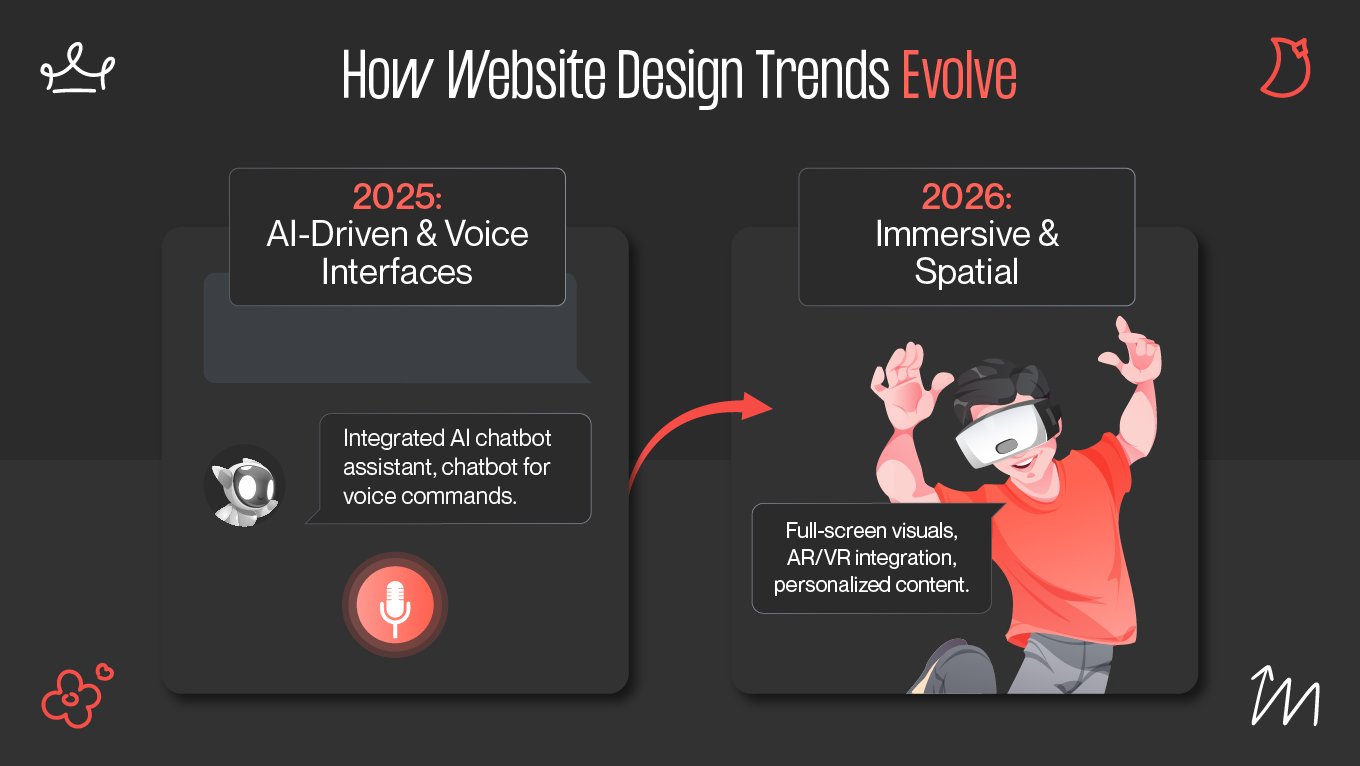
Website usage is changing faster than most companies realize. In 2025 alone, website consumption rates dropped 6.5% year-over-year, and the average scroll depth fell by 7%, landing at just 55% of a page. Users abandon websites that no longer meet their expectations for speed, intelligence, and relevance. The traditional “static page with a navigation bar” model is quickly losing its ability to hold attention, guide decisions, or convert.

In 2026, websites should evolve into adaptive, insight-driven experiences that serve users precisely what they need; no more, no less. At Gapsy, we’re already seeing these shifts emerge across product redesigns. Users now expect interfaces that anticipate intent rather than simply display information. 

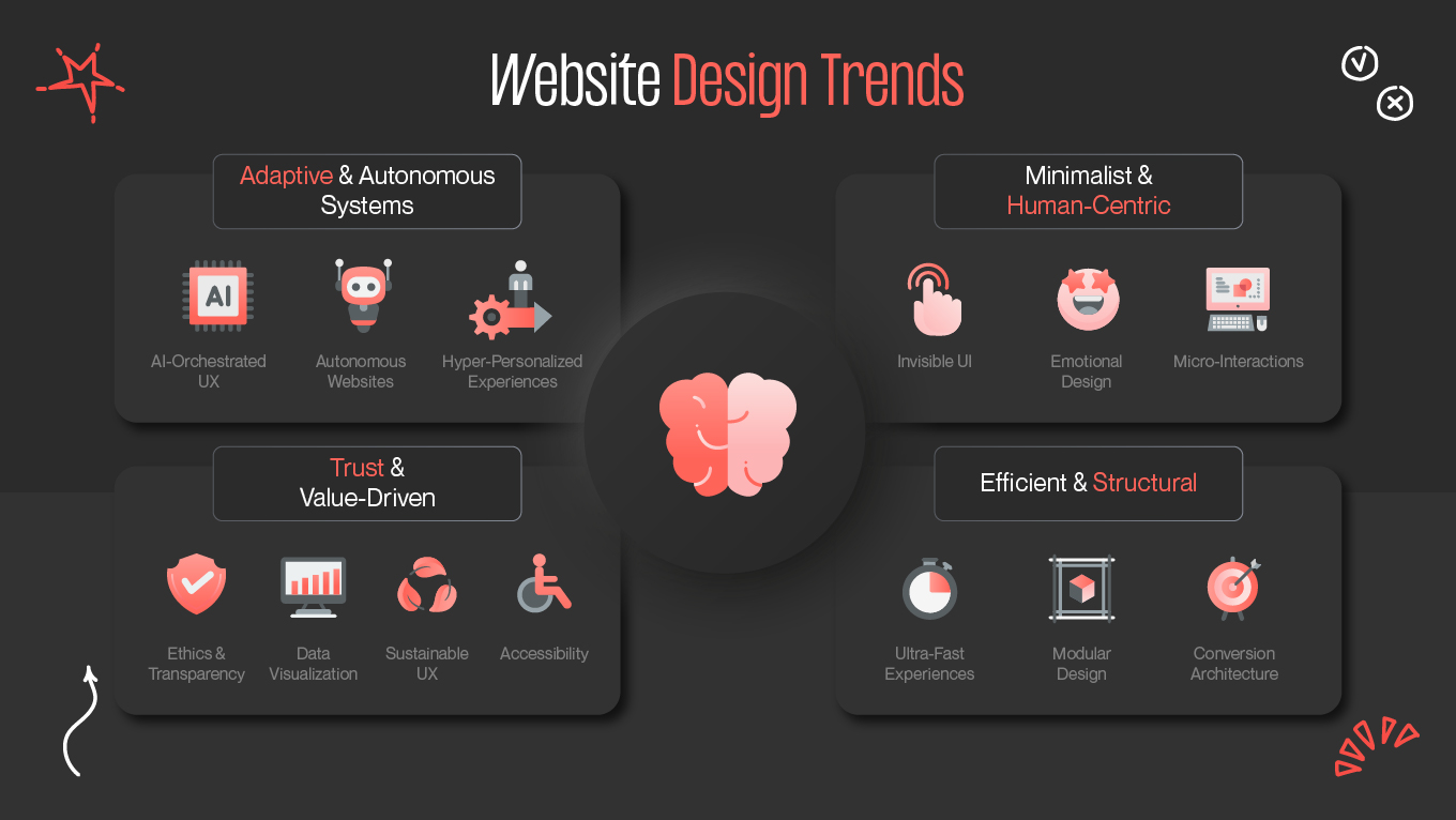
Let’s explore the website design trends that will define 2026 and reshape how companies communicate, acquire customers, and build digital trust.

How Website Design Trends Evolve

The way we build for the web has shifted from creating "digital brochures" to engineering living products. A modern website is a high-functioning member of your team that needs to sense intent and respond in real-time.

When a site feels "off," it’s rarely because the buttons are the wrong color; it's because the architecture is still rooted in an old mindset. Here is how the landscape has changed:

  • From Templates to Intent-Based Systems. Users no longer follow a linear path down a long-scroll page. They arrive with specific "jobs to be done." Modern design moves away from rigid templates and toward modular systems that adapt to how users evaluate their options.
  • The "AI-Standard" for Interaction. Thanks to the normalization of AI, users now subconsciously expect every platform to be context-aware. If a corporate site feels generic or requires users to hunt for basic information, it creates immediate cognitive friction.
  • Performance is the New Aesthetic. Speed, accessibility, and cross-device fluidity are the core of the user experience. A beautiful site that lags is effectively invisible.
  • The Website as an Operational Tool. Our web development team sees a move toward sites that do the heavy lifting: automating micro-tasks, qualifying leads with precision, and advising users rather than just pitching to them.

If your current site feels like a static relic, it’s likely time for a change in perspective. We’re here to help you map out a website that behaves as well as it looks.

How Web Design Trends Evolve

14 Modern Website Design Trends for 2026 to Consider

The digital landscape has shifted from aesthetic decoration to functional intelligence, where a site’s success is measured by its ability to sense intent and eliminate friction. The most effective website design trends 2026 are about creating adaptive, high-performance environments that respond to how users think and act. 

The following movements represent the new benchmark for brands that prioritize trust and clarity over noise.

AI-Orchestrated User Experiences (Not AI Features)

As in 2026, the benchmark for digital success has shifted from static layouts to "agentic" experiences that act more like intuitive partners than fixed pages. The most impactful website design trends focus on using AI to interpret user intent in real-time and silently adjust the interface to remove friction before it even occurs. By moving beyond generic personalization toward adaptive systems that prioritize cognitive ease, high-performing brands are transforming their websites into living engines that earn trust through every interaction.

This isn’t personalization in the old sense (“Hello, John”). It’s behavioral orchestration: the website anticipates intent and removes unnecessary steps before the user even feels friction.

Business Impact 

When users encounter an experience that intuitively “meets them halfway,” they convert faster, stay longer, and require far less cognitive effort to make decisions. Drop-offs decrease because dead ends disappear. Content teams scale more efficiently because the website handles distribution logic dynamically. And as intent signals accumulate, the website continually improves itself — delivering a smarter experience with every interaction.

Zero-UI and Invisible Interactions

Zero-UI represents a shift from "navigating an interface" to "achieving a goal." In 2026, designers treat the interface as a secondary layer that only appears when necessary. By leveraging background data and predictive logic, brands can remove the "noise" of traditional navigation, ensuring that the product feels like an extension of the user's intent rather than a hurdle to be cleared.

  • Platforms now recognize recurring patterns (like a user checking the same metric every morning) and surface that data via widgets or "dynamic islands" before the app is even opened.
  • Buttons and menus remain invisible until the user’s behavior (like a specific scroll speed or hover) indicates a need for them, keeping the focus entirely on the content.
  • Automatic form-saving and "smart-resume" homepages eliminate the "start from scratch" feeling that kills conversion.

Business Impact 

When users don’t have to think about how to get something done, they’re more likely to do it. Navigation-heavy websites force people to search, scroll, and interpret — all cognitive steps that drive drop-off. Zero-UI replaces that work with context-aware actions, subtle automation, and interactions triggered by natural behavior, not UI structure.

Hyper-Personalized Website Experiences

Personalization has evolved from a marketing tactic into a core architectural requirement. True individualization means the website’s structure is fluid enough to serve a CTO’s need for technical documentation and a founder’s focus on ROI simultaneously, without either user ever feeling lost. 

This level of responsiveness is a cornerstone of current website design trends, but it demands a sophisticated foundation to prevent "dynamic confusion." This is where our UI/UX design services come in: we build the intelligent frameworks that allow interfaces to reorganize themselves in real-time, turning a generic browsing session into a guided, high-conversion narrative tailored to the user's immediate context.

Business Impact 

When users feel understood, they engage more deeply and move through the funnel with far less hesitation. Every moment of relevance increases trust, strengthens intent, and naturally lifts lifetime value. In a digital environment where attention is shrinking, hyper-personalization is a strategic advantage that enables your website to work as intelligently as your customers expect.

Autonomous Websites Powered by AI Agents

One of the most transformative shifts we’ll see in 2026 is the rise of websites that do the work for the user. Instead of forcing visitors to search, compare, and decide, AI agents step in as active participants: booking meetings, resolving issues, qualifying leads, and guiding users through decisions autonomously.

These agents operate as the first-touch layer for both support and sales. A visitor who might otherwise abandon the page gets immediate clarity. A potential buyer can describe what they’re looking for in natural language and receive a tailored solution path. And because AI learns from every interaction, the website becomes progressively smarter — improving its accuracy, timing, and usefulness without additional engineering effort.

Business Impact 

Autonomous websites reduce operational overhead by deflecting support requests, accelerating response times, and improving lead qualification by filtering intent before a human ever steps in. Instead of being a static digital brochure, the website becomes an active revenue and service channel, one that scales without adding headcount and meets customers' immediacy expectations.

Neurodesign and Emotion-Aware Interfaces

Digital experiences begin to respect the user’s mental state as much as their search intent. By observing the subtle rhythms of navigation, like a pause that lingers too long or a back-and-forth scroll, interfaces can now detect when someone is hitting a wall of cognitive strain. 

This shift toward emotional responsiveness is a defining marker for website design trends in 2026. Rather than forcing a stressed visitor through a dense layout, neurodesign systems soften their pacing or simplify the path forward in real-time. 

For example, this can be a calming illustration design that acts as a functional layer and replaces technical complexity with intuitive comfort.

Business Impact 

When the interface reduces anxiety and supports more transparent decision-making, users stay longer, bounce less, and move forward with more confidence. Emotion-aware design doesn’t manipulate behavior—it removes pressure and complexity at the exact moment it matters, creating a digital environment where users feel guided rather than pushed. And in categories where trust and clarity shape every interaction, that emotional intelligence becomes a measurable competitive advantage.

Data-First Visual Experiences

There is a growing intolerance for digital clutter. Now, the most respected platforms have pivoted from using visuals as decoration to utilizing them as evidence. 

Data-first experiences in website design trends mean interfaces that function as a real-time window into the business. Instead of scrolling through vague claims, users are presented with live metrics—availability, performance, or progress—that allow them to make informed decisions in seconds. 

For example, instead of static charts or outdated infographics, companies can surf live metrics, interactive visuals, and dynamic comparisons that respond to user input. A sustainability company may show live carbon savings, a SaaS tool may reveal system uptime at a glance, and an e-commerce brand may highlight current demand signals.

Business Impact 

This shift builds trust. When users can explore data themselves, they feel informed, empowered, and confident in the decisions they’re making. Data-first experiences reduce ambiguity, accelerate evaluation, and create a sense of honesty that traditional marketing copy often fails to deliver. In a landscape where trust drives conversions, giving users real visibility becomes a strategic advantage, not just a design trend.

As more businesses move toward data-driven digital experiences, the challenge becomes not just what to surface — but how to structure, visualize, and communicate it so users instantly understand its value.

If you're exploring how to bring this level of clarity and intelligence into your website, our team is here to support you. You can reach out through our contact page to discuss how data-first UX might elevate your next iteration.

Ultra-Fast Experiences

Waiting is the loudest friction a user can experience. When a site keeps pace with the speed of thought, the technology itself seems to disappear, leaving only a clear path to the goal. 

Website design trends in 2026 are defined by an intolerance for latency, moving us toward "flow-state" browsing. By utilizing edge computing and content streaming, you can ensure that transitions are continuous. When the "loading" phase is eliminated, the user stays immersed in the brand story rather than being jolted back to reality by a spinning icon.

From the design point of view, this means creating pages with performance-first layouts, latency-aware components, and content that streams in without interrupting the flow. This way, transitions happen without reloads, interactions feel continuous, and the experience behaves more like a native app than a traditional website.

Business Impact 

For businesses, speed is a direct lever for growth. Faster experiences rank higher in search, convert better, and dramatically reduce bounce rates. When the website feels effortless to use, users stay longer, explore deeper, and make decisions with far less hesitation. In 2026, speed is no longer a part of the brand experience.

Immersive Micro-Experiences (AR, 3D, Haptics)

Digital browsing is reaching a point where seeing an item feels nearly identical to holding it. By leaning into the sophisticated possibilities of AR/VR, haptic feedback, and 3D rotations, brands can create sensory shortcuts, which are small, embedded moments that trigger a visceral feeling of ownership.

These are the website design trends that stick because they solve the "uncertainty gap" at the point of sale. By integrating custom 3D assets that are lightweight and interactive, brands offer a level of tactile transparency that photos can’t reach, allowing users to inspect the fine details of a product with a sense of physical mastery that makes the digital distance disappear.

Business Impact 

This means higher engagement, fewer doubts, and lower return rates, especially in e-commerce and product-driven categories. When users can feel a product, even digitally, they make faster and more informed decisions. Immersive micro-experiences turn uncertainty into understanding—and that shift directly improves conversion.

Accessibility as a Competitive Advantage

Designing for a "typical" user is an assumption that high-performing brands have largely outgrown. Accessibility is being reimagined as a proactive form of hospitality, where the interface reshapes its own logic to accommodate a vast spectrum of sensory and cognitive needs. 

Instead of static compliance, we are seeing the rise of AI-driven adaptability, where systems automatically fine-tune readability, navigation, and visual hierarchy to match how a specific individual processes the world. 

This approach moves beyond "checking a box," turning deep empathy into a strategic advantage that ensures no user is left behind due to a rigid interface.

Business Impact 

Accessible websites reach a broader audience, convert more consistently, and reduce the legal risks associated with outdated design standards. But more importantly, they send a clear signal: everyone is welcome here. In a crowded digital landscape, that level of inclusivity becomes a powerful trust builder — and a competitive edge that directly translates into growth.

Ethical and Transparent Design Principles

Trust in 2026 is no longer built through a polished sales pitch, but through the quiet integrity of the interface itself. People have developed a sharp instinct for when they are being tracked, coerced, or led down a "dark pattern," and they are increasingly choosing brands that respect their boundaries. 

You should treat the user’s autonomy as a sacred asset. It means making the "exit" as easy to find as the "entrance" and being radically honest about how data is used to shape the experience. 

Clear, Human Data Communication

People no longer accept dense privacy pages or vague consent boxes. They want to know:

  • What data is being collected?
  • Why do you need it?
  • How does it benefit me?

Ethical design makes this information visible, simple, respectful and not tucked behind legal jargon. When users understand the value exchange, trust rises naturally. It becomes even stronger when the product expresses a consistent and recognizable identity across all digital surfaces, supported by a clear, well-crafted visual identity that reinforces transparency and credibility.

Cookie-Less, Permission-Driven Experiences

As third-party cookies disappear, websites should shift to:

  • first-party data
  • contextual insights
  • transparent opt-in choices

This requires cleaner onboarding and value propositions. Users should choose to share data because the benefit is obvious, not because the interface cornered them into it.

Trust-First UX Patterns

These patterns protect the user’s interests and reduce anxiety:

  • no dark patterns or misleading buttons
  • reversible actions whenever possible
  • clear risk indicators during high-stakes moments
  • respectful use of attention (minimal pop-ups, no pressure tactics)

Trust-first design removes fear from the journey and lets users make confident decisions.

Business Impact 

Ethical design strengthens brand awareness, reduces churn, and builds long-term loyalty in a way aggressive tactics never could. When users feel the product is on their side, they stay longer, convert more confidently, and become advocates. Strong UX paired with thoughtful brand design ensures these trust signals remain consistent across every touchpoint. 

The End of Custom Everything: Modular and Systemized Design

Modular systems in 2026 don’t mean choosing efficiency over creativity. Instead, they help free teams from the repetitive grind of "reinventing the wheel." 

High-performing digital products have moved away from bespoke, one-off page builds in favor of a living, breathing architecture where every component is designed to play well with the next. 

By centering the workflow around a robust style guide, brands ensure that every new feature or landing page feels like it belongs to the same family, regardless of who built it. This modularity allows for a much more organic way of working, where you can test, iterate, and swap out elements without the house of cards falling down.

It turns design from a bottleneck into an engine, allowing the brand to scale its digital presence with a level of consistency and speed that feels entirely natural.

Business Impact 

For businesses, the benefits are faster time-to-market, lower long-term development costs, and stronger brand consistency across every digital touchpoint. Modular design isn’t the end of creativity — it’s the end of unnecessary reinvention. And for companies under pressure to ship more with fewer resources, it’s becoming one of the most pragmatic advantages of the modern web.

"Conversion Architecture"

The most effective websites have moved away from being passive brochures and toward becoming active, finely tuned engines for growth. 

This so-called concept of "conversion architecture" means treating every single pixel as a deliberate step in a larger behavioral journey. It’s the art of ensuring that, whether a user is looking at a high-impact hero section or scanning the fine print, the interface is quietly guiding them toward the next logical decision without ever feeling pushy.

By mapping out these intentional paths, brands can respond to the specific psychological state of each visitor:

  • Contextual Calls-to-Action. A user just beginning their research might see a "How it Works" prompt, while someone who has spent five minutes on a technical page is presented with a direct "See the Difference" comparison.
  • Friction with Purpose. While speed is usually the goal, conversion architecture occasionally uses "intentional friction" (like a quick confirmation step or an extra clarifying question) to build confidence in high-stakes moments and reduce post-purchase regret.
  • The Strategic Anchor. Even the most overlooked areas are becoming vital conversion points. For example, the website footer design can now provide a "safety net" that captures undecided users with trust signals, secondary resources, or a final, clear path forward just as they finish their scroll. This is a completely different approach from just listing links, as it was before. 

Business Impact 

The real beauty of conversion-centered design is that it doesn’t require a full redesign. It’s about layering smarter pathways, clearer choices, and behavior-aware interactions on top of what already exists. For businesses, this means measurable lifts in revenue, faster sales cycles, and more qualified leads — all achieved through smarter structure, not bigger budgets. Many of these optimizations rely on structured experimentation. Iterating on CTA placement, messaging, or micro-interactions through A/B testing helps teams validate what truly moves users forward.

Sustainability-Driven UX

A website’s carbon footprint is now a quiet but powerful indicator of a brand’s values. We are moving away from the era of "digital bloat"—heavy, autoplaying videos and oversized scripts—toward a more responsible standard that respects both the user’s battery life and the planet’s resources. 

By choosing leaner layouts and optimizing how data is delivered, brands are creating experiences that feel lighter and faster to the touch. We are even seeing the rise of "digital transparency labels" that honestly disclose the energy cost of a page load. This approach turns sustainability into a visible, humane commitment, signaling to a conscious audience that the company is mindful of its impact, right down to the last kilowatt-hour of a browsing session.

Business Impact 

For businesses, sustainability-driven UX becomes both a differentiator and a compliance advantage. It demonstrates alignment with modern environmental expectations while improving performance, speed, and accessibility. It’s a design choice that says something about the brand’s values — and in a market where trust and reputation are everything, that statement matters more than ever.

As sustainability becomes a defining expectation of modern digital products, teams are increasingly looking for ways to integrate efficiency, clarity, and responsibility into their web experience without sacrificing creativity or performance. 

If you're considering how to bring these principles into your next redesign, contact us — we’re always open to discussing thoughtful, future-ready approaches to UX.

Web Design Trends
Web Design Trends

Examples of Website Design Trends in Action

Across industries, the most effective digital experiences share a common thread: they anticipate users rather than instruct them. Below are examples of how leading companies are already applying the trends shaping 2026 — and why these approaches resonate so strongly with modern audiences.

Netflix Makes Personalization That Shapes Decisions

Netflix has moved from simply suggesting "what to watch next" to a model where the interface itself acts as a silent, intuitive curator. 

The platform doesn't just display a library; it guides users through it by subtly shifting thumbnails, trailers, and content rows based on deep behavioral cues; everything from how long someone hesitates over a title to the specific time of day they are browsing. 

This way, Netflix reduces the cognitive load of "the choice" itself. By eliminating decision fatigue, the company ensures that the experience feels understood rather than automated, a strategy that has been a primary driver of its projected 15–16% YoY revenue growth and the rapid scaling of its personalized ad business. 

Chase Uses Zero-UI to Remove the Burden From the User

Chase’s approach to zero-UI is simple but powerful: when a user returns to the app mid-process, the session continues seamlessly. No searching. No repeating steps. Just continuity.

Reducing friction in high-stakes financial actions builds trust — and in Chase’s case, even minor UX changes resulted in millions in new revenue.

Stitch Fix Creates Individualized Journeys That Feel Personal

Stitch Fix has mastered the art of making a digital platform feel like a private consultation. The company has eliminated past basic recommendations and created a model where the entire site structure (from the high-level narrative to the specific calls-to-action) dynamically reshapes itself based on a user’s unique stylistic profile and past interactions. 

A newcomer is greeted with transparency and guidance to build trust, while a long-term client is met with high-conviction, refined suggestions that bypass the need for browsing. By treating this approach as a framework for individual journeys, Stitch Fix has virtually removed the "paradox of choice." 

Their focus on lowering hesitation and increasing relevance is the engine behind their 40% jump in average order value and the doubling of their annual revenue, proving that when a user feels seen, they are far more likely to commit.

Intercom Makes Websites Act

There is a quiet power in a website that doesn’t just host information, but actively works to solve a visitor’s problem at the moment. 

Intercom’s Fin AI agent represents this transition from a passive page to a responsive partner, handling the immediate, often repetitive hurdles of qualifying leads and booking meetings with a level of nuance that feels like genuine hospitality. The goal isn't to replace the human element, but to protect it, ensuring that by the time a person joins the conversation, the "heavy lifting" is already done.

Such an approach turns a standard site into an "active" environment where answers are found in seconds rather than through a series of clicks and forms. With a 51% resolution rate and a trajectory toward $100M in AI-driven revenue, the success of this model proves that when a platform prioritizes the user's time and momentum, it stops being a mere digital storefront and becomes a high-performance engine for growth.

Patagonia Builds Trust Instead of Telling Stories

For Patagonia, trust is a design element that is built through the quiet evidence of their impact. The brand has removed the typical "About Us" narrative to a model where sustainability data is woven directly into the browsing experience. Instead of hiding environmental reports in a footer, they treat metrics like carbon savings, supply chain origin, and material recycled content as primary product specs, right alongside size and color.

This is all about radical, unpolished honesty. Patagonia’s recent "Work in Progress" reports even go as far as highlighting where they have failed—acknowledging, for instance, a 2% rise in emissions due to shifting product lines—to ensure their transparency is credible rather than curated. When a user can see the exact carbon cost of a jacket or trace its path back to a specific factory through the "Footprint Chronicles," the digital interface stops being a marketing tool and becomes a record of accountability. 

Patagonia Builds Trust Instead of Telling Stories

BBC Made Accessibility Their Market Strategy

For the BBC, accessibility is no longer a technical requirement, but a core form of digital hospitality. The broadcaster treats its interface as a shared space that must adapt to the user, rather than the other way around. 

By integrating high-fidelity transcripts, intuitive keyboard navigation, and cognitive-friendly layouts, they ensure that the billions of people (including aging populations and neurodiverse individuals) who are often overlooked by standard design can navigate news and media without friction. 

By removing the "invisible walls" that hinder diverse audiences, the BBC has transformed accessibility into a primary growth engine, proving that when you design for the most specific needs, you create a better experience for everyone.

Mint Delivers Conversion Paths Built Around Behavior

Mint has created a fluid, behavioral architecture that responds to the rhythm of the user's journey. Instead of a linear path, the website acts as an adaptive guide, where every call-to-action and navigational nudge shifts in real-time based on the visitor’s intent. A user who is clearly comparing options sees different cues than one who is ready to commit, ensuring that ambiguity is replaced by clarity at every turn.

What makes Mint’s approach a benchmark for website design trends is the use of "intentional clarity"—the strategic removal of choice at moments of high intent. By narrowing the focus and guiding users through complex decisions with zero distraction, the company managed to increase its storefront conversions by 41%. 

It is a masterclass in how a website can act as a proactive partner, moving users forward by clearing the path ahead.

Our Perspective: How We Approach Modern Website Design

Gapsy Studio designs websites as high-performing products rather than static marketing assets, prioritizing clarity and speed over passing trends. By applying proven usability patterns from fintech and SaaS, we replace guesswork with experience to turn complex paths into effortless decisions.

Our core values:

  • Product-first mindset. We build websites that work like reliable tools, which are intuitive, fast, and scalable.
  • Proven patterns over novelty. We leverage cross-industry experience to implement what works, avoiding "reinventing the wheel."
  • Friction removal. We identify and eliminate the small moments of hesitation that kill conversions.
  • Sustainable systems. We create reusable components and clear design rules so your site grows with you without needing constant rescues.
  • Outcome-driven design. Every aesthetic choice is tied to a measurable business goal, ensuring your site drives real results.

If you’re ready to make your website easier to use, grow, and convert, let’s talk. Contact us to discover where a smarter, product-driven design approach can make the biggest difference for your business.

Conclusion

In 2026, we’ve moved past the idea that a website is simply a collection of pretty layouts or a specific set of brand colors. The true measure is how quietly and effectively your website adapts to the person using it. 

This brings a new kind of responsibility that moves toward a sense of "digital hospitality,” where using tools like AI and modular systems allows you to honor the user’s time and emotional state. The brands that thrive are those that stop trying to be the loudest in the room and instead focus on being the most helpful, clearing away the "invisible walls" of friction so the path forward feels natural and obvious.

Ultimately, the most impactful digital ecosystems are those that feel less like a transaction and more like an experience built for a real person. 

If your current site feels a bit rigid or disconnected from your true goals, we’re always here for a low-pressure conversation. We would love to help you move away from the cycle of "starting over" and toward building a sustainable, human-centric presence that grows alongside your business.

Rate this article

35 ratings
Average: 4.9 out of 5

If you like what we write, we recommend subscribing to our mailing list to always be aware of new publications.

Do you have any questions? We tried to answer most of them!